

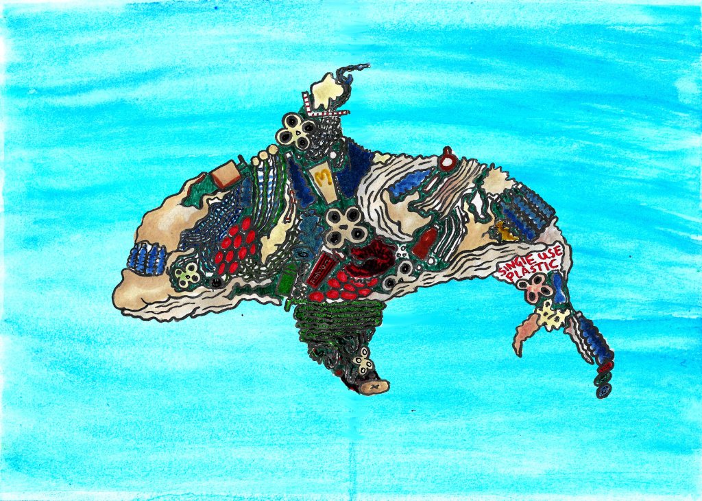
I started the week by digitally putting together my Planet Pollution and Plastic Orca illustrations by scanning both the colour and linework layers into Photoshop, editing them a bit and stitching them together with the linework layer above the colour layer. I then focused on creating watercolour backgrounds for these two designs using traditional media, just as I did for the front cover design. I tried developing the background designs I made earlier in the project by painting a simple watercolour ocean for the plastic orca illustration. I made the ocean simple because I didn’t want to take attention away from the orca which is the most important part of the design.
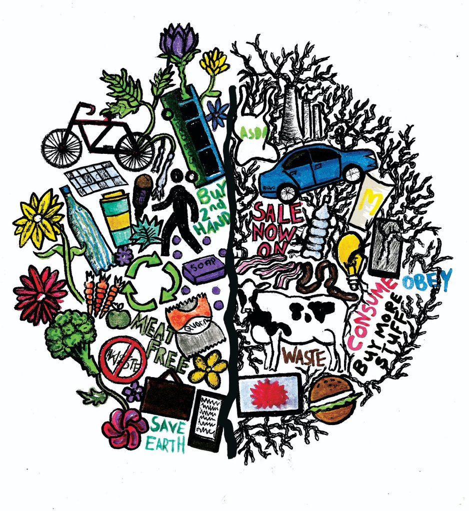
For the Planet Pollution illustration, I tried to paint a duality background with a light and colourful design on the eco-friendly side and a darker, more depressive design on the pollutants side. After talking to my tutors about this background design I realised it was too complicated and the planet pollution would look better against a white background. I left the watercolour background idea behind and spent the rest of the week focusing on developing my Advertisement Anxiety design.
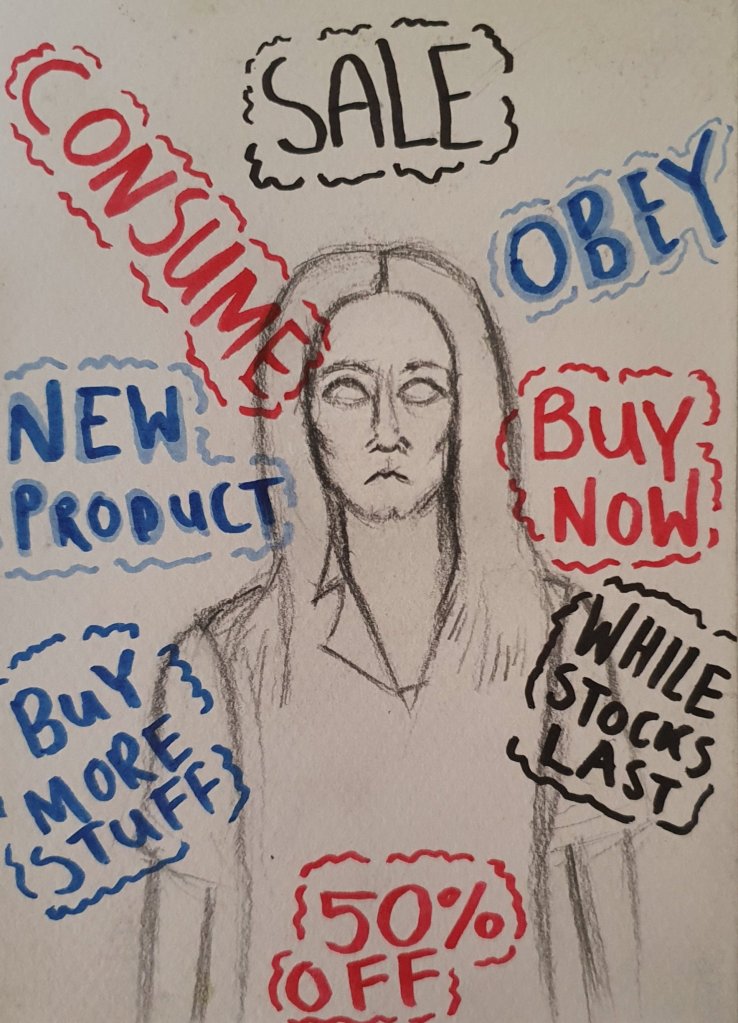
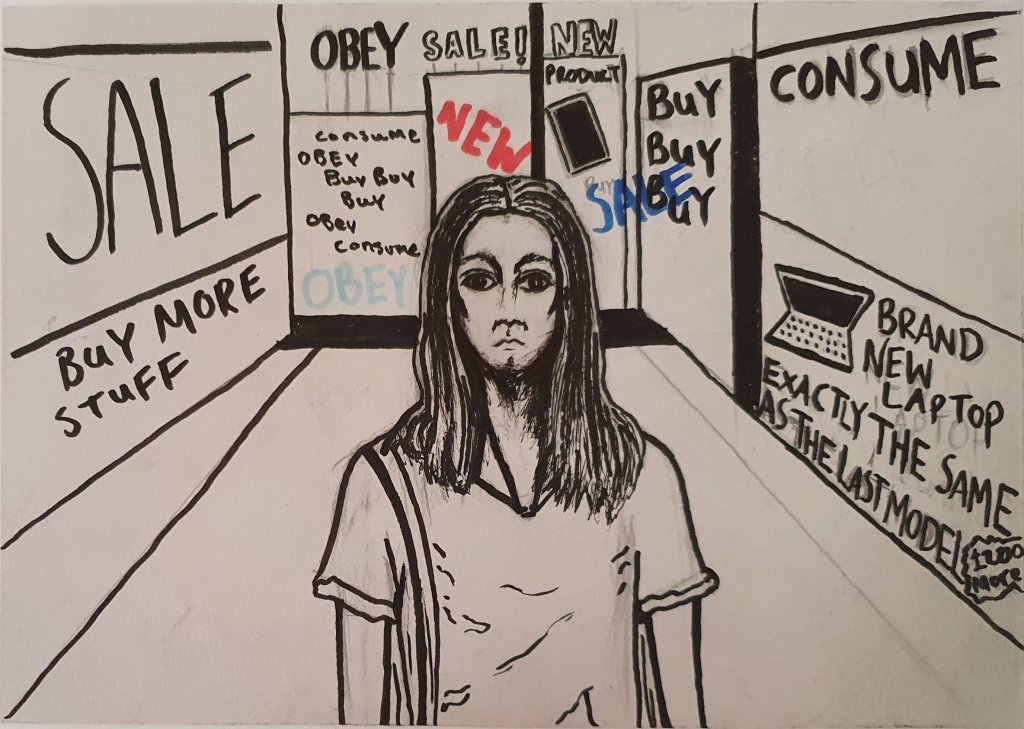
As I mentioned on my previous post, I researched further into how to portray anxiety in the media and came across an article that opened my eyes to the fact the head clutcher pose I was drawing the woman in previously was far too overused and could be conveyed as offensive and contribute to a negative stereotype about people (like myself I might add) who suffer from mental health problems. More details of this can be found in my previous post. It is because of this that I decided to completely change the way I portrayed this illustration. I started by researching how to portray anxiety accurately and fairly and which poses would be good to use. I then started to sketch out my ideas. My first sketch shows a woman staring blankly at the viewer while words such as Sale, Obey, Consume and Buy More Stuff attack her from all sides, symbolising how adverts are almost everywhere we look at the pressure they can put on us to consume. This quickly became my favourite sketch that I had done for this illustration, I loved the idea of someone looking directly at the audience, I thought it would be quite unnerving and further express the anxiety I was trying to portray.
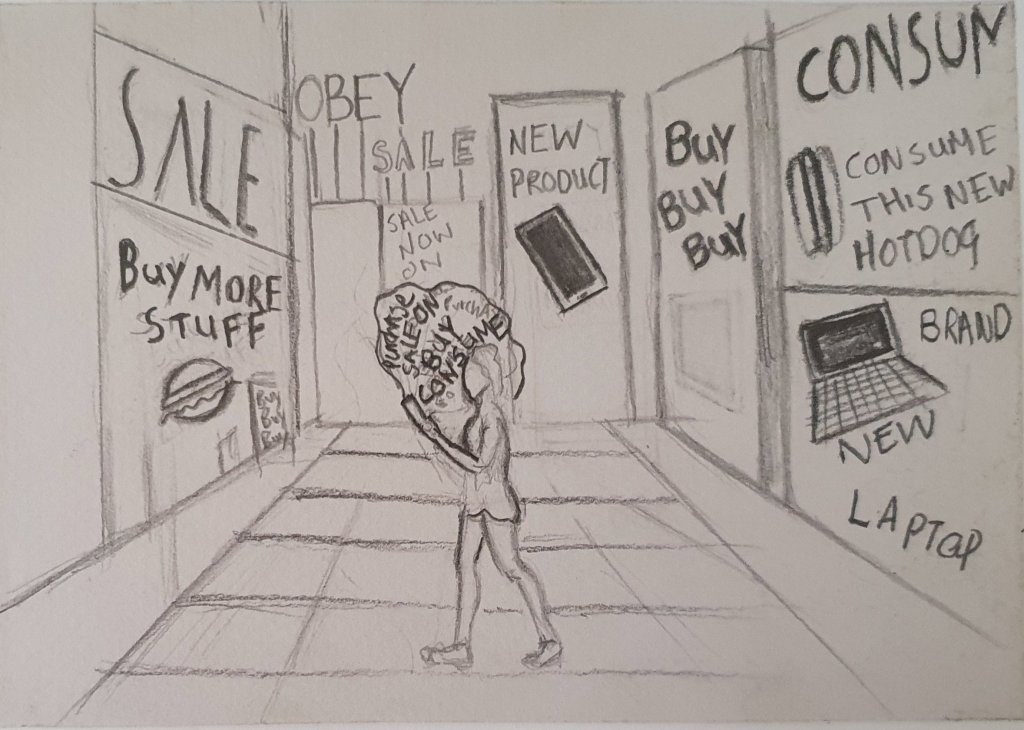
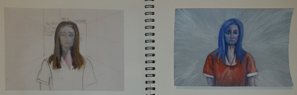
My 2nd sketch shows a woman walking in an empty city as she is bombarded by advertisements from her phone and the buildings around her, she is alone because that is how her phone makes her feel. I liked the background on this sketch but I didn’t like how small I drew the woman, nor did I like the perspective I had done on her. I decided to try combining the woman from my first sketch and the background from my 2nd sketch to create my third design. Compositionally, I much preferred this one, however, I went a bit too heavy on the brush pen and over inked the woman to the point I no longer liked the design. I knew by this point that brush pen wasn’t going to work for this illustration, unlike the other two so I started to try something else, something I’d never done before, gouache paint.
As you can probably tell, my first attempt at using gouache paint went horrifically wrong, which I guess is understandable as it was the first time I’d ever tried it in my life. Nevertheless, it taught me some things. I overwatered the paper a great deal which caused the paper to buckle and diluted the paint too much so the pencil lines beneath were still visible, and I didn’t wait long enough for each layer of paint to dry so all of the colours just kind of melded together into a gloopy mess. Things to not do on my 2nd attempt. I learned from my mistakes though and ended up producing a gouache painting of the woman which I actually loved. I was so surprised at how well my 2nd attempt at gouache painting went. I used less water this time and also waited patiently between each layer for it to dry and it paid off! I used a blue hue for the shadows because I wanted the woman to look slightly unnatural and a bit depressive, which the colour blue is really good for. Gouache paint is a medium that I am definitely going to use a lot more in the future, I can’t believe I wanted all of this time to try it. It has fundamentally changed how I see the medium.
Over the next week I am going to try and create a background for the woman and figure out a way to portray the constant adverts that are inducing the stress and anxiety in her. I will also create a background for my Plastic Orca illustration and finalise it for my zine because I still think there is quite a bit of room for improvement with this design. It’s missing text and the composition isn’t right. I am aware the original deadline is coming up (May 7th) but fortunately the deadline has been pushed back a month to accommodate the current world crisis so I have more time to finalise the zine and make it the best it can be. I still would like to create some art for the mental health brief too, but we’ll see how time goes.
