Final Project Evaluation

Rohan Hall final Evaluation

I don’t even know where to start with this evaluation. This project has by far been the weirdest, most challenging, and hardest one I’ve done so far. Working from home has been hard and my original time plan got thrown out of the window and shot to space. It is safe to say that I have not been able to keep to my original time plan, in fact I am at least one month behind schedule. I don’t even know if I can say that my time management has been bad throughout the course of this project because we are literally in the midst of a pandemic, the situation is unlike anything I and probably the rest of humanity have been in before. There have been many times when I struggled with the project, some days, if not weeks where I just could not bring myself to work at all which has definitely put a damper on the amount of work I have been able to do. My laptop broke later on in the project, prior to the 2nd brief which limited what I was able to do with it, I adapted to this though and chose to complete the 2nd brief traditionally, which in some ways was quite nice and refreshing because I worry I have become too reliant on computers when it comes to my art, but it was still challenging.

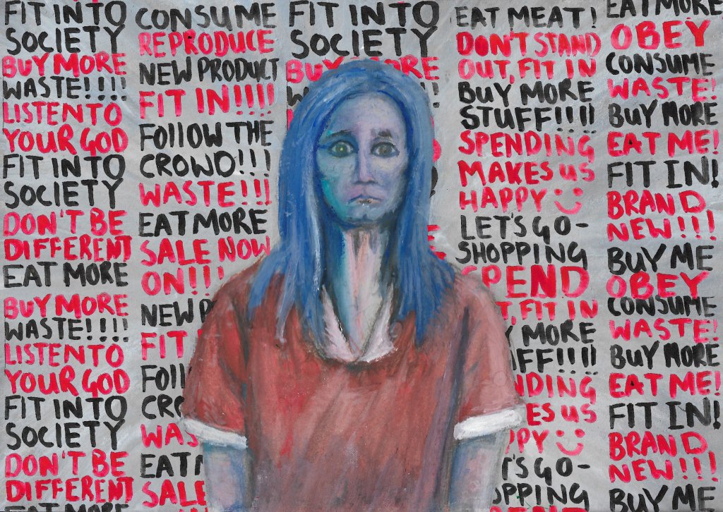
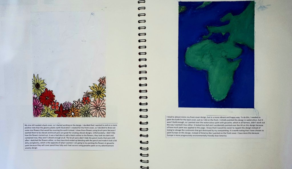
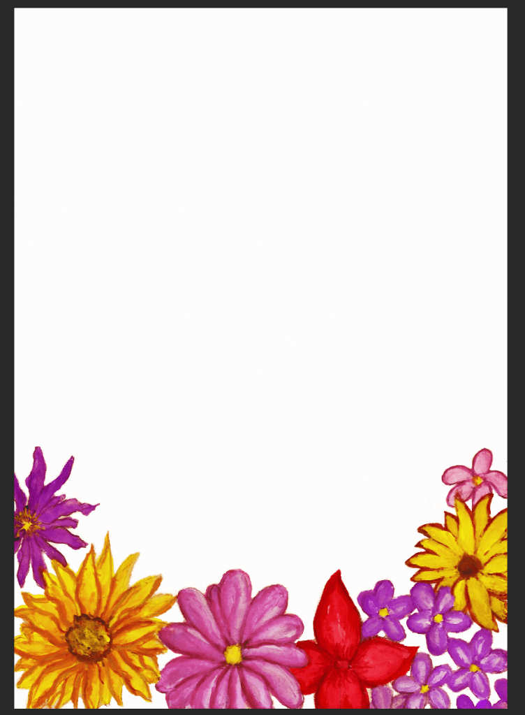
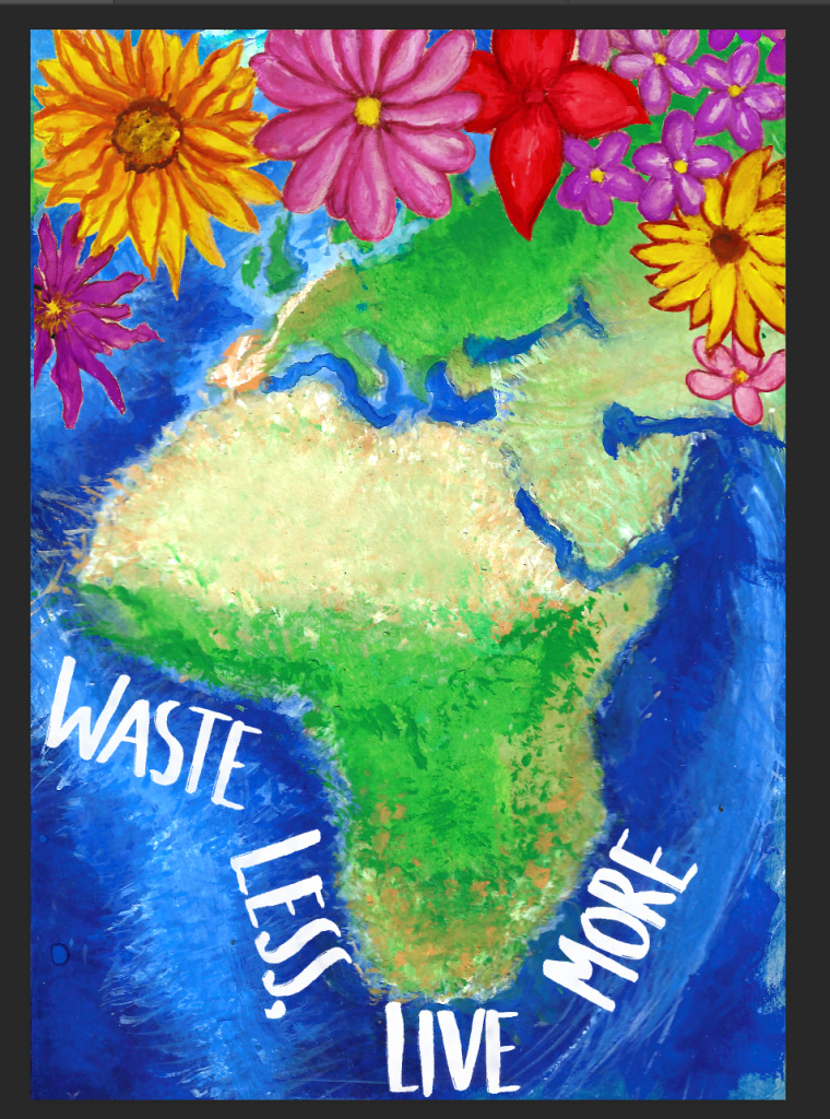
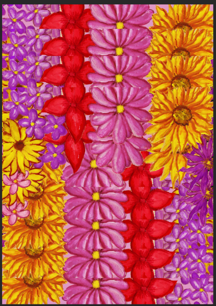
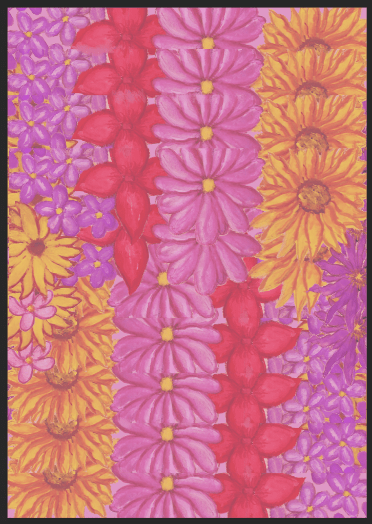
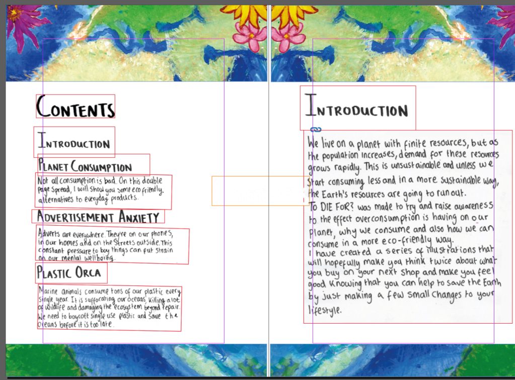
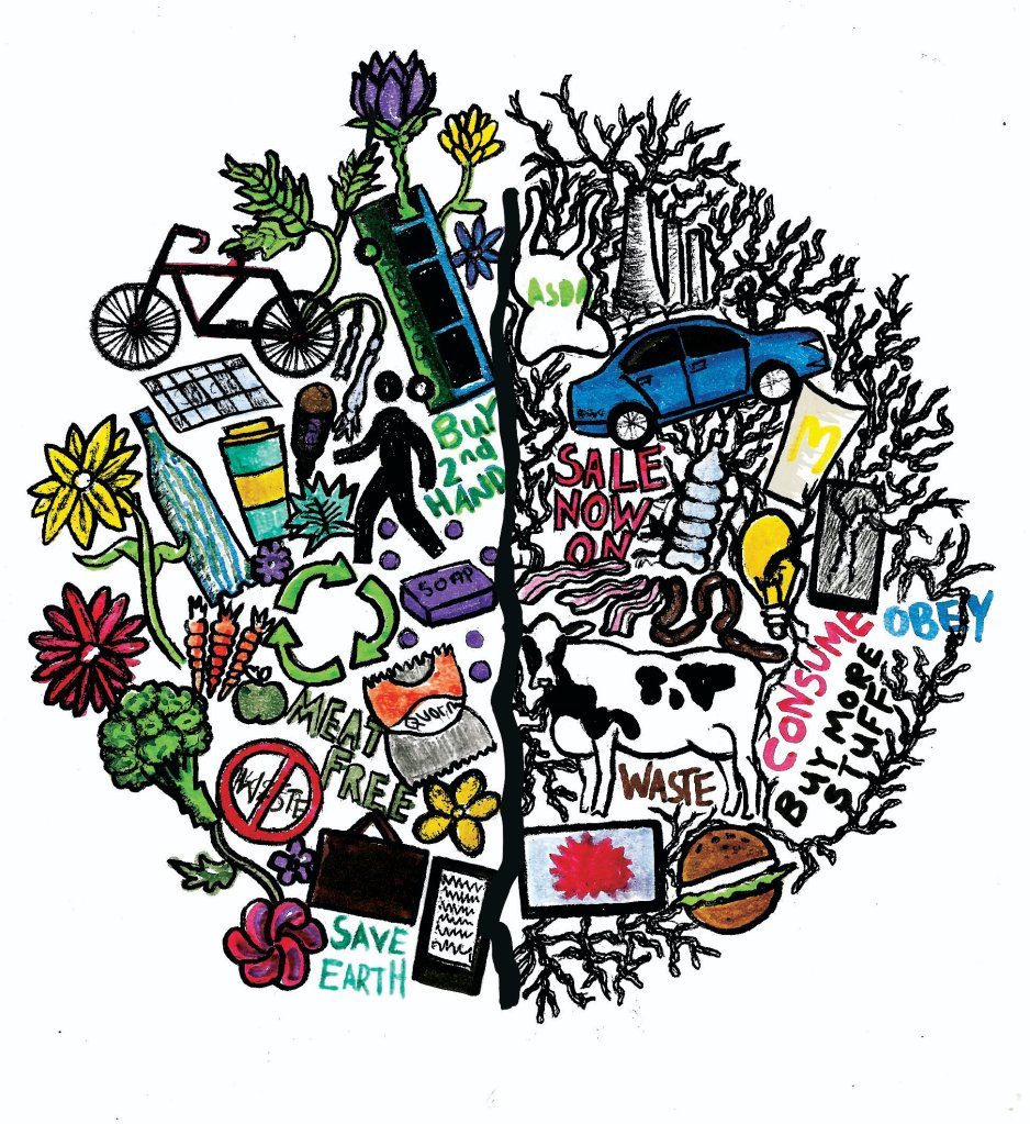
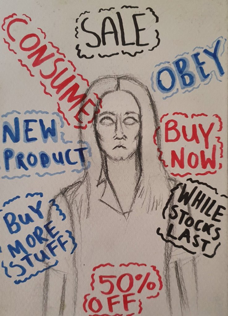
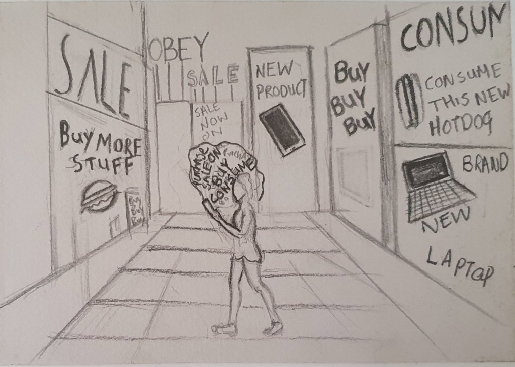
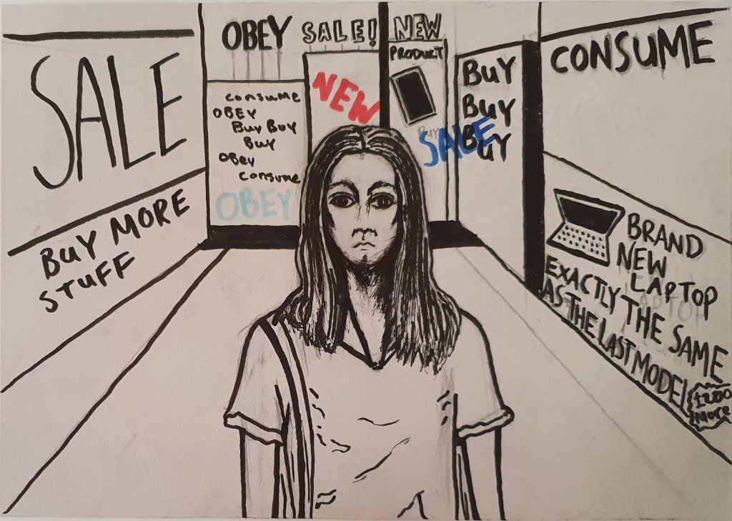
Let’s start with the zine because ultimately, I think that was the most successful of the two, and it’s the one I spent the most time on. I had high hopes for this project and was excited about doing it. I chose a zine as my final piece because I would like to do some editorial illustration as part of my career and have an interest in book illustrations too and creating a zine seemed like a good blend of the two fields. I also saw the kind of things people were submitting to the creative conscience briefs, rarely was there something as simple as a standalone illustration which pushed me to do something more. Admittedly, I may have misjudged how much time the zine would take me to create and also how much work it would entail. Normally for a project I would produce 1 or 2 illustrations maximum, but I ended up creating approximately 6 when you factor in the front and back covers and the inside page, as well as the 3 double paged spread illustrations I created for the inside of the zine, so it was a lot and I was definitely a bit overwhelmed throughout. I think in the future I need to be a bit more organised when it comes to the planning of a project, especially one such as zine because I didn’t initially take the time to figure out how many pages or illustrations I would need to achieve my goal which ended up causing a lot of stress later on when I realised just how much work I needed to do to make my zine look professional. 

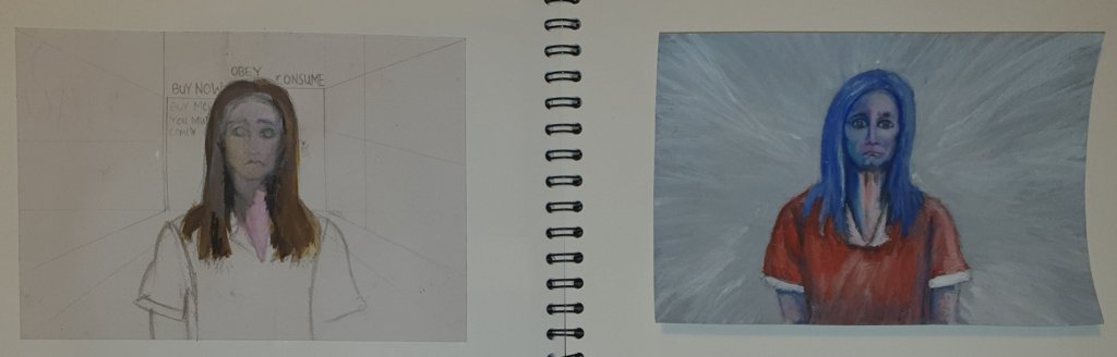
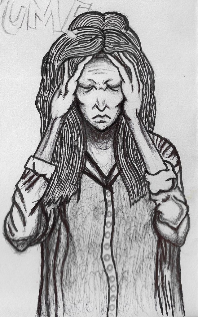
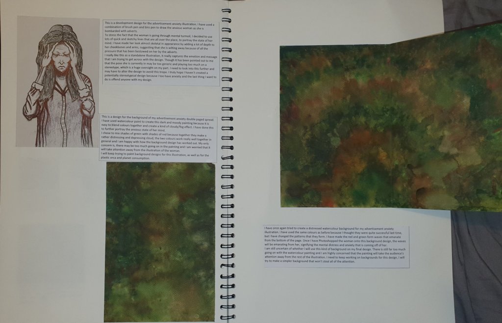
The project wasn’t all stressful though, there were times when I really enjoyed it, such as when I decided to try using gouache paint for the first time and I ended up loving it. I wanted to push myself by learning a new medium that, in the past I avoided like the plague, and it went well. My technique still needs a lot of improving with gouache though, I still haven’t figured out how to layer gouache properly and the opaqueness of the paint took some time getting used to. In regards to my advertisement anxiety design, I didn’t research enough originally how to portray anxiety in a fair and inoffensive way which resulted in me drawing a woman in the head clutching pose for the bulk of my development, which I later found out was both overused and added to the negative stigma that people with mental health problems can’t function properly, which simply isn’t true. I regret that I did not take the time at the start of the project to learn the right and wrong ways to portray mental health visually, not least because I suffer from mental health problems too. I fell into the trap of using overused press and stock images that are easy to find, but don’t necessarily convey the right message.

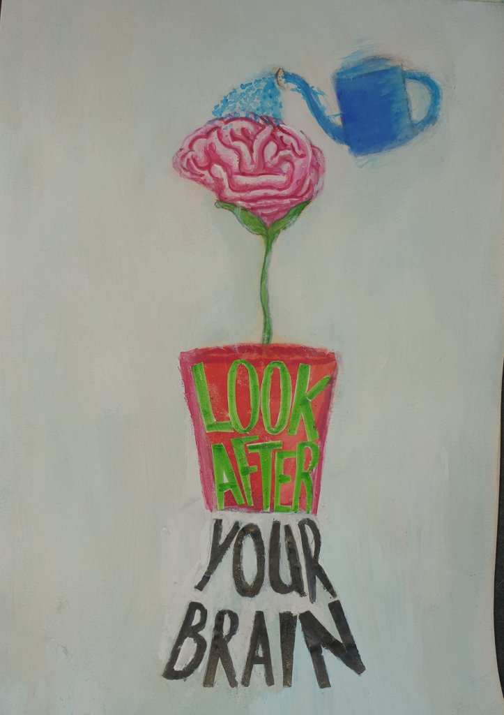
As for the 2nd brief, I only left myself 10 days to do it which to be honest, was nowhere enough time to do what I set out to do with it. That’s not to say I didn’t create a small project with a painting as the final outcome, I managed to achieve that, it’s more the quality of work that isn’t what I wanted it to be. I chose the Creative Conscience Mental Health brief which asked to create something that was both optimistic and empowering for people with mental health. My goal was to create a number of artist researches, sketches, development and a final piece, which in essence I did, but I would have liked to spend a lot more time researching and developing my ideas before creating the final piece. In the future I need to try adhering to my time plan more and manage my time more effectively so that I leave enough time to do both briefs, instead of spending so much of the project doing just one. My final painting depicts a brain flower being watered by a watering can, with the words ‘Look After Your Brain’ written on the design. I actually like this design in theory, it looks cute and effectively gets my message across, however, I think the visual execution of the design could be so much better. Ideally I would have liked to edit the final painting in Photoshop to make it look more professional, but I wasn’t able to do this because of my laptop breaking. 

I was also supposed to create more illustrations for my aunt’s book which is being published on Halloween,  and hand them in alongside my project, however I wasn’t able to achieve this due to bad time management and being negatively affected by the coronavirus crisis. I chose to put those illustrations on hold until after the project when I can invest much more of my time into doing them. Ultimately, I think I have done quite well with achieving my project aims, given the current circumstances, but I definitely need to improve my time management and plan my projects more realistically in the future. The zine was the most successful outcome of the two and I am quite proud of myself for finishing and publishing a zine in the time frame that I had. 

https://www.flipsnack.com/chickenstein/to-die-for-issue-1.html

Advertisement Anxiety- Gouache & Brush Pen
Back Cover- Gouache & Brush Pen
Look After Your Brain- Gouache and Marker Pen

SWOT Final Project

Strengths- Ambition, I was very ambitious when I decided to create an entire zine as part of my final project, and although it was the most challenging project so far, it was worth it.

Weaknesses- Being too reliant on a computer to create and edit my work. I basically crumbled when my laptop broke and spent a few days trying to figure out how to move forward. Technology isn’t reliable. Also Time Management, still I struggle with this, despite having a time plan at the start of the project.

Opportunities- World Illustration Awards. Creative Conscience. I’m illustrating a book, which now I can finally focus on so that should get me some exposure.

Threats- My inability to manage my time effectively and adapt to the current situation made it much more difficult for me to achieve the amount of work I had set out to do. My tendency to push myself too far is also a threat because it can be detrimental to my mental wellbeing.

SMART- Final Project

Targets to achieve over the summer.

Learn to be less reliant on computers to create my art.

Back up my computer more when I get a new laptop, just incase it breaks again.

Reach out to art directors for publications such as LWL and New Scientist over the summer and try to get commissioned by them.

Tailor art to the publications I’d like to illustrate for.

Sort out my online portfolio and create more illustrations to flesh it out.

Work on improving my online presence.

Crisis Management- Figuring Out How to Digitally Hand in a Project Without a Laptop

The end of the project is so close now and I’m both relieved and extremely stressed. My laptop decided to give up on me at the start of the week so I am now unable to edit photos for my blog or create any art digitally in any way, shape or form. I’m just lucky I was able to get on it long enough to back up all of my files so I haven’t lost the work I’ve done over the past year. I was also able to upload my zine to flipsnack before it gave it up on me so I’ll post a link to my zine on this post. What it does mean though is that my 2nd brief, which I have chosen to be the Creative Conscience Mental Health brief, will have to be created entirely traditionally, without the ability to edit it. I came so close to just calling it a day and handing in the project when my laptop died, I spent a few days trying to figure out what to do with myself, so it is safe to say that I haven’t achieved a great deal of work this week. I suppose the 2nd brief was always going to be a smaller one, and I am allowed to hand in a traditional piece, it doesn’t have to be digital so I guess it’s not the end of the world. 

I did manage to get some artist research this week to kick off my 2nd brief, I spent quite a lot of time looking for artists/illustrators that depict mental health in an accurate and fair way, I didn’t want to fall into the trap of using a negatively viewed, overused stereotype again like I did during the development of my zine with the head-clutcher image, a mistake I will never make again because the last thing I want to do is add to the already negative stigma surrounding mental health. I want to help remove the stigma and show people that mental health problems are a lot more common than they think. I will post my artist researches separately on my blog, providing I am able to access them on my phone which is what I am currently using to write and edit my blog posts now. 

Next week I need to really get a handle on the 2nd brief, I’ll only have like maybe 10 days or less to finish it, but I really want to achieve what I set out to at the start of the project despite everything. I have some ideas of what I am going to do,  I know from the brief that I need to create something that is optimistic and empowering to people with mental health problems, which shouldn’t be too diffgicult as I am one of those people. Right from tomorrow I am going to sketch out a bunch of my ideas and quickly move onto development , a lot faster than I normally would because this is kind of like a micro brief at this point, so the project doesn’t need to be as expansive as previous ones. 

Sharmelan Murugiah

Sharmelan Murugiah Research
Sharmelan Murugiah is a Welsh/Sri Lankan artist based in London. He creates amazingly surreal and dreamlike colourful illustrations. He has created work for New Scientist and Little White Lies which are two publications that I would like to create illustrations for which is one of the main reasons I have chosen to research him.
Murugiah has suffered deep seated issues of low self esteem and low confidence in his life which has always and will always be a part of him. This struggle is sometimes shown within his art and the kind of projects he has taken in the past. For example, he created work for the Poet Lionheart where he prodced 4 paintings that depicted anxiety and depression as a result of the built environment, which is the human made environment such as towns and cities. He has previously struggled with establishing his style, but this particular project helped him to generate a much clearer vision of his new style.
Murugiah’s process varies depending on whether or not he is creating work traditionally or digitally. When creating traditional work, Murugiah sketches his ideas on cheap printer paper because he reworks and redraws is ideas a lot initially, so using the cheap paper keeps the costs down. Murugiah also draws into sketchbooks to work out his ideas, similar to how I work. Once Murugiah is happy with a sketch, he scans them an blows them up big on to canvas before using posca markers to draw the linework and acrylic paint to colour his designs. This is a similar process to how I work, though I have never thought about blowing up my sketches to finish them at a larger scale traditionally, I normally don’t blow up my work until it is completely finished, perhaps this is a process I can try in the future.
When it comes to creating digital work, Murugiah starts out with the same process of working out his ideas on printer paper, he then scans his sketches and uses an iPad Pro and apple pencil to redraw the work in Photoshop before colouring digitally. I have always thought it would be nice to own a graphics tablet such as an iPad pro where you can draw directly onto the screen. It seems a lot less complicated than using a cheaper graphics tablet such as my Wacom draw where you have to look away from where your hand is moving in order to paint digitally. I too start off with a traditional sketch and use Photoshop to colour my art when creating digital illustrations, this seems to be an industry standard and it is reassuring to see professional illustrators working in a similar way to myself.
Murugiah gets a lot of inspiration from movies and has said that pretty much every movie that he has watched has provided him with inspiration in some way, shape or form. He seems to be drawn to older movies, like the ones he watched as a kid, as well as classic 80s sci-fi which led him to illustrate a Stranger Things book called Visions From the Upside Down which gave him a chance to produce a series of work in a different medium. He is also inspired by artists such Keith Haring, Roy Lichenstein and Andy Warhol, as well as more contemporary artists such as Eve Lloyd Knight, Hattie Stewart and the astounding James Jean.
I am really looking forward to using Murugiah as inspiration for this project because I love his art style and the way that he portrays mental health problems, he seems to really understand what people are going through, and he does as he has suffered himself. I see myself using Murugiah as a long-time inspiration, not just for this project.

Harris, M., 2018. Sharmelan Murugiah On Coping With Loneliness As A Freelance Illustrator. [online] Digital Arts. Available at: <https://www.digitalartsonline.co.uk/features/illustration/sharmelan-murugiah-most-importantly-i-am-going-be-open-honest-with-how-i-am-feeling/&gt;
Virus- Murugiah, S., 2020. MURUGIAH. [online] MURUGIAH. Available at: <https://murugiah.com/2019&gt;

Waste Less, Live More. A Mantra We Could All Learn Something From.

I have spent the bulk of this week working on creating a back cover and inside pages for the zine so that it will be ready to upload online in the coming days. I had an idea of having a nice border around the Earth on the back cover to contrast the dark plastic border that I created for the front cover. I started by sketching out some colourful flowers in an arch that would be placed around a painting of the Earth, symbolising life and the hope that readers are more aware of how to consume consciously after reading my zine. 

Brush Pen Flowers and 1st Gouache Earth

I drew out the first set of flowers in brush pen on marker paper because I thought that it would be bold and vibrant, having had success with brush pen previously, I also added a black putnline to the flowers to make them stand out more, which ended up being a mistake because it make them look too dark and similar to the front cover design which is the opposite affect I was going for. I decided to move on and try using gouache paint on my design instead because of how well it went when I painted the advertisement anxiety woman. The flowers were only going to be one part of the design, I still needed to paint the Earth. I chose gouache as my medium this time instead of watercolour like I used for the front cover because gouache seems to be much bolder and easier to layer, it’s also opaque so I am able to paint over any mistakes that I make. It took me a couple of attempts to paint an Earth scene that I was happy with, but I got there in the end. I struggled at first because I am still relatively new to gouache paint, it behaves quite differently to watercolour. I also repainted the flowers in gouache paint so that it was consistent with the rest of the back cover design, using gouache went a lot better than brush pens. I digitally collaged the flowers and Earth together using Photoshop to complete the base of the design. I felt like it was missing something though, text. I decided to write something I was originally going to put on the front cover ‘waste less, live more’ in brush pen and digitally collaged that on to my back cover design also. The process I went through to finalise the back cover is displayed below.  

I didn’t feel like the zine had enough pages, the layout I was using went straight from the front cover to the first main illustration which didn’t look very professional when compared to other zines and magazines in general. There are usually some inside pages of sorts, which is what I designed next. I used the gouache flowers that I painted for the back cover design and copied and pasted them over and over until they filled up an entire page. I then reduced their opacity and filled the background with a light pink that I sampled from the flowers to give them a faded, yet bright look. I chose to us the flowers as the basis of my inside page to add visual consistency to the zine. I then moved onto creating a contents and introduction page so that the audience could learn what the zine was about and what I am trying to achieve with it. I went through many different layouts for these pages and experimented a lot with hand written fonts, the processes of which can be found in the images below. I added the inside pages for another purpose too, to make sure my zine had 12 pages because it will make it easier to print and fold my zine when this coronavirus crisis is all over.  

The zine is almost finished, which is a huge relief, all that is left to do now is upload it to flipsnack which is the website I have chosen to publish my sine because it seems to be very user friendly. I will do this in the next few days, as well as finalising  the layout in Indesign so that it is ready to be printed in the future. I still have a 2nd brief to do as I set out to do originally at the start of his project, and I have so little time to do it, we’re already past the original deadline before it got extended to accommodate the current world situation. My time management has been pretty bad during the course of this project and quite frankly I am disappointed in myself for working so ineffectively. I know the world is all topsy turvy now but I didn’t expect myself to be this far behind my initial time plan. I can’t let the coronavirus stop me working well, especially when I start third year, there is no guarantee that I’ll be back at college by then, but I will have to manage my time so much more effectively because 3rd year is where everything really matters.

How My Zine Became SO Close To Being Finished

I’ve had yet another really productive and, to be honest, stressful week. I’m still finding it so difficult to motivate myself, but I was aiming for a distinction before the world went all topsy turvy and that’s still the grade I would like to get so I’m clinging onto that thought to try and push myself more and more every day.

Advertisement Anxiety final illustration

I’ve managed to get so much work done this week, staying up until around midnight everyday just to get enough work done. I started the week on a bit of a high by adding more layers to the energetic grey background on my advertisement anxiety gouache painting. I really like how it emanates from the woman and focuses the viewer’s attention on the woman in the centre of the design. All it needed after this was text. This was important because it needed to represent all of the advertisements that are causing the woman’s anxiety. I started this by creating various signs and fonts in marker pen so that I could decide which one would work best. I chose to use marker pen for the text, rather than gouache paint because I wanted the text to be bold and stand out against the gouache, rather than get enveloped by it. To figure out which font/sign would be best, I scanned a couple of them onto Photoshop, along with the gouache painting. I then edited them a bit and digitally placed the text over the gouache painting to see if they worked together. The first one didn’t work well, but the 2nd font looked a lot like scrawling on the wall. I digitally collaged it onto the gouache painting and used it to fill up all of the space around the woman to make it look like she has scrawled the words onto a wall in mental health unit. Or like the words are all she can think about.

Plastic Orca Layout 1

I was really happy with how my advertisement anxiety illustration turned out after I had chosen which text to use and edited in Photoshop and decided that it was ready to go into my zine. My next step was to move onto developing and finalising my plastic orca design. To do this, I scanned the watercolour ocean page I painted earlier in the project and digitally placed the plastic orca illustration on top, I then spent some time editing it until I was happy with the design. It took me quite a few attempts to figure out how much text I should include on this design and also what the composition should look like. I tried many different text combinations, including one that looked similar to the scrawling I used on my previous illustration, but it just didn’t work for the orca. But after many attempts, I was finally able to turn it into a design that I was happy with. Initially the orca was relatively static and horizontally placed on the page, I realised that this made the orca look more like a lifeless object rather than a creature and it was quite boring to look at. It is because of this that I decided to rotate the orca 45 degrees and increased the size of it. Doing so made the orca look like it was swimming down in the ocean. I also edited the ocean to make it darker so that it looked more like deep sea. For the text I went for a less is more approach and wrote the simple but effective sentence ‘Stop Single Use Plastic’, it gets my message across without taking up too much space on the page.

There have been times this week where I have thought about giving up on the zine and just moving on to a second brief, mainly because I didn’t expect to be doing this during a lockdown. I don’t yet have a back cover, or a contents page or anything of the sort, there is still a lot of work to do on the zine and not a lot of time. I wasn’t planning on spending this much time on the zine, according to my time plan which I created at the start of the project, I should have finished it by now. Admittedly my time management has been a lot worse during the course of this project, compared to the last ones and I am far less motivated than usual. I just can’t give on the zine yet though, I’m so close to finishing it and the illustrations I have so far look amazing. I just need to push myself for another week at least and hopefully by then I’ll be able to say that I have a finished zine.

How I Discovered My Love For Gouache Paint, and Other Things That Occurred This Week

I started the week by digitally putting together my Planet Pollution and Plastic Orca illustrations by scanning both the colour and linework layers into Photoshop, editing them a bit and stitching them together with the linework layer above the colour layer. I then focused on creating watercolour backgrounds for these two designs using traditional media, just as I did for the front cover design. I tried developing the background designs I made earlier in the project by painting a simple watercolour ocean for the plastic orca illustration. I made the ocean simple because I didn’t want to take attention away from the orca which is the most important part of the design.

For the Planet Pollution illustration, I tried to paint a duality background with a light and colourful design on the eco-friendly side and a darker, more depressive design on the pollutants side. After talking to my tutors about this background design I realised it was too complicated and the planet pollution would look better against a white background. I left the watercolour background idea behind and spent the rest of the week focusing on developing my Advertisement Anxiety design.

First Sketch- RH

As I mentioned on my previous post, I researched further into how to portray anxiety in the media and came across an article that opened my eyes to the fact the head clutcher pose I was drawing the woman in previously was far too overused and could be conveyed as offensive and contribute to a negative stereotype about people (like myself I might add) who suffer from mental health problems. More details of this can be found in my previous post. It is because of this that I decided to completely change the way I portrayed this illustration. I started by researching how to portray anxiety accurately and fairly and which poses would be good to use. I then started to sketch out my ideas. My first sketch shows a woman staring blankly at the viewer while words such as Sale, Obey, Consume and Buy More Stuff attack her from all sides, symbolising how adverts are almost everywhere we look at the pressure they can put on us to consume. This quickly became my favourite sketch that I had done for this illustration, I loved the idea of someone looking directly at the audience, I thought it would be quite unnerving and further express the anxiety I was trying to portray.

My 2nd sketch shows a woman walking in an empty city as she is bombarded by advertisements from her phone and the buildings around her, she is alone because that is how her phone makes her feel. I liked the background on this sketch but I didn’t like how small I drew the woman, nor did I like the perspective I had done on her. I decided to try combining the woman from my first sketch and the background from my 2nd sketch to create my third design. Compositionally, I much preferred this one, however, I went a bit too heavy on the brush pen and over inked the woman to the point I no longer liked the design. I knew by this point that brush pen wasn’t going to work for this illustration, unlike the other two so I started to try something else, something I’d never done before, gouache paint.

As you can probably tell, my first attempt at using gouache paint went horrifically wrong, which I guess is understandable as it was the first time I’d ever tried it in my life. Nevertheless, it taught me some things. I overwatered the paper a great deal which caused the paper to buckle and diluted the paint too much so the pencil lines beneath were still visible, and I didn’t wait long enough for each layer of paint to dry so all of the colours just kind of melded together into a gloopy mess. Things to not do on my 2nd attempt. I learned from my mistakes though and ended up producing a gouache painting of the woman which I actually loved. I was so surprised at how well my 2nd attempt at gouache painting went. I used less water this time and also waited patiently between each layer for it to dry and it paid off! I used a blue hue for the shadows because I wanted the woman to look slightly unnatural and a bit depressive, which the colour blue is really good for. Gouache paint is a medium that I am definitely going to use a lot more in the future, I can’t believe I wanted all of this time to try it. It has fundamentally changed how I see the medium.

My First and 2nd Attempts at Gouache Painting

Over the next week I am going to try and create a background for the woman and figure out a way to portray the constant adverts that are inducing the stress and anxiety in her. I will also create a background for my Plastic Orca illustration and finalise it for my zine because I still think there is quite a bit of room for improvement with this design. It’s missing text and the composition isn’t right. I am aware the original deadline is coming up (May 7th) but fortunately the deadline has been pushed back a month to accommodate the current world crisis so I have more time to finalise the zine and make it the best it can be. I still would like to create some art for the mental health brief too, but we’ll see how time goes.

Major Developments Ahead- Final Project Week Something??

I have had a much more productive week this week, I’ve managed to greatly develop each of my 3 designs for the zine. I was so far behind my time plan last week so I decided to really push myself this week to try and catch up with everything. It hasn’t been easy, but I’ve found that keeping myself working helps to take my mind off of everything that is going on right now.

I started with developing my advertisement anxiety illustration by drawing out an anxious woman clenching her head. I used a combination of biro pen, fineliners and a black brush pen to create this design because the ink allowed me to create a dark and moody illustration. With the biro pen I was able to create really sketchy and rough lines to convey the feeling of anxiety, stress and uncertainty. With the brush pen I was able to create bold lines for the outline of the piece and to pick out certain details that I wanted to make more noticeable. I used the fineliners primarily for adding shadows to the woman’s face and neck, I tried to make her face gaunt and almost skeleton-like to symbolise the physical toll her anxiety is having on her body. While I do like this design as a standalone illustration, I’m just not sure if it is right for my zine, the pose I have chosen to put the woman in might be a bit too cliched.

As well as drawing out the woman, I worked on painting potential backgrounds for the design using watercolour paints. I chose to make the background designs different shades of green with hints of red to try and make a really depressive murky fog. I am not sure that I like how complicated and dark I have made the painting, I worry that it will take too much attention away from the woman, so I am not sure if I am going to move forward with this background for my final design. I think I still have a lot of work to do when it comes to developing and finalising the advertisement anxiety design.

As well as developing my advertisement anxiety design, I also worked on developing and hopefully finalising my plastic planet illustration. I initially sketched out the linework with pencil before going over it with brush pen so that it would stand out. I took a lot more care when drawing out this design because I feel as if it could be the main focus of my zine, as it conveys my message really clearly by showing eco-friendly alternatives to many everyday products that are bad for the environment. As well as the linework, I coloured in my design using brush pens on a separate piece of marker paper. I did this so that if I messed up the colour, then the linework wouldn’t be affected since it’s on a different piece of paper. I will digitally put these two layers together and edit them a bit in Photoshop before I decide if it is ready for my final zine.

The third and final illustration I worked on this week was the Plastic Orca design. I used a similar process to create this design as I did on my Planet Pollution design. First I sketched out the linework in pencil, went over it with black brush pen and coloured it in on a separate piece of marker paper with coloured brush pens. I did this so that the linework wouldn’t be ruined if I messed up the colour. I am ultimately happy with how this design is going so far, I mean there are a few things that I need to change. The colours need to be edited a bit, but that can be sorted in Photoshop. My next step is to put my designs together on Photoshop and also to develop my Advertisement Anxiety and finalise it because I am just not happy with the pose I have put the woman in, I am worried that it is too cliched and overused. I think I need to research better ways to portray anxiety before settling on an idea for my final advertisement anxiety design.