Strengths- Willingness to try new media, I used soft pastels for I’m pretty sure the first time in my life when designing my final outcome and it ended up working unbelievably well. Researching- I spend so much time each project researching artists and companies that I get a pretty solid idea of what I want to get out of the project before it’s even fully underway.
Weaknesses- Time management towards the end of a project, I never seem to leave enough time to do all of the maintenance work at the end of a project, such as printing my final design and mounting it which leads to a mad panic on the last day while I try to get everything ready to hand in.
Opportunities- Seeking commissions from companies such as LWL by tailoring art to them and posting it on Instagram and tagging them, also reaching out to their art directors to get myself seen.
Threats- Cracking under pressure. When faced with the aforementioned mad panic on the last day, I basically crumble under pressure and come too close to missing the hand in deadline while I try to print and mount all of my work.
Creating timetables prior to starting each project, whether they be in depth or basic- This should help me a lot when it comes to managing my time more effectively which is something I consistently struggle with every project. It’s not that I don’t plan out each project, I do, it’s just usually within my own head or weaved into my sketchbook annotations as I progress week by week.
Learning how to Harvard reference- This is going to be essential in 3rd year and already is important now, not just that, but it’s moral too. I would hate people using images of my art if they didn’t at least credit me.
Continue to try using new and different medias- Using soft pastel properly for the first time went so well this project and it was a material that I had avoided all my life after having bad experiences with its cousin, the oil pastel. I wonder which other materials I’d enjoy using that I’ve previously stayed away from.
It’s done, I’ve handed in now and there is no going back. I wish that I was better t managing my time because the past weekend and week have been draining. I left myself so much to do and didn’t even realise it until the last week of the project. My sketchbook was a bit behind; my layout was only half finished and my final front cover design hadn’t been put together. It was a mess. From the outside I look organised and my tutors seem to think that I am, but on the inside, I am screaming. Not literally but you get the point. I keep saying that I am going to make some sort of timetable or planner, anything to help me organise my time and I ironically never get the time to do it. Part of me thinks that I work best with the stress, and in some ways, I do, I do lots of work in a small amount of time and then rest. Some people do bits of work over a long period of time and I just can’t work like that. But, it would be handy to create myself a timetable that works for me, something that helps me plan which days I will work on the book illustrations, which days I will work on my blog and which days I will do coursework for college because right now I just feel stretched and a bit all over the place.
I have found out that as part of the final project, which is starting on a week or two, we will have to plan the whole project ourselves and will need to show it as a part of our process. This is similar to what I had to do during the final project of my level 3 course, and I managed to get distinction then. I know I have the capacity to be organised, it’s just difficult for me sometimes, especially since I largely plan things in my head and change my plans according to different circumstances. I guess this final project is going to be a test for me since it will force me to be more organised again and actually show it on paper.
LWL Final Double Paged Spread
Anyway, all that aside, I ended up working like a machine over the past weekend and week, I tried out a bunch of different layout designs, redrew Blanche for my front cover, created a new trippy background with soft pastels and put everything together. I then found out that I hadn’t scanned my images to a high enough dpi which resulted in them being pixelated when I printed, so I had to rescan my spot illustrations again, and the front cover design again to try and stop the final designs from being pixelated. This all worked at first, until I got to the final day of the project and tried printing everything to hand in and I once again discovered that parts of my final design were pixelated which was an absolute nightmare because there wasn’t much I could do about it at that point. This time I knew it wasn’t something to do with how I scanned them because I got my tutors to check my scans and they were fine. Something went wrong with the software, whether I edited it too much, moved the file around too much or I don’t know what, something went wrong in the software and it has kind of ruined my final double paged spread on hand in day. Sometimes I forget how unreliable computers and digital art can be. I had to hand it in anyway and hope that it doesn’t cost me any marks because my tutors know that it wasn’t my fault. I’m going to have to redo the design when it comes to putting the work in my portfolio because I can’t show potential clients a pixelated piece of work. As stressful as it was sometimes, I have thorughly enjoyed this project and it has given me an interest in Editorial Illustration that i didnt have before, I am even conisdering it as a potential career path.
I have an essay due on the 19th of March and I decided to focus on the LWL project first as the due date was sooner. I am off next week while the project gets marked so I will use that time to do all of my research for the essay and get a first draft written ready to show my tutors on the Monday, I will be fine.
This has been an exceptionally busy week so far. I have primarily been focusing on designing and creating layouts for the double paged spread since I am so worried about how little time I have spent doing it so far Time is running out on this project and I need to manage my time better if I have any hope of completing everything on time.
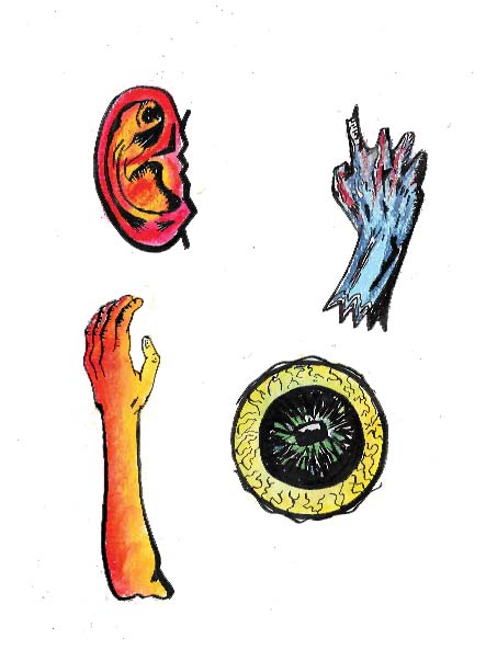
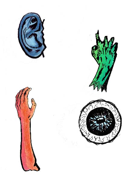
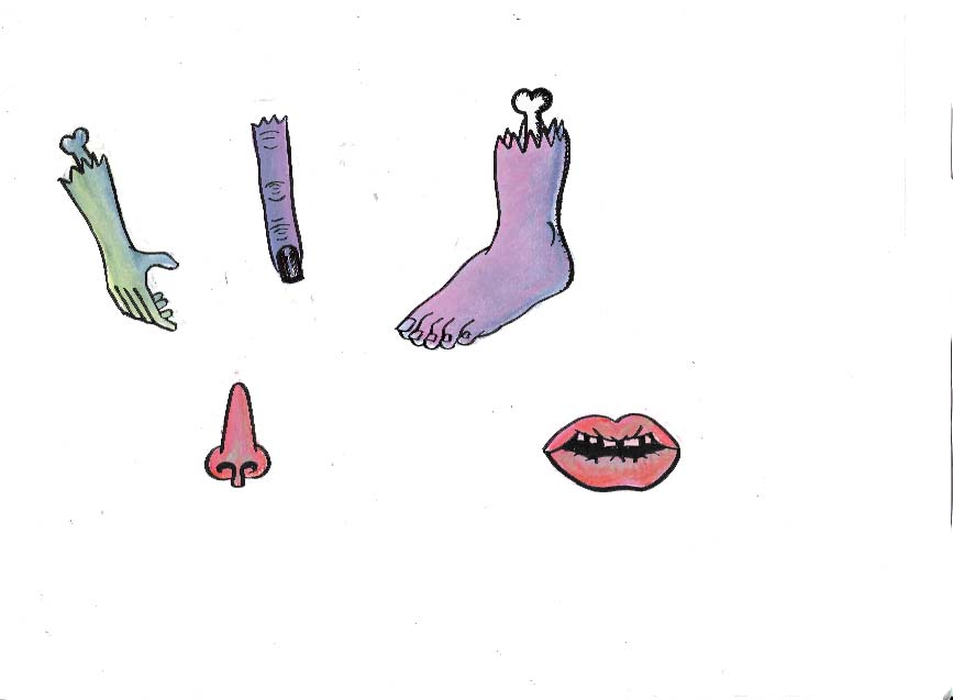
I have refined my spot illustrations a but by separating the colour layer from the linework layer. I did this by drawing out the shape of the body parts on a piece of layout payer using brush pen and colouring them in with soft pastels on a piece of cartridge paper with a light pad. This will allow me to stitch the linework and colour together in Photoshop and will make the linework and the whole spot illustrations bolder overall as the pastel won’t blur the lines. I have been struggling quite a bit with how much the pastels smudge, they are a relatively new material for me to use and doing the linework and colour separately seems to be the only way I can combat the problem.
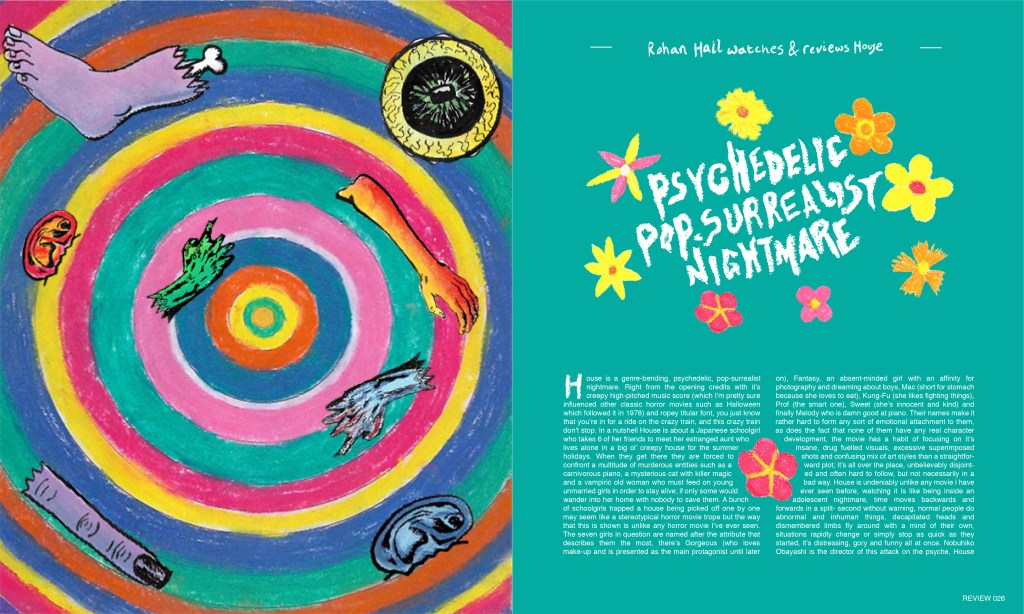
Body Parts Spot Illustrations
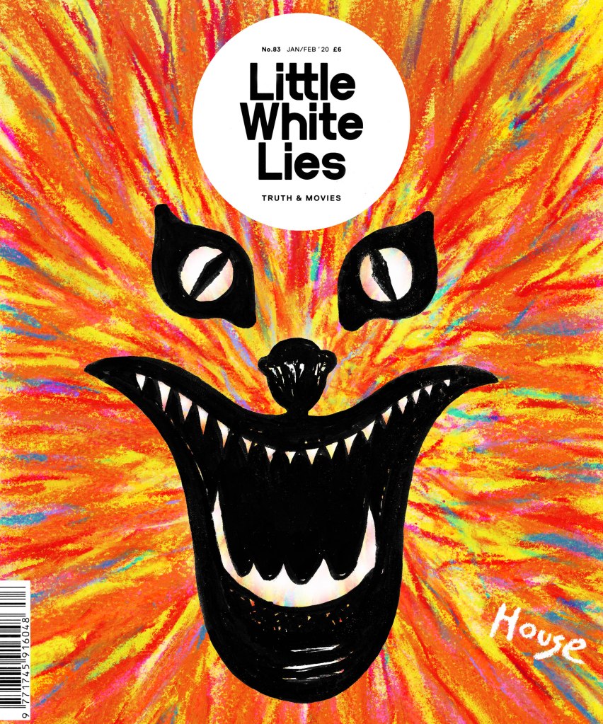
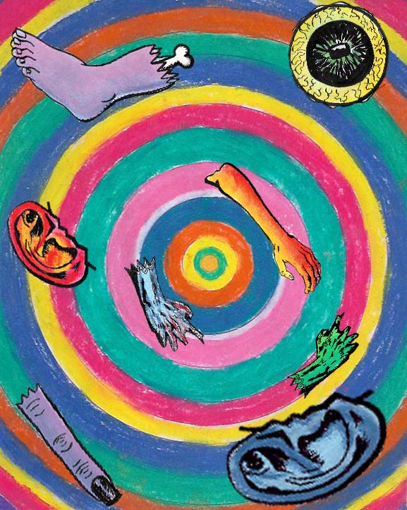
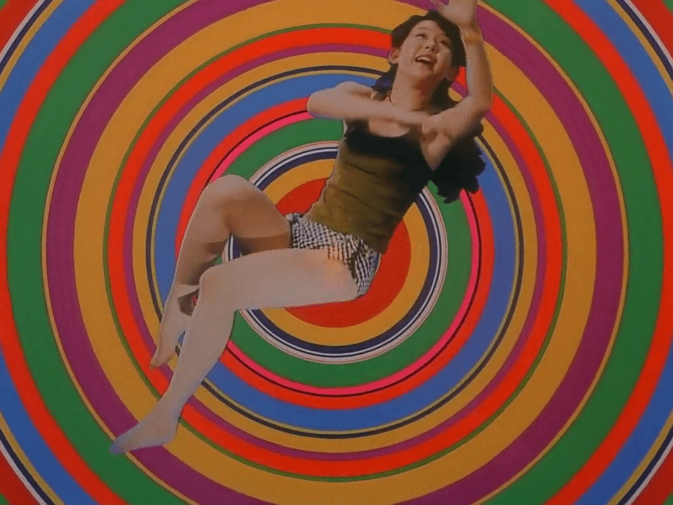
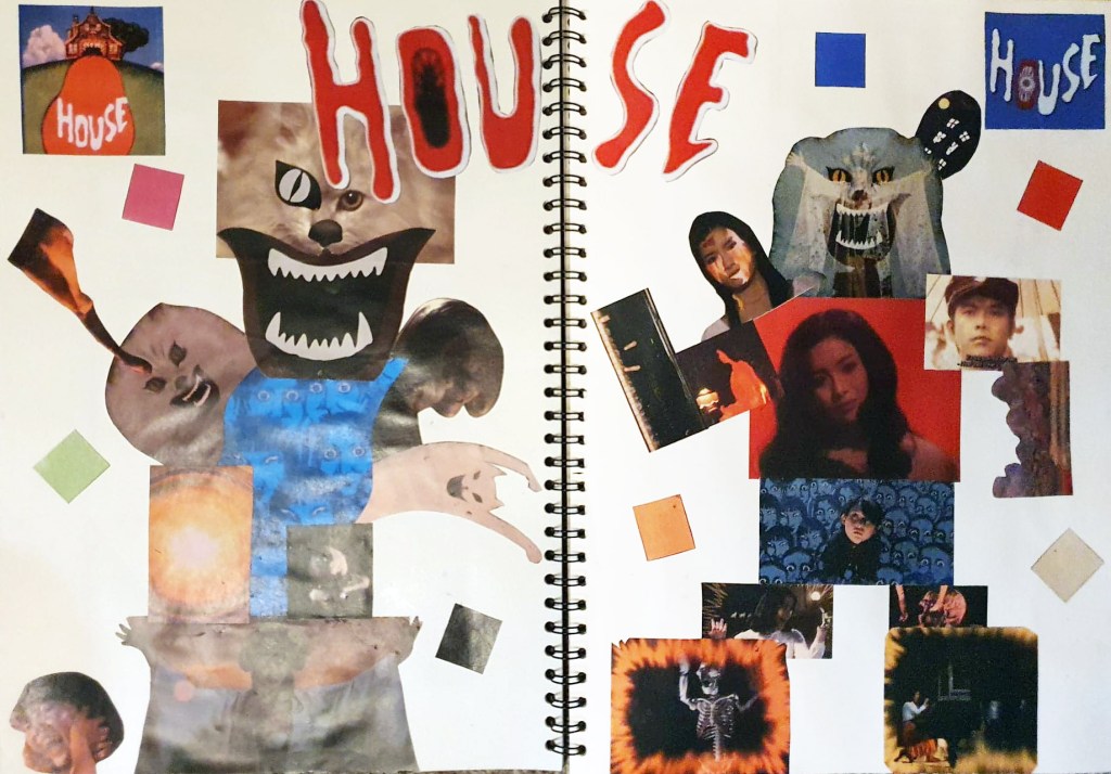
As far as the layout goes, I have decided that I want to have a full-page illustration on one page, with the text, headings, subheadings on the other page, with some other spot illustrations floating around the text. This is a similar layout to one used by Little White Lies in their Hidden Lives magazine issue and it inspired me quite a lot. For the full-page illustration, I was inspired by a particularly psychedelic scene in House where Kung-Fu is sucked through a lampshade and transported to some sort of weird, colourful dimension made up of colourful concentric circles. I decided to recreate this scene in my own way, having body parts swirling around in the vortex, rather than Kung-Fu because I feel as if using an entire person for a spot illustration would really blur the lines of what a spot illustration is supposed to be and wouldn’t really fit with how Little White Lies lays out their magazines.
Full Page Illustration Created By Me
Screenshot from House 1977 House. 1977. [film] Directed by N. Obayashi. Japan: Toho.
Comparison of my full page illustration and the image that inspired it.
Screenshot of Little White Lies draft layout
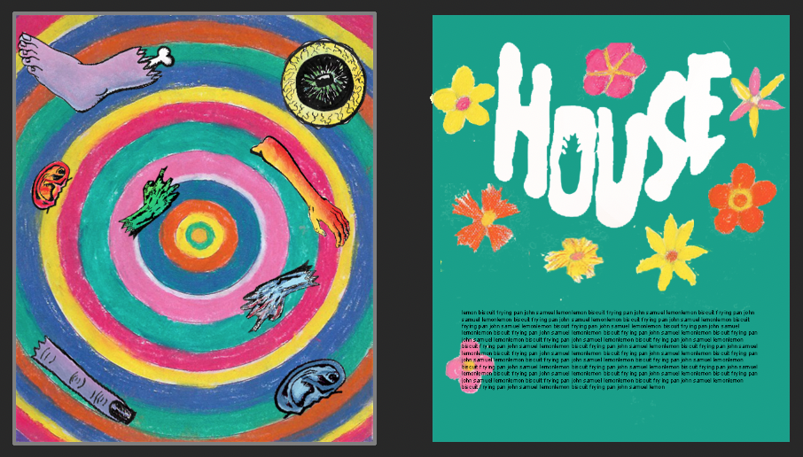
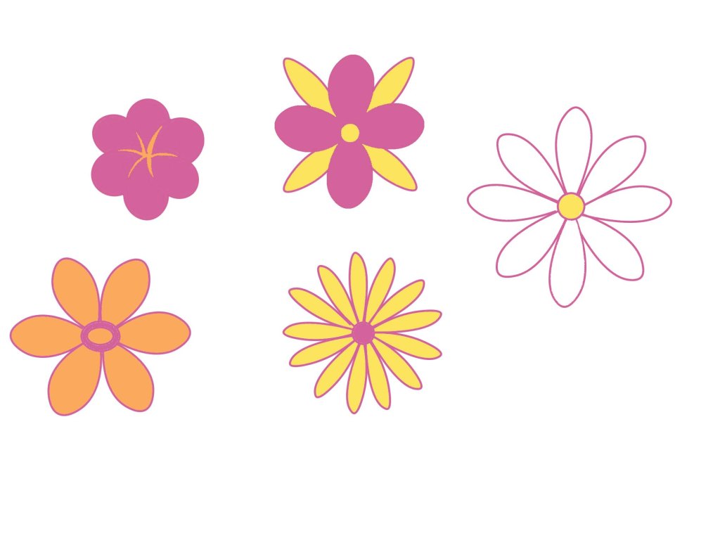
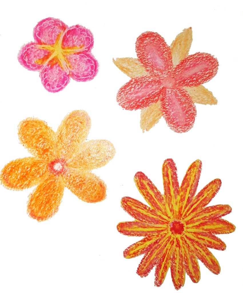
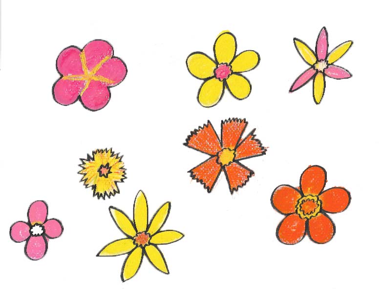
I have tried to be consistent with the materials I use for my spot illustrations, having used pastels for the colourful concentric circles design, the body parts and also the flowers because pastels seem to fit the messiness of House more than other materials and I want the texture of the spot illustrations to be the same since I am creating the design on the basis that it’s for a professional publication and it needs to be consistent for that. For the text page I used the eyedropper tool to sample colours from the full-page illustration and tried filling the text page with them to keep the colours consistent too. I settled on using the green colour as the background because it is lurid and creepy, while still looking nice and colourful which really fits with the overall tone of House. I used the actual text used on the House movie poster as placement text for the heading and filled it white because it seems to work best with the green and makes it look weirdly innocent, plus, Blanche the cat is white so it’s a nice nod to her. This isn’t going to be my final layout, but it does give me a good idea of what it is going to look like once I am done. I removed the outline on the flowers to contrast the boldness of the body parts illustrations on the previous page. I am quite happy with how much work I have done this week but there is still a long way to go. I need to refine my layout design and also do the same with the front cover. I am going to try separating the Blanche brush pen design from the trippy pastel background, similar to what I have done for these spot illustrations because I really want Blanche to stand out the most on the front over. I have quite a bit to do next week but I’m getting there. One day I will be good at managing my time instead of rushing around so much towards the end
I’d like to start this post by saying that I am so happy I have chosen House as the film I’m creating art for, and that we’re exploring editorial illustration. It is giving me the opportunity to explore materials and art styles that I have never done before, or even though I would ever do. The fact the visuals are so naïve and childlike has led me down the road of trying childlike materials such as crayons, and their adult cousin, soft pastels, which I’ve surprisingly really enjoyed doing. I feel as if this project is making me grow so much as an illustrator, more than the previous ones because I am so far out of my comfort zone, and thoroughly enjoying being so, that I’m considering keeping these materials in my illustrative arsenal and looking more into Editorial illustration as a potential path for me to go down, whether it’s side projects to add to my income or as a full time career. I need to research the field a lot more before I make any sort of concrete decision but I didn’t really think about it before this project and I feel as if my eyes have been opened up to the world of editorial illustration and it’s definitely got my interest.
Flowers painted by me using Photoshop, too clean and perfect for House.
Flowers drawing with crayon by me, I like them but they just aren’t bold enough for House.
Over the weekend I started what I hope are my final spot illustrations, having chosen soft pastels as the material I am going to use for them because of their boldness, messiness and ability to create interesting textures that I simply could not achieve with watercolour paint or digital painting. I also used a Japanese brush pen to draw linework around them to make them stand out more, I feel as if this is the best way for me to create them because I have used pens in my art pretty much consistently throughout my life and they also help me to contain the soft pastels a little bit and make the designs even bolder in the process. I still have a long way to go with using soft pastels, I need a lot more practice with them before the illustrations can be considered ready to be presented on my final design because I don’t have much experience with them prior to this week and they are difficult for me to get used to.
Pastel and Brush Pen Spot Illustrations
Decollage Attempt
As well as creating some spot illustrations at the start of the week, I have taken a bit of a U-turn as far as my front cover design for the LWL project goes, I was initially heading down the path of developing my cracked mirror design, and even went as far as creating a few media tests with decollage while I tried to figure out how to achieve the effect I wanted, but it just wasn’t working out. I realised that design was something I would feel comfortable doing and not necessarily something that would fit with the overall tone of House. Instead, I have chosen to develop my design that focuses on Blanche as the main character because I feel that she is the most recognisable film and focusing on only one character for the film fits with the layout that LWL magazines use on their front covers. I am worried that changing my mind about the front cover this late in the project could jeopardise the rest of my work because I am going to have to change the aesthetic a bit from what I was originally going for. I am hoping that this isn’t going to be much of a problem because my development piece has been done in soft pastel and brush pen, alike the spot illustrations I over the last weekend so at least there is some consistency with them. I haven’t really thought about how my spot illustrations are going to be presented on the page at this point, I’ve been focusing a lot on creating the art, rather than the layout which I realise isn’t a good thing because the layout of a magazine is just as important as the art inside it. Next week I really need to spend a lot of time creating potential layout sheets and thinking about where things should be placed on the page.
Front Cover Development- Soft Pastel and Brush Pen
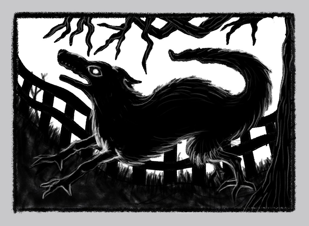
As promised, I’m going to use this post to talk about the fact I’m co-illustrating a book with my girlfriend which is getting published on October 31st, this is like a dream come true! Since the last post, I have managed to complete the 2nd illustration which depicts a Black Shuck, which is a ghostly black hell hound from East Anglian folklore that is said to roam the coastal town of Norfolk, causing havoc and death wherever it roams. The book is going to be comprised of a few of Lenora and Miss Jessel’s favourite posts from their blog ‘The Haunted Palace’ which has been exploring the darker side of folklore, history and the supernatural since 2013; it is an interesting read and really fits with the kind of things I am into. The illustrations are primarily going to be dark and eerie, and of the gothic sensibility, a style I have loved doing since I was a small child so I am unbelievably happy to be taking on this commission, alongside some of my favourite people.
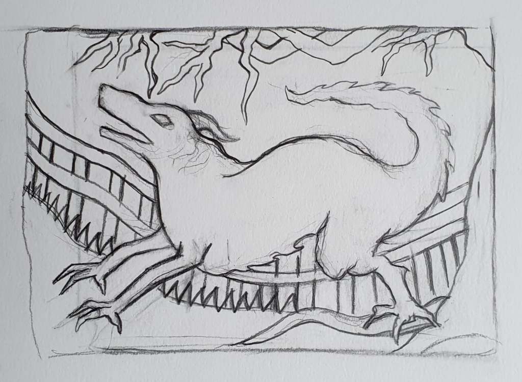
Black Shuck initial sketch
The illustrations I have done so far have started with a pencil sketch that I showed to my aunt to make sure she was happy with the composition of the piece and so she can offer any suggestions or ask for any changes, once she is happy, I scan the sketch onto my computer and do the final linework and colour in Photoshop using my Wacom tablet and brush tools. This is a different process to how I used to work digitally, previously I would do all of the linework in Illustrator before moving into Photoshop for to colour, but I have since realised that Photoshop is a more than capable program for painting the entire piece, and it is the industry standard for digital illustrators. I am doing my best to draw them in a consistent style, which is going to be vital as they are going to be published in a book and not only that, but I’m doing it for someone I care about, my aunt and I really don’t want to let her down because I know how much this means to her. It is my first time being published, I’ve never took on a project this big before and I am a bit worried, there is a lot of pressure, especially since I have college work to do alongside it, I have given myself a lot to do and there isn’t a lot of time to do it. I seriously need to work on my time management and planning, it’s something I always seem to struggle with, despite the fact seem to end up doing more work than people on my course. Part of me thinks that I work well with the stress, that I need it to work, and maybe that’s true, but it isn’t easy on me, it messes with my head sometimes and I find it hard to enjoy myself even when I’m not working, because even when I’m not physically moving, I’m thinking about the work. I think I could make my life a lot easier if I created some sort of timetable or planner, set myself time to work on each project and allow myself to chill when I’m not.
Haunted Palace Blog Logo- Digital painting
The stress is only one part of this commission though, yes I am finding it difficult to balance the book illustrations with college work, but I’m still doing it, and in a way it’s going to provide me with valuable experience that a lot of people my age don’t get. I’m learning to communicate with a client, compromise with them and give them what they want without jeopardising my own wellbeing. Plus, all of the illustrations I do for the book will make amazing additions to my professional portfolio, which could help me to get more work in the future. Not only that, but I’m getting published at 22, I’m doing something that will make people I care about happy and I get to do it with my girlfriend, literally the only thing that is making it difficult for me is the fact that I also have project work to do alongside it. I guess this will be a good growing opportunity for me, it’ll force me to work to a schedule, juggle projects and better manage my time, which is going to be important after my course if I have any hope of being a full-time illustrator. I am hoping that I’m able to incorporate the book work with my college work at some point though it would make my life that little bit easier as I wouldn’t have to worry that I’m not putting enough work into one of the projects because I’m struggling to juggle two different things at once right now.
Well, I didn’t manage to watch all of the movies over the weekend because I was busy finishing off the King of The Cats illustration for my aunts’ book, which I’m trying to do alongside my university work; I’m not going to lie, it’s going to be difficult but I just need to get better at managing my time. I watched Blade Runner and House though, I’ll post my reviews of the movies separately because there is just so much to say about them, especially House which is basically a drug fuelled nightmare in all of the right ways. After watching these two I have decided that House is the movie that I am going to focus on creating art for this project, it’s been a while since I did any horror based art and I think House will really challenge me it is far from a normal horror movie, the style, tone and atmosphere of the film are unlike anything I have ever came across before. I think choosing House for this project will really push me as an illustrator and take me far out of my comfort zone which will be a good thing to show in my portfolio.
Double paged spread House moodboard
On Monday we were asked to create a mood board for one of the films that we will be able to refer back to for ideas during the course of the project, I actually ended up creating two because I just couldn’t fit all of my ideas for House on one page. On the mood board I have included images of the main protagonists, antagonists and supporting characters, as well as images of some of the many bizarre scene changes and special effects that are plastered throughout the film. I watched the movie on my laptop, so I was able to get reasonably high quality screenshots of key scenes in the film which I cut and stuck into my sketchbook. I also used the eyedropper tool in Photoshop to take samples of the main colours that House uses so that I have an idea of what colours to use in my development and my final illustrations. The whole point of the Little White Lies front covers is to capture the themes, atmosphere and visual tone of the specially selected movie, this can be done with the use of linework, colour and composition of the illustration, the colours used should reflect the movie in order for it to be successful which is why I sampled the colours directly from the movie.
LWL House thumbnail sketches
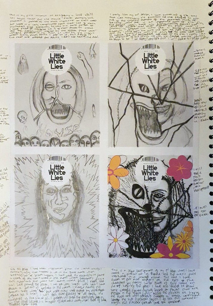
As well as creating a mood board, one of my tutors kindly created a worksheet that contains four blank Little White Lies front covers, we were asked to sketch 8 different front cover variants as part of our initial ideas and development. So far, I have sketched out four out of 8 designs, taking inspiration from the House movie, as well as some illustrators that have previously created covers for LWL to do so. I have found it really difficult so far because no matter how hard I try, I just can’t get any of my people portraits to look right, I also can’t decide who the main character in House is, and I’m supposed to be creating a portrait of them. The plot of House is so confusing that I think 3 characters present in the film are all the same person by the end and one of them isn’t even human. I have tried to combine fragments of all 3 of their faces to create one unified portrait which hasn’t went very well either, trying to show all three characters was too much, it compromises the appearance of all of them. I also tried doing something similar using two of the main characters faces instead, which worked a lot better because half of the portrait is a cat which is something that I am much better at drawing. I used the iconic mirror scene from House to frame the design which really works to me compositionally, so far, my second design is the strongest and the one I want to develop further. Speaking of cats, I’m going to create a wholly separate post at some t point talking about my King of The Cats illustration because I am unbelievably happy that my art is going to be published and I want to talk about it.
Mo, S., Le Bec, Y., Eke, J. and Sergeant, S. (2020). A Hidden Life – Little White Lies. [online] Little White Lies. Available at: https://lwlies.com/back-issues/a-hidden-life/ [Accessed 04 Feb. 2020].
The new project is getting well underway and we still haven’t found out our grades for the previous print project, which is quite disappointing because I really want to know if I did well. On the plus side, the new project that we have been given seems to be really interesting and could help me to produce some decent work for my final portfolio, we have been asked to design a front cover and double page spread with spot illustrations for Little White Lies Magazine. Editorial illustration is a massive industry that has become increasingly popular over the years, it is used by art directors and publications to capture the essence of a piece of writing, as well as to break up the text and make a piece of writing more accessible and understandable. Admittedly, it isn’t an industry that I have ever considered going into or really thought about before, that is not to say that I am not looking forward to trying it this project, it would make for a good piece of portfolio work. I have also found out that it is quite often considered bread and butter work for illustrators, which makes sense because there is a huge demand for it out there and it seems to be a pretty good way for an illustrator to get out there and make a living out of in-between personal work.
Double Page Spread in an issue of Little White Lies, Photo Taken by me.
So far this week I have managed to complete my initial research for this project, we were asked to research the Little White Lies magazine and Editorial Illustration as a whole, both of which I have done. I am happy that we have been asked to do a Little White Lies style cover because, despite not knowing what it was before the start of the project, it has quickly become my favourite movie magazine and I will most likely be buying every issue from now on. Each issue dedicates the entire first half of the mag to a carefully selected movie which the serves as the inspiration for the front cover design, the illustrators there are amazing, you can tell that they really care about movies because they capture the essence, tone and atmosphere of the movie in a singular piece of art. It’s just so unique and I can completely understand why my tutors have chosen this publication as the foundations of this project. It is our task to do the same as Little White Lies and create a front cover and a double page spread complete with spot illustrations that captures the tone of one of 3 given films, House (1977), Blade Runner (1982) and The Holy Mountain. Now, initially I’m thinking that I’ll choose Blade Runner because it is the only movie out of the 3 that I have actually seen, and I love sci-fi, though I could change my mind after watching the other two. I’ve watched the trailers for each of them and I must say that House looks absolutely bonkers in a good way, it could be quite a fun one to choose so we’ll see after I’ve watched them all.
I still have some other bits of research to do over the weekend too, I’ll need to research some artists that can inspire me throughout the course of the project, ideally ones that have illustrated for Little White Lies because they would be best suited to a project inspired by the magazine. As well as artist research, I am going to do my best to watch all 3 of the films, even Blade Runner because it has been many years since I have seen it so I need to refresh my memory. I am a bit worried about watching the Holy Mountain, not because it looks gory or anything but because it looks unbelievably confusing and bonkers in all of the wrong ways, plus, based on the trailers it seems to tackle religion a lot and that is one topic that I generally struggle with, but I’ll give it a go. I do have some concerns about this project, mainly the fact that the majority of Little White Lies front covers feature a portrait of the main character present in their featured film and I am notoriously bad at drawing people which could hold me back a lot this project and I really don’t want to produce an ineffective piece of work just because portraits are one of my weaker areas. I’ll just have to find a way to make the project work for me.
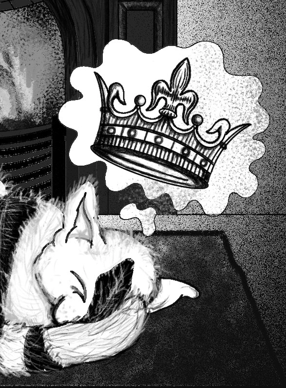
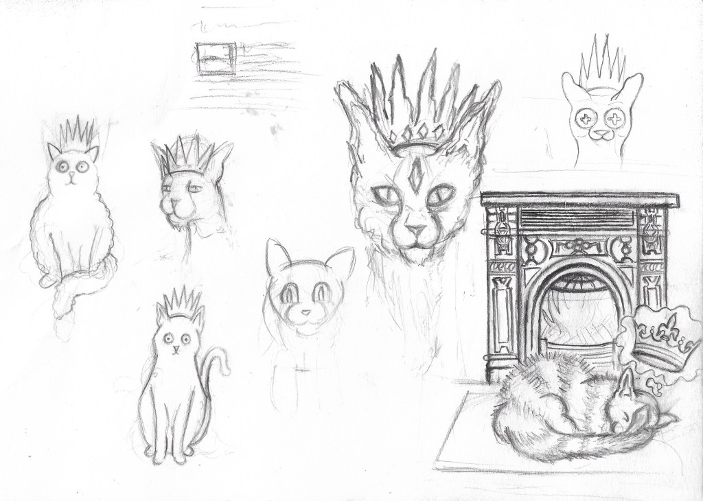
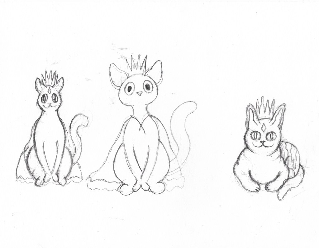
It’s weird for me to say but I actually kind of enjoyed creating a character for the 2cute2fail challenge, it ended up tying in with another project I’m working on, illustrating a book for my aunt by association. One of her friends and her have been running a blog for years where they write about weird history, folklore and the sometimes supernatural, it’s a really cool blog full of bizarre and sometimes horrific tales and historic events. Anyway, they have decided to publish a book featuring a collection of their best and most bizarre posts and they’ve asked myself and my girlfriend to illustrate it, which is amazing, my art is going to get published! One of the posts they need an illustration for is about a folk tale called ‘The King O’ the Cats’ in which a blissfully unaware cat is comfortably sitting in front of the fireplace when he finds out the previous cat king has died and he is now the new crowned king; the thought of a cat with a crown is adorable so I decided I’d kill two birds with one stone and design the King O’ the Cats for both the #2Cute2Fail contest and the book. I tired many times to get the design right but I just kept struggling to make the kitty look cute, it’s so unlike anything I’ve ever tried before, the first lot of designs looked too realistic and not cute at all… the 2nd batch were a step in the right direction but still weren’t right, it’s safe to say I got a little frustrated while trying to design the King O’ the Cats.
The King O’ the Cats pencil sketches.
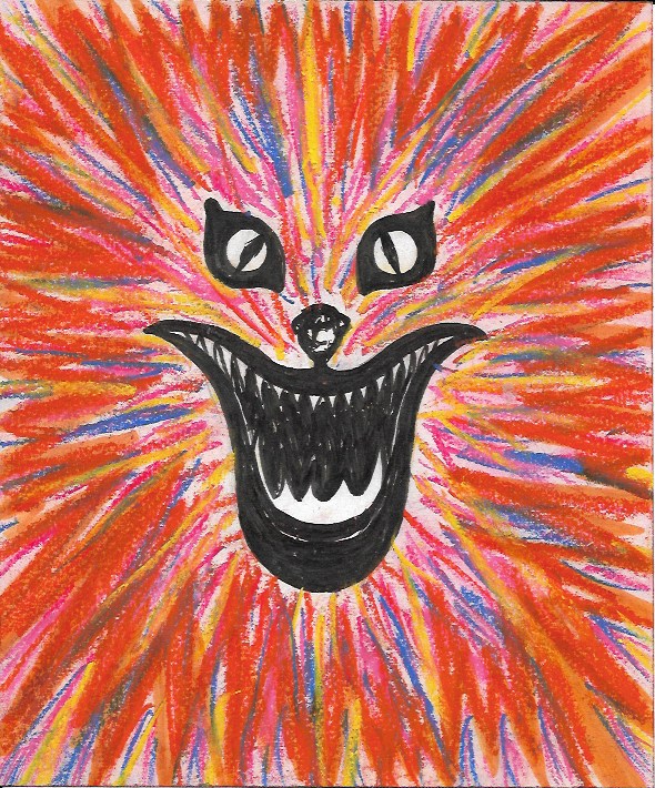
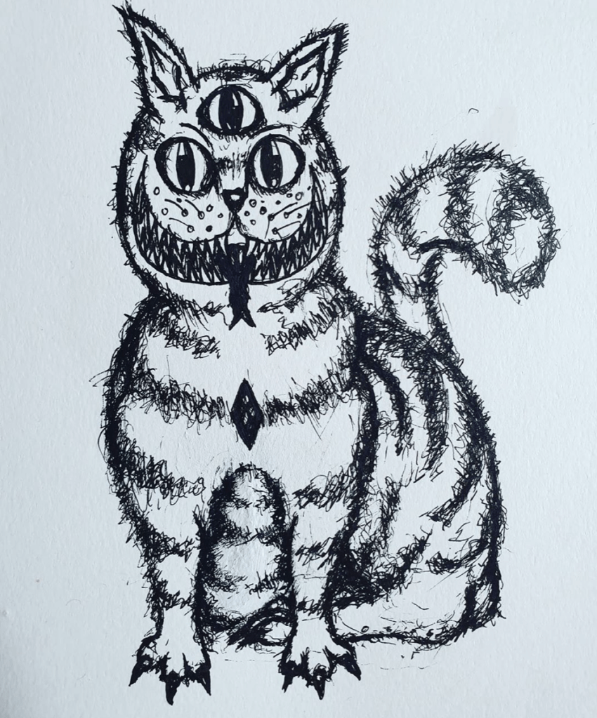
Insanity Psychopus- Fineliner and pencil
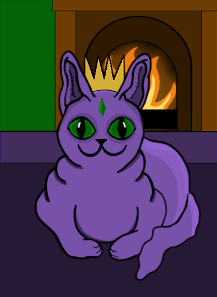
One night, when I was feeling particularly annoyed at my inability to draw something cute, I decided to give up and just started drawing a creepy cat instead. I wasn’t sure what it was going to turn out like, I wasn’t trying to make it good or cute, I was just drawing. I gave it 3 eyes, a terrifying grin and Cheshire cat stripes and it looked amazing. It wasn’t stereotypically cute, not by a long way, but it was my kind of cute, all dark and a bit ropey. I entered it into the #2Cute2Fail competition immediately and called it Insanity Psychopus, a feline Psychopomp that takes your sanity away. Sure, it might not get the best reception and probably doesn’t quite fit the criteria for the call for entries, but everyone has their own idea of what cute is and I wanted to enter something that really came from me, weird, unadulterated, unaffected by university me. Of course, I did then go on to submitting a more stereotypically cute King O’ the Cats too, one that was made digitally because hey, more chances to win right? The 2nd illustration was cuter in the traditional sense and resembled a normal cat, if that cat happened to have purple skin… like the one I drew. It also more closely depicted the folktale from which my original idea came from with the cat sitting peacefully in front of a fire.
I’m glad that I entered two different pieces into the competition because it just shows that I am capable of doing more than just one style, though I do much prefer the ropey one. As for the book illustration, neither of the designs ended up being fit for purpose but I did create a lot of sketches during the process of designing my #2Cute2Fail submissions and there’s one if particular that I think I’m going to develop further for the book, I may not have killed two birds with one stone but I have made the book illustration process easier than it was before and without knowing about the King O’ The Cats I probably wouldn’t have had an idea for the Pictoplasma competition at all. All in all, it’s been a pretty productive week and I’m weirdly looking forward to starting a new project at uni next week, and finding out my results for the previous one.