Learn when a design should be a personal project and not a uni project- there are often designs that i want to make that I try to blend into my projects on the course, sometimes this works, but mostly it doesn’t. I need to learn when to keep my vanity designs off the course.
Find ways to manage my anxiety and stress levels more when in college- I feel like not doing this is hindering me a lot. I’m often too nervous to ask for help in person and also end up forgetting to do certain things when I get too stressed. I need to find ways to keep my anxiety out of the studio, or at least keep it under control.
Manage my time more effectively, plan for the hand in day panic- If I managed my time more effectively, I probably wouldn’t have a hand in day panic.
Sleep before hand in day- going into college with minimal sleep when it’s time to hand in is just hindering me.
Strengths- Consistency was a huge strength for me this project (at least it was until the final print) I picked an umbrella theme right at the beginning of the project that all of my print designs would fall under and stuck with it. This allowed me to create a series of illustrations that told a narrative of the negative affects we are having on the environment, as seen through the eyes of H.P. Lovecraft.
Weaknesses- An inability to know when a design should be part of a personal project, rather than a uni project. For my final design, I mistakenly chose to create a piece that tackled the current Australian bushfire crisis which was a passion project because I was so determined to fight a new environmental issue, that I didn’t stop to think if it fit the theme that I had set out with my previous prints. This led my final outcome to be inconsistent with the previous prints I had made and most likely cost me some marks.
Opportunities- Pictoplasma briefs, World Illustration Awards, Adobe Design Achievement Awards
Threats- Awry time management always seems to be a threat to me, no matter how much I try to improve it, this results in less time to finish my work.
I had a bit of a stressful week the past week when it came to getting my prints ready to hand in, the screenprinting process wasn’t as easy as I thought it would be. Printing two colours is definitely a lot harder than one because you’ve got to perfectly line up each colour layer. I originally made the mistake of screenprinting the black layer before the orange layer, so when I tried to print colour over the black, parts of the design just got enveloped in the void. It also became a lot harder to line up each layer and I ended up creating a lot of offset prints. The same thing happened a while ago with risograph printing, but I was certain that the problem woudn’t be repeated with screenprinting, I was wrong. I kept getting unlucky with mesh screens too, both of the ones I used had marks on them which stopped my design being transferred properly, so whenever I tried printing a layer, a small part of my design was missing, a problem I just had to work with. Nevertheless, something good did come out of printing the black layer first, I realised just how good the design looks on it’s own without colour and all of a sudden I had two different print variations I could sell to raise money for the Australian Bushfire support. I still needed to create the colour prints that I originally set out to create to make my project successful so I started a different series of prints where I printed the orange layer first and then the black one on top; it was a lot easier to line up the colour layers this way so the 2nd batch of prints ended up having a lot less offset which I was finally happy with.
This project has been a huge eye opener for me, there were times during screenprinting where I wished I had just let the risograph machine do the work for me, it would have been a lot quicker and potentially easier than manually lining up each layer. But I would’ve definitely got an offset with the risograph machine, no matter how quick it is, at least with screenprinting I have more control over how much offset my prints are. I can unequivocally say that I will do screenprinting again in the future and hopefully, with a lot of practice, the process will be even more successful next time. Overall the quality of prints could be better, but they could also be a lot worse and I still intend to try and sell the prints I have on Etsy to raise money for WWF Australia which is what their original purpose was, so ultimately I think I have done a good jo this project, no matter what grade I end up getting. I have handed in the project now so I guess all I can do is wait and see what grade I get, I’d be lying if I said I wasn’t a bit worried because the prints didn’t turn out perfectly, there are some inconsistencies and the brief asked for 10 perfect prints which I haven’t really achieved. I can always fix the inconsistencies manually with a paintbrush when it comes to sellng them so that they are of a high quality, but it wasn’t something I could do before handing them in because in a way it would be cheating and my tutors had already seen the inconsistencies so they’d know if I fixed them before handing in. I just hope the fact that the meshes I used were fault doesn’t affect my grade because it was completey out of my control. Agh.
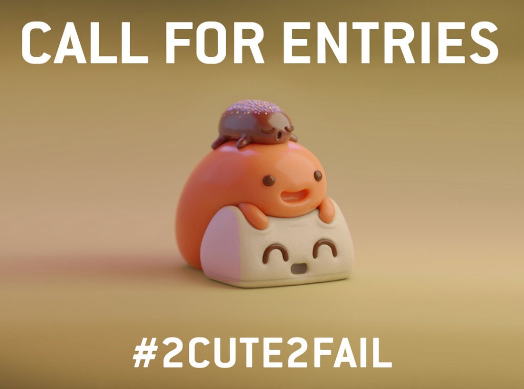
On a slightly less stressful note, I think… we’re off for the next week again while the print projects get marked and once again we have been given a task to complete we return. This time we have been asked to create a cute character and enter it into the Pictoplasma #2Cute2Fail competition, now if you follow my art then you’ll know that I don’t really do cute, more creepy and macabre so this is definitely going to be a bit of a challenge for me. I’m up for it though, it’s never a bad thing being taken out of your comfort zone so I’ll do my best to create a super cute character, though I can’t guarantee it won’t be a bit on the creepy side.
It’s been just over a week since I returned from my holidays in Poland and Edinburgh, and after spending 3 weeks away from the course, I have been finding it quite difficult to readjust to university life. I didn’t draw enough when I was away, instead I focused on going to galleries and exhibitions in Poland so that I could try and get some more inspiration for where my project and coursework is going to go next, as well as enjoying myself because hey, it was Christmas and new year’s. While the time away was really nice, it has meant that it’s taking me a while to get back into the flow of things, when I returned, I wasn’t really sure what I was going to do for my final print, despite seeing so much amazing art abroad. It wasn’t until I was scrolling through Facebook and watching the news at home that an idea hit me horribly, the Australian bushfire crisis.
So far during the print project, I have been creating art that tackles topics such as climate change and pollution, two things that are having a horrific impact on our world and wildlife, yet to me, aren’t being tackled enough. I wanted to try and change that, not necessarily on a large scale, I have to be realistic, but if I could reach just one person with my art it would be something. Having tackled these issues so far on the project, it was obvious to me that I needed to stick to similar themes when it came to be designing my final print, I just wasn’t sure what issue to tackle, there are unfortunately so many. For a while I considered tackling the meat industry, but this seemed too hypocritical as I was still eating meat, albeit little, at the time. I have stopped eating meat fully now and have for the past week, but still, I didn’t feel as if it is enough to start hitting the meat industry now. When I saw the horrors of the bushfires and just how much of the environment is being destroyed and how many animals are being killed, it made me feel sick to my core, it’s so upsetting that (at the time of writing) one billion animals have been affected. Having loved animals and nature since I was a child, sometimes more than humans, this topic hit close to heart and I just knew that I had to try and do something to help.
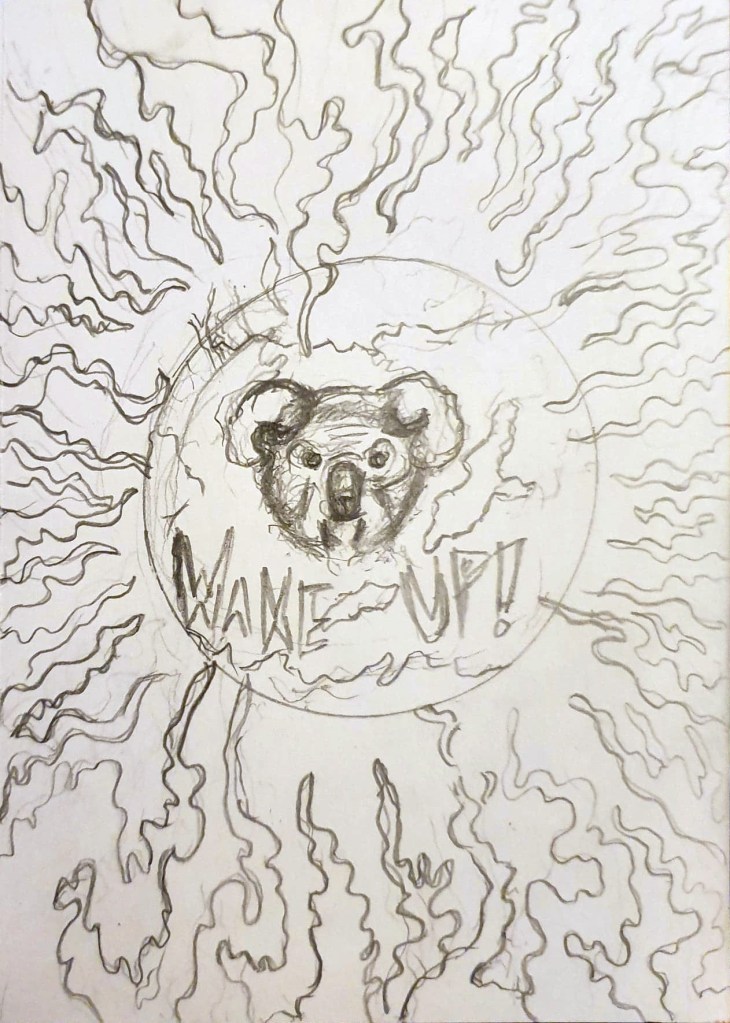
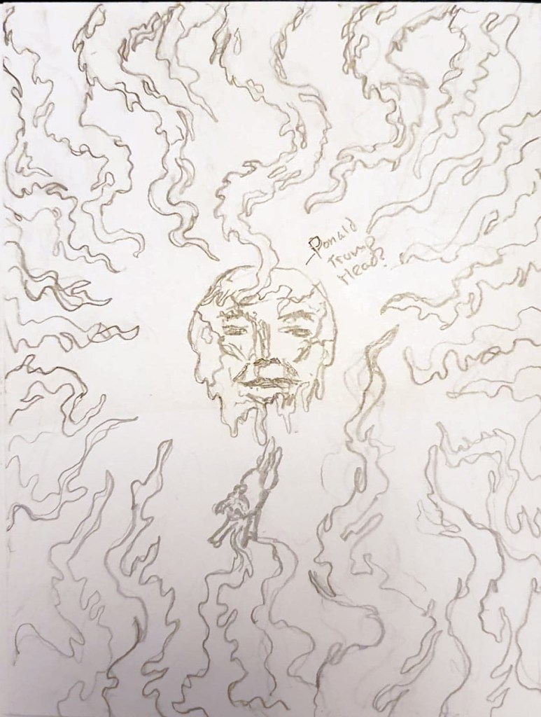
Now that I had an idea of what I was going to illustrate with my final print, I started sketching ideas of just how I could show the Australian bushfires and the impact that they are having. I made a few rough thumbnail sketches in pencil to get out some of my ideas which included:
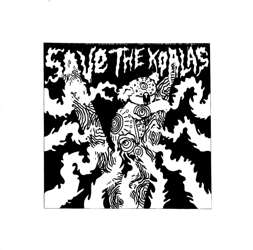
The world being consumed by fire with a koala’s face emerging out in fear because the bushfires are the latest of the wildfires that have devastated the planet in the past year.
A Donald Trump earth laughing at the fires while a koala fell off the face of the earth, symbolising the risk of the koalas going extinct and just how little Trump cares about the environment (I thought this might be a bit too political so I didn’t take this idea forward)
A koala’s face on the Earth as it melted away in the flames, which would show the impact of climate change and how it is causing the ice caps to melt, as well as the impact the fires are having on the koalas.
Initial idea sketches for my final print.
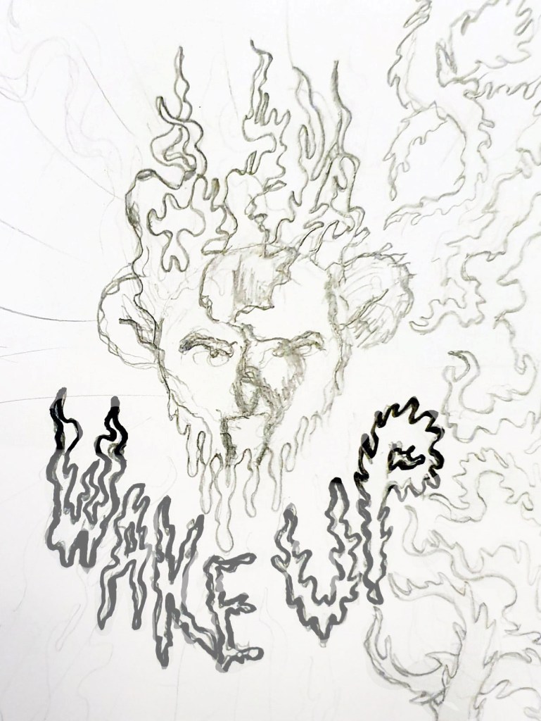
The sketch I decided to take forward.
All of these ideas seemed a bit too wide, they focused on the entire world, rather than just the area and the animals that are being affected by the fires, on previous projects I did focus on showing the environmental impact of climate change, but I haven’t really focused on the impact it is having on its inhabitants, with one billion animals being affected by the horrific blaze, this time needed to be different, the animals needed the centre stage. I kept the idea of having the flames framing the illustration, but instead of showing the whole Earth, I drew a lonely koala clinging to a tree for dear life amongst the oncoming flames I showed my sketches to a few people to get their opinion and to find out which one they thought would get the most attention, and they agreed that the lone koala in the tree was the saddest of the sketches and would get more of a reaction from the wider public.
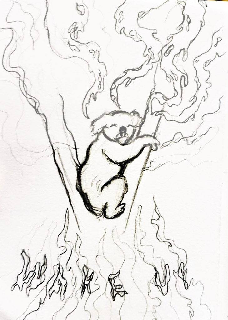
Digital Koala Development
With the design picked, I developed the thumbnail sketch further by drawing it out in a larger scale in an a4 sketchbook before scanning it onto my laptop and going over the line work and colouring it in Illustrator/ Photoshop so that it looked more professional ahead of college on fast approaching Thursday. My tutors liked the design but pointed out that I had two styles going on at once, with the fire and text being done in one style and the koala being done in another. I had struggled with how to depict the koala, I went with a rather realistic approach because I didn’t want to do a cutesy cartoon koala that would take away from the seriousness of the situation, but the realism clashed with the rest of the piece so I agreed that I needed to redesign the koala. The problem I was having is that the koala isn’t a monster, it’s a victim and up until that point on the project I had been depicting climate change in the form of Lovecraftian creatures attacking the planet and reclaiming their home. This time however I was trying to show how vulnerable the animals in Australia are right now, they needed to be cute and upsetting, to evoke feelings of sadness and vulnerability so that people would do their best to help them. I redraw the koala 3 or 4 times before I finally came up with a design that felt right.
I looked at Australian aboriginal paintings of koalas as a source of inspiration which really helped me to figure out how to show the koala without making it too realistic. Unfortunately, I didn’t get the design right until the end of the day on Thursday, meaning that it was too late to send my design off to be prepared for print, which means that I am going to have to wait until next week to do this and come into college on a day that I am not scheduled to be in so that I can finish the project before the deadline next Thursday. This is fine for me though because I want to raise more money for charities to help save the animals in Australia, no matter what, and in order to do that, I need the prints. I just really hope that I am able to get everything done in time and that people do buy the prints when I try and sell them, this is the only way I know to raise money for the charities without having much reach in the field of illustration.
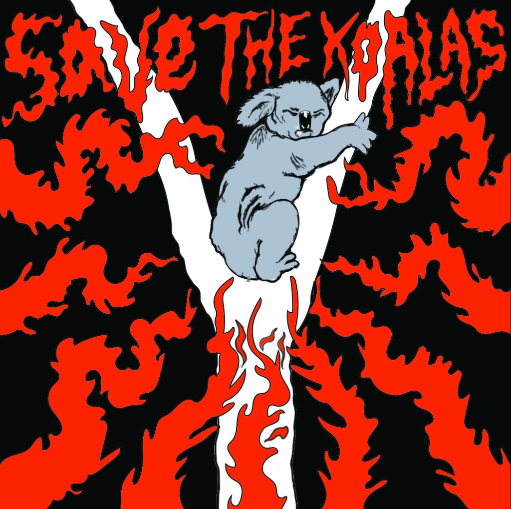
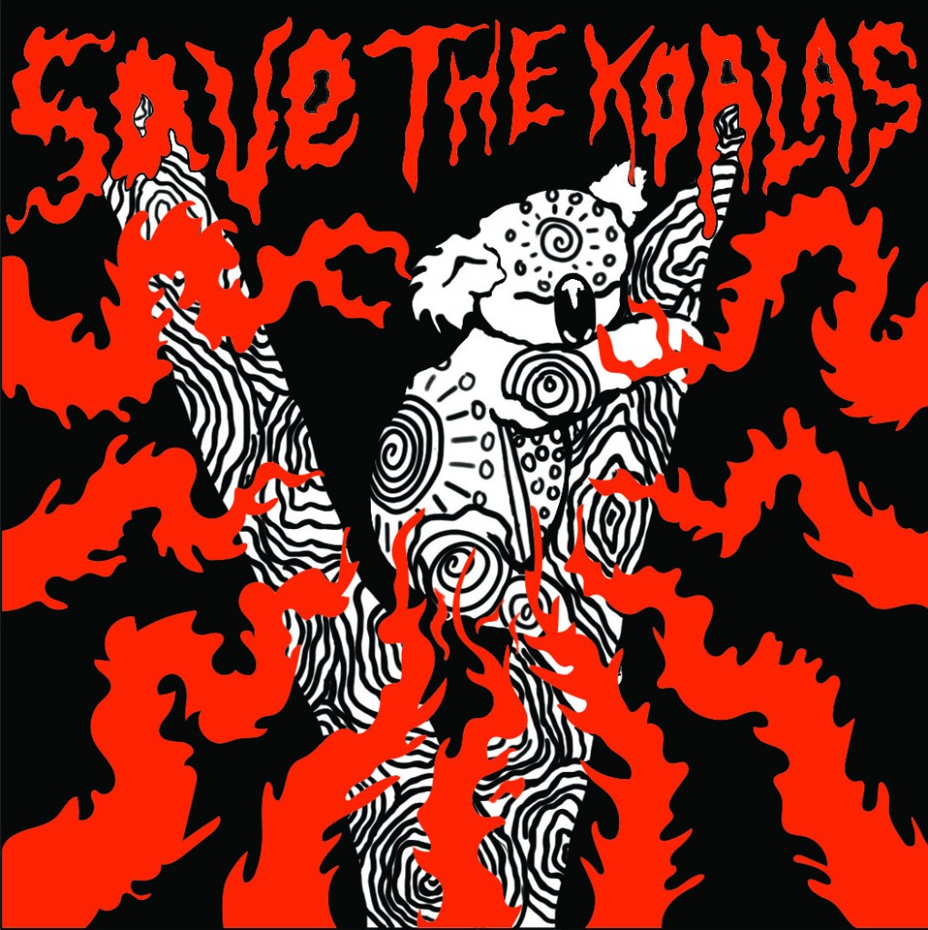
Final print design
Disclaimer; I am aware that Koalas are only one of the thousands of species that are being affected by the bushfires and I am not ignoring their struggle, but koalas are more well known and loved by many so I feel that they will help to get the attention of more people, which means that I have more chance of selling the prints and donating the proceeds to charities that are fighting to save all of the animals that are being affected by the wildfires.
While in Krakow with my girlfriend visiting her father, we went to the main building of the National Museum in Krakow, which is a huge monolithic art gallery that houses art from across the ages, mainly from famous Polish artists, but also the art of artists from across the globe. Walking up to this huge building I was feeling a mix of excitement and awe because I could tell that there was going to be an expansive collection of art inside, and I was right. The gallery, alike many others offers some free exhibitions for people who want to enjoy art on a budget, as well as some special paid exhibitions that are often there for a limited time only. To achieve the full gallery experience we elected to pay for all of the exhibitions that were available to view, my girlfriends’ father, who is also an artist, was more than happy to do this. He neglected to take a tour guide however, instead he became our guide as he merrily walked through the gallery, telling us the history of the building and also of the artists that were featured there, unfortunately much of what he said got lost in translation.
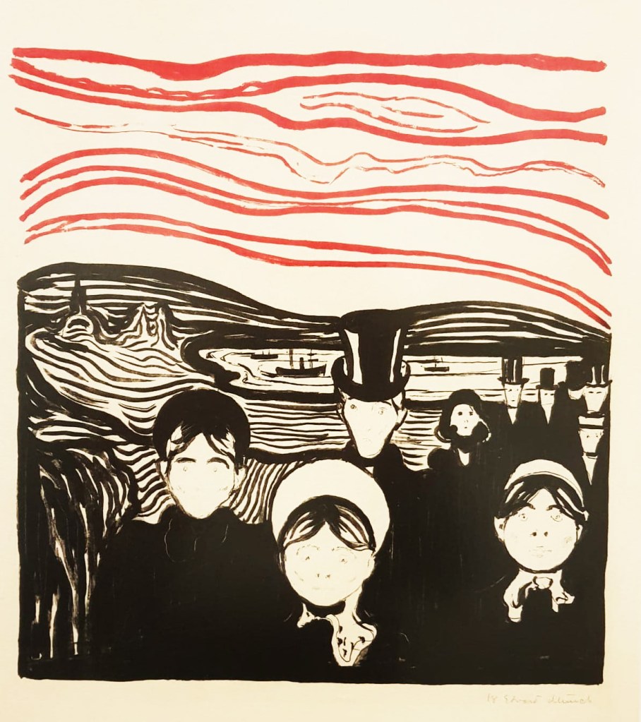
‘Anxiety’ by Edvard Munch: Lithography print
As we walked around inside I couldn’t help feeling slightly disappointed as much of the building was closed for renovation and/or refurbishment, something which was not apparent from the outside, nevertheless, the building was massive and there was still plenty of things to see, some of which I loved, and other bits that I failed to have much interest in, as is usually the case with art galleries, it’s all subjective. The museum had an array of collections, from old furniture, pottery and sculptures to things like colossal stained glass windows, 19th century paintings and prints from some of my favourite artists and print makers such as Hokusai and Edvard Munch, I melted a bit inside when I saw Munch’s prints because he has influenced me so much in my own work and they were pieces that I hadn’t seen before, it was so inspiring. The print that got my attention the most was a lithography print of his painting ‘Anxiety’ which despite lacking much of the original detail, still captured the gripping tension and fear that the painting did, if not more so because the figures looked far more ghostly and unsettling, perhaps proving that less is sometimes more. I was so intrigued to see how Munch’s paintings translated into prints and I think it has given me some ideas of how my own prints could look, I often struggle with knowing how much detail I need to use to convey a feeling and Munch’s prints have eased that struggle.
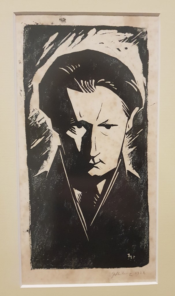
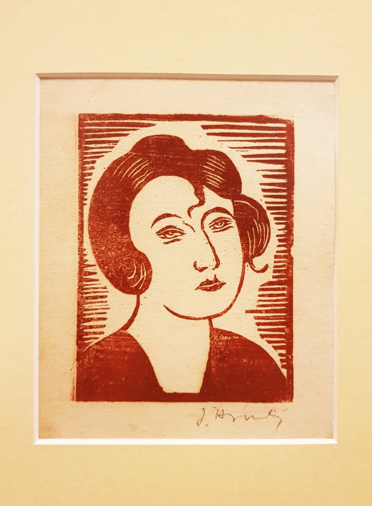
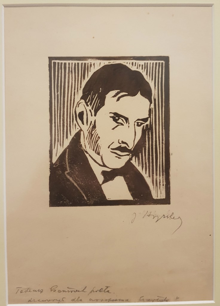
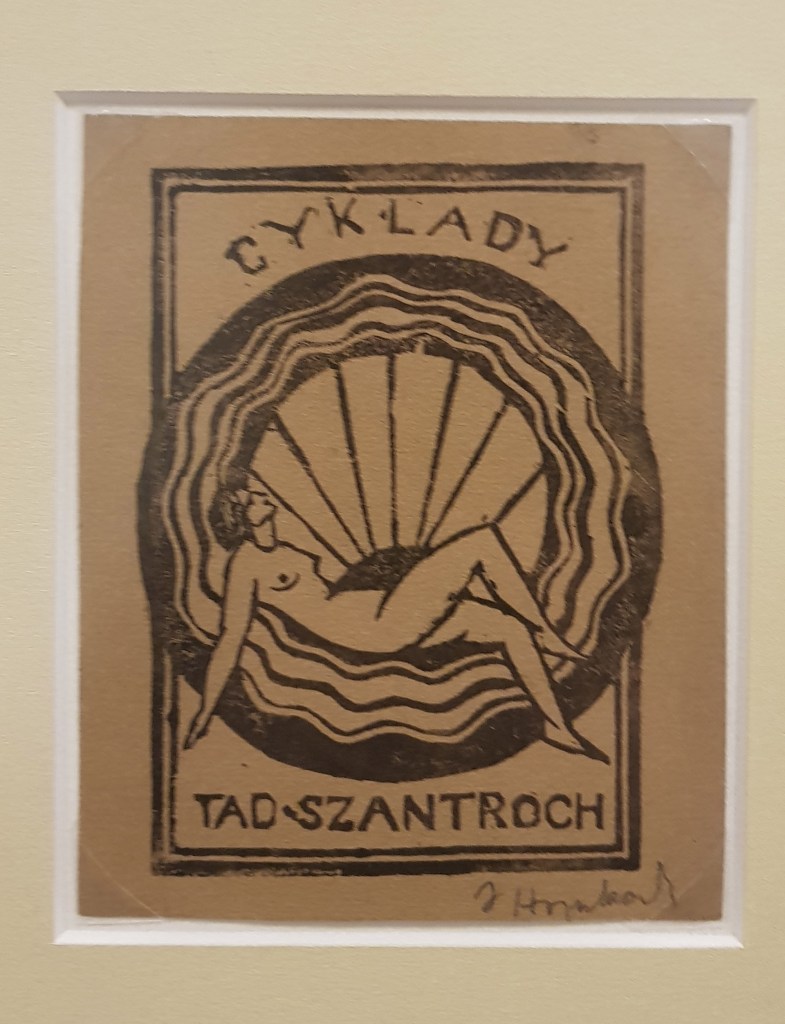
The main artist that was featured in the National gallery was one that I was unfamiliar with called Jan Hrynkowski who was a Polish graphic artist, painter, theatre designer and he was also the co-creator of the Avant Gard movement in Poland in the 20th century. The exhibition showcased work from all throughout his life and showed just how much an artist can evolve and change styles throughout their career. There were periods of his life where Hyrnkowski honed and perfected realism which was a commonplace and widely accepted art form at the time, this all changed with the arrival of WWI when he moved into expressionism and indeed took part in the first Polish Expressionist exhibition in 1917, he was clearly affected by the events of the war and ended up becoming one of the most important figures in Polish art circles. While I may not have liked all of Hyrnowski’s work, I was interested to see the progression of his art and how events in his life and in history pushed him into a different genre of art entirely. I too am feeling a shift in my art style which is being pushed by current world events such as climate change, and more recently, the Australian bushfire crisis, these events have made me reconsider how I do my art because I want to raise awareness to them and try to do something to help, which means my art has to be more accessible to a wider audience, whereas before my art style was primarily niche, bordering gothic, sci-fi and the outright macabre. I don’t want to stop drawing in these styles, but I realise that in order to make my work more accessible, I need to adapt and develop a new style of working when it comes to raising awareness for problems going on in the world.
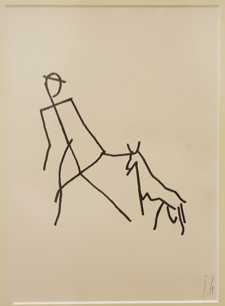
The work of Jan Hrynkowski: I was really fond of his prints, they are really bold and surprisingly detailed for prints, they capture so much emotion and the personalities of the people really well. I am not a fan of his drawings though, they are drawing in such a naive and simplistic way, making them look like they were drawn when he was in his youth, maybe they were. I the line work is surprisingly clean for such childlike and disproportionate drawings though which is intriguing.
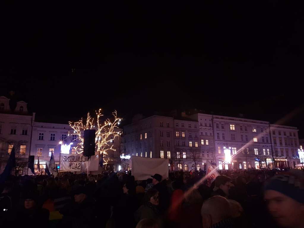
The past couple of days have been something else, and somewhat unexpected; upon arriving to Krakow to meet a friend of my girlfriend’s family, we were taken on a walk through the streets of Krakow at night and came across the beginnings of a protest against the government for plans to make the judges answer only to the right-wing, nationalist, conservative, Christian party that rules the country currently, which would potentially devastate the country, demolish the justice system and also risk Poland being kicked out of the EU by violating European law. I fully support the protests, despite not being Polish myself, my girlfriend is however and it is important to her and I also believe that judges should be allowed to make fair judgements without political interference and in any way that could allow guilty people walk free, so I am glad that we were taken to this protest, however, it was made slightly awkward by the fact that I still had my suitcase at this point, it was definitely a spontaneous affair.
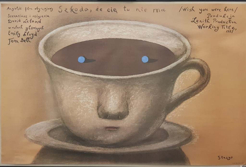
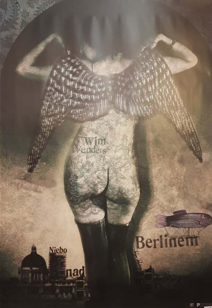
As well as attending the protest, we finally got to go to the Krakow Poster Gallery which I had been hoping to go to since arriving in Poland, when I arrived I must admit that I thought the place looked quite small, that did not however affect the sheer volume of posters that was inside. I was left stunned and amazed walking through that small building, seeing posters from all different generations and commercial avenues such as film, tv, theatre, music festivals, food, gigs and so much more. I could have spent so long in there staring and taking photos of all the posters that interested me, but as I said, the place was quite small and there was a few people inside so I felt quite awkward standing there and taking photos, I only managed to get a few of the ones that really stood out to me. It was so nice seeing so many different styles of art and it gave me a plethora of ideas of how I could layout my final poster design at the end of the print project. Being in such polluted cities and seeing first hand the effect that it is having on peoples’ lives has also given me ideas of what my design is going to depict. I’ve been doing my research on which industries contribute the most to pollution and one of the high flyers is the meat industry… now, at the time of writing I do still eat meat but I’ve cut back a lot and I have been thinking for a while that I want to give it up, I just knew that I had no chance of doing that over a Polish Christmas (there’s loads of meat and fish and barley a vegetarian option in sight) but I still feel as if I could take a swing at the meat industry this project, I may be vegetarian by the end of this trip.
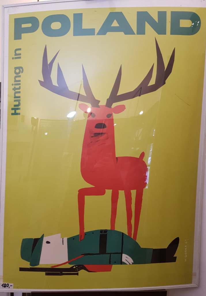
One of the posters that really stood out to me, especially as inspiration for this project was a one that said, ‘Hunting in Poland’ and depicted what I assume is a deer standing over the body of a hunter with its’ hoof on his chest. I couldn’t help but laugh a little at the sight of this, the role reversal is just spectacular, and I find it really refreshing to see something like this in a country where hunting is rather common and animal culls have happened numerous times in the past. My interpretation of the poster could be wrong but to me it is saying that the animals rule and not those that hunt them, that the hunters become the hunted and to be honest, that’s just karma.
I’m finally in Poland! And I can’t breathe! Okay so I was surprised at how polluted the air in Warsaw is, I’ve been here before and didn’t have any problems last time, but this time, I feel as if my lungs have shrivelled and died. The city looks nice and I’m having a great time chilling with some amazing friends, but I feel ill at the same time. Being here is just making me realise even more how much of a problem pollution really is, I’ve seen locals wearing gas masks, there’s warnings about when it’s safe to go outside and nobody seems to drink the tap water because it smells funny. This has resulted in people either using water filters, or, for the most part, buying bottled water, which isn’t good! It’s just contributing to the ongoing plastic problem, I mean yes, the people I’m staying with recycle and so do many other people, which is great, but we still need to cut back on plastic; especially in a city that has highly toxic air. I don’t want to offend anyone with this post, I know that Warsaw can be a lovely place, there’s a lot of green areas and I’ve heard that the local government is trying to fight back against the pollution, I’m just making observations based on what I have seen, and felt (in my lungs) so far.
I brought a few of my prints with me to give to friends and family of my better half as presents for Christmas and so far, they’ve went down really well. The bug one went down especially well, which I think is largely because of the design and the fact the pollution message isn’t as on the nose as my Pollution Apocalypse design. I’ve found that some people think the Pollution Apocalypse poster is really heavy, but important still, and it’s meant to be… I wasn’t trying to get a positive response from that poster because it isn’t tackling a positive subject, pollution is heavy and it’s a reality that we really need to face. I’m just glad people have taken the design and have said that they like it at least, despite the fact it evokes a lot of difficult and real feelings, to me this means the design in a successful one which I’m so happy about. I’m going to have to get some reprints of the Lovecraftian bug and pollution apocalypse when I get back to college because they have been well received so far so I’m hoping that’ll be the case outside of people that I know and that I’ll be able to get myself out there more and maybe sell some on Etsy or something like that. It’d be nice if more people saw my art and what I’m trying to do because I really want to help make the world a better place, even if it’s just in a small way, but it’s hard to if nobody sees me.
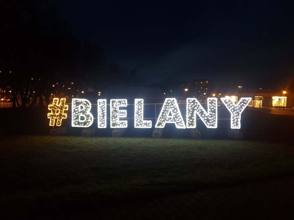
Poland so far!!
I haven’t had the chance to go to any galleries so far because we were tired and have mainly been chilling with friends so far, but I’m hoping to either at the end of this week or next week when I travel to Krakow, I’ve done some research and there’s a really interesting poster gallery there that is run by a family, they’ve been collecting posters for years and their collection features posters from Polish artists, as well as artists from around the world. I think it’ll be invaluable to me to see poster art from different cultures, especially for the print project because I have been making posters so far and sometimes struggle with how to layout my design, seeing how other people have done it will definitely be a beneficial venture. I am really enjoying my time here though, I have some amazing friends here and wish I didn’t have to move on to the next place.
Well, that’s it, I’m off college until the new year and I’m spending pretty much a lot of that time in Poland for Christmas with my girlfriend’s family, so I am not too sure how much work I am going to be able to do before I return… Hopefully a lot but I do feel apprehensive to say the least. I was in on Monday, which is just as well because I just, and I mean just, managed to get my A3 risograph print done. I spent a lot of Monday waiting for things to happen: waiting for the printer (the only working one in the entire building as the 2nd one was out of order) which was a bit stressful; they really should get the other printer fixed because one printer is not enough for an entire building of students. When I wasn’t waiting for the printer so that I could print my master sheets for risograph printing, I was waiting for the actual risograph machine to create my prints. It all was a bit frustrating as I am not usually the most patient person, nevertheless, I did finally manage to get a series of Pollution Apocalypse prints made, and right now I am in Poland, so things could be worse.
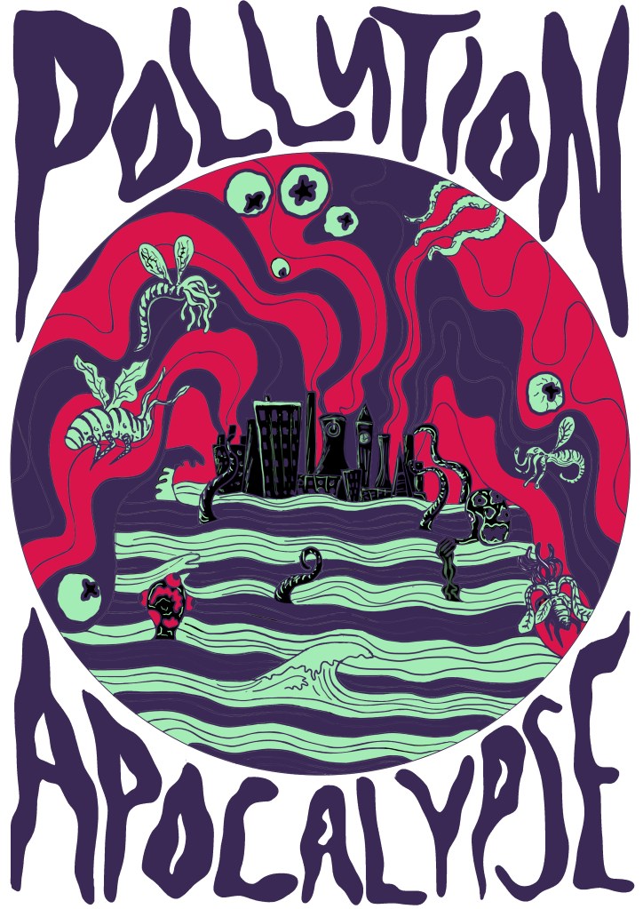
Having only done risograph printing a couple of times before, I wasn’t entirely sure what to expect from the experience, nor was I fully aware of how layering colours on the risograph machine worked, something I would sorely regret later. I had spent a lot of time meticulously separating the colours of my design onto different layers in Photoshop so that they would be ready to be printed using the risograph machine, which, as I have mentioned in previous posts, works in a similar fashion to screen printing, printing each colour one at a time. I thought that I had planned the whole print to the finest detail and happily numbered each layer in the order that they would go through the risograph machine. When it came to printing the first couple of layers, things seemed to be going well, black went through first, then green, then red, finally followed by purple; things were happening so quickly that I didn’t realise during the process that I had made a mistake that changed the design completely. I printed black first which, if it were screen-printing wouldn’t have mattered. Risograph, while extremely similar to screen printing, has it’s differences which I didn’t learn about until after the Pollution Apocalypse print was made… which meant that no colour would show over the top of it, meaning that all of the green highlights and details that I added to the polluted city and the Lovecraftian creatures were nowhere to be seen. I was absolutely devastated as soon as this happened, but after looking at the design for a while and receiving positive feedback from people that have seen it, I don’t think it looks bad, just different to how I envisioned it. At least this experience has shown me what not to do with riso, I definitely have a better understanding of how risograph printing works now and how to layer the colours in the future, should I ever choose to do risograph printing again.
All in all, this week definitely could have gone better, I should’ve researched how to layer risograph prints more and maybe done a few tests first before diving into the deep end, but, the end result wasn’t bad, so things could have gone worse too. I think at some point over the next month, I am going to do a bunch of risograph colour and layering tests to see what kind of effects I can achieve with risograph printing so that I am better equipped next time.
I’m really looking forward to my time out of England, and just hope that I am able to keep up with my work and prepare myself for the final print at the end of this project which is going to happen in early-to mid-January.
It’s Riso print week next week, which will be interesting considering how iffy my one-page zine went. We aren’t doing it this week like I thought as one of my tutors wasn’t in so they’re giving us more time to get our sketchbooks up to date and do more of the prints we have already. I’m hoping that my risograph print goes better this time, at least the one-page zine experience taught me what not to do when it comes to risograph printing. I am still sceptical though of whether or not I’ll be able to achieve a good result though because the last riso print was only a 2 colour one and I’ve decided to be a bit more ambitious this time and try a 4-colour print, which might be my downfall, but I’m really happy with what I have designed so far so I really, really hope that I am able to create a good print out of it.
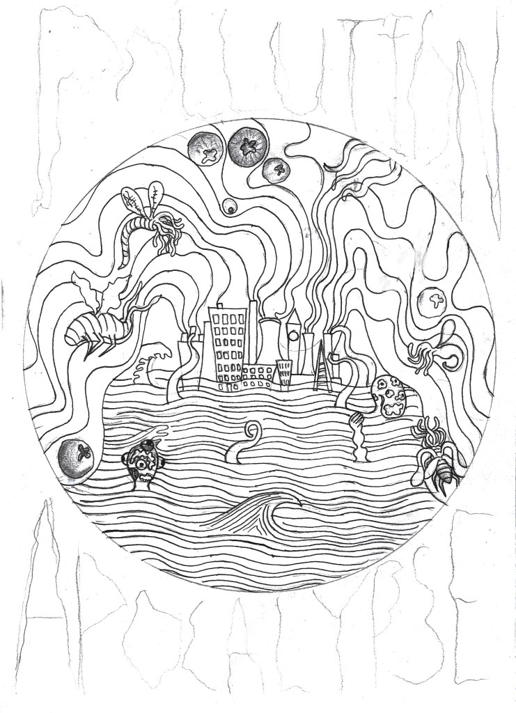
For the design I have once again decided to stick to the Lovecraftian/climate change theme that I’ve got going on right now, only this time I have made it blatantly clear that this is the issue I am trying to tackle, compared to my previous designs which were more subtle in tone. I have written ‘Pollution Apocalypse’ around the outside of the main design so that there is no confusion to the issues I am trying to convey. While apocalypse may sound a bit drastic and exaggerated, scientists would disagree given the fact 11,000 scientists have declared a global climate emergency, which sounds like the beginning of an apocalypse to me. The main focus of the design is a heavily polluted city that is pumping noxious gases into the atmosphere, causing the city to flood and attracting all manners of monsters to its’ centre. The creatures represent the end of life as we know it, as well as mother nature fighting back against the destruction that we as a species have caused.
Pollution Apocalypse Photoshop Design.
11,000 scientists declare global climate emergency and warn of ‘untold human suffering’.
I’m going to Poland for Christmas next Thursday and I’ll hopefully be visiting a lot of galleries, exhibitions and also doing art with my girlfriend’s dd who is a full on, free spirited artist and actually makes a living out of it. So I’m hoping that I’ll be able to write a lot of interesting blog posts while I’m away because I feel like my blog is a little bland right now, I haven’t really had time to go to exhibitions and things like that because I’m so invested in each project that I don’t get out much. But yeah, anyway, hopefully a lot of interesting posts and photos of Polish art and inspiration happening in the coming weeks. I’m really looking forward to immersing myself in all sorts of different art that I haven’t seen before, and hopefully seeing some of Van Gogh’s work because he is one of my favourite artists of all time and I’m pretty sure some of his work is on display at a gallery in Krakow. The only thing I am slightly concerned about is the fact I am going to miss 2 days in college before Christmas which could potentially set me behind in the project before the hand in day in January, however, I have already done a lot of printing and my sketchbook is almost up to date so I should be fine, as long as I do some work while I am away.