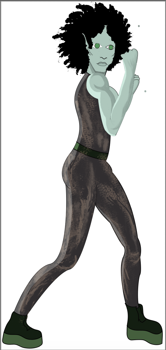
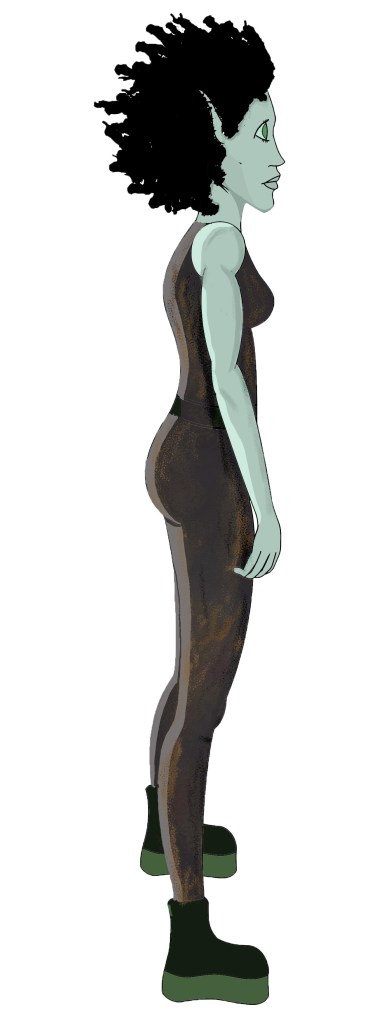
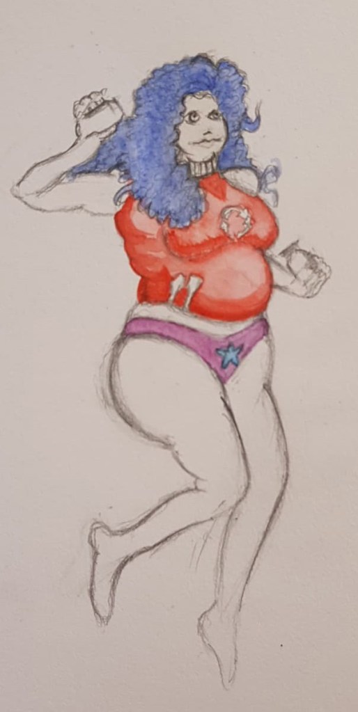
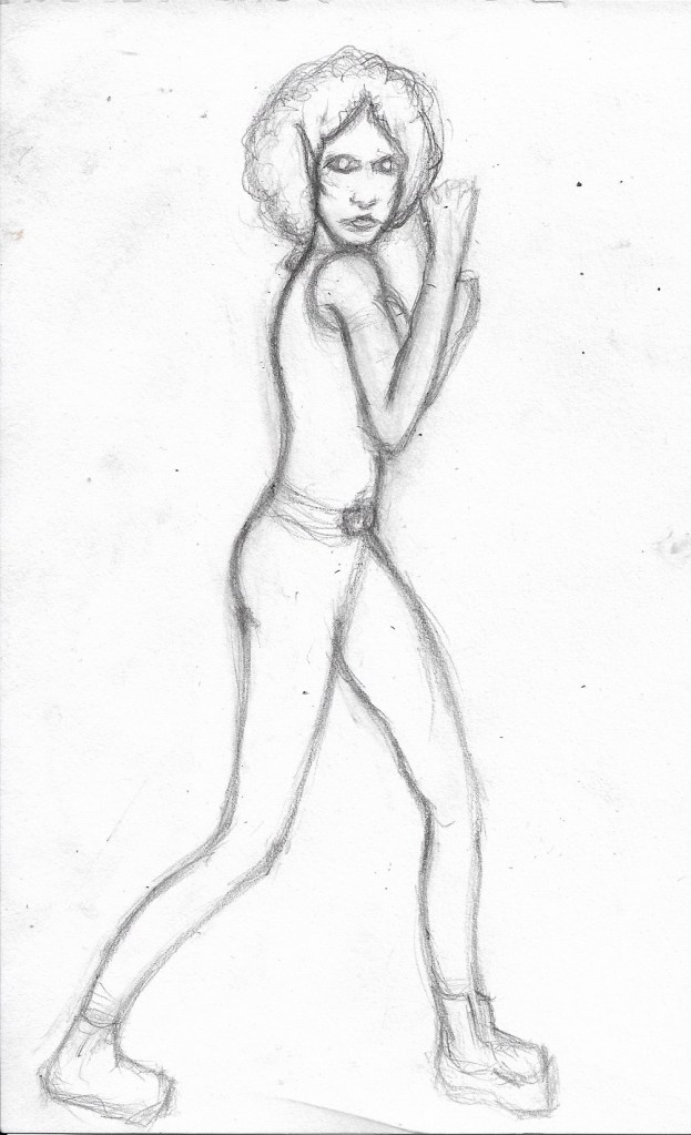
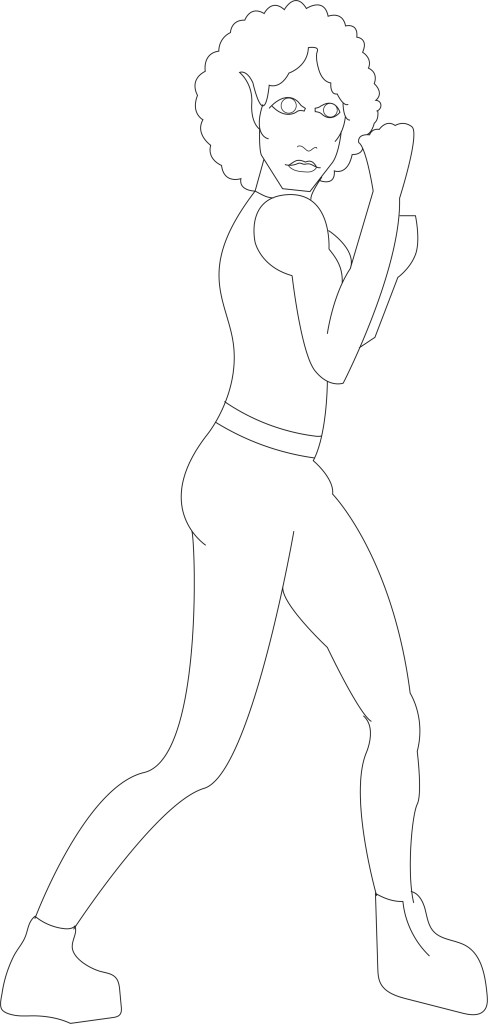
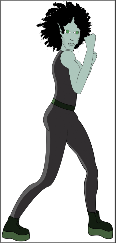
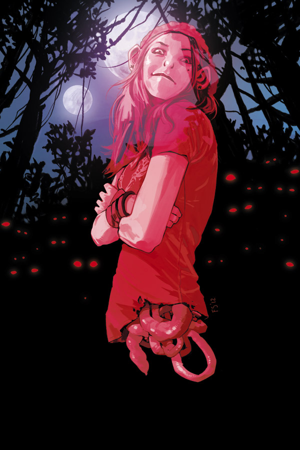
Surprisingly, this week has went a lot better than I thought it would. At the start of the week I felt slightly lost and had no idea how to bring some life to Skaadi, she looked good but was missing heart and fire, her eyes looked soulless and plain. However, after a lot of experimentation and watching a plethora YouTube tutorials on Photoshop processes I have finally created Skaadi as I saw her in my head, sure there are still a few small kinks and details to sort out, but overall, I am much happier with how she looks now.


I primarily focused on fully developing the Skaadi dynamic pose as this is the one that I plan to use when I create my final comic book panel which will depict Skaadi defending her forest home. Throughout this project I had the idea of showing Skaadi inside the beautiful forest in which she resides for my final outcome, however, over the past week or two I came to the conclusion that this would be too bright and happy and it wouldn’t show the depth and darkness within the story that I wrote, it also wouldn’t portray my protagonist as the complex and conflicted character that she is.
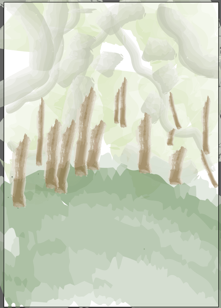
Initial Forest Photoshop Sketch 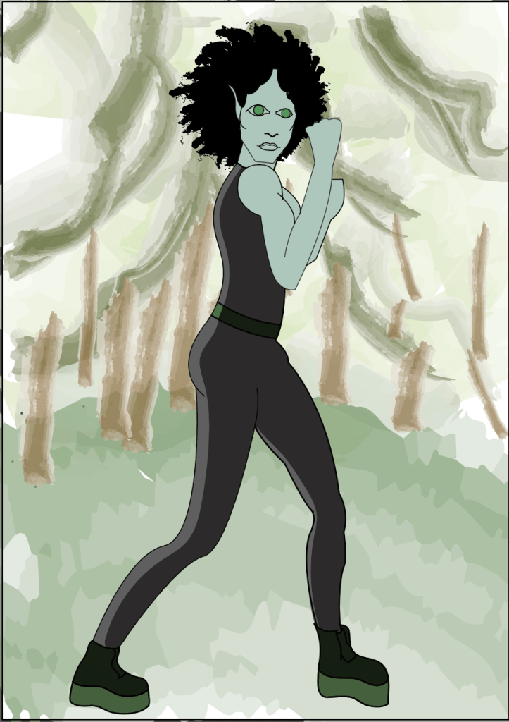
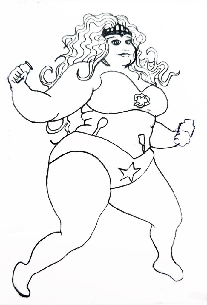
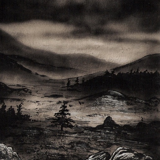
Old Skaadi in the Forest
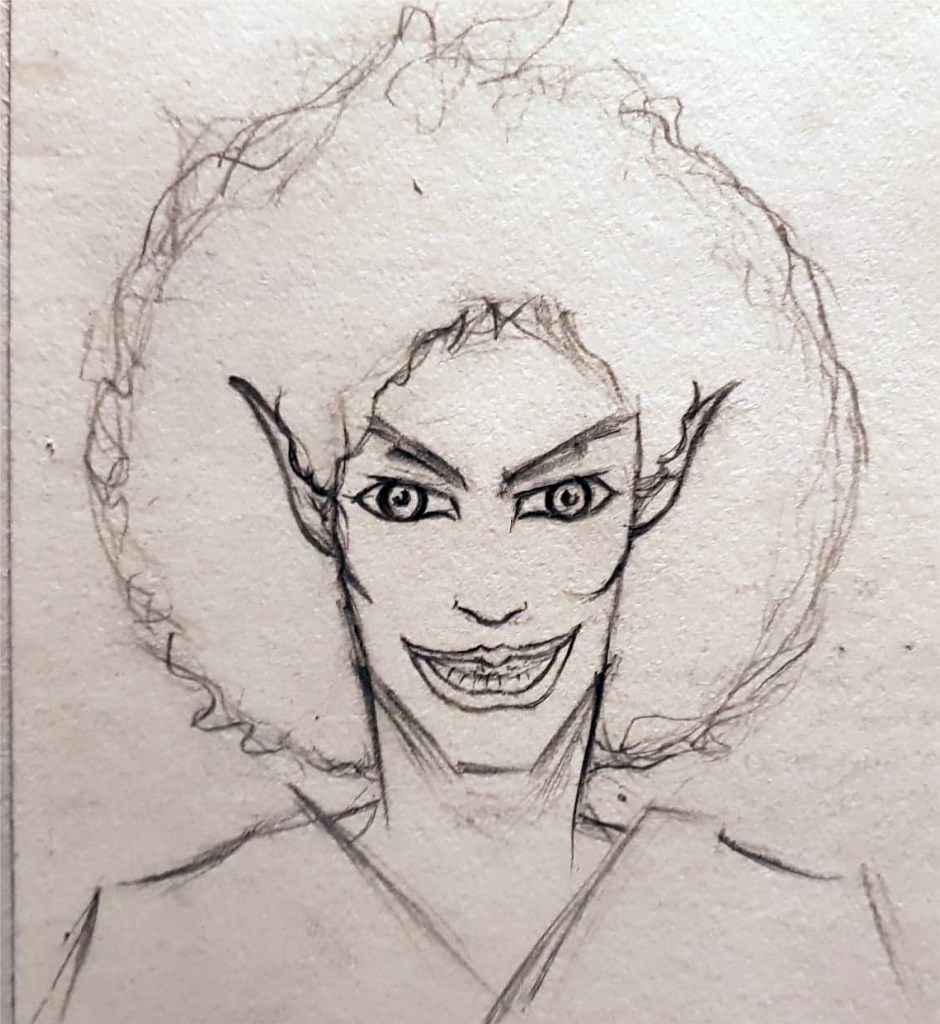
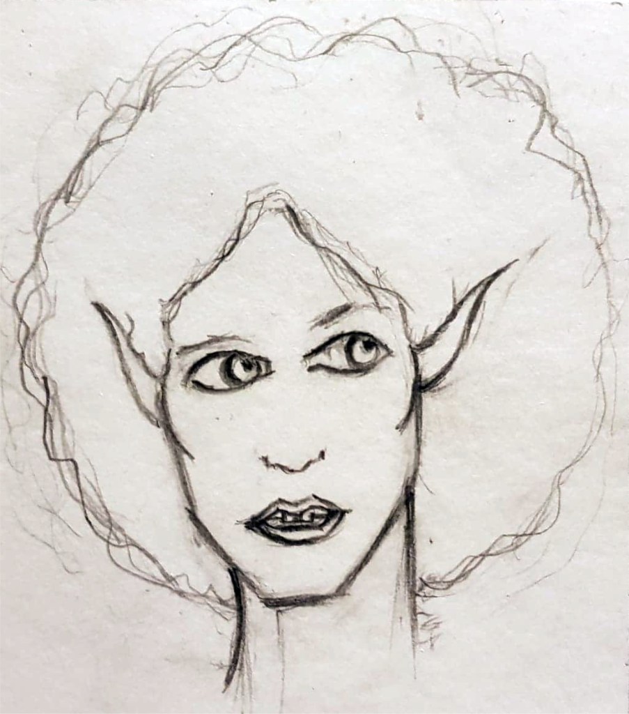
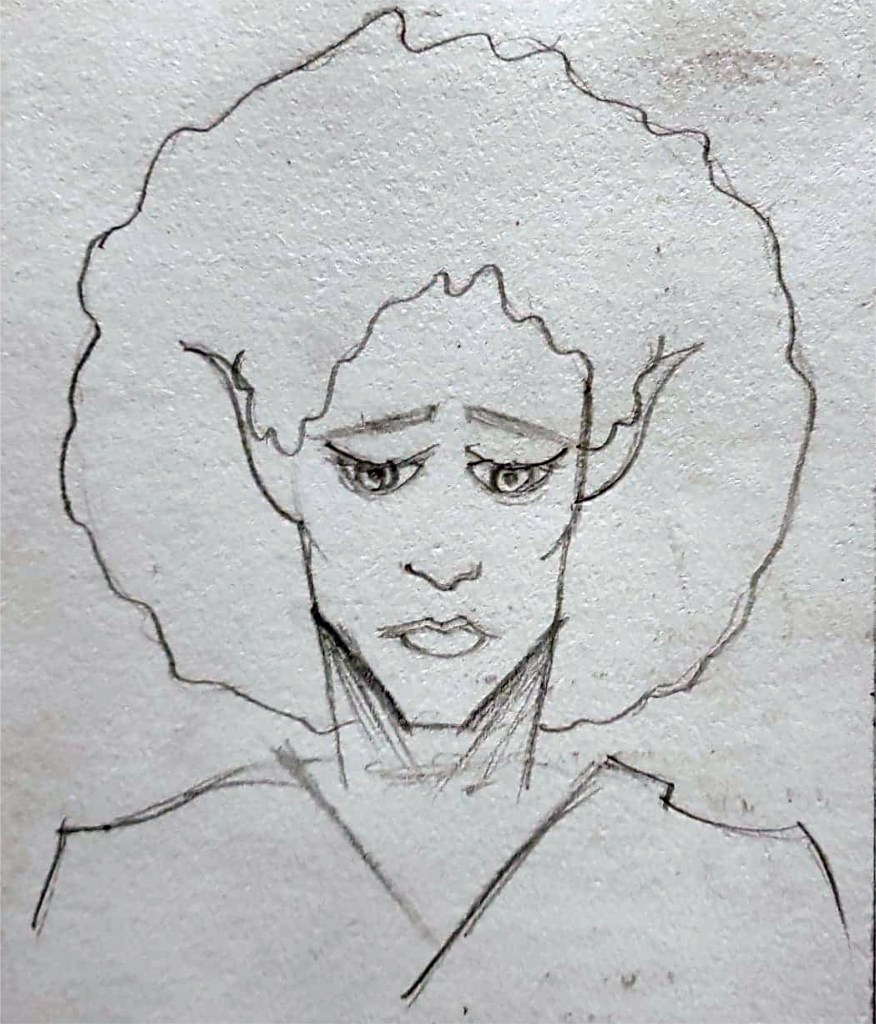
I spoke to one of my tutors last week and she pointed out that Skaadi was currently looking quite normal, when she isn’t, she has a much darker demon side and there is endless conflict within her world which just wasn’t showing in the illustrations I had done so far. To tackle this problem, I have decided to depict Skaadi standing in the blasted heath that I describe in the story, protecting the forest she calls home. I hope that choosing this landscape will reveal a glimpse of how dark and distressing her life can be. I’m not certain that this change of setting will be enough though, Skaadi herself will still look the same, just in a different place, I think I need to show her demon face somewhere on my final hand ins. Physically showing her other side in all of its maniacal glory would most likely solve this issue. I guess I could show the expressions I drew of her (including her demon face) on one of my development boards. Speaking of which I’m not too sure how I am going to tackle the development boards as such because I have primarily been focusing on what the final standalone illustration will look like, I need to improve my ability to spread my focus and attention across all aspects of the project.
But even all this was not so bad as the blasted heath. I knew it the moment I came upon it at the bottom of a spacious valley; for no other name could fit such a thing, or any other thing fit such a name.
H.P. Lovecraft- The Colour Out of Space
I feel as if my time management and focus has been a bit off this project, I want to blame it on the fact that I haven’t done a course for a long time, however I don’t feel like this is good enough an excuse. Other than a few notes, both mental and paper, I didn’t really set myself an official timetable for this project which is starting to bite me in the behind a bit now; when I do future projects, I should try to write up a timetable, even if it is a loose one of how and when I am going to tackle each aspect of the project. I think this would be greatly beneficial to me as it would help me to organise my time better and would make me feel less scatter-brained.