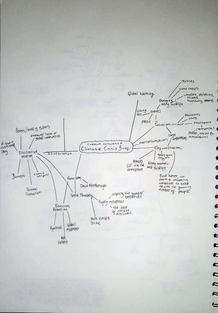
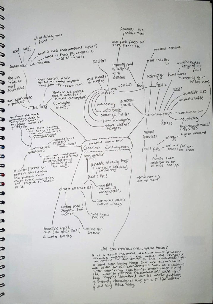
This week I have spent a lot of time working on my front cover design and developing my ideas. I felt like this was necessary because I wasn’t happy with any of the front cover designs I did previously. The front cover is the first thing people are going to see and will likely determine whether or not someone decides to read and buy a publication, so it is essential that I take my time with it and create a design that will grab people’s attention.
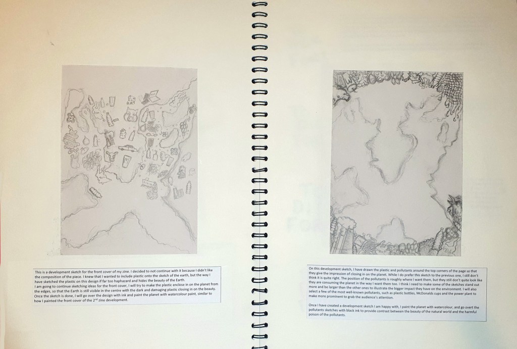
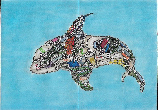
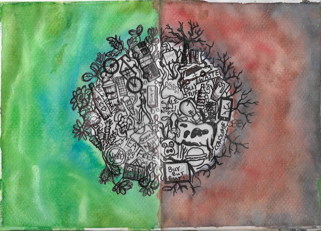
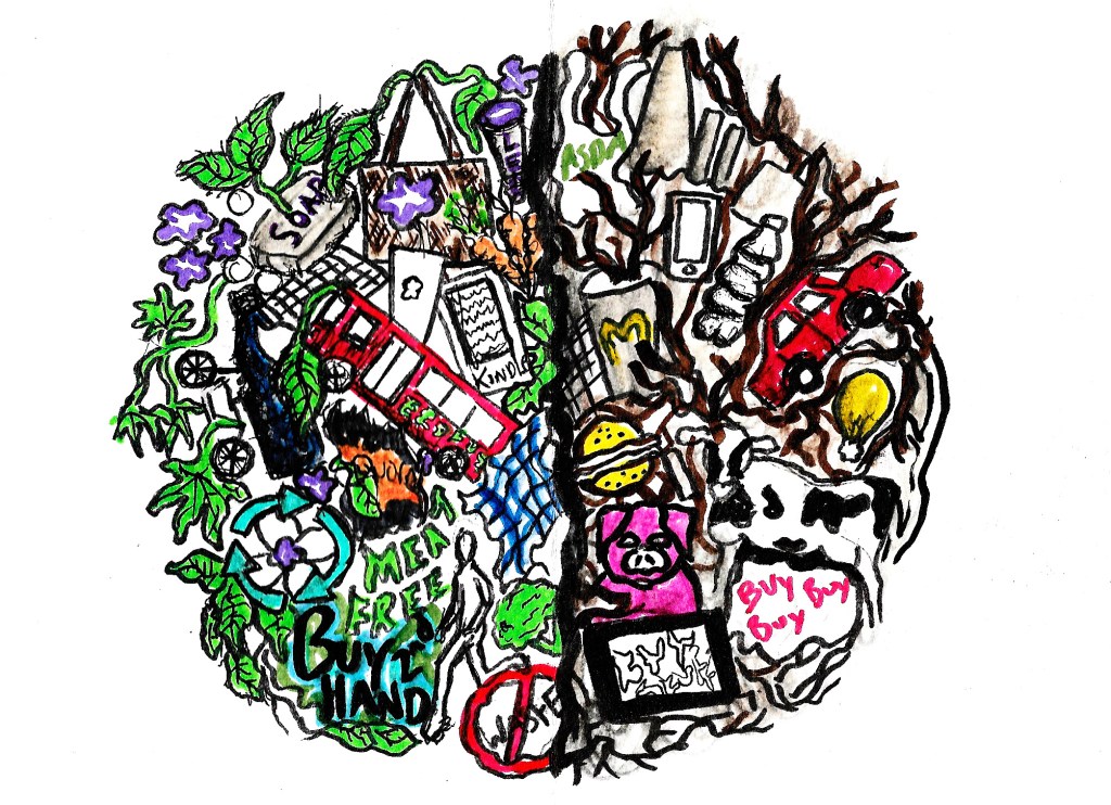
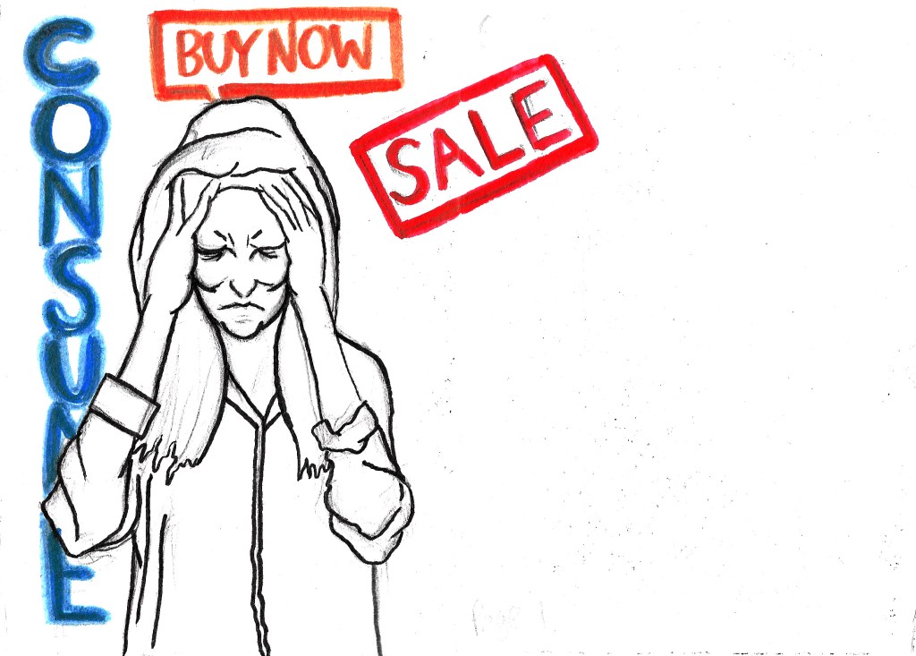
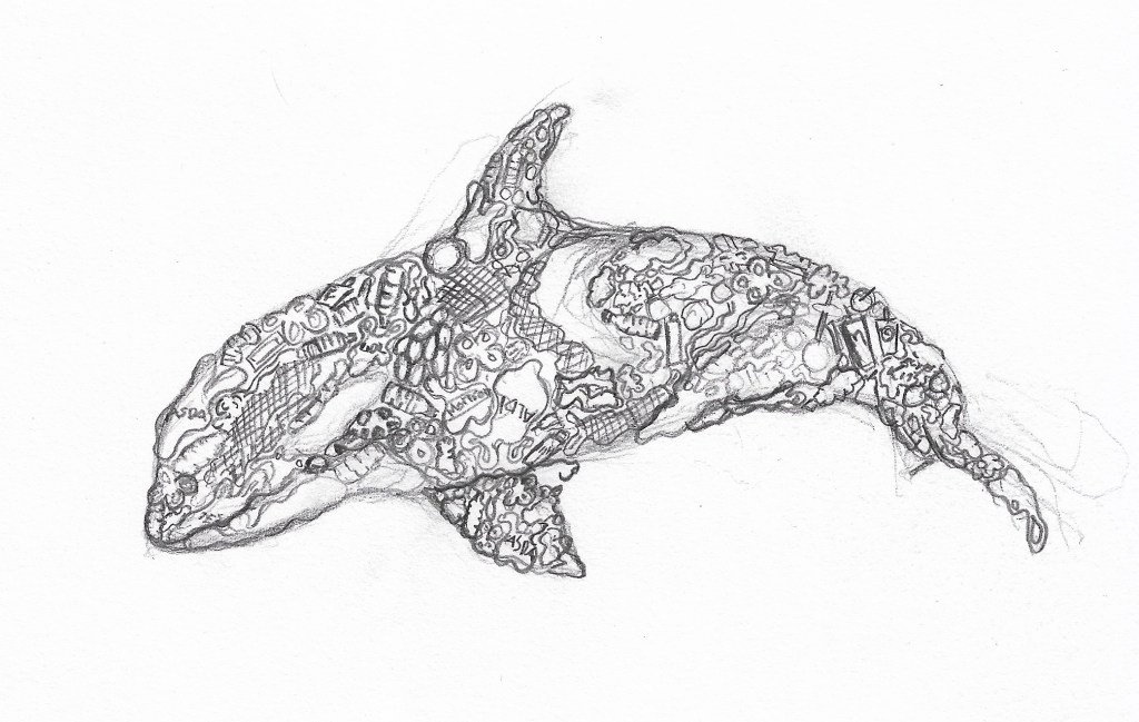
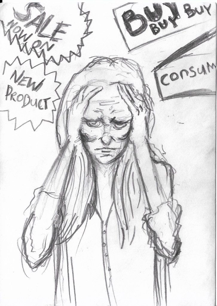
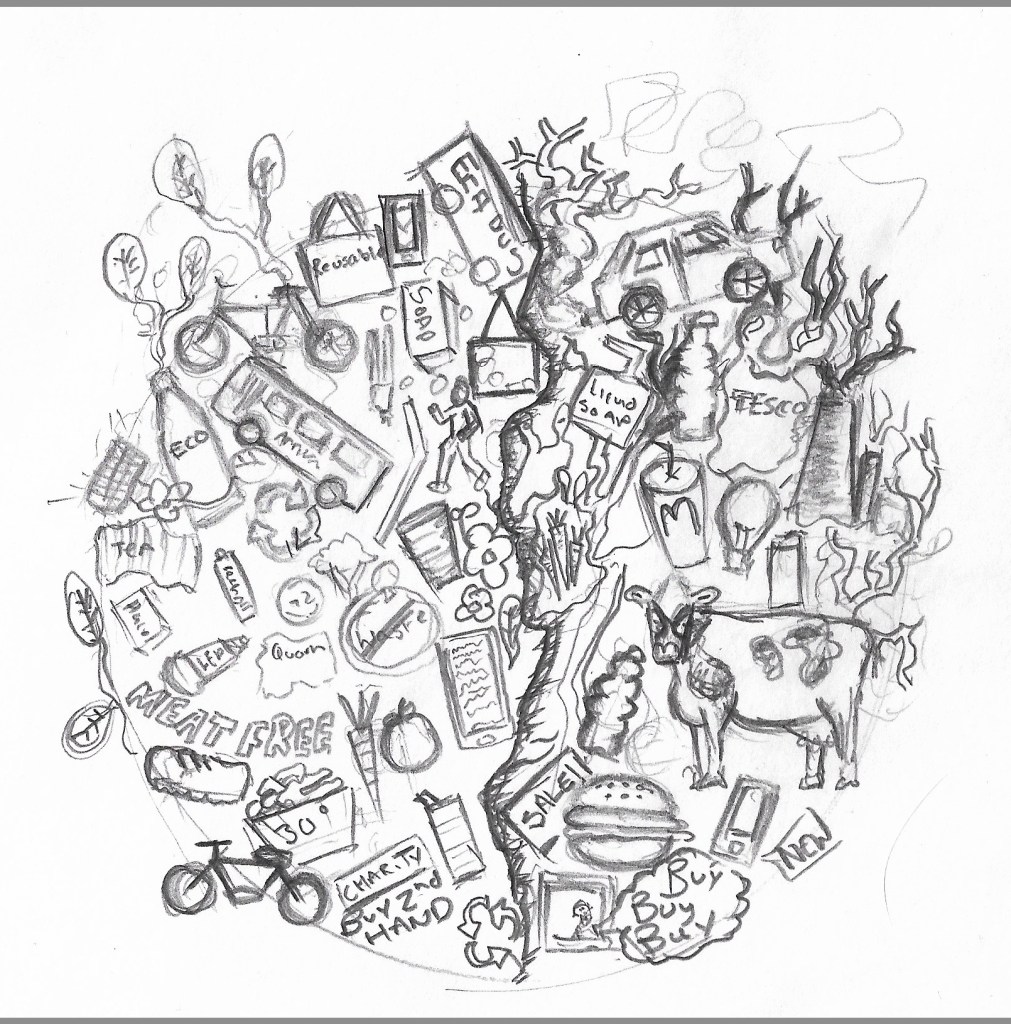
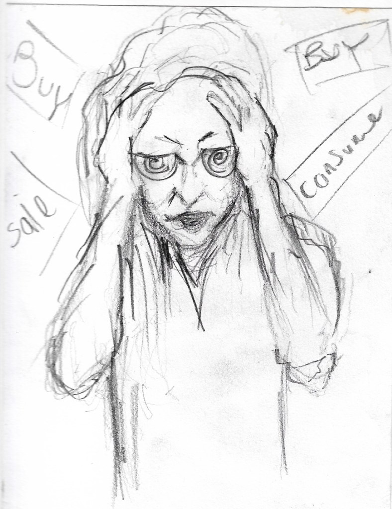
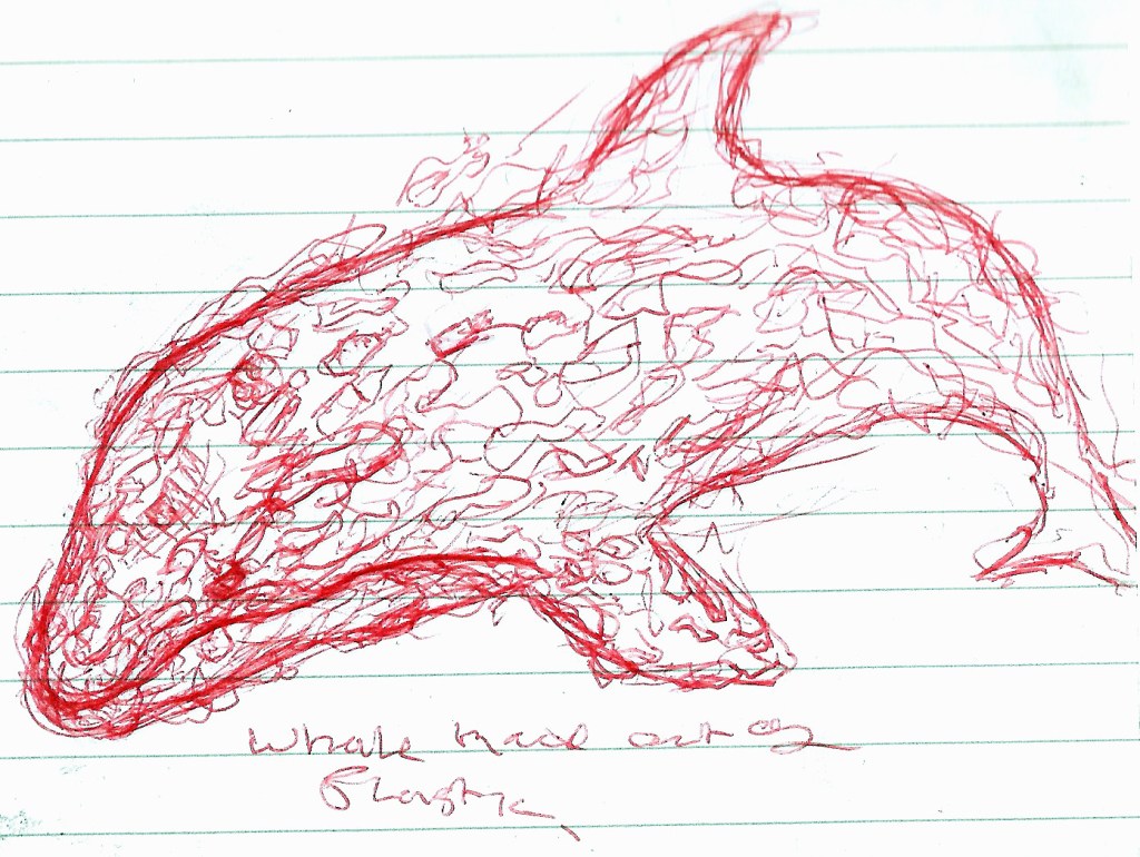
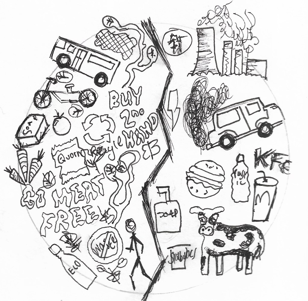
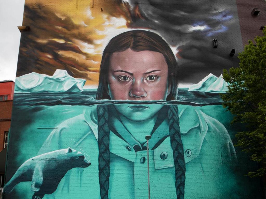
I started this week by sketching out a few ideas I had of how I could show the damaging affect plastic and pollution has on the Earth. I decided that the best way to do this would be to show plastic and pollutants consuming the wonders of the world. My first sketch shows plastic bottles, bags and meat covering the entirety of the Earth in an absolute mess. The composition of this sketch wasn’t very good, it was far too haphazard and covered too much of the planet so I decided to not pursue this design. My 2nd sketch was a lot better than the first, I positioned the plastic and pollutants to the top and bottom of the page to create a border that encloses on the Earth. My idea behind this was to give the impression that the pollutants are attacking the world. I still thought that the composition could do with some improvements though, it didn’t look enough like the pollutants were attacking the planet, but rather falling on it.
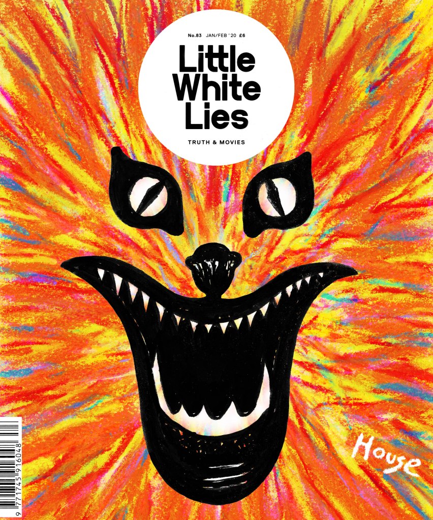
My 3rd attempt at creating the front cover went a lot better than the first, I used a 2b pencil to sketch out the design before painting the Earth with watercolour paints. Once the Earth was painted I used biro pen to draw the pollutants enclosing around the Earth, I tried to make them look like fangs to symbolise the negative effect overconsumption has on the planet. I was really happy with this design and I’m confident that it is the one that I am going to take forward and use as my final front cover.
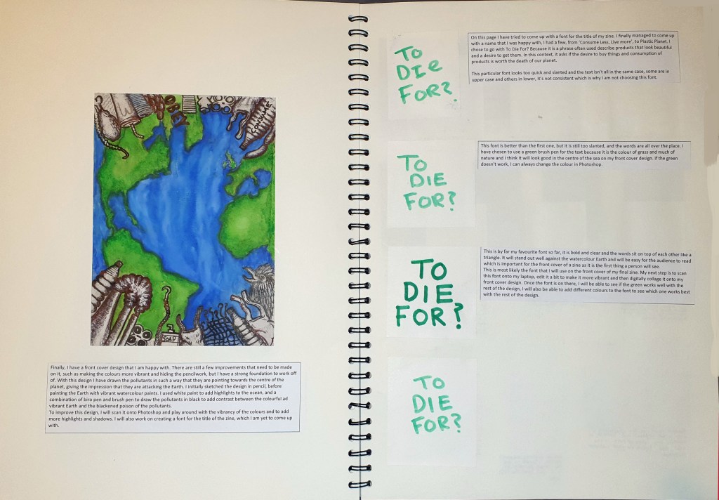
An important part of any front cover and publication is the title, which is something I didn’t have. What I did have though is a few ideas, from Plastic Planet to Consume Your Doom, but I ended up going for To Die For? I chose this because is a term often used to describe a strong desire for something. In this sense, it asks if all of the consuming is worth the plant dying. I tried writing out my chosen title in a few different fonts which I have displayed on the above pages. On the pages below, I have chosen to display the process I used to digitally put my front cover together.
Admittedly, I am still having a hard time motivating myself during the course of this project due to the fact that I’m working at home. I am slowly slipping behind my initial time plan week by week, I should really have finished at least one of my final designs by now, if not more. I am worried that I will have to alter the plans I set out in my proposal and treatment if the deadline isn’t extended or something because of the coronavirus crisis. I just don’t have the space to work effectively like I did when I had access to college facilities, nor do I have access to certain materials and devices that would benefit me greatly, such as an A3 scanner, riso graph machine and printing facilities. I am doing my best to achieve what I set out to do at the start of this project, it is just going slower than I’d hoped it would.