Illustration Changes alot, What is Trending Now?

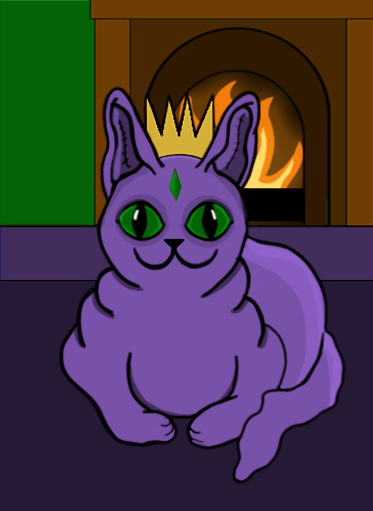
Flat colour, clean vectors and a limited colour palette have been dominating the illustration scene throughout the 2010s, largely because of the rise in digital painting programs such as Photoshop. These designs take a ‘less is more’ approach that can add an air of sophistication to an illustration.  A reduced colour palette also makes the illustrator think about the colours they are using.

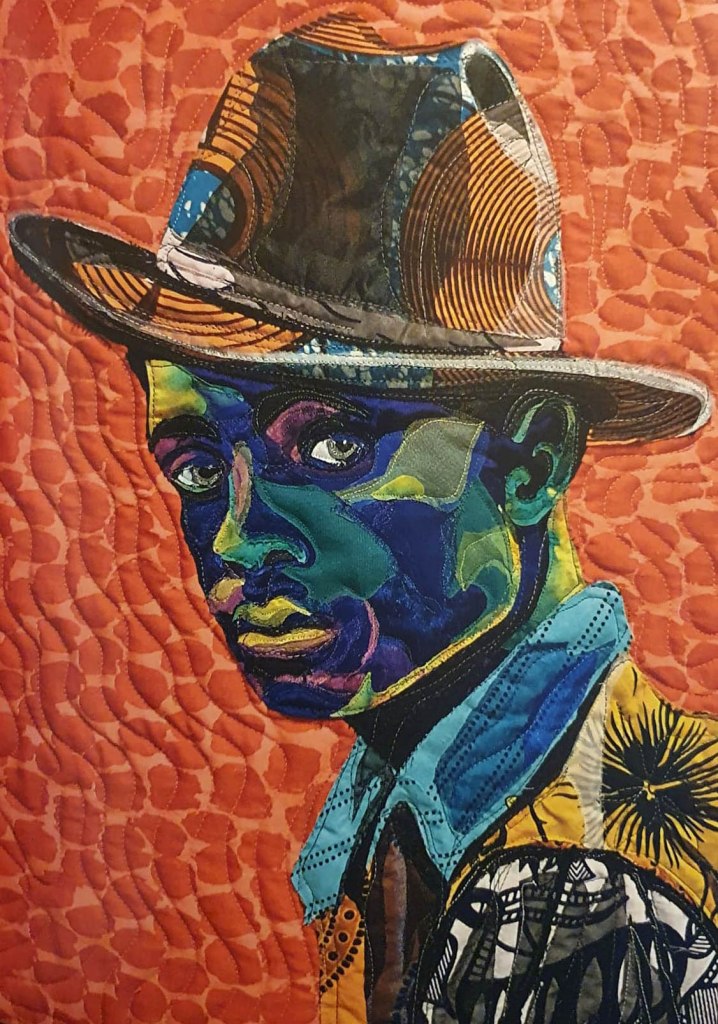
A counter trend to the simplistic and colourful flat vector art is the resurgence of printmaking and traditional looking illustrations that has been occurring lately, much to my joy. Traditional looking illustrations add a uniqueness that seems to be missing from the flat, simplistic digital illustrations that dominated in the 2010s, many companies are turning to a more traditional looking approach that adds a certain warmth to the illustration and helps them to stand out from the crowd.

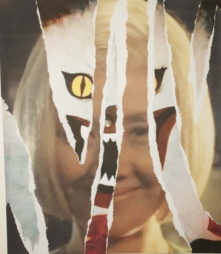
Another thing that has seen a rise in popularity recently is pieces that blur the lines between illustration and animation. As our attention spans get shorter and shorter, illustrators are having to find new ways to keep audiences engaged with their work. Things such as gifs, images that move are making the lines between animation and illustration even greyer.

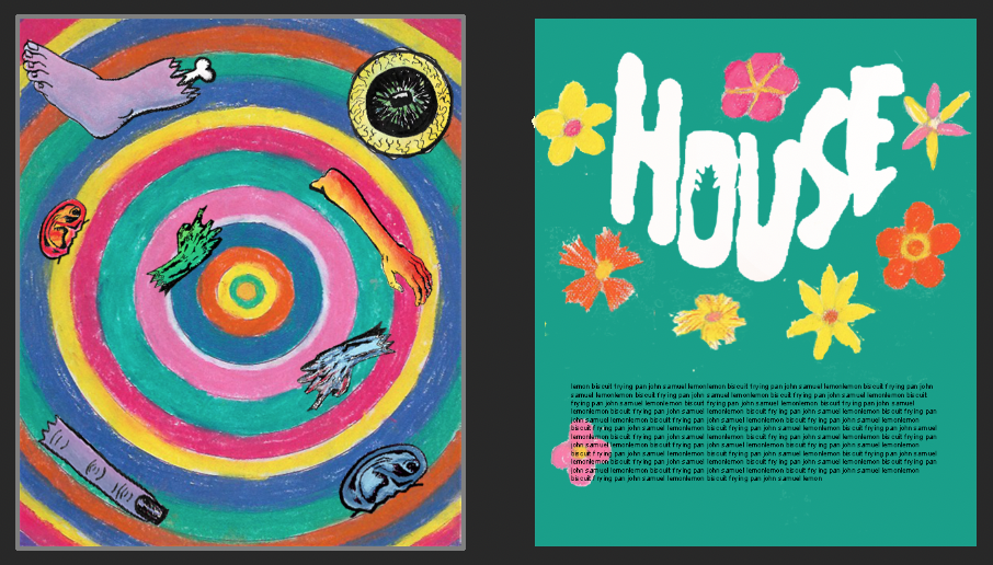
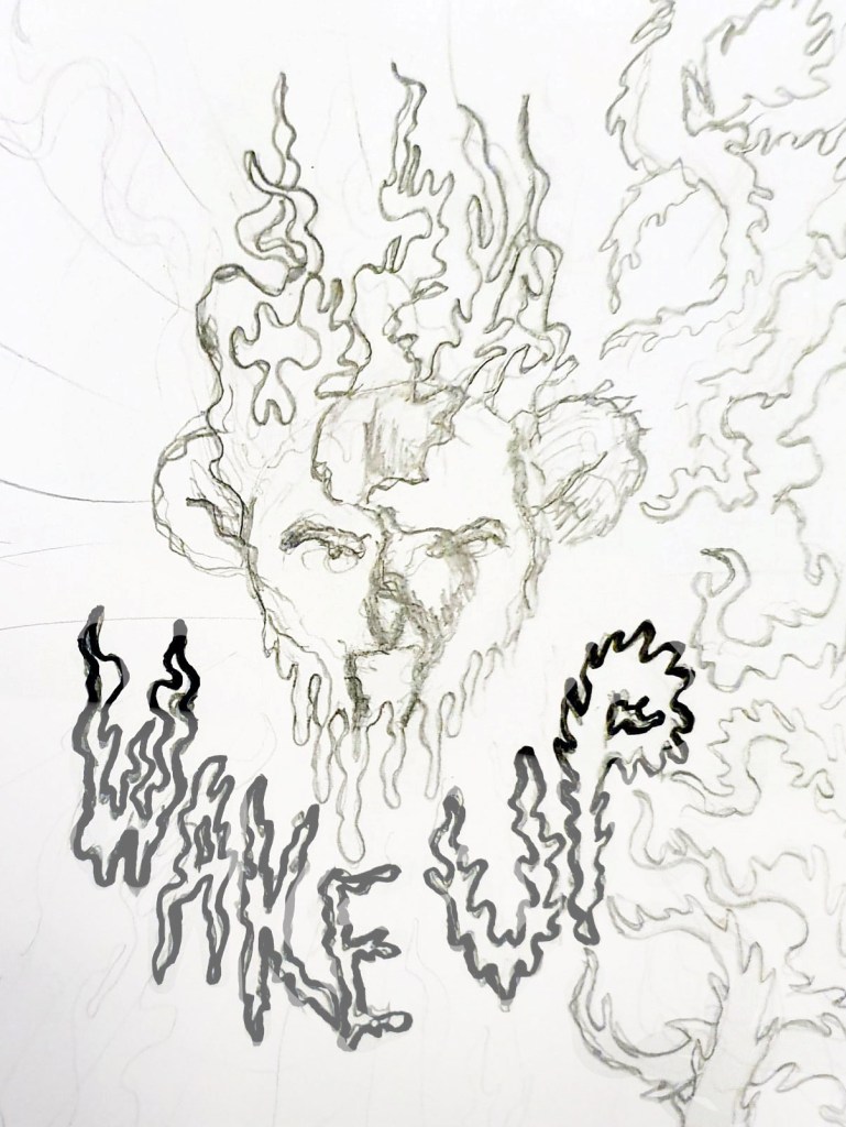
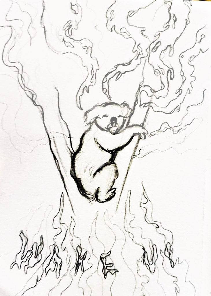
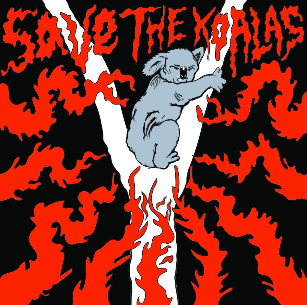
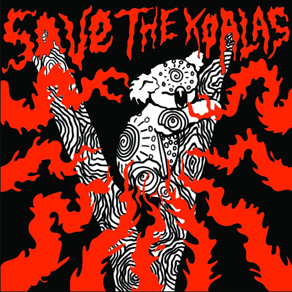
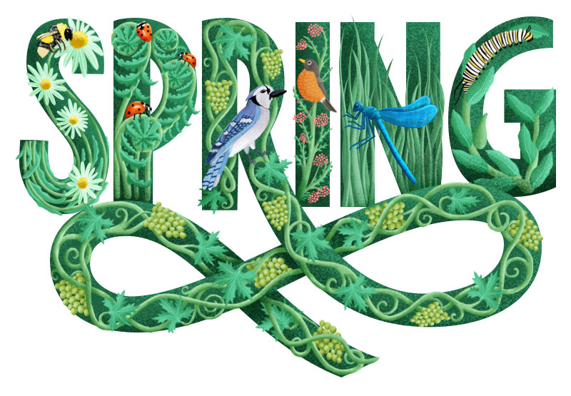
Illustrated letters and typography are a trend that has been around for a while and is here to stay. While typefaces still have their uses, they just can’t blend an illustrative style into an image the same way that typography can. Illustrated letters make a blog of text stand out and add character to a page, illuminating the worlds that follow them.

(Maywst, 2016)

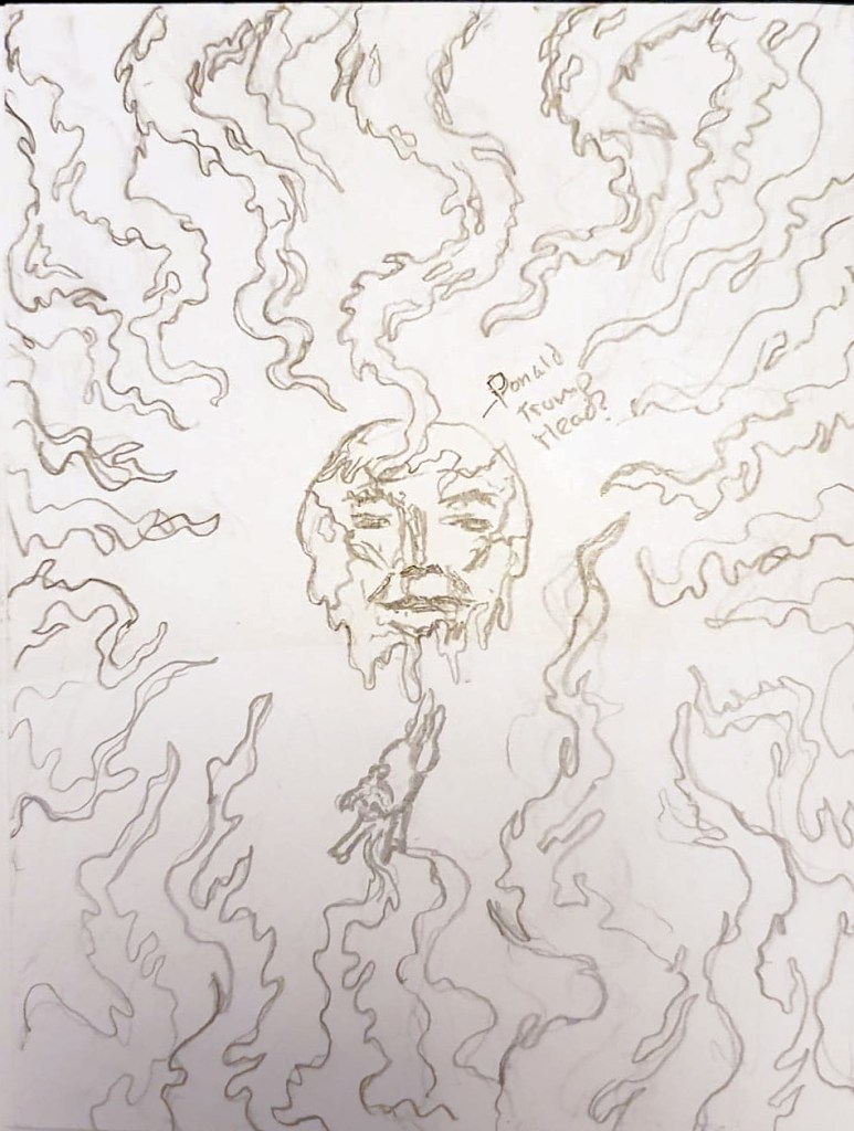
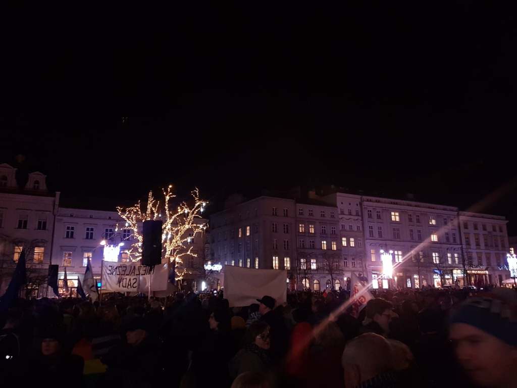
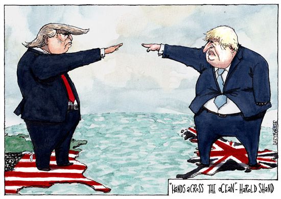
While political statements might not be a trend for everyone, they still do play a huge part in illustration today. With all of the crazy things going on in the world right now, from Brexit to the re-elections in the US and everything else, many people are turning to illustration to express their views and deal with the current world crisis in their own way, be it through satirical art or otherwise, I expect that this trend is just going to grow even more throughout the course of 2020.

(Barker, n.d.)

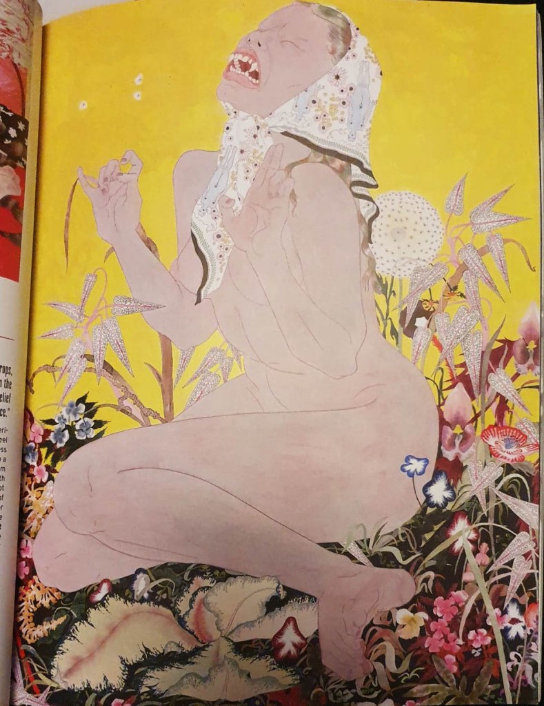
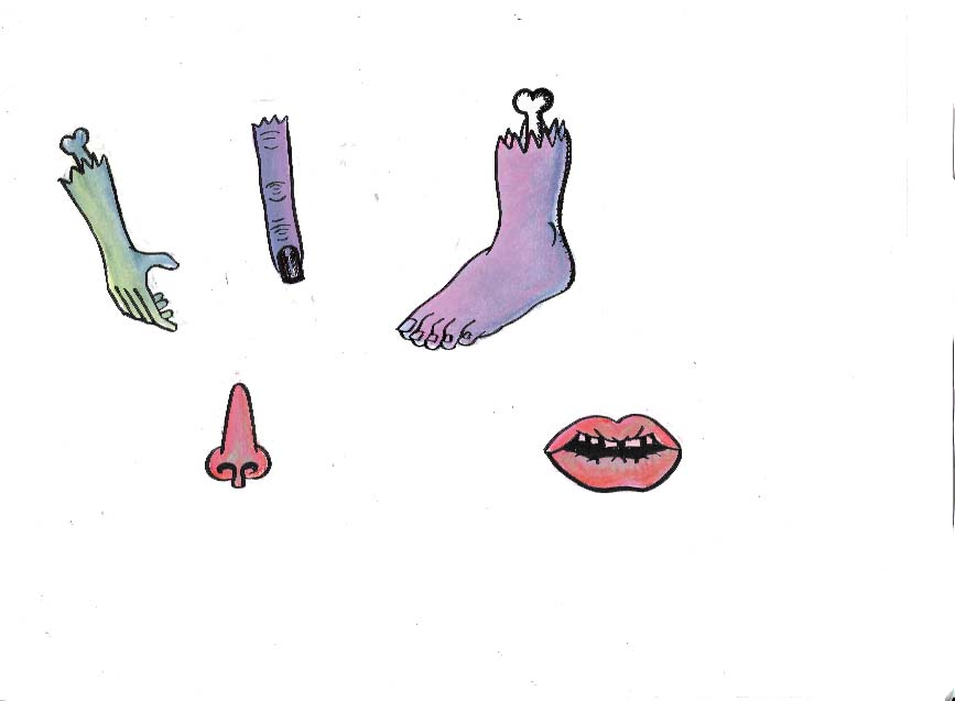
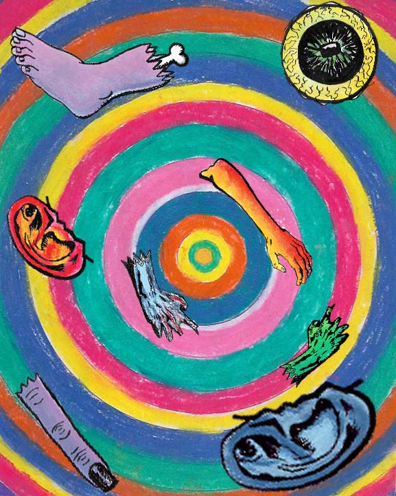
In the 2010s we finally started moving away from deplorable ‘body shaming’ and instead headed towards celebrating our personal and physical appearance. Many illustrators have been captured all of the different ways our bodies are perceived in imperfect and wacky ways. They have done this through wobbly lines, uneven brush strokes and odd proportions. An add on to this is the surge in inclusive art that has been becoming more prominent in the past year, people from all ages, backgrounds and lifestyles are coming forward in a multitude of visual styles. Illustration itself is becoming as in demand, if not more as photography within editorial illustration, so the demand for inclusive illustration is just going to get larger and hopefully it will be a trend that is here to stay.

(Byrd, 2019)

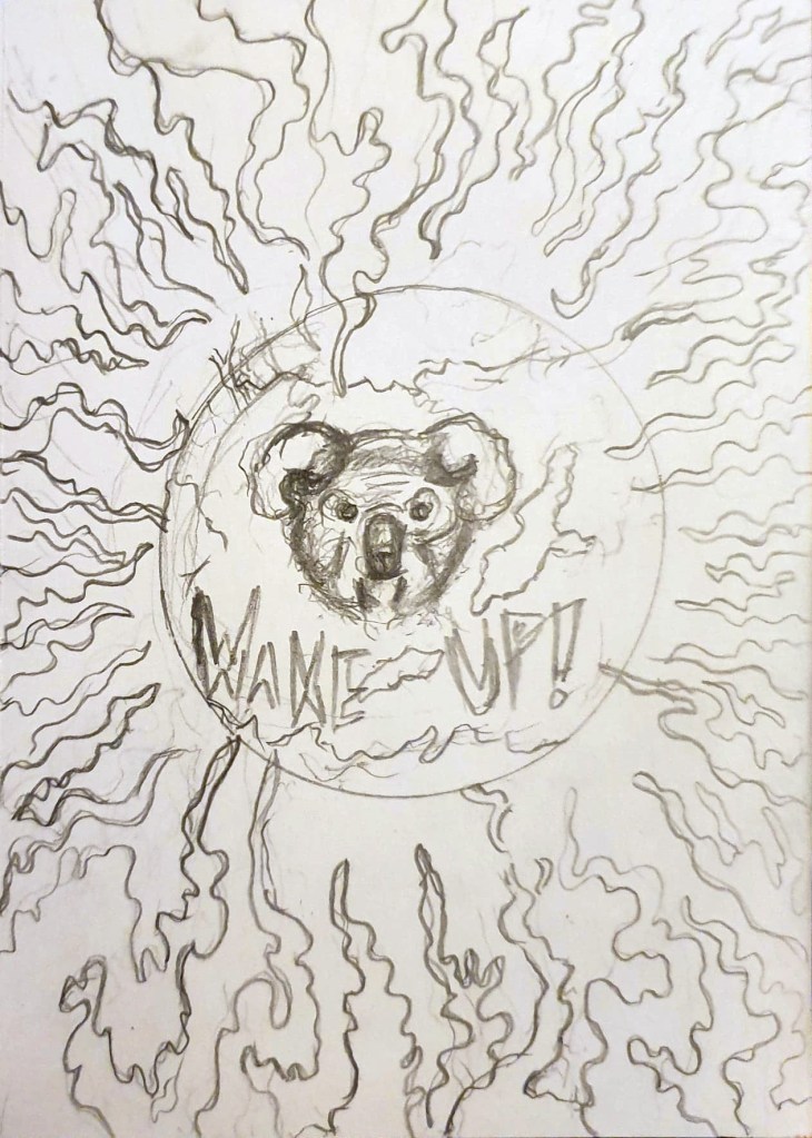
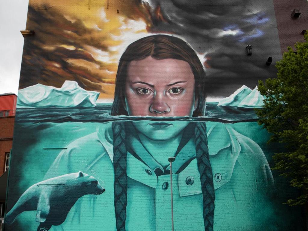
With the rise of figures such as Greta Thunberg and David Attenborough who are fighting for our planet and making it mainstream, and also the increasing availability of eco-friendly products and meat alternatives, sustainable living is itself becoming a huge trend. This is translating into the illustration world too; more and more illustrators are tackling issues such as climate change and over consumption and urging us to live a more sustainable life and to do our part to save our home and the animals that live on it. This is a trend that I hope never goes away, and one that I too am a part of.

(Thomas, 2019)

Maywst, R., 2016. Illustrative Lettering Process — Ray Mawst Lettering & Design. [online] Ray Mawst Lettering & Design. Available at: <http://www.raymawst.com/blog/2016/3/11/fosz1e117f33nrg3fvuqldwzzk1jmt&gt; [Accessed 28 March 2020].

Barker, G., n.d. Trump Cartoon Boris. [online] UK Political Cartoonist Cartoons. Available at: <https://www.garybarker.co.uk/donald-trump-boris-cartoon.html&gt; [Accessed 27 March 2020].

Byrd, T., 2019. Illustrating A More Inclusive Brand. [online] Medium. Available at: <https://medium.com/facebook-design-business-tools/illustrating-a-more-inclusive-brand-bbb4fa6c4bb3&gt; [Accessed 28 March 2020].

Moran, L., 2019. Huffpost Is Now A Part Of Verizon Media. [online] Huffingtonpost.co.uk. Available at: <https://www.huffingtonpost.co.uk/entry/greta-thunberg-street-art-jody-thomas-bristol-upfest_n_5cdeb690e4b00735a915598e?ri18n=true&gt; [Accessed 28 March 2020].

May, T., 2019. 10 Top Illustration Trends For 2020. [online] Creative Bloq. Available at: <https://www.creativebloq.com/features/illustration-trends-2020&gt; [Accessed 28 March 2020].

Lee, E., 2018. Trends From The London Illustration Fair 2019 | Printed.Com Blog. [online] Printed.com Blog. Available at: <https://www.printed.com/blog/trends-london-illustration-fair-2019/&gt; [Accessed 28 March 2020].

Digital Arts. 2020. 2020’S Best Up-And-Coming Illustrators. [online] Available at: <https://www.digitalartsonline.co.uk/features/illustration/illustrators-wholl-kick-off-2020s-in-style/&gt; [Accessed 28 March 2020].

What is New Scientist Magazine and Why Should You Read It?

New Scientist magazine is one of the world’s most popular weekly science and technology magazines. Their magazine is featured online, through print and also on app editions which means that the illustrations and layout present in the mag need to be formattable across these areas. The magazine covers stories about science and technology that intrigue, inform and entertain the widest possible audience, which consists of people from a wide variety of lifestyle, from physicists, biologists to people that have no background in science at all. They have an unrivalled global reach largely in part to the fact they have been around since 1956 and have offices working for them around the world.

New Scientist does it’s best to stand out from the crowd, from writing exclusive scientific stories from an angle that can’t be found anywhere else, to hiring independent illustrators to design their covers and colourful illustrations that are carefully placed throughout each issue of the magazine. New Scientist really is one of a kind. They do something that a lot of science magazines don’t, they explore the social and cultural impacts of both scientific and technological discovery, as well as any consequences they could pose on society, rather than just documenting them. As well as exploring the social and cultural impacts of discoveries, they also write regular features and commentary on environmental issues, something that I am highly passionate about. This is one of the main reasons that I would like to create illustrations for New Scientist one day, they have ethics and aren’t afraid to show it, which is something that I really admire them for.

New Scientist uses often colourful and vibrant illustrations to help explain complex scientific theories and ideas in a more understandable and sometimes conceptual way. This is really important because a lot of their audience don’t have a huge scientific knowledge, but still want to keep up to date with the latest scientific and technological progress, the illustrations within the mag help non-scientists engage with the articles and keeps them coming back for more. They also need to be accurate enough to engage with the audience that are scientists, this must be a difficult line to walk but New Scientist manages to do it regardless. The art editor at New Scientist is Craig Mackie and he says that of 36 illustrated covers that he commissioned in 2015, 17 of them were done by new illustrators. He likes to keep the magazine fresh with new talent and while he does have a list of go to illustrators that he knows he can rely on; he likes bringing in new people that are going to bring something different to the magazine. Working like this is beneficial for both Mackie and the illustrators that he brings on, they get more exposure and the magazine gets to keep being ahead of the curve and stand out from the crowd.New Scientist. 2020.

About New Scientist Magazine | New Scientist. [online] Available at: <https://www.newscientist.com/about/&gt; [Accessed 26 March 2020].

Carless, J., 2020. What Art Directors Want: Tips For Editorial Illustrators | Create. [online] Create.adobe.com. Available at: <https://create.adobe.com/2016/4/20/what_art_directors_want_a_guide_for_editorial_illustrators.html&gt; [Accessed 26 March 2020].

New Scientist. 2020. Guide For Freelancers | New Scientist. [online] Available at: <https://www.newscientist.com/in209-guide-for-freelancers/&gt; [Accessed 29 March 2020].

https://www.newscientist.com/in16-about-new-scientist-magazine/

Newscientist.com. 2020. Magazine Archive 2020 | New Scientist. [online] Available at: <https://www.newscientist.com/issues/&gt; [Accessed 29 March 2020].

Hi Fructose Volume 54 Review

Hi-Fructose Volume 54 Cover- Image taken by Rohan Hall

In this post I will be reviewing Volume 54 of Hi-Fructose Magazine. Now this is the first time I have ever owned Hi-Fructose so I wasn’t too sure what to expect, but I liked the look of their website which is what lead me to purchasing it. The front cover also drew me to this particular issue a bit when I was browsing around in WH-Smith, it seemed to be rather nature focused, with an image of a young girl having a relaxing cup of tea in the middle of a forest/jungle. Gibbons surround the girl in the trees while they tuck into some oranges and stare curiously at the girl who appears to be drawing a picture of a dragon. There is just so much going on in this front cover, the more I stare at it, the more of a story I see and the more questions I have about what is going on. I was definitely drawn to the nature aspect of the cover, it seemed really interesting and I hoped that the nature theme would continue throughout the magazine, and I some ways it did.

Now I cannot say that I like all of the art that is presented in this magazine, but even the artists that I do not likely still teach me something because the articles in Hi-Fructose are so well written and the interviews go so in depth to each illustrators and artists process to find out why they do what they do. This can be said about the first artist that is featured in this volume of Hi-Fructose, Eunjeon Choi, who creates unbelievably vibrant and psychedelic pieces that are inspired by bonsai trees and the way that they are structured and forced to grow a certain way against their will. To me, Choi’s work is too much to look at, their work feels crowded and overtly colourful and chaotic. This is kind of the point as Choi also takes inspiration from our fascination with artificiality and they chaotic world we have created online and while I do like the idea behind Choi’s work and their motivations, the art itself is just too much for me.

Eunjeon Choi artwork featured in HI-Fructose Volume 54- Image taken by Rohan Hall

There are artists in this issue of Hi Fructose that really inspire me, artists such as Rikka Sormunnen and Bisa Butler who use their respective mediums to try and fight for change in the world and raise awareness to current issues that unfortunately are on the rise in 2020. Riikka Sormunen subverts the impossible beauty standards placed on women by men by using traditional poses that are often associated with beauty and turns them into something uncanny, something slightly disturbing. She has plans to start drawing women with stretch marks and cellulite in the future. Bisa Butler uses fabrics to create stunning, actual size portraits of unnamed African Americans in an attempt to give them the respect they never received in life. Her portraits are also made to confront people who do not believe that African Americans are equal, to challenge their misled preconceptions and force them to look them in the eye and question why their negative views.

There are a lot more artists featured in this issue of Hi-Fructose, there is even a small book contained within which is a nice extra bonus. Each page is beautifully laid out and has opened my eyes to a whole host of illustrators and artists that I didn’t know about before. I am definitely going to be buying more issues Hi-Fructose in the future. The magazine seems to be catered to young adult/adult audience, since quite a few of the artists draw mature things and the topics that are presented within the magazine are quite complex, as is the way the interviews and articles are written. I just don’t think a child would be able to understand much of what is going on within Hi-Fructose.

This magazine is going to help me a lot in my college work, it will provide me with a wider range of artists to research and explore which id dint have before. I also intend to use it as a part of my research for the essay which we have been asked to write before the 19th of March.

I Am Not Organised, When Will I Learn? Also An Autobiography

This has been an exceptionally busy week so far. I have primarily been focusing on designing and creating layouts for the double paged spread since I am so worried about how little time I have spent doing it so far Time is running out on this project and I need to manage my time better if I have any hope of completing everything on time.

I have refined my spot illustrations a but by separating the colour layer from the linework layer. I did this by drawing out the shape of the body parts on a piece of layout payer using brush pen and colouring them in with soft pastels on a piece of cartridge paper with a light pad. This will allow me to stitch the linework and colour together in Photoshop and will make the linework and the whole spot illustrations bolder overall as the pastel won’t blur the lines. I have been struggling quite a bit with how much the pastels smudge, they are a relatively new material for me to use and doing the linework and colour separately seems to be the only way I can combat the problem.

As far as the layout goes, I have decided that I want to have a full-page illustration on one page, with the text, headings, subheadings on the other page, with some other spot illustrations floating around the text. This is a similar layout to one used by Little White Lies in their Hidden Lives magazine issue and it inspired me quite a lot. For the full-page illustration, I was inspired by a particularly psychedelic scene in House where Kung-Fu is sucked through a lampshade and transported to some sort of weird, colourful dimension made up of colourful concentric circles. I decided to recreate this scene in my own way, having body parts swirling around in the vortex, rather than Kung-Fu because I feel as if using an entire person for a spot illustration would really blur the lines of what a spot illustration is supposed to be and wouldn’t really fit with how Little White Lies lays out their magazines.

Screenshot of Little White Lies draft layout

I have tried to be consistent with the materials I use for my spot illustrations, having used pastels for the colourful concentric circles design, the body parts and also the flowers because pastels seem to fit the messiness of House more than other materials and I want the texture of the spot illustrations to be the same since I am creating the design on the basis that it’s for a professional publication and it needs to be consistent for that. For the text page I used the eyedropper tool to sample colours from the full-page illustration and tried filling the text page with them to keep the colours consistent too. I settled on using the green colour as the background because it is lurid and creepy, while still looking nice and colourful which really fits with the overall tone of House. I used the actual text used on the House movie poster as placement text for the heading and filled it white because it seems to work best with the green and makes it look weirdly innocent, plus, Blanche the cat is white so it’s a nice nod to her. This isn’t going to be my final layout, but it does give me a good idea of what it is going to look like once I am done. I removed the outline on the flowers to contrast the boldness of the body parts illustrations on the previous page. I am quite happy with how much work I have done this week but there is still a long way to go. I need to refine my layout design and also do the same with the front cover. I am going to try separating the Blanche brush pen design from the trippy pastel background, similar to what I have done for these spot illustrations because I really want Blanche to stand out the most on the front over. I have quite a bit to do next week but I’m getting there. One day I will be good at managing my time instead of rushing around so much towards the end

LWL dev

I’d like to start this post by saying that I am so happy I have chosen House as the film I’m creating art for, and that we’re exploring editorial illustration. It is giving me the opportunity to explore materials and art styles that I have never done before, or even though I would ever do. The fact the visuals are so naïve and childlike has led me down the road of trying childlike materials such as crayons, and their adult cousin, soft pastels, which I’ve surprisingly really enjoyed doing. I feel as if this project is making me grow so much as an illustrator, more than the previous ones because I am so far out of my comfort zone, and thoroughly enjoying being so, that I’m considering keeping these materials in my illustrative arsenal and looking more into Editorial illustration as a potential path for me to go down, whether it’s side projects to add to my income or as a full time career. I need to research the field a lot more before I make any sort of concrete decision but I didn’t really think about it before this project and I feel as if my eyes have been opened up to the world of editorial illustration and it’s definitely got my interest.

Over the weekend I started what I hope are my final spot illustrations, having chosen soft pastels as the material I am going to use for them because of their boldness, messiness and ability to create interesting textures that I simply could not achieve with watercolour paint or digital painting. I also used a Japanese brush pen to draw linework around them to make them stand out more, I feel as if this is the best way for me to create them because I have used pens in my art pretty much consistently throughout my life and they also help me to contain the soft pastels a little bit and make the designs even bolder in the process. I still have a long way to go with using soft pastels, I need a lot more practice with them before the illustrations can be considered ready to be presented on my final design because I don’t have much experience with them prior to this week and they are difficult for me to get used to.

Decollage Attempt

As well as creating some spot illustrations at the start of the week, I have taken a bit of a U-turn as far as my front cover design for the LWL project goes, I was initially heading down the path of developing my cracked mirror design, and even went as far as creating a few media tests with decollage while I tried to figure out how to achieve the effect I wanted, but it just wasn’t working out. I realised that design was something I would feel comfortable doing and not necessarily something that would fit with the overall tone of House. Instead, I have chosen to develop my design that focuses on Blanche as the main character because I feel that she is the most recognisable film and focusing on only one character for the film fits with the layout that LWL magazines use on their front covers. I am worried that changing my mind about the front cover this late in the project could jeopardise the rest of my work because I am going to have to change the aesthetic a bit from what I was originally going for. I am hoping that this isn’t going to be much of a problem because my development piece has been done in soft pastel and brush pen, alike the spot illustrations I over the last weekend so at least there is some consistency with them. I haven’t really thought about how my spot illustrations are going to be presented on the page at this point, I’ve been focusing a lot on creating the art, rather than the layout which I realise isn’t a good thing because the layout of a magazine is just as important as the art inside it. Next week I really need to spend a lot of time creating potential layout sheets and thinking about where things should be placed on the page.

Front Cover Development- Soft Pastel and Brush Pen

Insanity Psychopus- Not #2Cute2Fail

It’s weird for me to say but I actually kind of enjoyed creating a character for the 2cute2fail challenge, it ended up tying in with another project I’m working on, illustrating a book for my aunt by association. One of her friends and her have been running a blog for years where they write about weird history, folklore and the sometimes supernatural, it’s a really cool blog full of bizarre and sometimes horrific tales and historic events. Anyway, they have decided to publish a book featuring a collection of their best and most bizarre posts and they’ve asked myself and my girlfriend to illustrate it, which is amazing, my art is going to get published! One of the posts they need an illustration for is about a folk tale called ‘The King O’ the Cats’ in which a blissfully unaware cat is comfortably sitting in front of the fireplace when he finds out the previous cat king has died and he is now the new crowned king; the thought of a cat with a crown is adorable so I decided I’d kill two birds with one stone and design the King O’ the Cats for both the #2Cute2Fail contest and the book. I tired many times to get the design right but I just kept struggling to make the kitty look cute, it’s so unlike anything I’ve ever tried before, the first lot of designs looked too realistic and not cute at all… the 2nd batch were a step in the right direction but still weren’t right, it’s safe to say I got a little frustrated while trying to design the King O’ the Cats.

Insanity Psychopus- Fineliner and pencil

One night, when I was feeling particularly annoyed at my inability to draw something cute, I decided to give up and just started drawing a creepy cat instead. I wasn’t sure what it was going to turn out like, I wasn’t trying to make it good or cute, I was just drawing. I gave it 3 eyes, a terrifying grin and Cheshire cat stripes and it looked amazing. It wasn’t stereotypically cute, not by a long way, but it was my kind of cute, all dark and a bit ropey. I entered it into the #2Cute2Fail competition immediately and called it Insanity Psychopus, a feline Psychopomp that takes your sanity away. Sure, it might not get the best reception and probably doesn’t quite fit the criteria for the call for entries, but everyone has their own idea of what cute is and I wanted to enter something that really came from me, weird, unadulterated, unaffected by university me. Of course, I did then go on to submitting a more stereotypically cute King O’ the Cats too, one that was made digitally because hey, more chances to win right? The 2nd illustration was cuter in the traditional sense and resembled a normal cat, if that cat happened to have purple skin… like the one I drew. It also more closely depicted the folktale from which my original idea came from with the cat sitting peacefully in front of a fire.

I’m glad that I entered two different pieces into the competition because it just shows that I am capable of doing more than just one style, though I do much prefer the ropey one. As for the book illustration, neither of the designs ended up being fit for purpose but I did create a lot of sketches during the process of designing my #2Cute2Fail submissions and there’s one if particular that I think I’m going to develop further for the book, I may not have killed two birds with one stone but I have made the book illustration process easier than it was before and without knowing about the King O’ The Cats I probably wouldn’t have had an idea for the Pictoplasma competition at all. All in all, it’s been a pretty productive week and I’m weirdly looking forward to starting a new project at uni next week, and finding out my results for the previous one.

King O’ The Cats- Photoshop and Wacom tablet.

Save The Koalas

It’s been just over a week since I returned from my holidays in Poland and Edinburgh, and after spending 3 weeks away from the course, I have been finding it quite difficult to readjust to university life. I didn’t draw enough when I was away, instead I focused on going to galleries and exhibitions in Poland so that I could try and get some more inspiration for where my project and coursework is going to go next, as well as enjoying myself because hey, it was Christmas and new year’s. While the time away was really nice, it has meant that it’s taking me a while to get back into the flow of things, when I returned, I wasn’t really sure what I was going to do for my final print, despite seeing so much amazing art abroad. It wasn’t until I was scrolling through Facebook and watching the news at home that an idea hit me horribly, the Australian bushfire crisis.

Please donate to help save the animals in Australia!- https://support.wwf.org.uk/australia-bushfires

So far during the print project, I have been creating art that tackles topics such as climate change and pollution, two things that are having a horrific impact on our world and wildlife, yet to me, aren’t being tackled enough. I wanted to try and change that, not necessarily on a large scale, I have to be realistic, but if I could reach just one person with my art it would be something. Having tackled these issues so far on the project, it was obvious to me that I needed to stick to similar themes when it came to be designing my final print, I just wasn’t sure what issue to tackle, there are unfortunately so many. For a while I considered tackling the meat industry, but this seemed too hypocritical as I was still eating meat, albeit little, at the time. I have stopped eating meat fully now and have for the past week, but still, I didn’t feel as if it is enough to start hitting the meat industry now. When I saw the horrors of the bushfires and just how much of the environment is being destroyed and how many animals are being killed, it made me feel sick to my core, it’s so upsetting that (at the time of writing) one billion animals have been affected. Having loved animals and nature since I was a child, sometimes more than humans, this topic hit close to heart and I just knew that I had to try and do something to help.

Now that I had an idea of what I was going to illustrate with my final print, I started sketching ideas of just how I could show the Australian bushfires and the impact that they are having. I made a few rough thumbnail sketches in pencil to get out some of my ideas which included:

  • The world being consumed by fire with a koala’s face emerging out in fear because the bushfires are the latest of the wildfires that have devastated the planet in the past year.
  • A Donald Trump earth laughing at the fires while a koala fell off the face of the earth, symbolising the risk of the koalas going extinct and just how little Trump cares about the environment (I thought this might be a bit too political so I didn’t take this idea forward)
  • A koala’s face on the Earth as it melted away in the flames, which would show the impact of climate change and how it is causing the ice caps to melt, as well as the impact the fires are having on the koalas.
The sketch I decided to take forward.

All of these ideas seemed a bit too wide, they focused on the entire world, rather than just the area and the animals that are being affected by the fires, on previous projects I did focus on showing the environmental impact of climate change, but I haven’t really focused on the impact it is having on its inhabitants, with one billion animals being affected by the horrific blaze, this time needed to be different, the animals needed the centre stage. I kept the idea of having the flames framing the illustration, but instead of showing the whole Earth, I drew a lonely koala clinging to a tree for dear life amongst the oncoming flames I showed my sketches to a few people to get their opinion and to find out which one they thought would get the most attention, and they agreed that the lone koala in the tree was the saddest of the sketches and would get more of a reaction from the wider public.

Digital Koala Development

With the design picked, I developed the thumbnail sketch further by drawing it out in a larger scale in an a4 sketchbook before scanning it onto my laptop and going over the line work and colouring it in Illustrator/ Photoshop so that it looked more professional ahead of college on fast approaching Thursday. My tutors liked the design but pointed out that I had two styles going on at once, with the fire and text being done in one style and the koala being done in another. I had struggled with how to depict the koala, I went with a rather realistic approach because I didn’t want to do a cutesy cartoon koala that would take away from the seriousness of the situation, but the realism clashed with the rest of the piece so I agreed that I needed to redesign the koala. The problem I was having is that the koala isn’t a monster, it’s a victim and up until that point on the project I had been depicting climate change in the form of Lovecraftian creatures attacking the planet and reclaiming their home. This time however I was trying to show how vulnerable the animals in Australia are right now, they needed to be cute and upsetting, to evoke feelings of sadness and vulnerability so that people would do their best to help them.  I redraw the koala 3 or 4 times before I finally came up with a design that felt right.

I looked at Australian aboriginal paintings of koalas as a source of inspiration which really helped me to figure out how to show the koala without making it too realistic. Unfortunately, I didn’t get the design right until the end of the day on Thursday, meaning that it was too late to send my design off to be prepared for print, which means that I am going to have to wait until next week to do this and come into college on a day that I am not scheduled to be in so that I can finish the project before the deadline next Thursday. This is fine for me though because I want to raise more money for charities to help save the animals in Australia, no matter what, and in order to do that, I need the prints. I just really hope that I am able to get everything done in time and that people do buy the prints when I try and sell them, this is the only way I know to raise money for the charities without having much reach in the field of illustration.

Final print design

Disclaimer; I am aware that Koalas are only one of the thousands of species that are being affected by the bushfires and I am not ignoring their struggle, but koalas are more well known and loved by many so I feel that they will help to get the attention of more people, which means that I have more chance of selling the prints and donating the proceeds to charities that are fighting to save all of the animals that are being affected by the wildfires.

Poland, Posters and a bit of Protesting

The past couple of days have been something else, and somewhat unexpected; upon arriving to Krakow to meet a friend of my girlfriend’s family, we were taken on a walk through the streets of Krakow at night and came across the beginnings of a protest against the government for plans to make the judges answer only to the right-wing, nationalist, conservative, Christian party that rules the country currently, which would potentially devastate the country, demolish the justice system and also risk Poland being kicked out of the EU by violating European law. I fully support the protests, despite not being Polish myself, my girlfriend is however and it is important to her and I also believe that judges should be allowed to make fair judgements without political interference and in any way that could allow guilty people walk free, so I am glad that we were taken to this protest, however, it was made slightly awkward by the fact that I still had my suitcase at this point, it was definitely a spontaneous affair.

As well as attending the protest, we finally got to go to the Krakow Poster Gallery which I had been hoping to go to since arriving in Poland, when I arrived I must admit that I thought the place looked quite small, that did not however affect the sheer volume of posters that was inside. I was left stunned and amazed walking through that small building, seeing posters from all different generations and commercial avenues such as film, tv, theatre, music festivals, food, gigs and so much more. I could have spent so long in there staring and taking photos of all the posters that interested me, but as I said, the place was quite small and there was a few people inside so I felt quite awkward standing there and taking photos, I only managed to get a few of the ones that really stood out to me. It was so nice seeing so many different styles of art and it gave me a plethora of ideas of how I could layout my final poster design at the end of the print project. Being in such polluted cities and seeing first hand the effect that it is having on peoples’ lives has also given me ideas of what my design is going to depict. I’ve been doing my research on which industries contribute the most to pollution and one of the high flyers is the meat industry… now, at the time of writing I do still eat meat but I’ve cut back a lot and I have been thinking for a while that I want to give it up, I just knew that I had no chance of doing that over a Polish Christmas (there’s loads of meat and fish and barley a vegetarian option in sight) but I still feel as if I could take a swing at the meat industry this project, I may be vegetarian by the end of this trip.

One of the posters that really stood out to me, especially as inspiration for this project was a one that said, ‘Hunting in Poland’ and depicted what I assume is a deer standing over the body of a hunter with its’ hoof on his chest. I couldn’t help but laugh a little at the sight of this, the role reversal is just spectacular, and I find it really refreshing to see something like this in a country where hunting is rather common and animal culls have happened numerous times in the past. My interpretation of the poster could be wrong but to me it is saying that the animals rule and not those that hunt them, that the hunters become the hunted and to be honest, that’s just karma.

Poland, Pollution and a few Presents

I’m finally in Poland! And I can’t breathe! Okay so I was surprised at how polluted the air in Warsaw is, I’ve been here before and didn’t have any problems last time, but this time, I feel as if my lungs have shrivelled and died. The city looks nice and I’m having a great time chilling with some amazing friends, but I feel ill at the same time. Being here is just making me realise even more how much of a problem pollution really is, I’ve seen locals wearing gas masks, there’s warnings about when it’s safe to go outside and nobody seems to drink the tap water because it smells funny. This has resulted in people either using water filters, or, for the most part, buying bottled water, which isn’t good! It’s just contributing to the ongoing plastic problem, I mean yes, the people I’m staying with recycle and so do many other people, which is great, but we still need to cut back on plastic; especially in a city that has highly toxic air. I don’t want to offend anyone with this post, I know that Warsaw can be a lovely place, there’s a lot of green areas and I’ve heard that the local government is trying to fight back against the pollution, I’m just making observations based on what I have seen, and felt (in my lungs) so far.

I brought a few of my prints with me to give to friends and family of my better half as presents for Christmas and so far, they’ve went down really well. The bug one went down especially well, which I think is largely because of the design and the fact the pollution message isn’t as on the nose as my Pollution Apocalypse design. I’ve found that some people think the Pollution Apocalypse poster is really heavy, but important still, and it’s meant to be… I wasn’t trying to get a positive response from that poster because it isn’t tackling a positive subject, pollution is heavy and it’s a reality that we really need to face. I’m just glad people have taken the design and have said that they like it at least, despite the fact it evokes a lot of difficult and real feelings, to me this means the design in a successful one which I’m so happy about. I’m going to have to get some reprints of the Lovecraftian bug and pollution apocalypse when I get back to college because they have been well received so far so I’m hoping that’ll be the case outside of people that I know and that I’ll be able to get myself out there more and maybe sell some on Etsy or something like that. It’d be nice if more people saw my art and what I’m trying to do because I really want to help make the world a better place, even if it’s just in a small way, but it’s hard to if nobody sees me.

I haven’t had the chance to go to any galleries so far because we were tired and have mainly been chilling with friends so far, but I’m hoping to either at the end of this week or next week when I travel to Krakow, I’ve done some research and there’s a really interesting poster gallery there that is run by a family, they’ve been collecting posters for years and their collection features posters from Polish artists, as well as artists from around the world. I think it’ll be invaluable to me to see poster art from different cultures, especially for the print project because I have been making posters so far and sometimes struggle with how to layout my design, seeing how other people have done it will definitely be a beneficial venture. I am really enjoying my time here though, I have some amazing friends here and wish I didn’t have to move on to the next place.