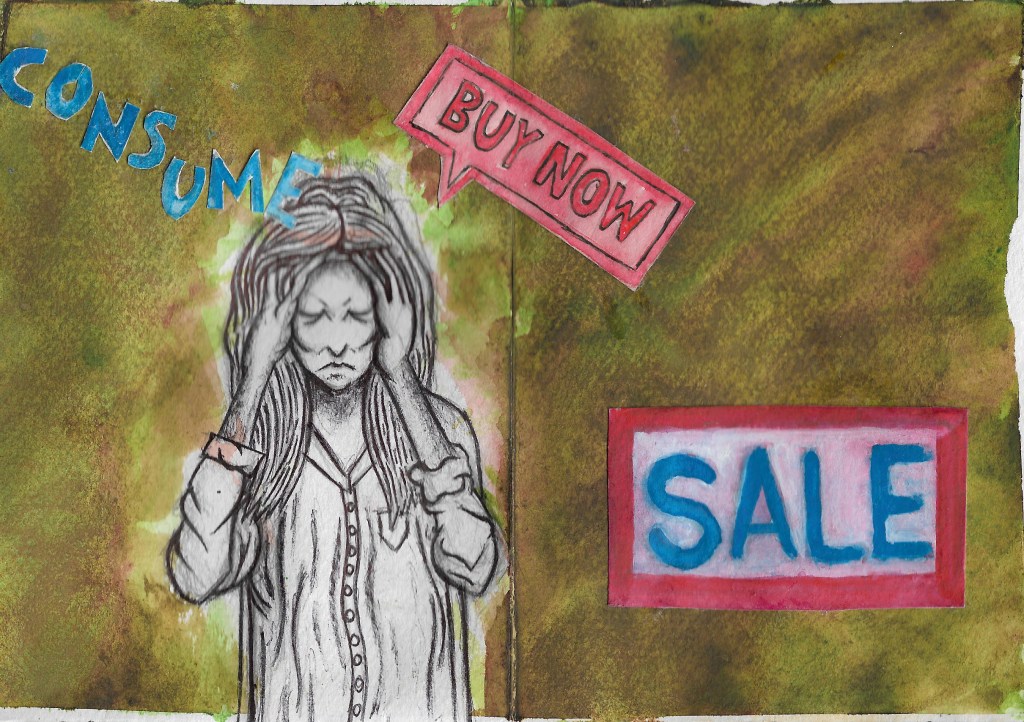
Zine week, it’s one page zine week. I am slowly getting used to the new lockdown way of life, it’s a weird world we’re living in now. I have found that focusing on one thing at a time is the way to motivate myself to do more work. This week has been spent creating a couple of one page zines which have allowed me to experiment with different mediums such as watercolour paint and marker pens. I’m still torn between the two mediums and I can’t decide which one would be best for creating my final zine. They both work well in their own way and neither of them really work for all 3 of the illustrations. For example, the plastic orca illustration seems to look best in brush pen, especially when it comes to creating a simple ocean background; but the advertisement anxiety illustration looks best with a combination of biro pen and watercolour paint. I’m starting to think that using mixed media would be the best way to proceed with the project. The one page zine format has also given me an opportunity to do some layout development at the same time as my media testing. It’s such a useful and economic way to work because if, when all of this is over, I want to print the zines, I’ll only have to pay for one page of printing which would save me a lot of money compared to printing other zine formats.
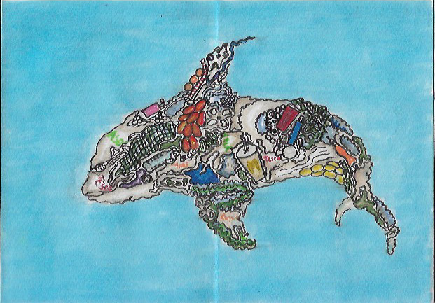
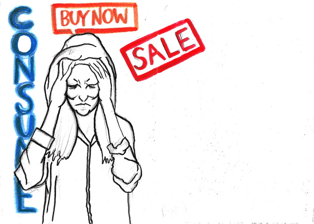
Planet Consumption, Watercolour and Biro Pen, and Brush Pen on Paper
I am going to be making the zine accessible in a digital format as this is the only way I am going to be able to publish my zine due to the lack of printing facilities. I will be able to split the pages of my one page zine digitally using Photoshop or InDesign if I choose to use the one page format for my final piece. Which I might not, because while there are many positives to the format, there are also some negatives, such as the fact it would limit me to a certain number of pages, and the illustrations would have to be rather small as I only have access to A3 paper, meaning each individual page would be reduced to A6. Ideally I would like to draw them each at a minimum of A5.
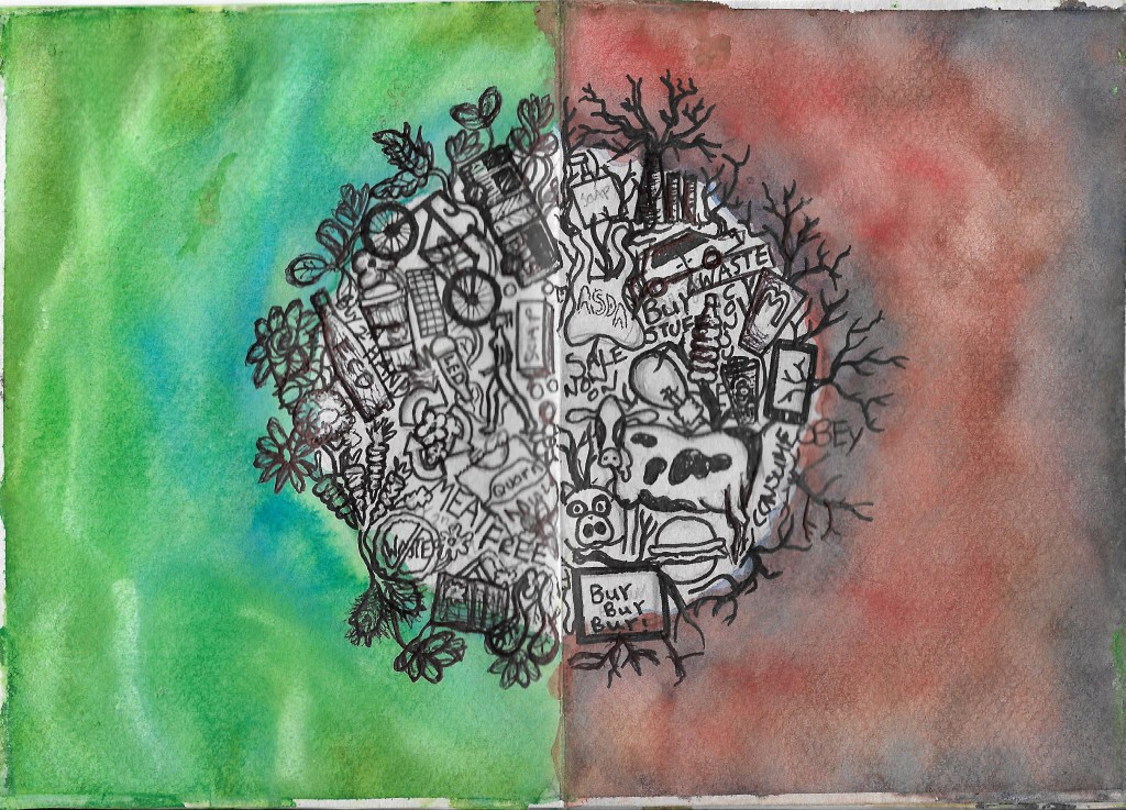
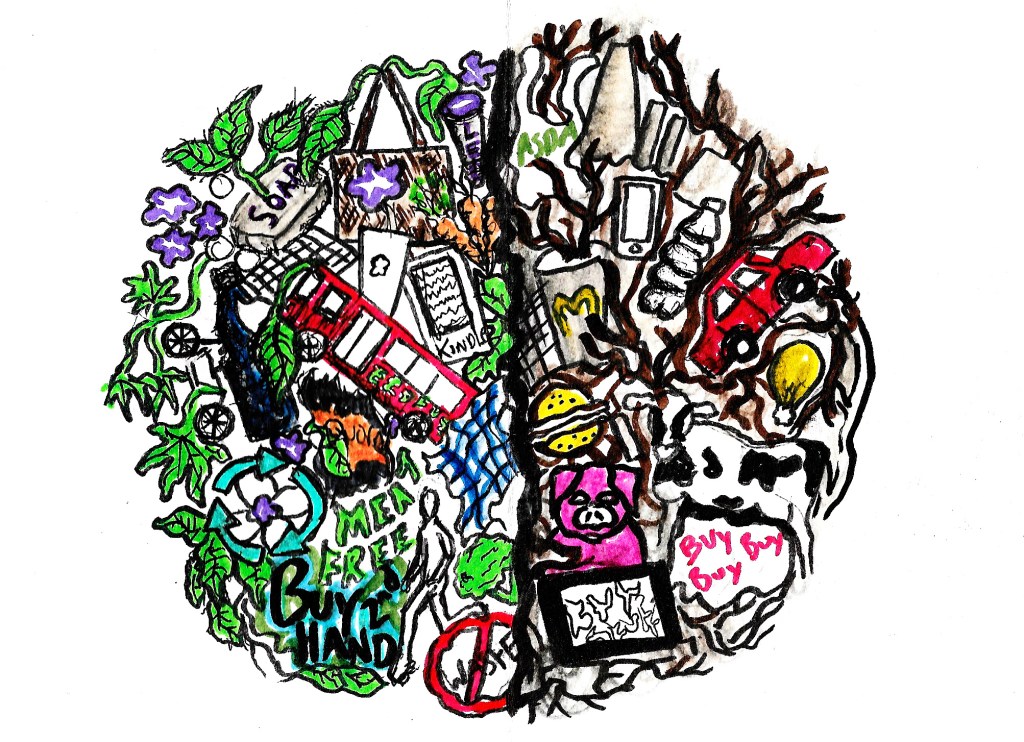
Advertisement Anxiety- Watercolour and Biro Pen, and Marker Pen on Paper
I really need to spend more time working on layout development too, because so far I have only tried creating double paged spreads with a front and back cover. While I do like these layouts, they are missing a few things such as text and I don’t want to just stick to the first layout idea I’ve had. I should experiment a bit more before deciding which layout will be best for my final zine. I’ve had some more ideas of how I could show conscious consumption since the start of the project too so I intend to create at least one more illustration which I would like to go in the zine, this is naturally going to change my layout ideas. I’m also thinking about adding a contents page, which are present in many zines and magazines, it would make the zine look a bit more professional. The addition of these extra pages would mean that I’d need to explore new methods of creating a zine because the one-page zine format just wouldn’t be viable anymore.
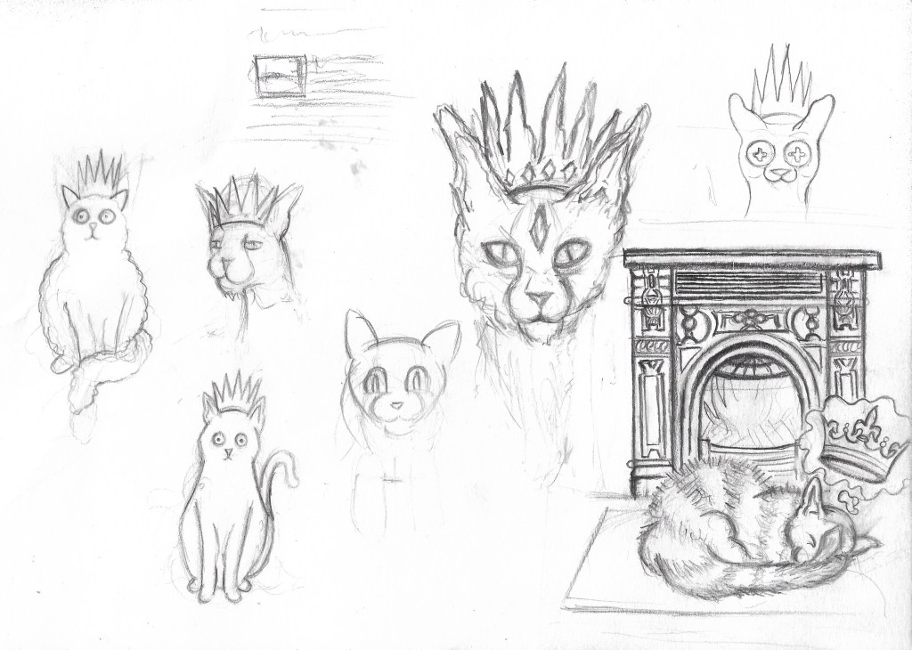
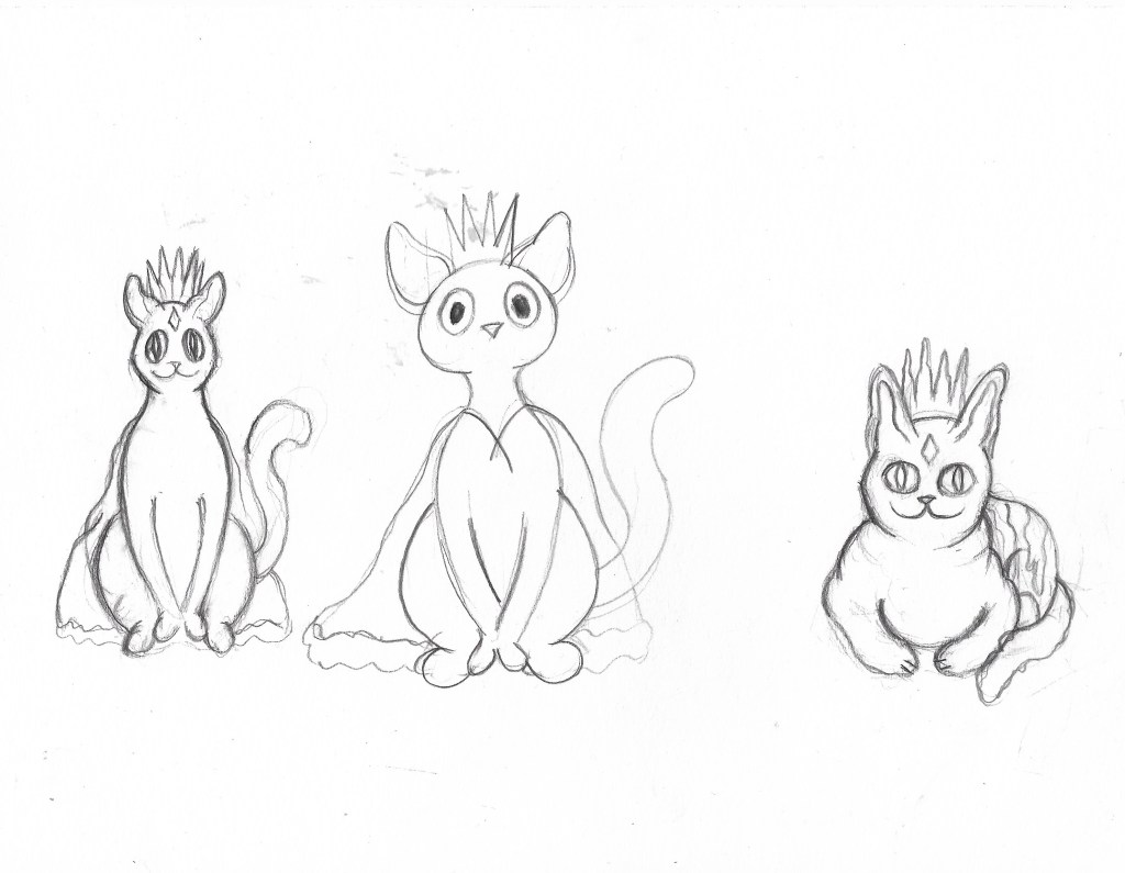
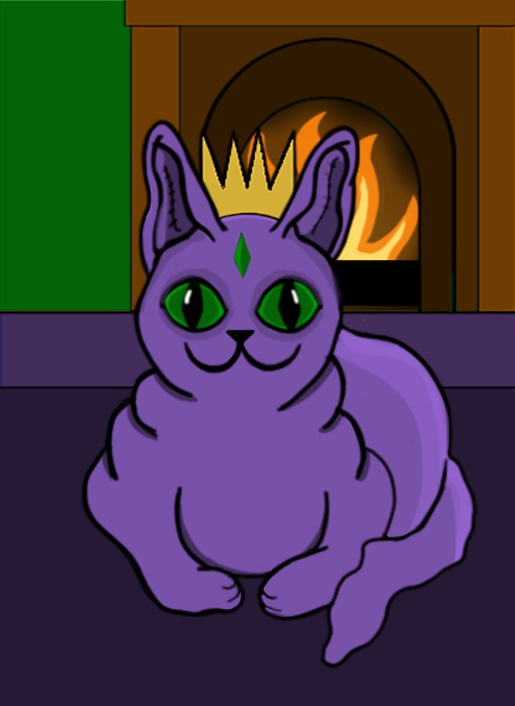
It’s weird for me to say but I actually kind of enjoyed creating a character for the 2cute2fail challenge, it ended up tying in with another project I’m working on, illustrating a book for my aunt by association. One of her friends and her have been running a blog for years where they write about weird history, folklore and the sometimes supernatural, it’s a really cool blog full of bizarre and sometimes horrific tales and historic events. Anyway, they have decided to publish a book featuring a collection of their best and most bizarre posts and they’ve asked myself and my girlfriend to illustrate it, which is amazing, my art is going to get published! One of the posts they need an illustration for is about a folk tale called ‘The King O’ the Cats’ in which a blissfully unaware cat is comfortably sitting in front of the fireplace when he finds out the previous cat king has died and he is now the new crowned king; the thought of a cat with a crown is adorable so I decided I’d kill two birds with one stone and design the King O’ the Cats for both the #2Cute2Fail contest and the book. I tired many times to get the design right but I just kept struggling to make the kitty look cute, it’s so unlike anything I’ve ever tried before, the first lot of designs looked too realistic and not cute at all… the 2nd batch were a step in the right direction but still weren’t right, it’s safe to say I got a little frustrated while trying to design the King O’ the Cats.
The King O’ the Cats pencil sketches.
Insanity Psychopus- Fineliner and pencil
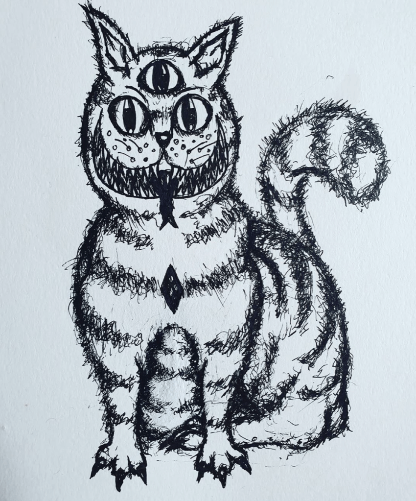
One night, when I was feeling particularly annoyed at my inability to draw something cute, I decided to give up and just started drawing a creepy cat instead. I wasn’t sure what it was going to turn out like, I wasn’t trying to make it good or cute, I was just drawing. I gave it 3 eyes, a terrifying grin and Cheshire cat stripes and it looked amazing. It wasn’t stereotypically cute, not by a long way, but it was my kind of cute, all dark and a bit ropey. I entered it into the #2Cute2Fail competition immediately and called it Insanity Psychopus, a feline Psychopomp that takes your sanity away. Sure, it might not get the best reception and probably doesn’t quite fit the criteria for the call for entries, but everyone has their own idea of what cute is and I wanted to enter something that really came from me, weird, unadulterated, unaffected by university me. Of course, I did then go on to submitting a more stereotypically cute King O’ the Cats too, one that was made digitally because hey, more chances to win right? The 2nd illustration was cuter in the traditional sense and resembled a normal cat, if that cat happened to have purple skin… like the one I drew. It also more closely depicted the folktale from which my original idea came from with the cat sitting peacefully in front of a fire.
I’m glad that I entered two different pieces into the competition because it just shows that I am capable of doing more than just one style, though I do much prefer the ropey one. As for the book illustration, neither of the designs ended up being fit for purpose but I did create a lot of sketches during the process of designing my #2Cute2Fail submissions and there’s one if particular that I think I’m going to develop further for the book, I may not have killed two birds with one stone but I have made the book illustration process easier than it was before and without knowing about the King O’ The Cats I probably wouldn’t have had an idea for the Pictoplasma competition at all. All in all, it’s been a pretty productive week and I’m weirdly looking forward to starting a new project at uni next week, and finding out my results for the previous one.
It’s been just over a week since I returned from my holidays in Poland and Edinburgh, and after spending 3 weeks away from the course, I have been finding it quite difficult to readjust to university life. I didn’t draw enough when I was away, instead I focused on going to galleries and exhibitions in Poland so that I could try and get some more inspiration for where my project and coursework is going to go next, as well as enjoying myself because hey, it was Christmas and new year’s. While the time away was really nice, it has meant that it’s taking me a while to get back into the flow of things, when I returned, I wasn’t really sure what I was going to do for my final print, despite seeing so much amazing art abroad. It wasn’t until I was scrolling through Facebook and watching the news at home that an idea hit me horribly, the Australian bushfire crisis.
So far during the print project, I have been creating art that tackles topics such as climate change and pollution, two things that are having a horrific impact on our world and wildlife, yet to me, aren’t being tackled enough. I wanted to try and change that, not necessarily on a large scale, I have to be realistic, but if I could reach just one person with my art it would be something. Having tackled these issues so far on the project, it was obvious to me that I needed to stick to similar themes when it came to be designing my final print, I just wasn’t sure what issue to tackle, there are unfortunately so many. For a while I considered tackling the meat industry, but this seemed too hypocritical as I was still eating meat, albeit little, at the time. I have stopped eating meat fully now and have for the past week, but still, I didn’t feel as if it is enough to start hitting the meat industry now. When I saw the horrors of the bushfires and just how much of the environment is being destroyed and how many animals are being killed, it made me feel sick to my core, it’s so upsetting that (at the time of writing) one billion animals have been affected. Having loved animals and nature since I was a child, sometimes more than humans, this topic hit close to heart and I just knew that I had to try and do something to help.
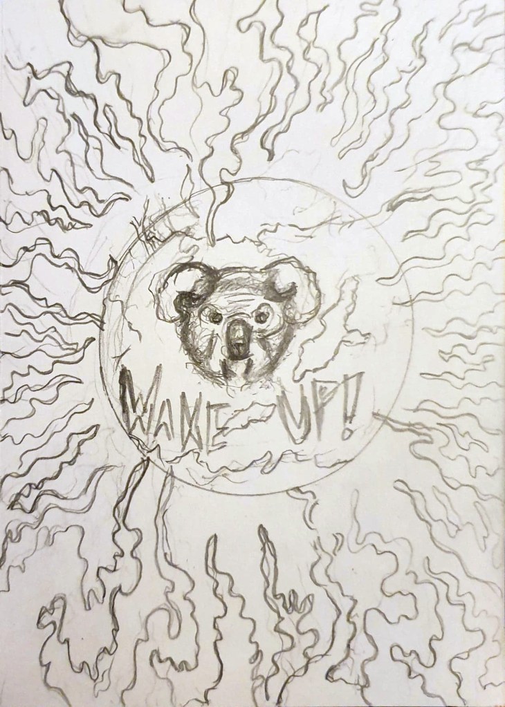
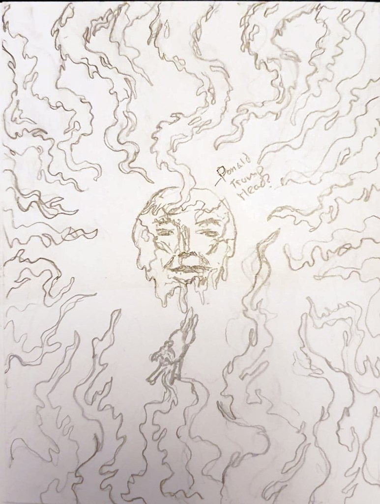
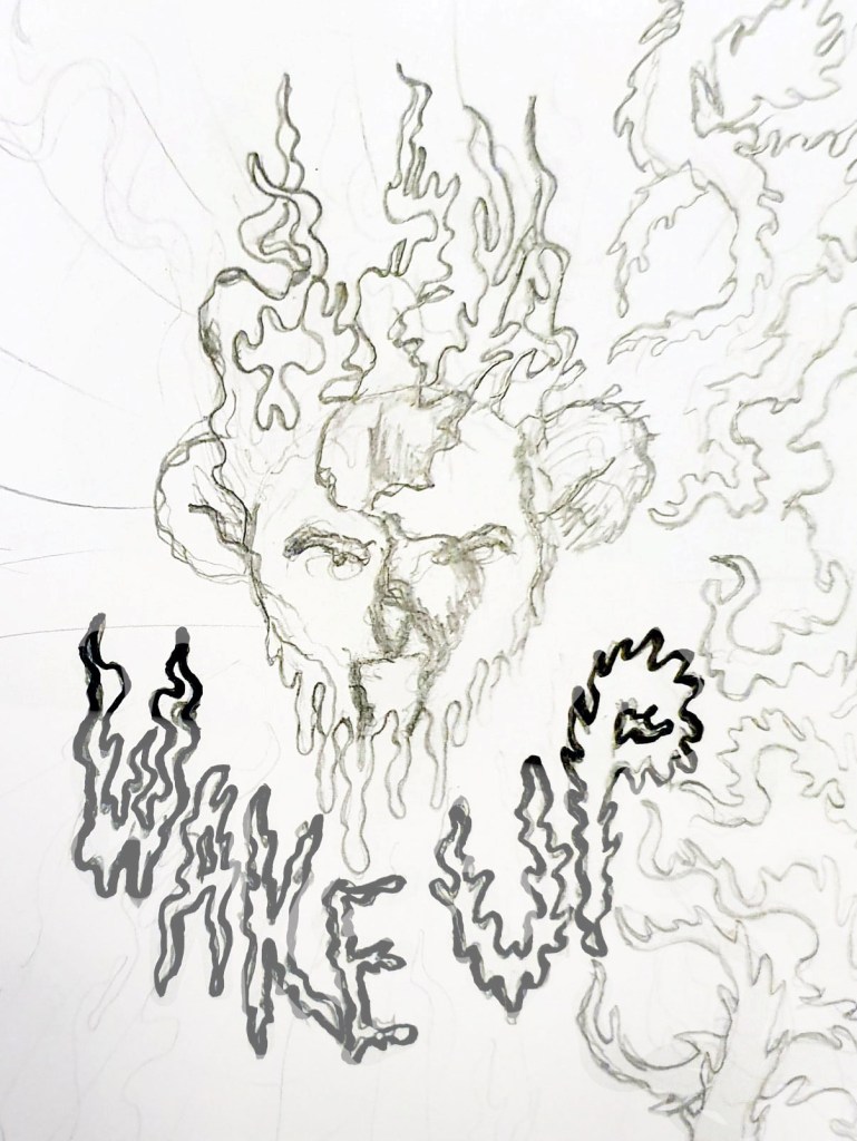
Now that I had an idea of what I was going to illustrate with my final print, I started sketching ideas of just how I could show the Australian bushfires and the impact that they are having. I made a few rough thumbnail sketches in pencil to get out some of my ideas which included:
The world being consumed by fire with a koala’s face emerging out in fear because the bushfires are the latest of the wildfires that have devastated the planet in the past year.
A Donald Trump earth laughing at the fires while a koala fell off the face of the earth, symbolising the risk of the koalas going extinct and just how little Trump cares about the environment (I thought this might be a bit too political so I didn’t take this idea forward)
A koala’s face on the Earth as it melted away in the flames, which would show the impact of climate change and how it is causing the ice caps to melt, as well as the impact the fires are having on the koalas.
Initial idea sketches for my final print.
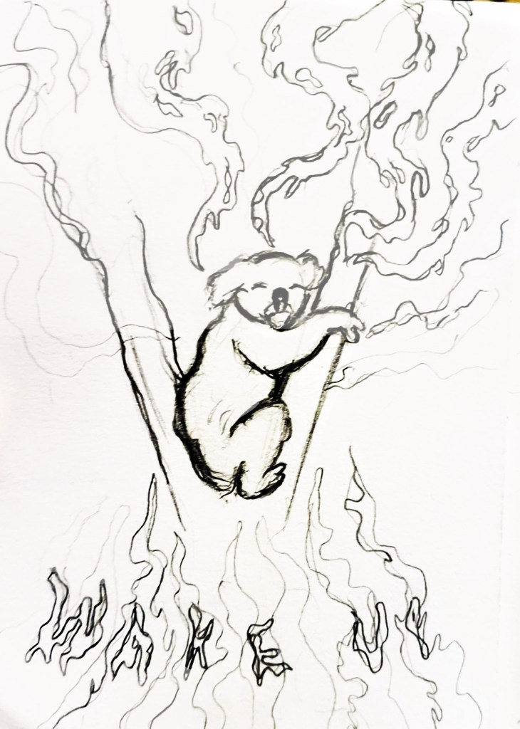
The sketch I decided to take forward.
All of these ideas seemed a bit too wide, they focused on the entire world, rather than just the area and the animals that are being affected by the fires, on previous projects I did focus on showing the environmental impact of climate change, but I haven’t really focused on the impact it is having on its inhabitants, with one billion animals being affected by the horrific blaze, this time needed to be different, the animals needed the centre stage. I kept the idea of having the flames framing the illustration, but instead of showing the whole Earth, I drew a lonely koala clinging to a tree for dear life amongst the oncoming flames I showed my sketches to a few people to get their opinion and to find out which one they thought would get the most attention, and they agreed that the lone koala in the tree was the saddest of the sketches and would get more of a reaction from the wider public.
Digital Koala Development
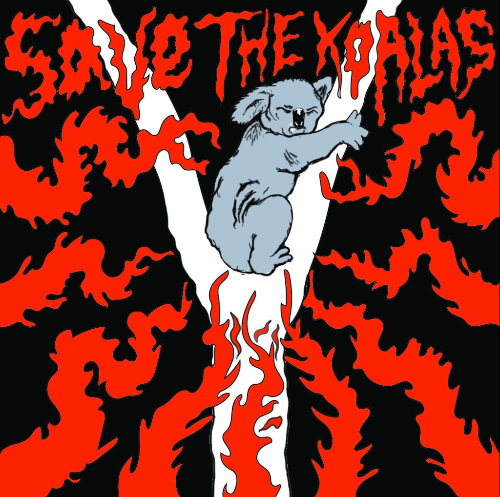
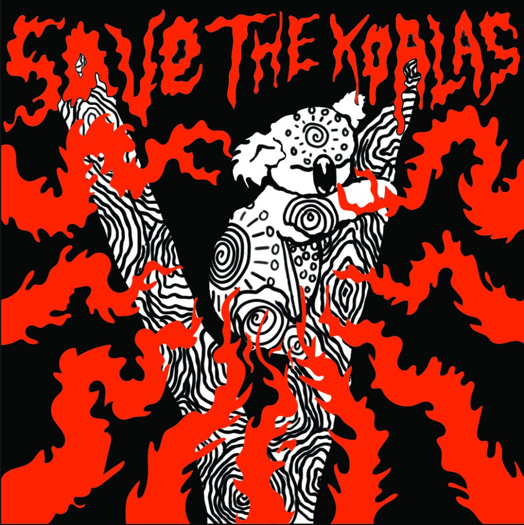
With the design picked, I developed the thumbnail sketch further by drawing it out in a larger scale in an a4 sketchbook before scanning it onto my laptop and going over the line work and colouring it in Illustrator/ Photoshop so that it looked more professional ahead of college on fast approaching Thursday. My tutors liked the design but pointed out that I had two styles going on at once, with the fire and text being done in one style and the koala being done in another. I had struggled with how to depict the koala, I went with a rather realistic approach because I didn’t want to do a cutesy cartoon koala that would take away from the seriousness of the situation, but the realism clashed with the rest of the piece so I agreed that I needed to redesign the koala. The problem I was having is that the koala isn’t a monster, it’s a victim and up until that point on the project I had been depicting climate change in the form of Lovecraftian creatures attacking the planet and reclaiming their home. This time however I was trying to show how vulnerable the animals in Australia are right now, they needed to be cute and upsetting, to evoke feelings of sadness and vulnerability so that people would do their best to help them. I redraw the koala 3 or 4 times before I finally came up with a design that felt right.
I looked at Australian aboriginal paintings of koalas as a source of inspiration which really helped me to figure out how to show the koala without making it too realistic. Unfortunately, I didn’t get the design right until the end of the day on Thursday, meaning that it was too late to send my design off to be prepared for print, which means that I am going to have to wait until next week to do this and come into college on a day that I am not scheduled to be in so that I can finish the project before the deadline next Thursday. This is fine for me though because I want to raise more money for charities to help save the animals in Australia, no matter what, and in order to do that, I need the prints. I just really hope that I am able to get everything done in time and that people do buy the prints when I try and sell them, this is the only way I know to raise money for the charities without having much reach in the field of illustration.
Final print design
Disclaimer; I am aware that Koalas are only one of the thousands of species that are being affected by the bushfires and I am not ignoring their struggle, but koalas are more well known and loved by many so I feel that they will help to get the attention of more people, which means that I have more chance of selling the prints and donating the proceeds to charities that are fighting to save all of the animals that are being affected by the wildfires.
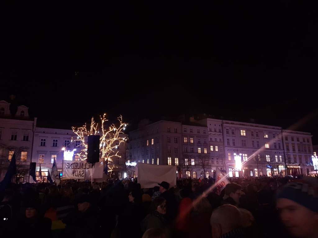
The past couple of days have been something else, and somewhat unexpected; upon arriving to Krakow to meet a friend of my girlfriend’s family, we were taken on a walk through the streets of Krakow at night and came across the beginnings of a protest against the government for plans to make the judges answer only to the right-wing, nationalist, conservative, Christian party that rules the country currently, which would potentially devastate the country, demolish the justice system and also risk Poland being kicked out of the EU by violating European law. I fully support the protests, despite not being Polish myself, my girlfriend is however and it is important to her and I also believe that judges should be allowed to make fair judgements without political interference and in any way that could allow guilty people walk free, so I am glad that we were taken to this protest, however, it was made slightly awkward by the fact that I still had my suitcase at this point, it was definitely a spontaneous affair.
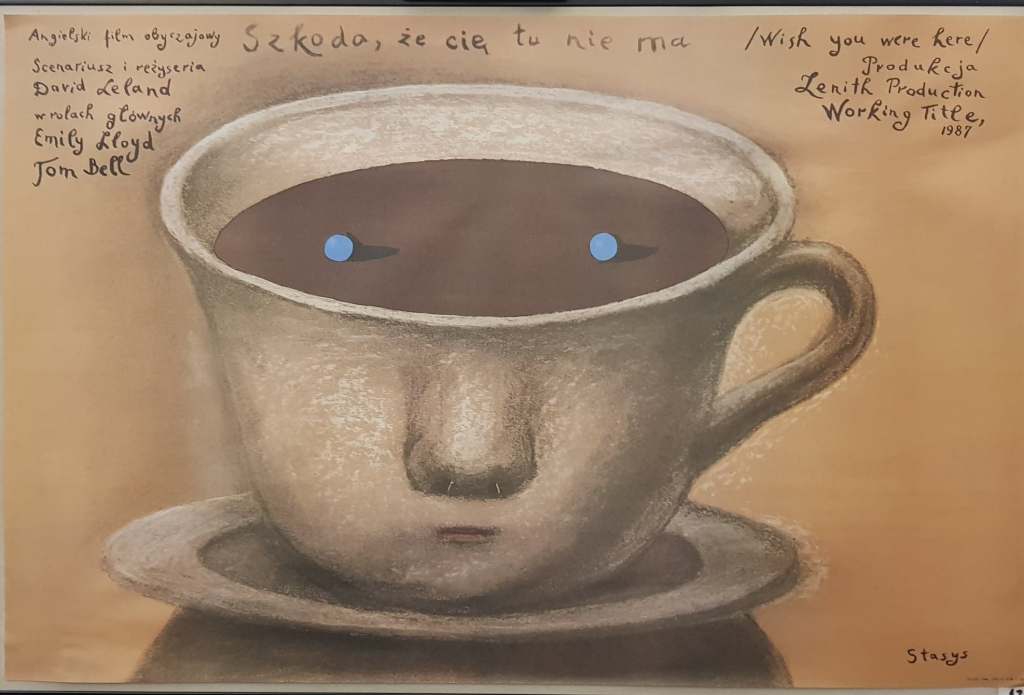
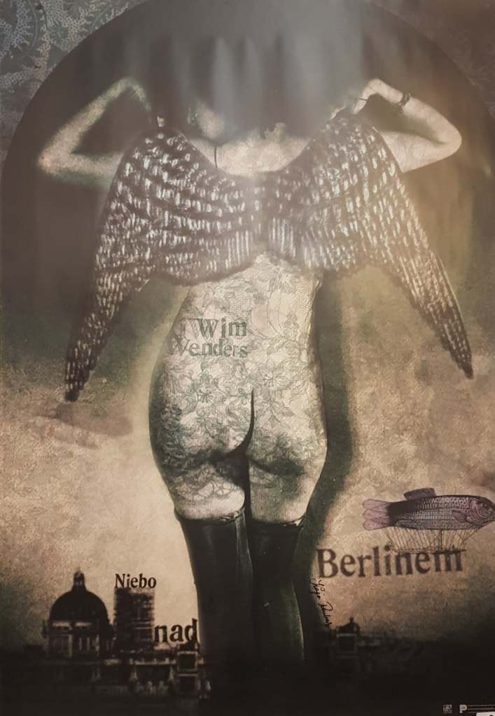
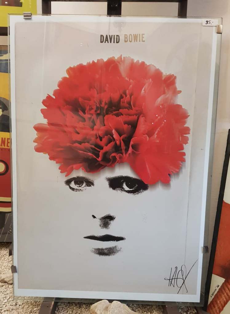
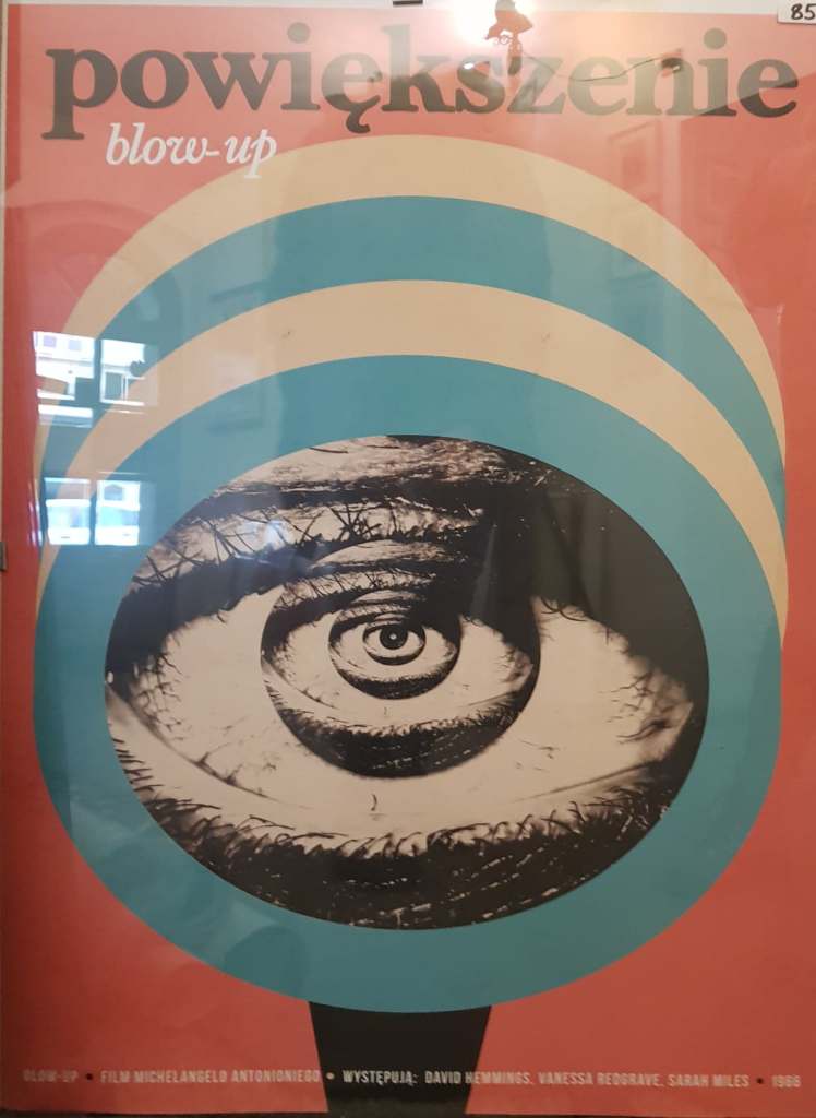
As well as attending the protest, we finally got to go to the Krakow Poster Gallery which I had been hoping to go to since arriving in Poland, when I arrived I must admit that I thought the place looked quite small, that did not however affect the sheer volume of posters that was inside. I was left stunned and amazed walking through that small building, seeing posters from all different generations and commercial avenues such as film, tv, theatre, music festivals, food, gigs and so much more. I could have spent so long in there staring and taking photos of all the posters that interested me, but as I said, the place was quite small and there was a few people inside so I felt quite awkward standing there and taking photos, I only managed to get a few of the ones that really stood out to me. It was so nice seeing so many different styles of art and it gave me a plethora of ideas of how I could layout my final poster design at the end of the print project. Being in such polluted cities and seeing first hand the effect that it is having on peoples’ lives has also given me ideas of what my design is going to depict. I’ve been doing my research on which industries contribute the most to pollution and one of the high flyers is the meat industry… now, at the time of writing I do still eat meat but I’ve cut back a lot and I have been thinking for a while that I want to give it up, I just knew that I had no chance of doing that over a Polish Christmas (there’s loads of meat and fish and barley a vegetarian option in sight) but I still feel as if I could take a swing at the meat industry this project, I may be vegetarian by the end of this trip.
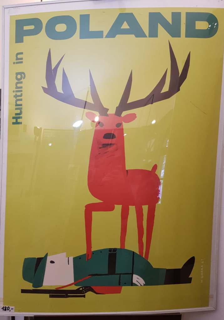
One of the posters that really stood out to me, especially as inspiration for this project was a one that said, ‘Hunting in Poland’ and depicted what I assume is a deer standing over the body of a hunter with its’ hoof on his chest. I couldn’t help but laugh a little at the sight of this, the role reversal is just spectacular, and I find it really refreshing to see something like this in a country where hunting is rather common and animal culls have happened numerous times in the past. My interpretation of the poster could be wrong but to me it is saying that the animals rule and not those that hunt them, that the hunters become the hunted and to be honest, that’s just karma.
It’s Riso print week next week, which will be interesting considering how iffy my one-page zine went. We aren’t doing it this week like I thought as one of my tutors wasn’t in so they’re giving us more time to get our sketchbooks up to date and do more of the prints we have already. I’m hoping that my risograph print goes better this time, at least the one-page zine experience taught me what not to do when it comes to risograph printing. I am still sceptical though of whether or not I’ll be able to achieve a good result though because the last riso print was only a 2 colour one and I’ve decided to be a bit more ambitious this time and try a 4-colour print, which might be my downfall, but I’m really happy with what I have designed so far so I really, really hope that I am able to create a good print out of it.
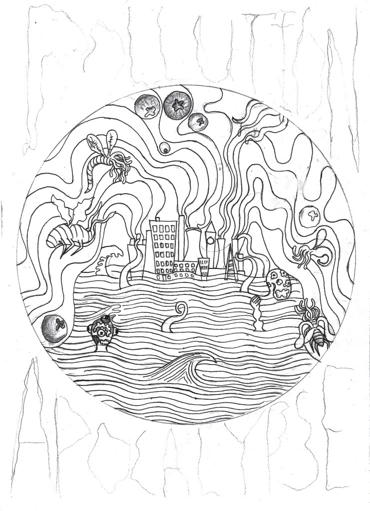
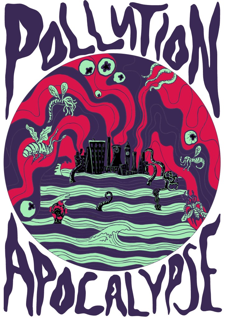
For the design I have once again decided to stick to the Lovecraftian/climate change theme that I’ve got going on right now, only this time I have made it blatantly clear that this is the issue I am trying to tackle, compared to my previous designs which were more subtle in tone. I have written ‘Pollution Apocalypse’ around the outside of the main design so that there is no confusion to the issues I am trying to convey. While apocalypse may sound a bit drastic and exaggerated, scientists would disagree given the fact 11,000 scientists have declared a global climate emergency, which sounds like the beginning of an apocalypse to me. The main focus of the design is a heavily polluted city that is pumping noxious gases into the atmosphere, causing the city to flood and attracting all manners of monsters to its’ centre. The creatures represent the end of life as we know it, as well as mother nature fighting back against the destruction that we as a species have caused.
Pollution Apocalypse Photoshop Design.
11,000 scientists declare global climate emergency and warn of ‘untold human suffering’.
I’m going to Poland for Christmas next Thursday and I’ll hopefully be visiting a lot of galleries, exhibitions and also doing art with my girlfriend’s dd who is a full on, free spirited artist and actually makes a living out of it. So I’m hoping that I’ll be able to write a lot of interesting blog posts while I’m away because I feel like my blog is a little bland right now, I haven’t really had time to go to exhibitions and things like that because I’m so invested in each project that I don’t get out much. But yeah, anyway, hopefully a lot of interesting posts and photos of Polish art and inspiration happening in the coming weeks. I’m really looking forward to immersing myself in all sorts of different art that I haven’t seen before, and hopefully seeing some of Van Gogh’s work because he is one of my favourite artists of all time and I’m pretty sure some of his work is on display at a gallery in Krakow. The only thing I am slightly concerned about is the fact I am going to miss 2 days in college before Christmas which could potentially set me behind in the project before the hand in day in January, however, I have already done a lot of printing and my sketchbook is almost up to date so I should be fine, as long as I do some work while I am away.
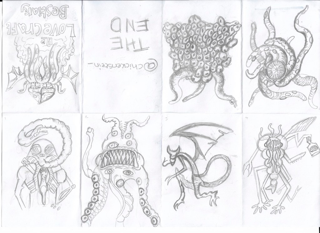
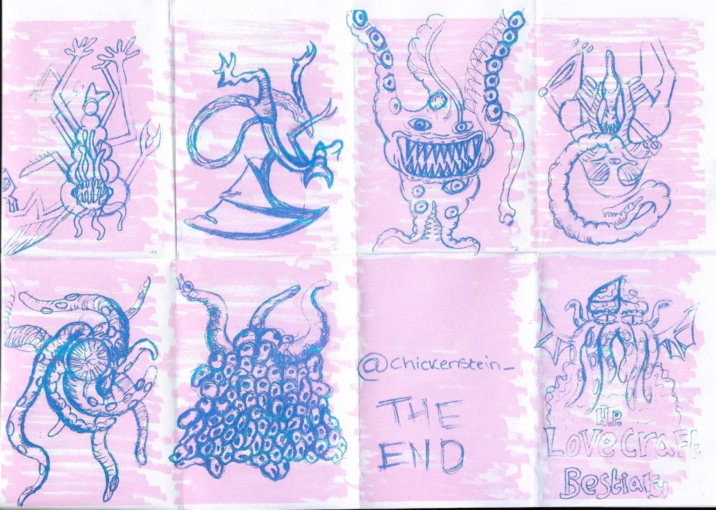
This week has been a fun one, we’ve done so much printmaking, including printing an unexpected one-page zine on Monday. I kept with my Lovecraftian theme and created a bestiary of his monsters, I was really happy with the designs I drew, but the finished zine did not go to plan at all. I think I rushed the background a bit and I hadn’t done risograph printing before, so despite having researched the process, I wasn’t entirely sure how it would work in practice. I drew my monster sketches in pencil and scribbled the background in pen, which in hindsight wasn’t the best idea because when it came to printing the zine, the background overpowered my illustrations and the risograph printed wasn’t able to pick up much of the detail of my pencil sketches so the final zine looks like a bit of a mess. It was a good learning exercise though, at least I know that next time I riso print, I need to make my line work bolder and the background needs to be done in a lighter tone to the foreground.
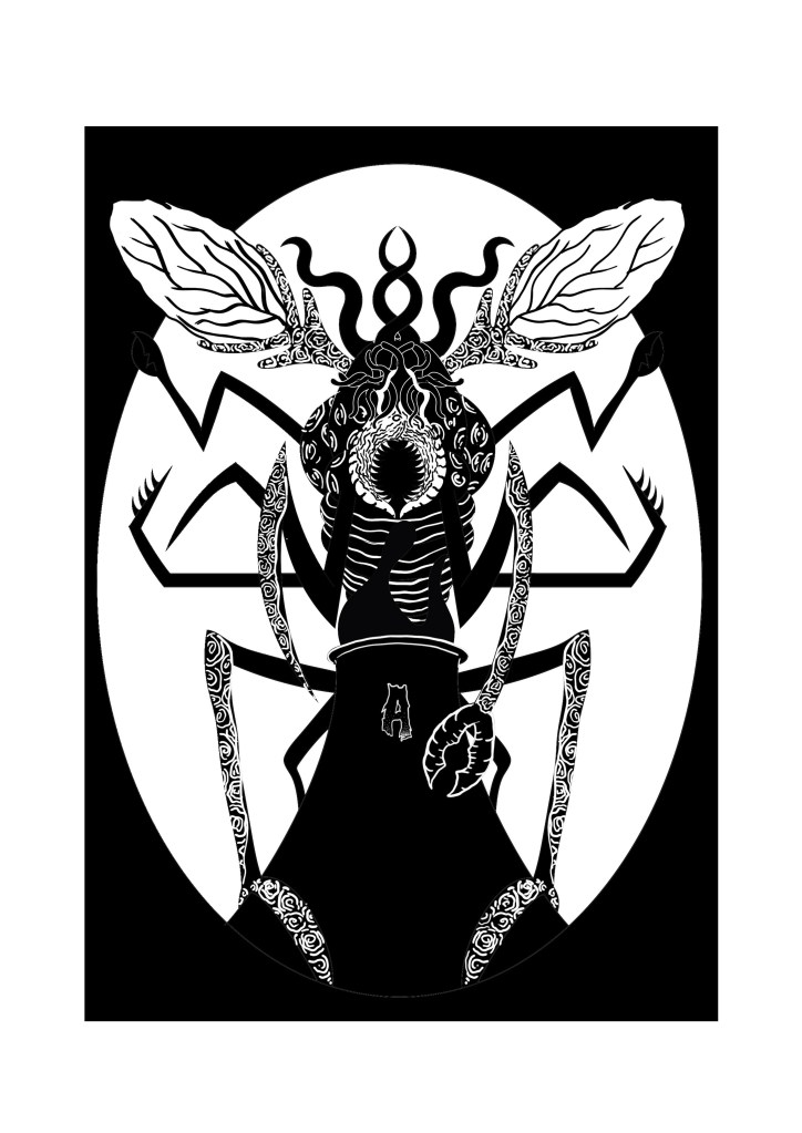
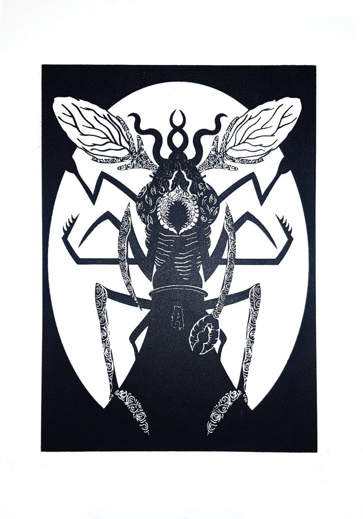
The zines were only the first part of printing we did on Monday, in the afternoon we went to the print workshop to make our screens for screen printing the 2nd of our designs. It cost £14 for the screens which is a bit on the high side for me because I’m having some money issues in the run up to Christmas, but after actually using the screen, I know it was a worthwhile investment because I can print that design as much as I want now and also change the screen and use the same frame for any other designs I make in the future. I managed to do a design that I am really happy with, it depicted one of Lovecraft’s monsters, a Mi-Go, perched over a power-plant and feeding off of its fumes. I chose to depict this because in Lovecraft lore, the Mi-Go awakens from its slumber when it gets warm and power plants heavily contribute to global warming. I wanted to show how horrible and horrific the world could be if it keeps heating up at the rate it is, using the Mi-go to depict the horrors of what life would be like in a scorching, desolate Earth. I’m once again not 100% certain if my illustration conveys the message that I want it to though, I know what it means, but I’m not convinced that other people will, they’d probably just a cool giant bug creature so when I do more designs this project I need to make the climate change and global warming message clearer, while still using Lovecraftian creatures so that I stick to the theme that I’ve chosen for this project.
Sketched in pencil, refined in Illustrator and finished in Photoshop.
I screen-printed this design on to 200gsm paper.
Relief printed with an acrylic block and ink and put through a roller press.
I had to send my first design back off to the wood workshop place to be re- laser cut because I made a mistake with the formatting when I send it off the first time (no surprises there) so some of my design was missing from the acrylic plate, this all got sorted by Thursday though so I managed to create a lot of prints of both of the designs. I’ll post photos of the prints next week once the ink has all dried. I’ve thoroughly enjoyed printing so far, I’m just not sure about risograph printing yet, probably because it is the one that went the worst for me. I totally get the appeal of risograph printing, it’s so easy to create a huge run of prints, I just haven’t quite figured out how to make the process work for me yet, hopefully over the weekend I’ll be able to create a design that works because we are creating an A3 riso-print on Monday. It’d be great if I had another design to add to my permanent print collection. I already have some ideas of what I’m going to depict, I plan on showing a modern polluted and poisoned world with buildings that everyone should be able to recognise, inspired by Lovecraft’s short story ‘The Colour Out of Space’, I’ll leave a link to the story on this post. I’m hoping that I can make my message clear this time, hopefully 3rd time’s the charm.
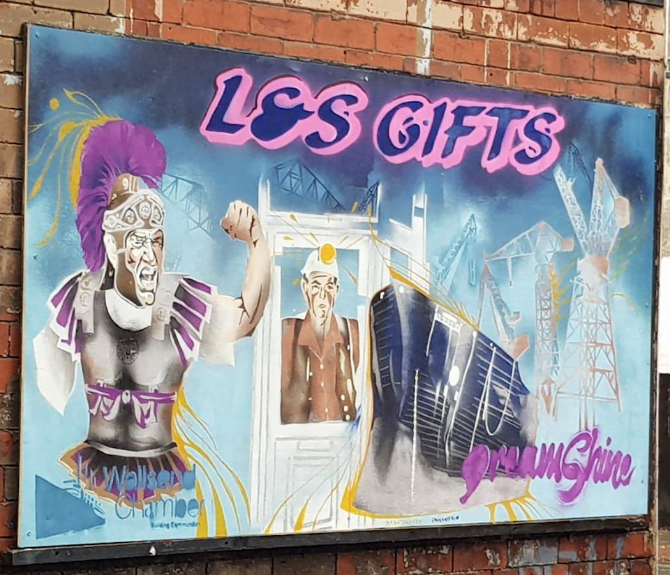
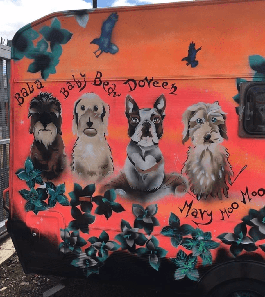
Mural painted by Iga Pencak for L&S Gifts in Wallsend.
I’m so happy with myself right now, I got a high merit (or a 2:1) on my first university project in almost a year!! I was so worried that I’d only get a pass, but all of the work I put into the Character Design project finally paid off. The mural that my girlfriend was commissioned to do got finished on time too and the woman commissioned her loved it, I was so happy that it worked out and the mural is now displayed in Wallsend, hopefully forever. I did struggle to get all of the research done on time and to be honest, I still have one form of printing to research so I am a little bit behind right now. I’ll catch up though, now that the mural is out of the way. I would love to get a distinction at the end of the course, the only reason I didn’t get one this time is because I had an idea of what Skaadi would look like from the start and I stuck with that design throughout the entire project. In the future I need to explore different designs and develop my characters and ideas more. I do struggle with this to be honest; I think too much about what I want to achieve and once I have a solid idea, I just stick to it. I really should sketch out multiple designs first and be a bit more adventurous with my development instead of just keeping my ideas exactly the same from start to finish.
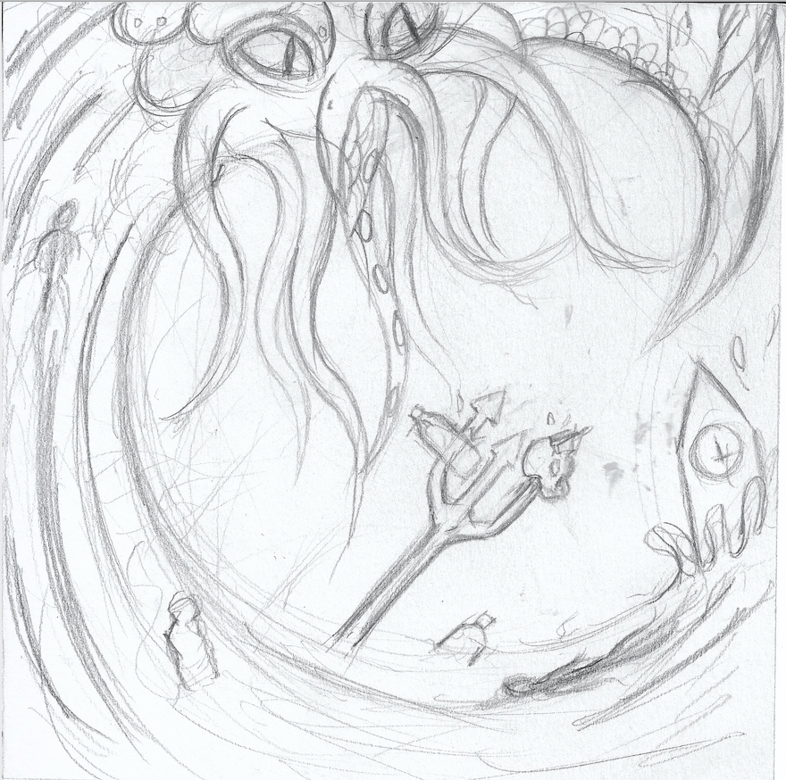
First print design , 2b pencil on paper.
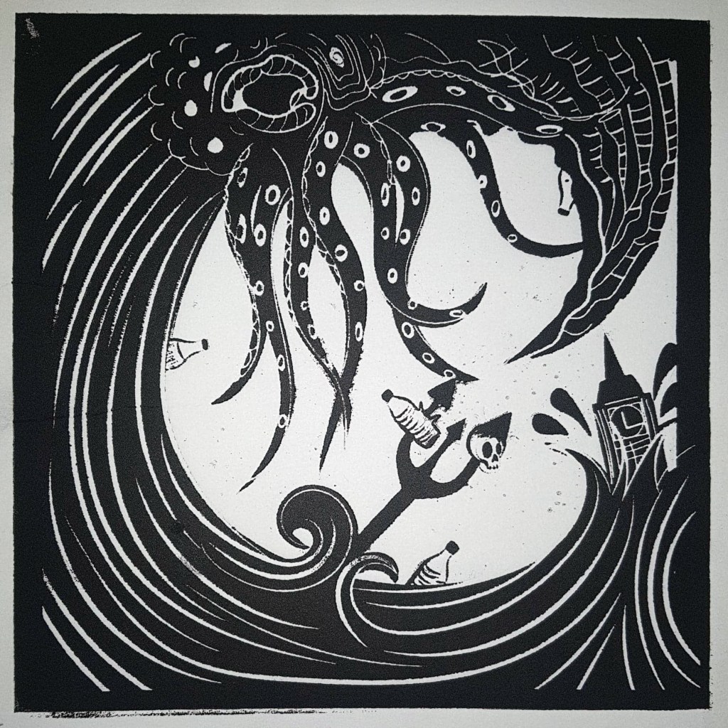
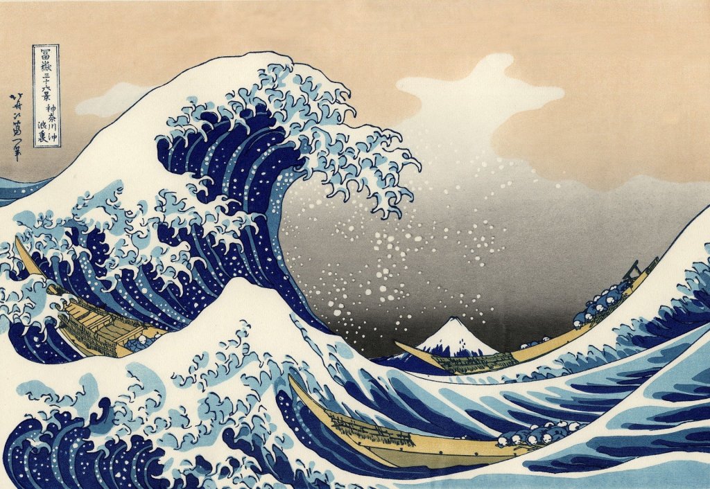
Since last week I’ve managed to finish researching all of the artists that were set to us by the tutors, including Hokusai, Liv Rainey-Smith and Jack Davis, and I’ve researched relief printing and risograph printing, all that’s left to do as far as the research goes is screen-print research, technically we we’re supposed to have finished this by now so I have made things a bit harder for myself but I’m not too worried; I like the writing and research side of things so it shouldn’t take me too long. As well as the research I’ve also completed my first design for printing, I opted to draw Cthulhu riding a plastic polluted Hokusai inspired wave, with a trident piercing a skull and water bottle at the moment the wave crashes over Big Ben. It sounds like a lot I know but I don’t know how else to put it, I chose to do this design because alike the Skaadi project where I made my design depict the Amazon Rainforest crisis, I wanted to make my designs this project convey some of the horrific issues that are facing our world today. I chose to depict the ongoing plastic pollution problem that is threatening our oceans because it is something that could and probably will wipe out much of our known world if we don’t do something about it. My design serves as a warning, with Cthulhu symbolising the horrors of pollution and the great wave that could flood the world if the ice caps continue to melt and the sea levels rise.
Initial print design idea. 2b pencil on paper. Inspired by Hokusai.
I struggled with designing this because I knew what I wanted to convey, I just didn’t know how, I’m not even sure if my final design is effective at getting the message across, my original sketch was far too derivative of Hokusai, it took me a couple of attempts to get something that I was happy with. Time was against me though and I had to settle with what I had, it’s not that I don’t like the design, it’s just missing something where the white space is. I guess can always paint over the design once it’s been printed or redo it in my own time, but the main thing is that the design has been sent off to the right place for it to be laser cut onto acrylic ready for printing. Speaking about sending the file off, I once again struggled with formatting my design correctly to be laser cut, my tutor told us how to do it but a lot of the information got lost to me in my head, I don’t know if it’s because he was throwing a lot of information at the class really fast, or because I wasn’t paying attention enough due to the fact I get anxious in clss. Either way, I need to work on my ability to format things, I keep meaning to take a notebook to class with me so that I can take notes on how to do these things, but ironically, I keep forgetting to do so. I will try to take a notebook next time because I am sick of feeling kind of stupid when I have to keep asking the tutors to help me send files to certain places to be marked or printed. I don’t see many other people needing help with this and to be perfectly honest, I don’t want to have to either. I think we are printing the design on Monday which I am looking forward to, it’d be good to finally have a design that I can print over and over again, it could be something that I end up selling on Etsy which would be nice. We’ve already been asked to create another design for a different form of printmaking that we’ll be doing soon, which is great because I’ll have a lot of reproduceable designs in the near future. I’m probably going to stick with the Lovecraftian take on modern day issues theme that I’ve started with the Cthulhu design, so I guess I’m going to need to look for a more obscure one of his creatures, I don’t want to only use Cthulhu in my designs. I love H.P. Lovecraft though, so the next weekend is going to be quite fun.
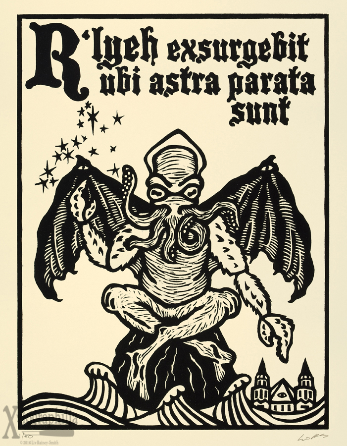
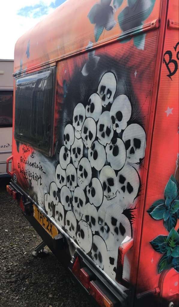
Well, this has a been a pretty productive week so far, I’ve done over half of the research and figured out which of my own artists I am going to choose to research once I’ve finished the ones set by my tutors. I found a really cool woodcut printmaker called Liv Rainey-Smith who does some seriously gothic, Lovecraftian designs; her work is right up my alley and is definitely going to tie into my more macabre theme that I plan on running with this project, with H.P. Lovecraft being one of the godfathers of horror, he even has a branch of horror named after him! The level of detail Rainey-Smith achieves with woodcut is mind-blowing too, it’s almost hard to believe that she’s using woodcut to create her designs. I’m getting so excited about this project now; I think I’m going to hone the spirit of Lovecraft with my designs this time too. The only thing I’m worried about is whether or not I am going to have time to finish the research because my girlfriend is working on a large mural commission that is going up in Wallsend and it’s looking like she is going to need help finishing it before the deadline on Saturday. I may have to put my research project on hold for a couple of days to make sure that the mural gets finished on time and do my best to catch up on the research afterwards. I just can’t let her struggle like this, we’ve collaborated on murals before, we painted a caravan together and work well together so I’m confident that if I help her then it’ll get done on time and then I can wholly focus on the research afterwards, even if it means staying up most of the night on Sunday, it’s not like I have a project hand in on Monday, her deadline is more important right now.
Photos from the caravan me and @babajagaart panted a while back.
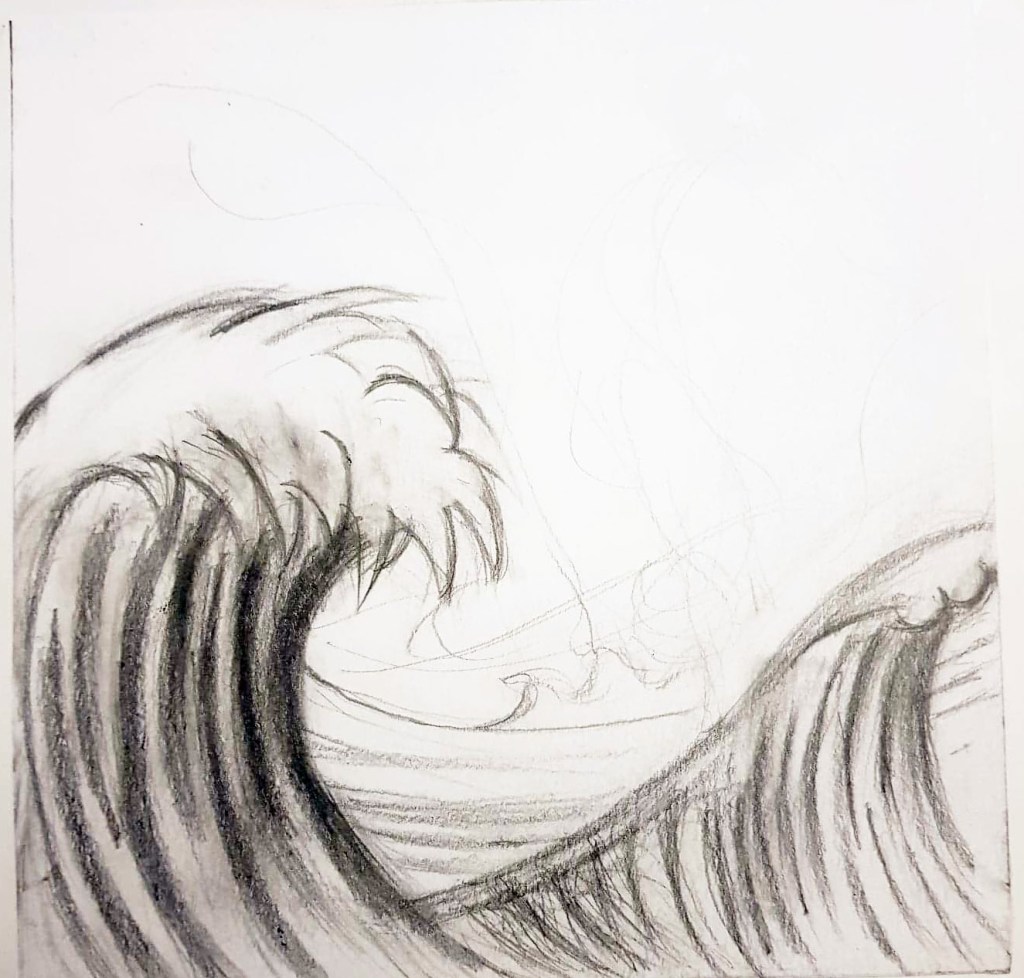
The Great Wave off Kanagawa- Hokusai
All of this said, I am still going to do bits of research in between painting the mural, like when the paint is drying etc, so hopefully I won’t have a horrific amount to do on Sunday. As well as Liv Rainey-Smith, I plan on researching the legendary Hokusai, I mean how could I not research him for the purpose of a print project, he literally revolutionised relief printing and took it into a whole other realm. I’m not usually that interested in the historical artists, which I know is bad because we wouldn’t be where we are with art without them, however, there are a few historical artists that I’m really interested in and Hokusai is one of them. I don’t really know a lot about him as a person or artist, only what I’ve seen of his work like the great wave so it will be interesting to research him properly and find out how he achieved so much in his life, maybe I could learn something that I could apply to my own artistic practice.
The third and final artist that I’m going to research isn’t even a print maker at all, which I’m hoping won’t be a problem, I’m not sure if we’re only supposed to research artists that make prints. Anyway, I’m going to research Jack Davis, best known for his work on the Creepshow comics, I’ve chosen him as more of a style reference than anything else, he used to create highly bizarre and macabre characters that I think could inspire my own horror focused style during the print project. I’m really hoping that we get to create enough prints to take home and not just prints for the course during the project because I wouldn’t mind selling some on etsy or something, it’s not exactly making comics but I have thought about selling art prints and getting myself out there for a while, I’ve just never had the resources to do so and I’m hoping exploring all of the print facilities I’ll have access to on the upcoming project will change that. I’m happy that we are going to be doing different types of printing because I’ll be able to figure out which one works out best for me, who knows, it could even be the start of a print business venture for me.