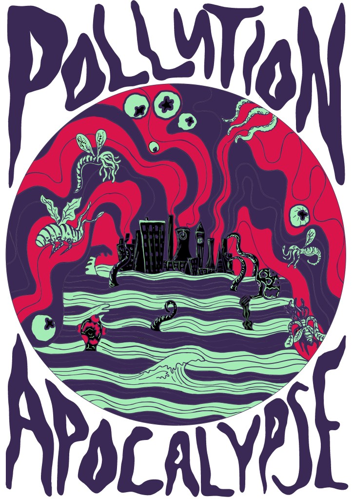
It’s Riso print week next week, which will be interesting considering how iffy my one-page zine went. We aren’t doing it this week like I thought as one of my tutors wasn’t in so they’re giving us more time to get our sketchbooks up to date and do more of the prints we have already. I’m hoping that my risograph print goes better this time, at least the one-page zine experience taught me what not to do when it comes to risograph printing. I am still sceptical though of whether or not I’ll be able to achieve a good result though because the last riso print was only a 2 colour one and I’ve decided to be a bit more ambitious this time and try a 4-colour print, which might be my downfall, but I’m really happy with what I have designed so far so I really, really hope that I am able to create a good print out of it.
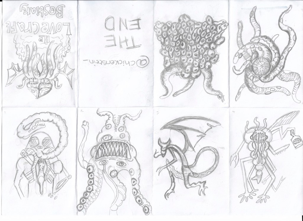
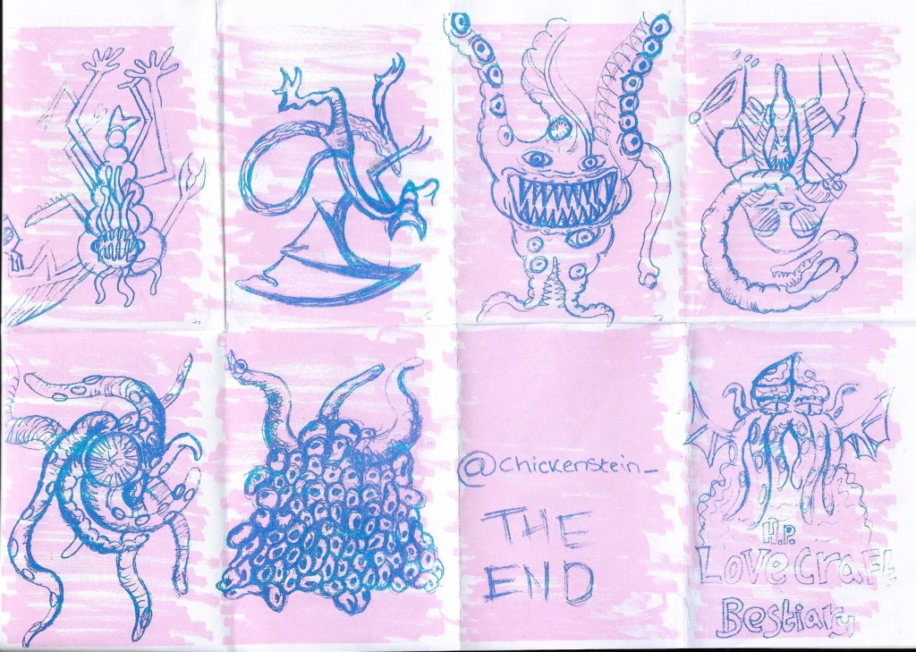
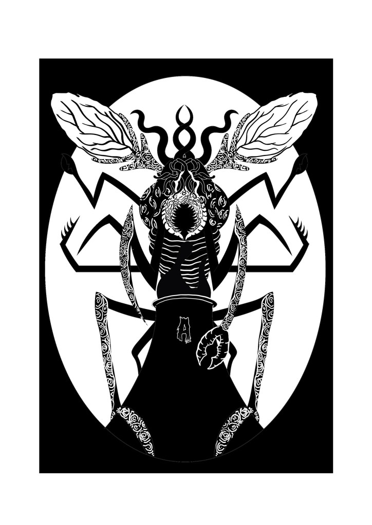
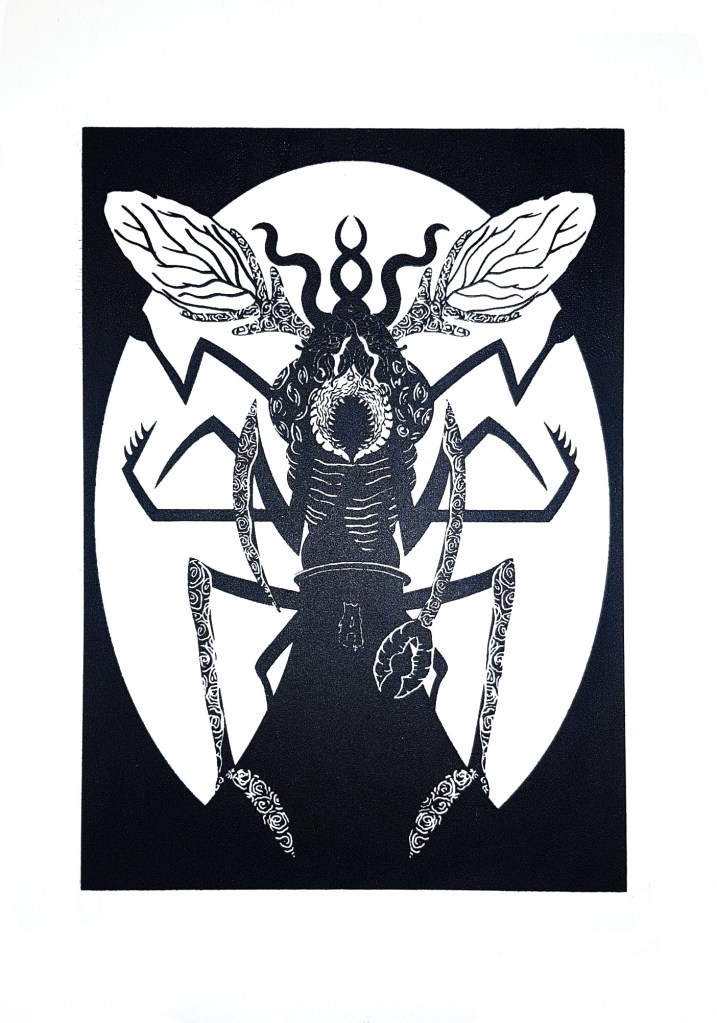
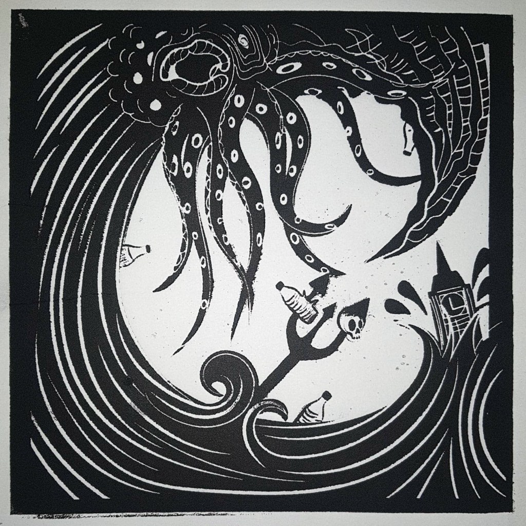
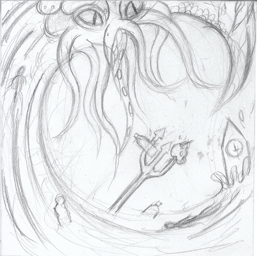
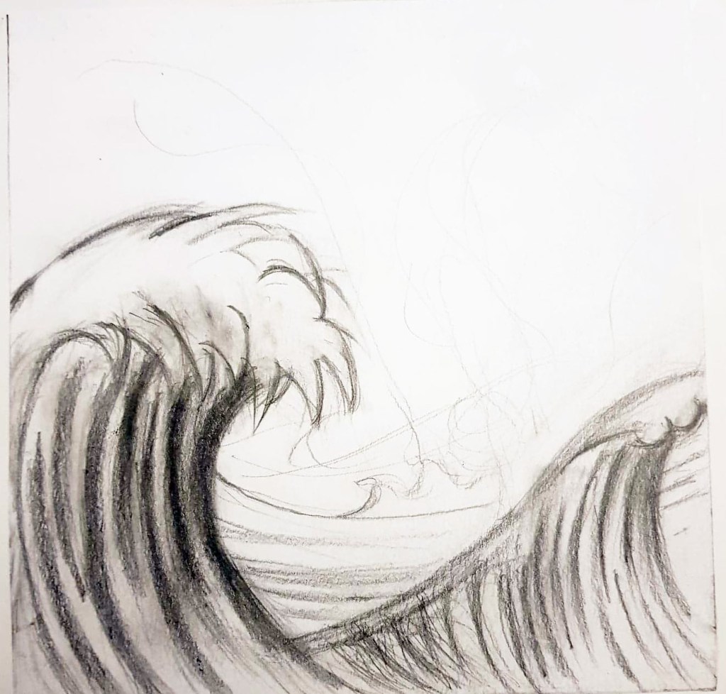
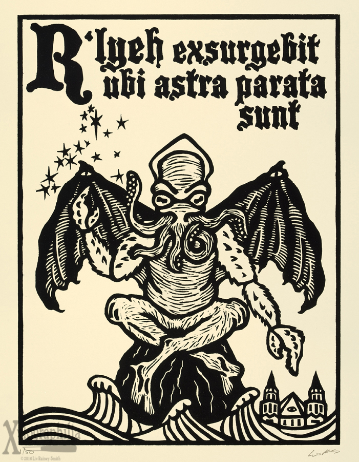
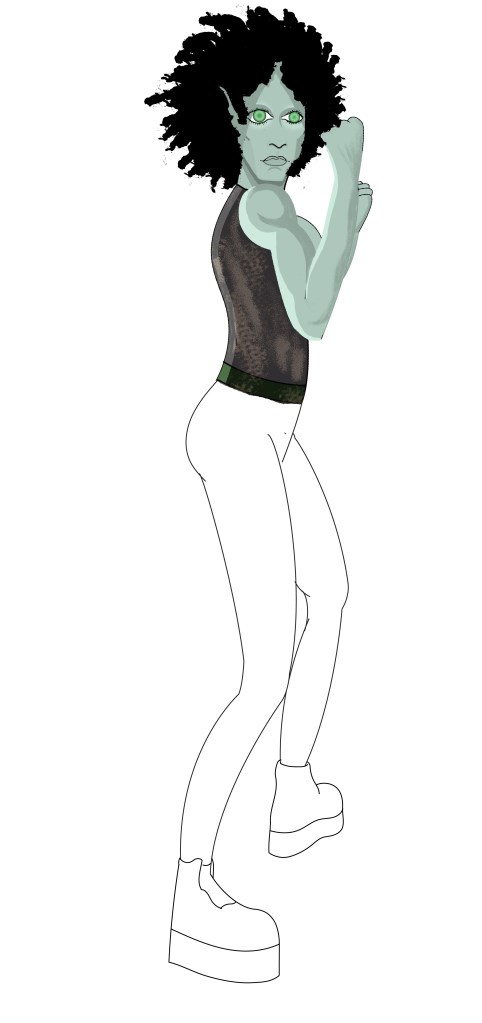
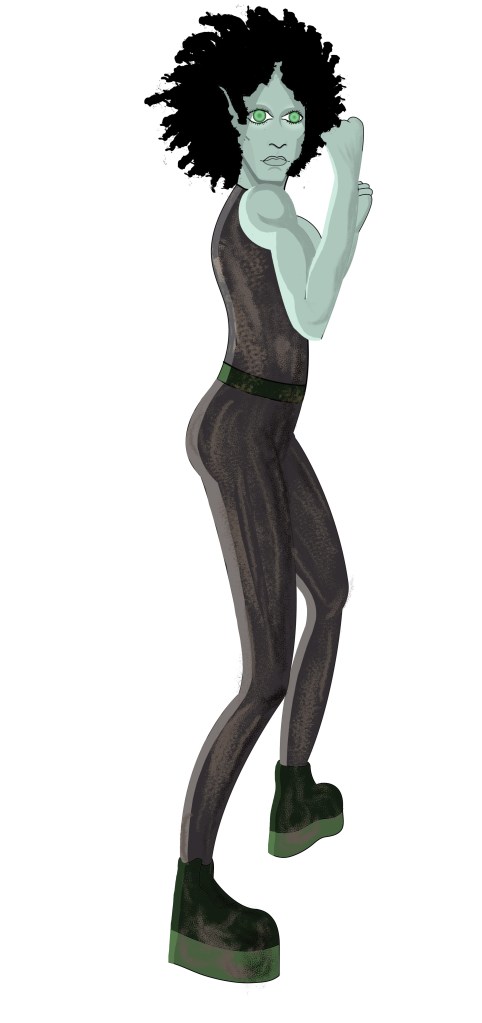
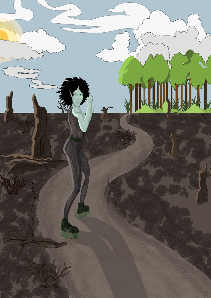
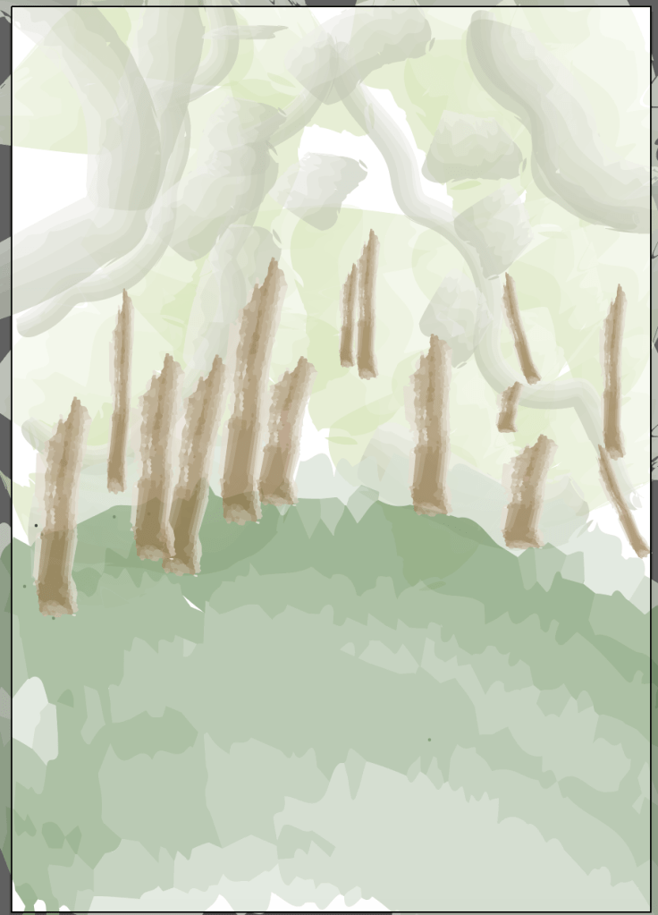
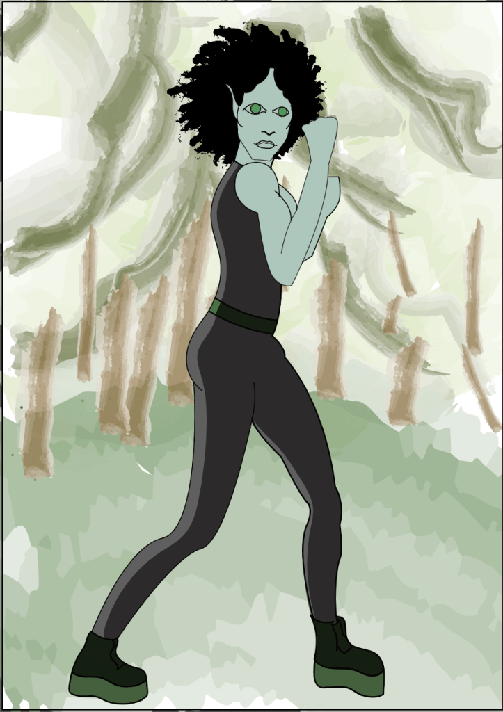
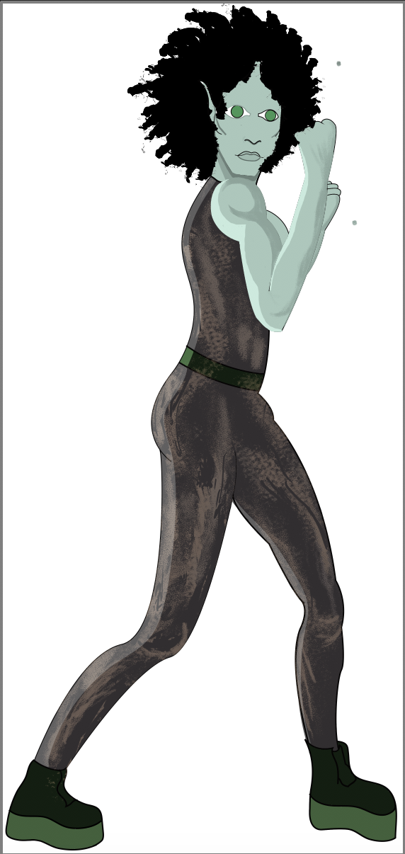
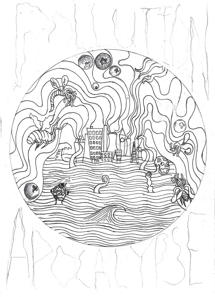
For the design I have once again decided to stick to the Lovecraftian/climate change theme that I’ve got going on right now, only this time I have made it blatantly clear that this is the issue I am trying to tackle, compared to my previous designs which were more subtle in tone. I have written ‘Pollution Apocalypse’ around the outside of the main design so that there is no confusion to the issues I am trying to convey. While apocalypse may sound a bit drastic and exaggerated, scientists would disagree given the fact 11,000 scientists have declared a global climate emergency, which sounds like the beginning of an apocalypse to me. The main focus of the design is a heavily polluted city that is pumping noxious gases into the atmosphere, causing the city to flood and attracting all manners of monsters to its’ centre. The creatures represent the end of life as we know it, as well as mother nature fighting back against the destruction that we as a species have caused.
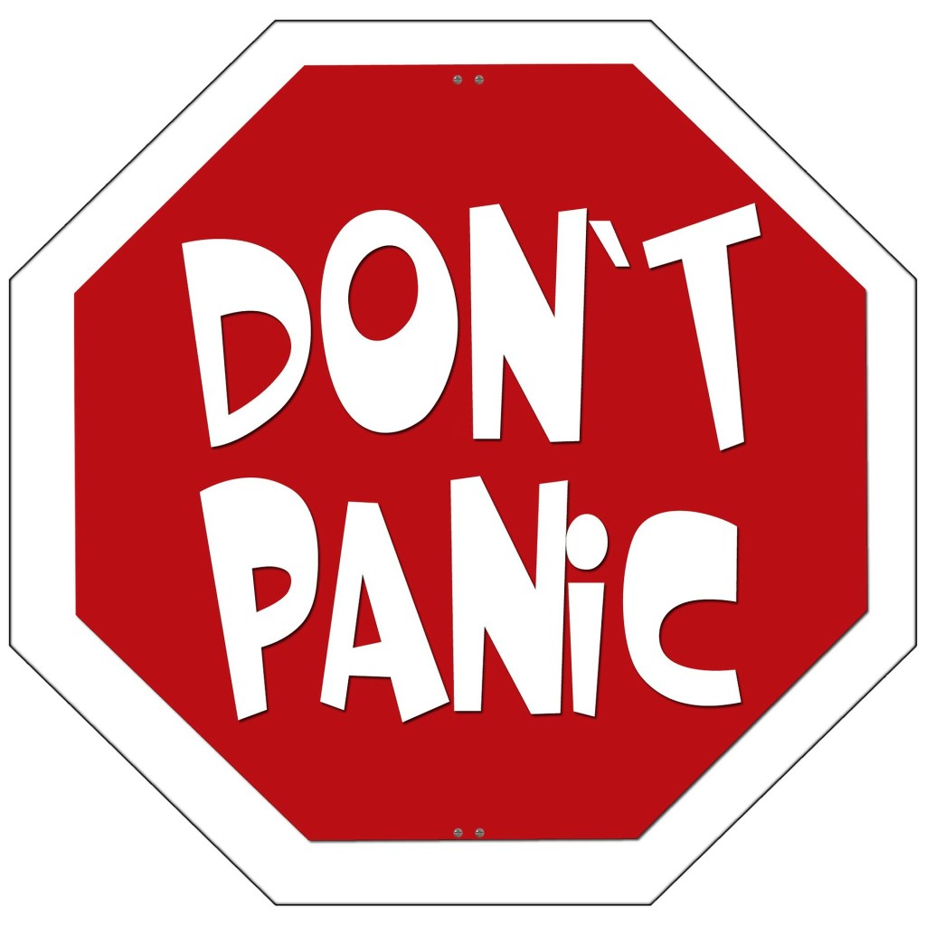
11,000 scientists declare global climate emergency and warn of ‘untold human suffering’.
Weston, P. (2019). 11,000 scientists declare global climate emergency and warn of ‘untold human suffering’. [online] The Independent. Available at: https://www.independent.co.uk/environment/climate-emergency-scientists-emissions-letter-climate-change-a9185786.html [Accessed 5 Nov. 2019].
I’m going to Poland for Christmas next Thursday and I’ll hopefully be visiting a lot of galleries, exhibitions and also doing art with my girlfriend’s dd who is a full on, free spirited artist and actually makes a living out of it. So I’m hoping that I’ll be able to write a lot of interesting blog posts while I’m away because I feel like my blog is a little bland right now, I haven’t really had time to go to exhibitions and things like that because I’m so invested in each project that I don’t get out much. But yeah, anyway, hopefully a lot of interesting posts and photos of Polish art and inspiration happening in the coming weeks. I’m really looking forward to immersing myself in all sorts of different art that I haven’t seen before, and hopefully seeing some of Van Gogh’s work because he is one of my favourite artists of all time and I’m pretty sure some of his work is on display at a gallery in Krakow. The only thing I am slightly concerned about is the fact I am going to miss 2 days in college before Christmas which could potentially set me behind in the project before the hand in day in January, however, I have already done a lot of printing and my sketchbook is almost up to date so I should be fine, as long as I do some work while I am away.