Coming to Terms With Life in Lockdown- Final Project Week 3

This has been a more productive week than last week, I have managed to develop my initial sketches further into more detailed illustrations. I am not completely happy with all of them because they are still a bit all over the place and are nowhere near good enough to go into the zine, but they are an improvement on my initial designs.

I’m still behind schedule on my weekly planner, which I guess is to be expected considering the state of the world right now. Though technically I have more time now, I’m still finding it difficult to motivate myself at home. I was hoping that by now I would have adjusted to the situation, but I haven’t, I miss being able to leave the house and going into college to knock out tons of work in a day. I miss seeing my tutors and the few people I talk to in college, I’m realising how helpful it was to be around a bunch of creatives that are all working, it definitely motivates me. Nevertheless, I am doing my best at home, I’m trying to work consistently, even if my work hours have changed. And while I may not feel like I’m doing as much work as usual, I am still working hard and not giving up. I also have my girlfriend and aunt to talk to and throw ideas off of which I am grateful for, life would have been much harder if I was still in London right now.

Plastic Orca Development Sketch

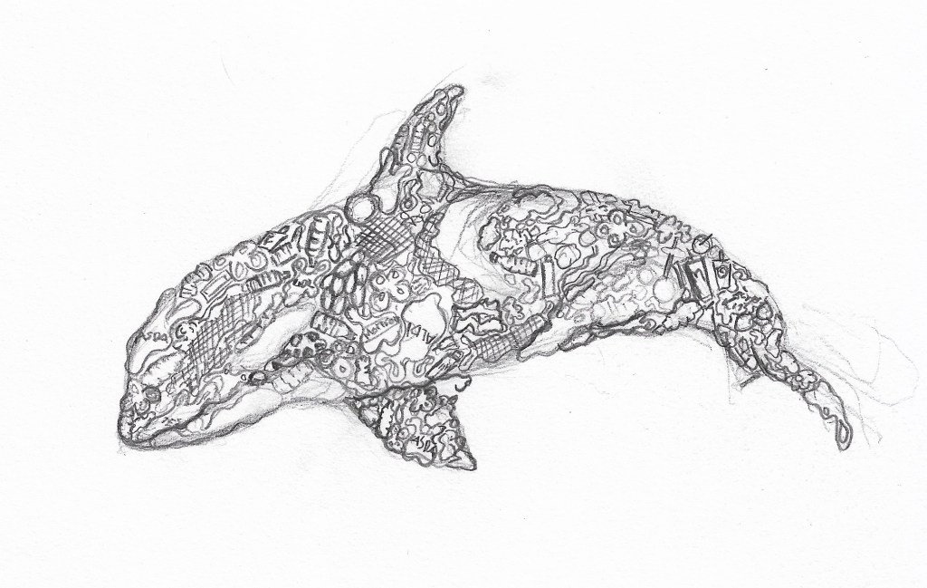
I am most happy with my orca development illustration which looks most like I see it in my mind. So far, I have only used pencils to create my illustrations, I intend to spend the next week or two working on media testing and layout ideas. I am going to experiment with watercolours, brush pens, digital painting and collage, with the possibility of trying out soft pastels again. I will only try soft pastels if I am able to get access to some, which so far is proving difficult due to shops being closed, I already have the rest of the materials to hand in my home.

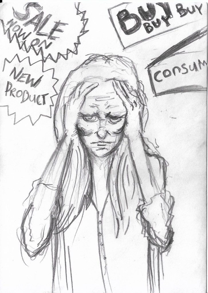
I am also quite happy with my advertisement anxiety development illustration, there is a lot of energy emanating off of it and it’s overtly dramatic, in a good way. There is still a lot of room for improvement with it however, the drawing is still very sketchy and the proportions of the women needs to be improved. I’m still not the most comfortable with drawing people, which is exactly why I need to draw them more, practice makes perfect and all that jazz. I know I’m going to need to draw people if I want to become an editorial illustrator so I’m using the time I have now to get better at them.

Advertisement Anxiety Development Sketch

Speaking of time, if this lockdown situation is still happening over the summer after I have handed in my final project then I am planning on using the time to create a spreadsheet of art directors’ details that I am interested in working for. As well as this, I will also create a series of illustrations that are tailored to publications such as Little White Lies, New Scientist and the Guardian, in the hope that I get onto their radars and get the opportunity to illustrate for them. It would be a great way to get myself out into the world and get some cliental. At the very least, the illustrations would be great for my portfolio, even if they don’t get me work with the companies.

Planet Consumption Development Sketch

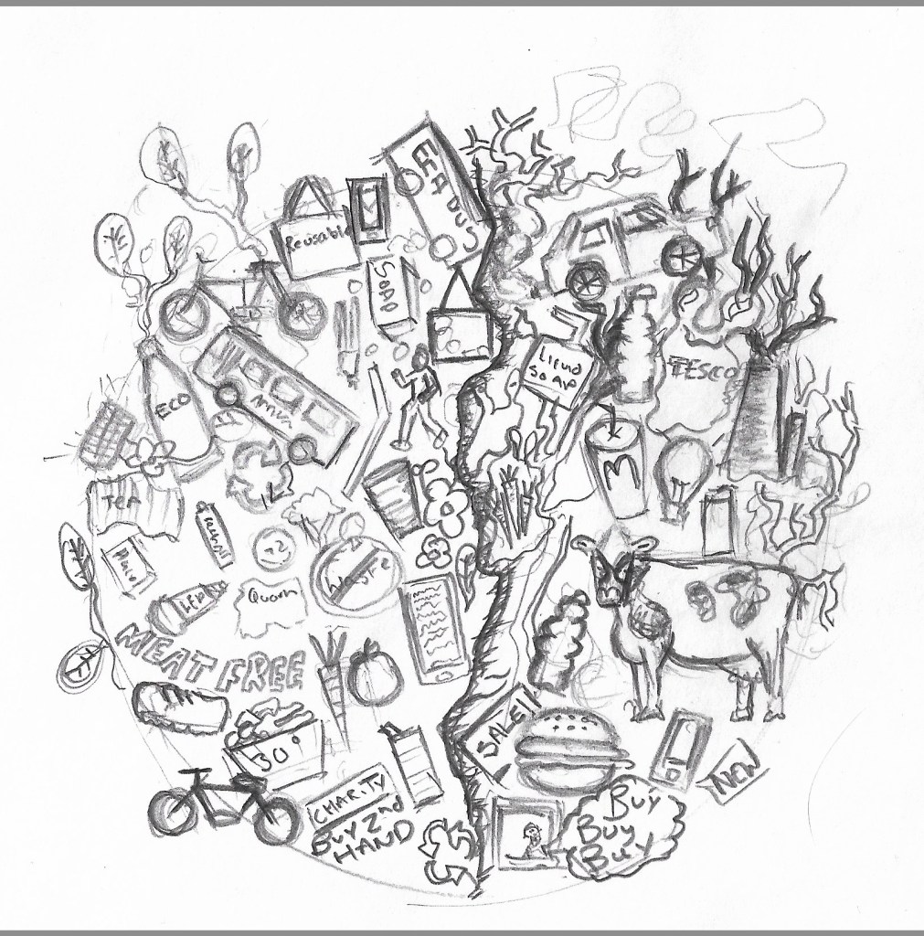
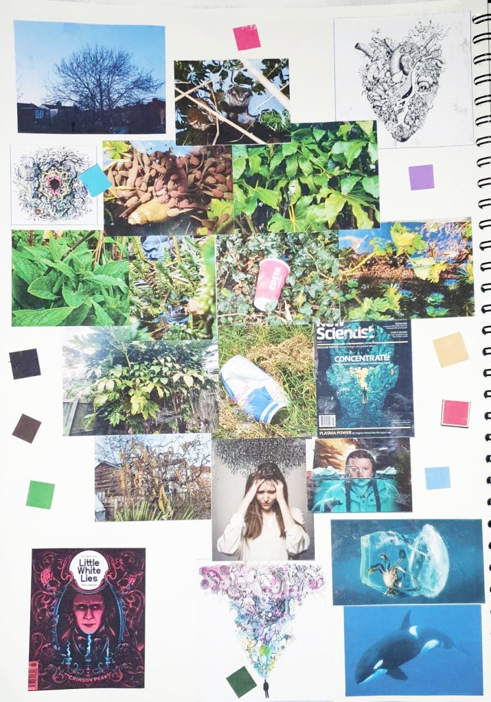
I started struggling with coming up with ideas for how to develop my designs further, and what colours to use on them. It is because of this that I decided to do something that I should have done much earlier in the project, I created a mind map that gathers a bunch of imagery and colour swatches on one page to help me get inspired during the remainder of the project.

The Printed Project Hand In

Save The Koalas Black And White Variant.

I had a bit of a stressful week the past week when it came to getting my prints ready to hand in, the screenprinting process wasn’t as easy as I thought it would be. Printing two colours is definitely a lot harder than one because you’ve got to perfectly line up each colour layer. I originally made the mistake of screenprinting the black layer before the orange layer, so when I tried to print colour over the black, parts of the design just got enveloped in the void. It also became a lot harder to line up each layer and I ended up creating a lot of offset prints. The same thing happened a while ago with risograph printing, but I was certain that the problem woudn’t be repeated with screenprinting, I was wrong. I kept getting unlucky with mesh screens too, both of the ones I used had marks on them which stopped my design being transferred properly, so whenever I tried printing a layer, a small part of my design was missing, a problem I just had to work with. Nevertheless, something good did come out of printing the black layer first, I realised just how good the design looks on it’s own without colour and all of a sudden I had two different print variations I could sell to raise money for the Australian Bushfire support. I still needed to create the colour prints that I originally set out to create to make my project successful so I started a different series of prints where I printed the orange layer first and then the black one on top; it was a lot easier to line up the colour layers this way so the 2nd batch of prints ended up having a lot less offset which I was finally happy with.

This project has been a huge eye opener for me, there were times during screenprinting where I wished I had just let the risograph machine do the work for me, it would have been a lot quicker and potentially easier than manually lining up each layer. But I would’ve definitely got an offset with the risograph machine, no matter how quick it is, at least with screenprinting I have more control over how much offset my prints are. I can unequivocally say that I will do screenprinting again in the future and hopefully, with a lot of practice, the process will be even more successful next time. Overall the quality of prints could be better, but they could also be a lot worse and I still intend to try and sell the prints I have on Etsy to raise money for WWF Australia which is what their original purpose was, so ultimately I think I have done a good jo this project, no matter what grade I end up getting. I have handed in the project now so I guess all I can do is wait and see what grade I get, I’d be lying if I said I wasn’t a bit worried because the prints didn’t turn out perfectly, there are some inconsistencies and the brief asked for 10 perfect prints which I haven’t really achieved. I can always fix the inconsistencies manually with a paintbrush when it comes to sellng them so that they are of a high quality, but it wasn’t something I could do before handing them in because in a way it would be cheating and my tutors had already seen the inconsistencies so they’d know if I fixed them before handing in. I just hope the fact that the meshes I used were fault doesn’t affect my grade because it was completey out of my control. Agh.

On a slightly less stressful note, I think… we’re off for the next week again while the print projects get marked and once again we have been given a task to complete we return. This time we have been asked to create a cute character and enter it into the Pictoplasma #2Cute2Fail competition, now if you follow my art then you’ll know that I don’t really do cute, more creepy and macabre so this is definitely going to be a bit of a challenge for me. I’m up for it though, it’s never a bad thing being taken out of your comfort zone so I’ll do my best to create a super cute character, though I can’t guarantee it won’t be a bit on the creepy side.