The Printed Project Hand In

Save The Koalas Black And White Variant.

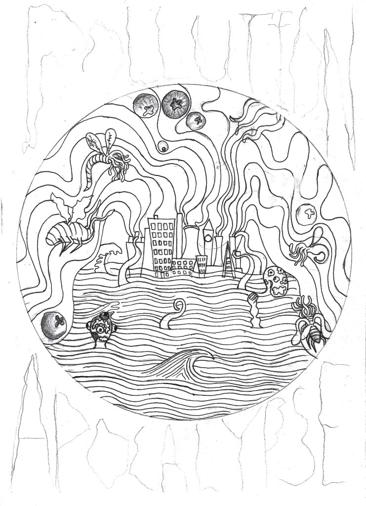
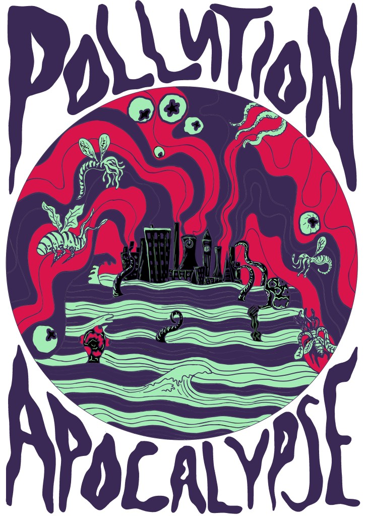
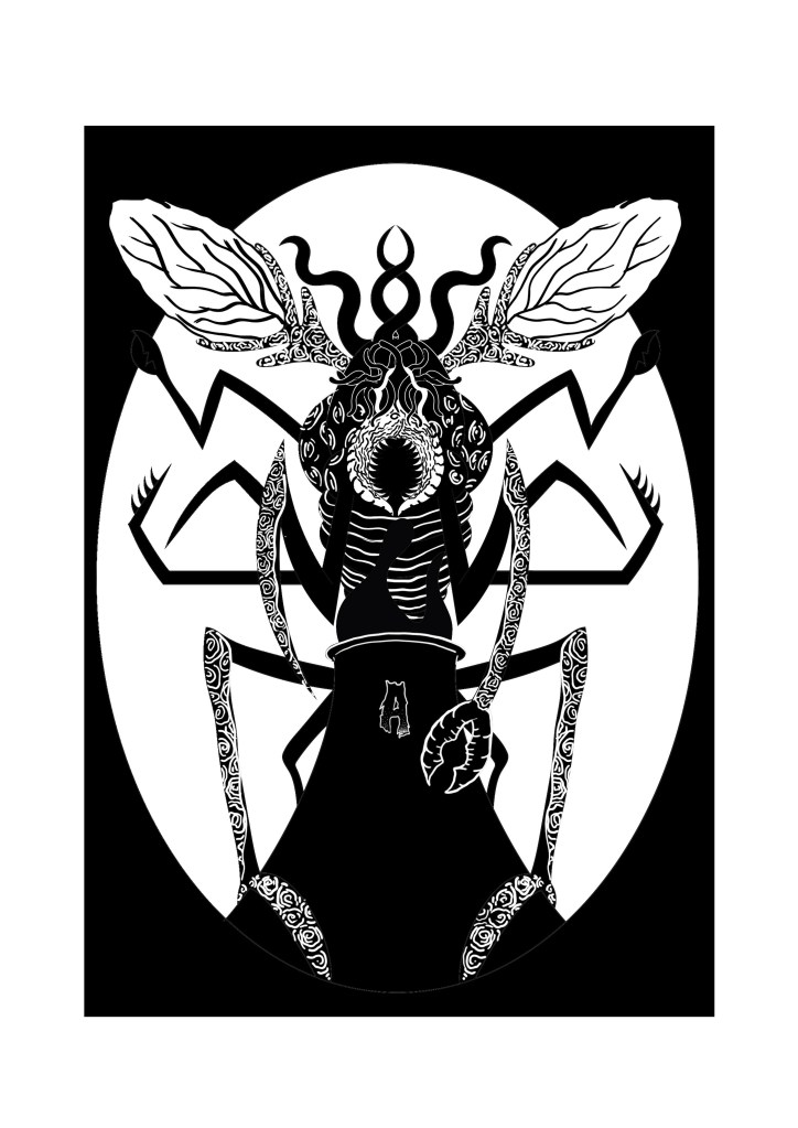
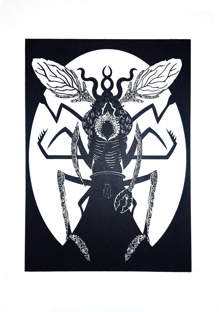
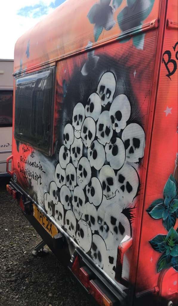
I had a bit of a stressful week the past week when it came to getting my prints ready to hand in, the screenprinting process wasn’t as easy as I thought it would be. Printing two colours is definitely a lot harder than one because you’ve got to perfectly line up each colour layer. I originally made the mistake of screenprinting the black layer before the orange layer, so when I tried to print colour over the black, parts of the design just got enveloped in the void. It also became a lot harder to line up each layer and I ended up creating a lot of offset prints. The same thing happened a while ago with risograph printing, but I was certain that the problem woudn’t be repeated with screenprinting, I was wrong. I kept getting unlucky with mesh screens too, both of the ones I used had marks on them which stopped my design being transferred properly, so whenever I tried printing a layer, a small part of my design was missing, a problem I just had to work with. Nevertheless, something good did come out of printing the black layer first, I realised just how good the design looks on it’s own without colour and all of a sudden I had two different print variations I could sell to raise money for the Australian Bushfire support. I still needed to create the colour prints that I originally set out to create to make my project successful so I started a different series of prints where I printed the orange layer first and then the black one on top; it was a lot easier to line up the colour layers this way so the 2nd batch of prints ended up having a lot less offset which I was finally happy with.

This project has been a huge eye opener for me, there were times during screenprinting where I wished I had just let the risograph machine do the work for me, it would have been a lot quicker and potentially easier than manually lining up each layer. But I would’ve definitely got an offset with the risograph machine, no matter how quick it is, at least with screenprinting I have more control over how much offset my prints are. I can unequivocally say that I will do screenprinting again in the future and hopefully, with a lot of practice, the process will be even more successful next time. Overall the quality of prints could be better, but they could also be a lot worse and I still intend to try and sell the prints I have on Etsy to raise money for WWF Australia which is what their original purpose was, so ultimately I think I have done a good jo this project, no matter what grade I end up getting. I have handed in the project now so I guess all I can do is wait and see what grade I get, I’d be lying if I said I wasn’t a bit worried because the prints didn’t turn out perfectly, there are some inconsistencies and the brief asked for 10 perfect prints which I haven’t really achieved. I can always fix the inconsistencies manually with a paintbrush when it comes to sellng them so that they are of a high quality, but it wasn’t something I could do before handing them in because in a way it would be cheating and my tutors had already seen the inconsistencies so they’d know if I fixed them before handing in. I just hope the fact that the meshes I used were fault doesn’t affect my grade because it was completey out of my control. Agh.

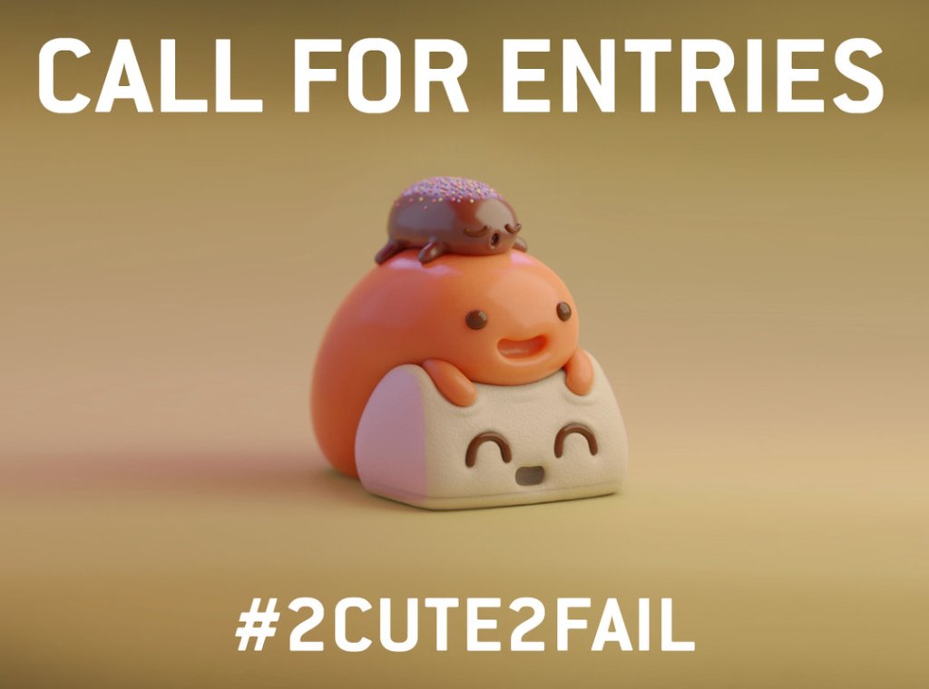
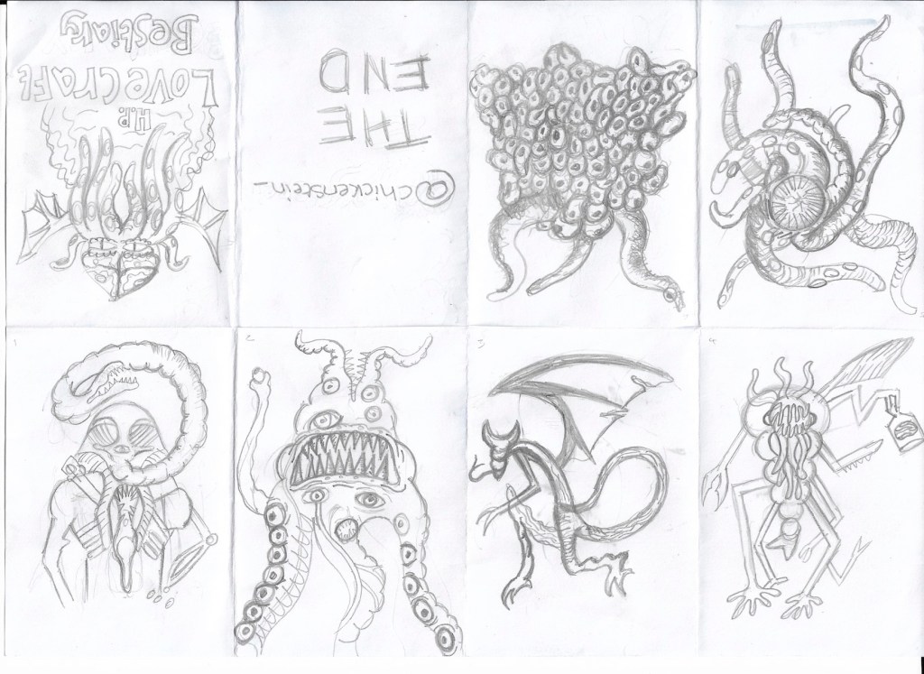
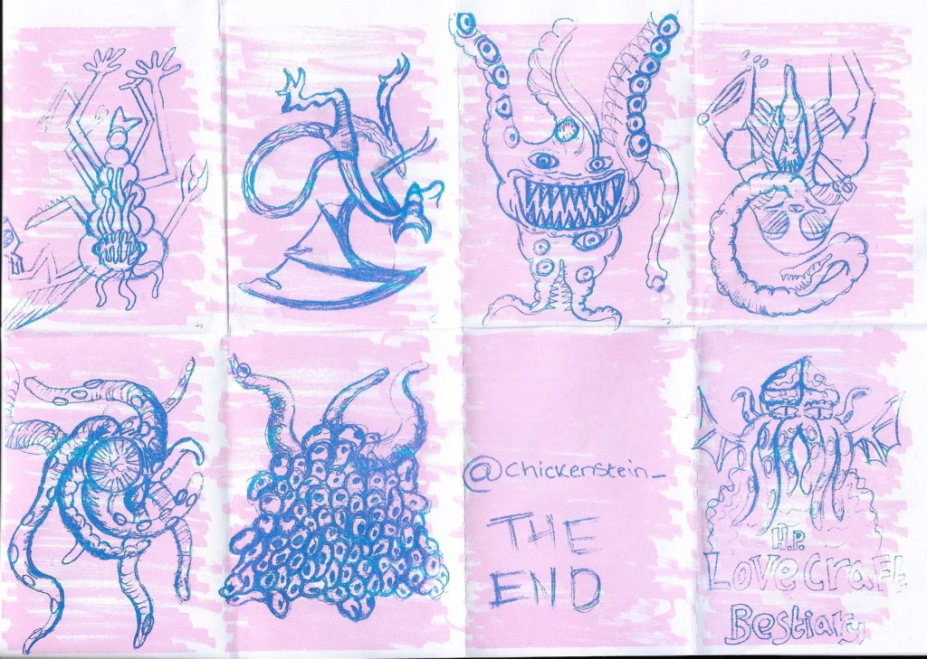
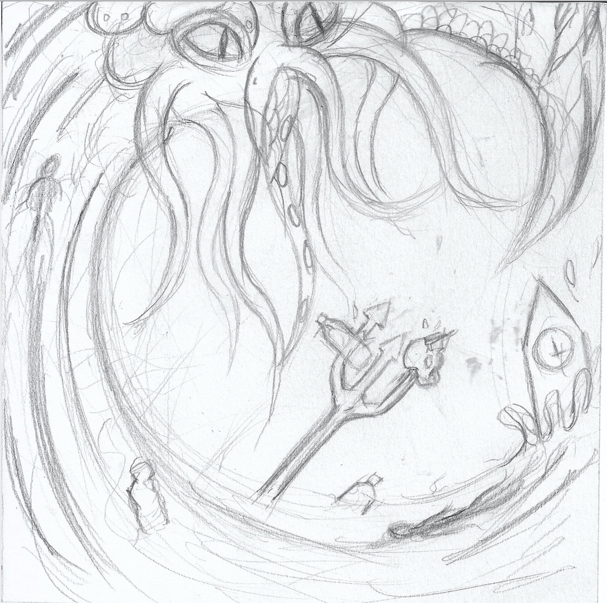
On a slightly less stressful note, I think… we’re off for the next week again while the print projects get marked and once again we have been given a task to complete we return. This time we have been asked to create a cute character and enter it into the Pictoplasma #2Cute2Fail competition, now if you follow my art then you’ll know that I don’t really do cute, more creepy and macabre so this is definitely going to be a bit of a challenge for me. I’m up for it though, it’s never a bad thing being taken out of your comfort zone so I’ll do my best to create a super cute character, though I can’t guarantee it won’t be a bit on the creepy side.

Pollution Apocalypse- An Illustrated Response to the ongoing Climate Crisis

Pollution Apocalypse Initial Sketch

It’s Riso print week next week, which will be interesting considering how iffy my one-page zine went. We aren’t doing it this week like I thought as one of my tutors wasn’t in so they’re giving us more time to get our sketchbooks up to date and do more of the prints we have already.  I’m hoping that my risograph print goes better this time, at least the one-page zine experience taught me what not to do when it comes to risograph printing. I am still sceptical though of whether or not I’ll be able to achieve a good result though because the last riso print was only a 2 colour one and I’ve decided to be a bit more ambitious this time and try a 4-colour print, which might be my downfall, but  I’m really happy with what I have designed so far so I really, really hope that I am able to create a good print out of it.

For the design I have once again decided to stick to the Lovecraftian/climate change theme that I’ve got going on right now, only this time I have made it blatantly clear that this is the issue I am trying to tackle, compared to my previous designs which were more subtle in tone. I have written ‘Pollution Apocalypse’ around the outside of the main design so that there is no confusion to the issues I am trying to convey. While apocalypse may sound a bit drastic and exaggerated, scientists would disagree given the fact 11,000 scientists have declared a global climate emergency, which sounds like the beginning of an apocalypse to me. The main focus of the design is a heavily polluted city that is pumping noxious gases into the atmosphere, causing the city to flood and attracting all manners of monsters to its’ centre. The creatures represent the end of life as we know it, as well as mother nature fighting back against the destruction that we as a species have caused.

Pollution Apocalypse Photoshop Design.

11,000 scientists declare global climate emergency and warn of ‘untold human suffering’.

Weston, P. (2019). 11,000 scientists declare global climate emergency and warn of ‘untold human suffering’. [online] The Independent. Available at: https://www.independent.co.uk/environment/climate-emergency-scientists-emissions-letter-climate-change-a9185786.html [Accessed 5 Nov. 2019].

I’m going to Poland for Christmas next Thursday and I’ll hopefully be visiting a lot of galleries, exhibitions and also doing art with my girlfriend’s dd who is a full on, free spirited artist and actually makes a living out of it. So I’m hoping that I’ll be able to write a lot of interesting blog posts while I’m away because I feel like my blog is a little bland right now, I haven’t really had time to go to exhibitions and things like that because I’m so invested in each project that I don’t get out much. But yeah, anyway, hopefully a lot of interesting posts and photos of Polish art and inspiration happening in the coming weeks. I’m really looking forward to immersing myself in all sorts of different art that I haven’t seen before, and hopefully seeing some of Van Gogh’s work because he is one of my favourite artists of all time and I’m pretty sure some of his work is on display at a gallery in Krakow. The only thing I am slightly concerned about is the fact I am going to miss 2 days in college before Christmas which could potentially set me behind in the project before the hand in day in January, however, I have already done a lot of printing and my sketchbook is almost up to date so I should be fine, as long as I do some work while I am away.

Print, Prints and Printed- A Gallery of My Riso, Relief and Screen Prints

This week has been a fun one, we’ve done so much printmaking, including printing an unexpected one-page zine on Monday. I kept with my Lovecraftian theme and created a bestiary of his monsters, I was really happy with the designs I drew, but the finished zine did not go to plan at all. I think I rushed the background a bit and I hadn’t done risograph printing before, so despite having researched the process, I wasn’t entirely sure how it would work in practice. I drew my monster sketches in pencil and scribbled the background in pen, which in hindsight wasn’t the best idea because when it came to printing the zine, the background overpowered my illustrations and the risograph printed wasn’t able to pick up much of the detail of my pencil sketches so the final zine looks like a bit of a mess. It was a good learning exercise though, at least I know that next time I riso print, I need to make my line work bolder and the background needs to be done in a lighter tone to the foreground.

The zines were only the first part of printing we did on Monday, in the afternoon we went to the print workshop to make our screens for screen printing the 2nd of our designs. It cost £14 for the screens which is a bit on the high side for me because I’m having some money issues in the run up to Christmas, but after actually using the screen, I know it was a worthwhile investment because I can print that design as much as I want now and also change the screen and use the same frame for any other designs I make in the future. I managed to do a design that I am really happy with, it depicted one of Lovecraft’s monsters, a Mi-Go, perched over a power-plant and feeding off of its fumes. I chose to depict this because in Lovecraft lore, the Mi-Go awakens from its slumber when it gets warm and power plants heavily contribute to global warming. I wanted to show how horrible and horrific the world could be if it keeps heating up at the rate it is, using the Mi-go to depict the horrors of what life would be like in a scorching, desolate Earth. I’m once again not 100% certain if my illustration conveys the message that I want it to though, I know what it means, but I’m not convinced that other people will, they’d probably just a cool giant bug creature so when I do more designs this project I need to make the climate change and global warming message clearer, while still using Lovecraftian creatures so that I stick to the theme that I’ve chosen for this project.

Relief printed with an acrylic block and ink and put through a roller press.

I had to send my first design back off to the wood workshop place to be re- laser cut because I made a mistake with the formatting when I send it off the first time (no surprises there) so some of my design was missing from the acrylic plate, this all got sorted by Thursday though so I managed to create a lot of prints of both of the designs. I’ll post photos of the prints next week once the ink has all dried. I’ve thoroughly enjoyed printing so far, I’m just not sure about risograph printing yet, probably because it is the one that went the worst for me. I totally get the appeal of risograph printing, it’s so easy to create a huge run of prints, I just haven’t quite figured out how to make the process work for me yet, hopefully over the weekend I’ll be able to create a design that works because we are creating an A3 riso-print on Monday. It’d be great if I had another design to add to my permanent print collection. I already have some ideas of what I’m going to depict, I plan on showing a modern polluted and poisoned world with buildings that everyone should be able to recognise, inspired by Lovecraft’s short story ‘The Colour Out of Space’, I’ll leave a link to the story on this post. I’m hoping that I can make my message clear this time, hopefully 3rd time’s the charm.

http://www.hplovecraft.com/writings/texts/fiction/cs.aspx

Achievement unlocked!

Mural painted by Iga Pencak for L&S Gifts in Wallsend.

I’m so happy with myself right now, I got a high merit (or a 2:1) on my first university project in almost a year!! I was so worried that I’d only get a pass, but all of the work I put into the Character Design project finally paid off. The mural that my girlfriend was commissioned to do got finished on time too and the woman commissioned her loved it, I was so happy that it worked out and the mural is now displayed in Wallsend, hopefully forever. I did struggle to get all of the research done on time and to be honest, I still have one form of printing to research so I am a little bit behind right now. I’ll catch up though, now that the mural is out of the way. I would love to get a distinction at the end of the course, the only reason I didn’t get one this time is because I had an idea of what Skaadi would look like from the start and I stuck with that design throughout the entire project. In the future I need to explore different designs and develop my characters and ideas more. I do struggle with this to be honest; I think too much about what I want to achieve and once I have a solid idea, I just stick to it. I really should sketch out multiple designs first and be a bit more adventurous with my development instead of just keeping my ideas exactly the same from start to finish.

First print design , 2b pencil on paper.

Since last week I’ve managed to finish researching all of the artists that were set to us by the tutors, including Hokusai, Liv Rainey-Smith and Jack Davis, and I’ve researched relief printing and risograph printing, all that’s left to do as far as the research goes is screen-print research, technically we we’re supposed to have finished this by now so I have made things a bit harder for myself but I’m not too worried; I like the writing and research side of things so it shouldn’t take me too long. As well as the research I’ve also completed my first design for printing, I opted to draw Cthulhu riding a plastic polluted Hokusai inspired wave, with a trident piercing a skull and water bottle at the moment the wave crashes over Big Ben. It sounds like a lot I know but I don’t know how else to put it, I chose to do this design because alike the Skaadi project where I made my design depict the Amazon Rainforest crisis, I wanted to make my designs this project convey some of the horrific issues that are facing our world today. I chose to depict the ongoing plastic pollution problem that is threatening our oceans because it is something that could and probably will wipe out much of our known world if we don’t do something about it. My design serves as a warning, with Cthulhu symbolising the horrors of pollution and the great wave that could flood the world if the ice caps continue to melt and the sea levels rise.

Initial print design idea. 2b pencil on paper. Inspired by Hokusai.

I struggled with designing this because I knew what I wanted to convey, I just didn’t know how, I’m not even sure if my final design is effective at getting the message across, my original sketch was far too derivative of Hokusai, it took me a couple of attempts to get something that I was happy with. Time was against me though and I had to settle with what I had, it’s not that I don’t like the design, it’s just missing something where the white space is. I guess can always paint over the design once it’s been printed or redo it in my own time, but the main thing is that the design has been sent off to the right place for it to be laser cut onto acrylic ready for printing. Speaking about sending the file off, I once again struggled with formatting my design correctly to be laser cut, my tutor told us how to do it but a lot of the information got lost to me in my head, I don’t know if it’s because he was throwing a lot of information at the class really fast, or because I wasn’t paying attention enough due to the fact I get anxious in clss. Either way, I need to work on my ability to format things, I keep meaning to take a notebook to class with me so that I can take notes on how to do these things, but ironically, I keep forgetting to do so. I will try to take a notebook next time because I am sick of feeling kind of stupid when I have to keep asking the tutors to help me send files to certain places to be marked or printed. I don’t see many other people needing help with this and to be perfectly honest, I don’t want to have to either. I think we are printing the design on Monday which I am looking forward to, it’d be good to finally have a design that I can print over and over again, it could be something that I end up selling on Etsy which would be nice. We’ve already been asked to create another design for a different form of printmaking that we’ll be doing soon, which is great because I’ll have a lot of reproduceable designs in the near future. I’m probably going to stick with the Lovecraftian take on modern day issues theme that I’ve started with the Cthulhu design, so I guess I’m going to need to look for a more obscure one of his creatures, I don’t want to only use Cthulhu in my designs. I love H.P. Lovecraft though, so the next weekend is going to be quite fun.

Warning- Cute Dog Painting Inside

Rainey-Smith, L. (2019). Gallery | The Art of Liv Rainey-Smith. [online] Xylographilia.com. Available at: https://xylographilia.com/gallery/#jp-carousel-3538 [Accessed 14 Nov. 2019].

Well, this has a been a pretty productive week so far, I’ve done over half of the research and figured out which of my own artists I am going to choose to research once I’ve finished the ones set by my tutors. I found a really cool woodcut printmaker called Liv Rainey-Smith who does some seriously gothic, Lovecraftian designs; her work is right up my alley and is definitely going to tie into my more macabre theme that I plan on running with this project, with H.P. Lovecraft being one of the godfathers of horror, he even has a branch of horror named after him! The level of detail Rainey-Smith achieves with woodcut is mind-blowing too, it’s almost hard to believe that she’s using woodcut to create her designs. I’m getting so excited about this project now; I think I’m going to hone the spirit of Lovecraft with my designs this time too. The only thing I’m worried about is whether or not I am going to have time to finish the research because my girlfriend is working on a large mural commission  that is going up in Wallsend and it’s looking like she is going to need help finishing it before the deadline on Saturday. I may have to put my research project on hold for a couple of days to make sure that the mural gets finished on time and do my best to catch up on the research afterwards. I just can’t let her struggle like this, we’ve collaborated on murals before, we painted a caravan together and work well together so I’m confident that if I help her then it’ll get done on time and then I can wholly focus on the research afterwards, even if it means staying up most of the night on Sunday, it’s not like I have a project hand in on Monday, her deadline is more important right now.

The Great Wave off Kanagawa- Hokusai

All of this said, I am still going to do bits of research in between painting the mural, like when the paint is drying etc, so hopefully I won’t have a horrific amount to do on Sunday. As well as Liv Rainey-Smith, I plan on researching the legendary Hokusai, I mean how could I not research him for the purpose of a print project, he literally revolutionised relief printing and took it into a whole other realm. I’m not usually that interested in the historical artists, which I know is bad because we wouldn’t be where we are with art without them, however, there are a few historical artists that I’m really interested in and Hokusai is one of them. I don’t really know a lot about him as a person or artist, only what I’ve seen of his work like the great wave so it will be interesting to research him properly and find out how he achieved so much in his life, maybe I could learn something that I could apply to my own artistic practice.

The third and final artist that I’m going to research isn’t even a print maker at all, which I’m hoping won’t be a problem, I’m not sure if we’re only supposed to research artists that make prints. Anyway, I’m going to research Jack Davis, best known for his work on the Creepshow comics, I’ve chosen him as more of a style reference than anything else, he used to create highly bizarre and macabre characters that I think could inspire my own horror focused style during the print project. I’m really hoping that we get to create enough prints to take home and not just prints for the course during the project because I wouldn’t mind selling some on etsy or something, it’s not exactly making comics but I have thought about selling art prints and getting myself out there for a while, I’ve just never had the resources to do so and I’m hoping exploring all of the print facilities I’ll have access to on the upcoming project will change that. I’m happy that we are going to be doing different types of printing because I’ll be able to figure out which one works out best for me, who knows, it could even be the start of a print business venture for me.