Insanity Psychopus- Not #2Cute2Fail

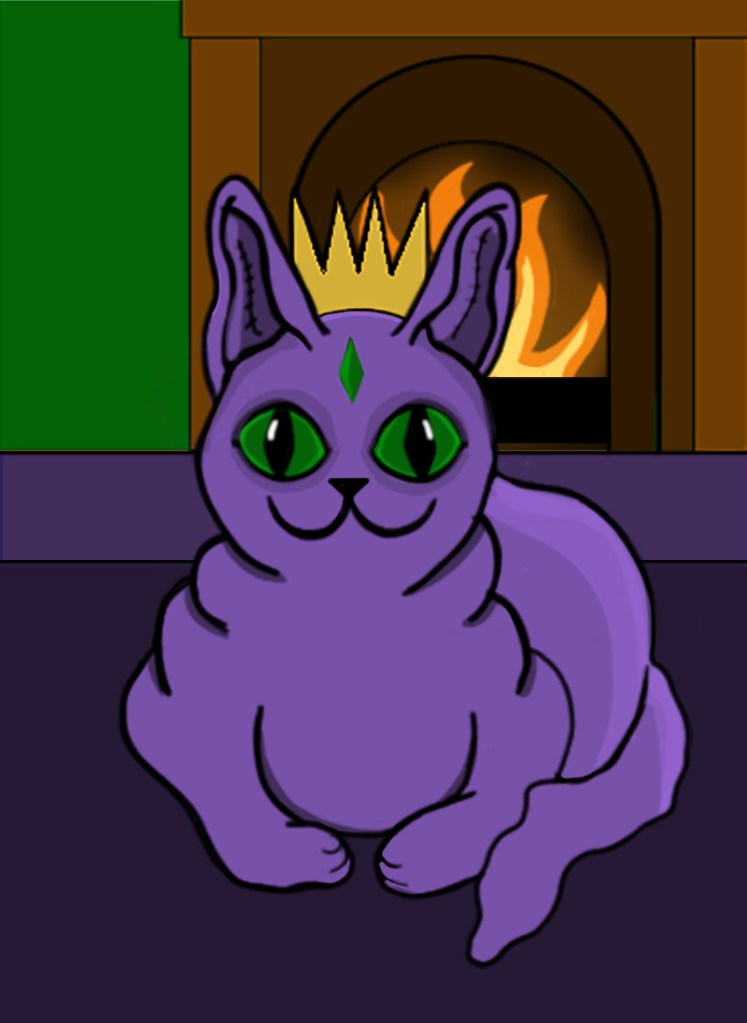
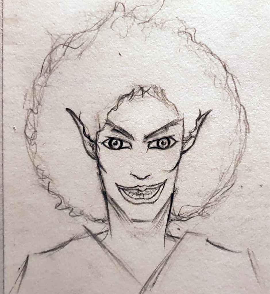
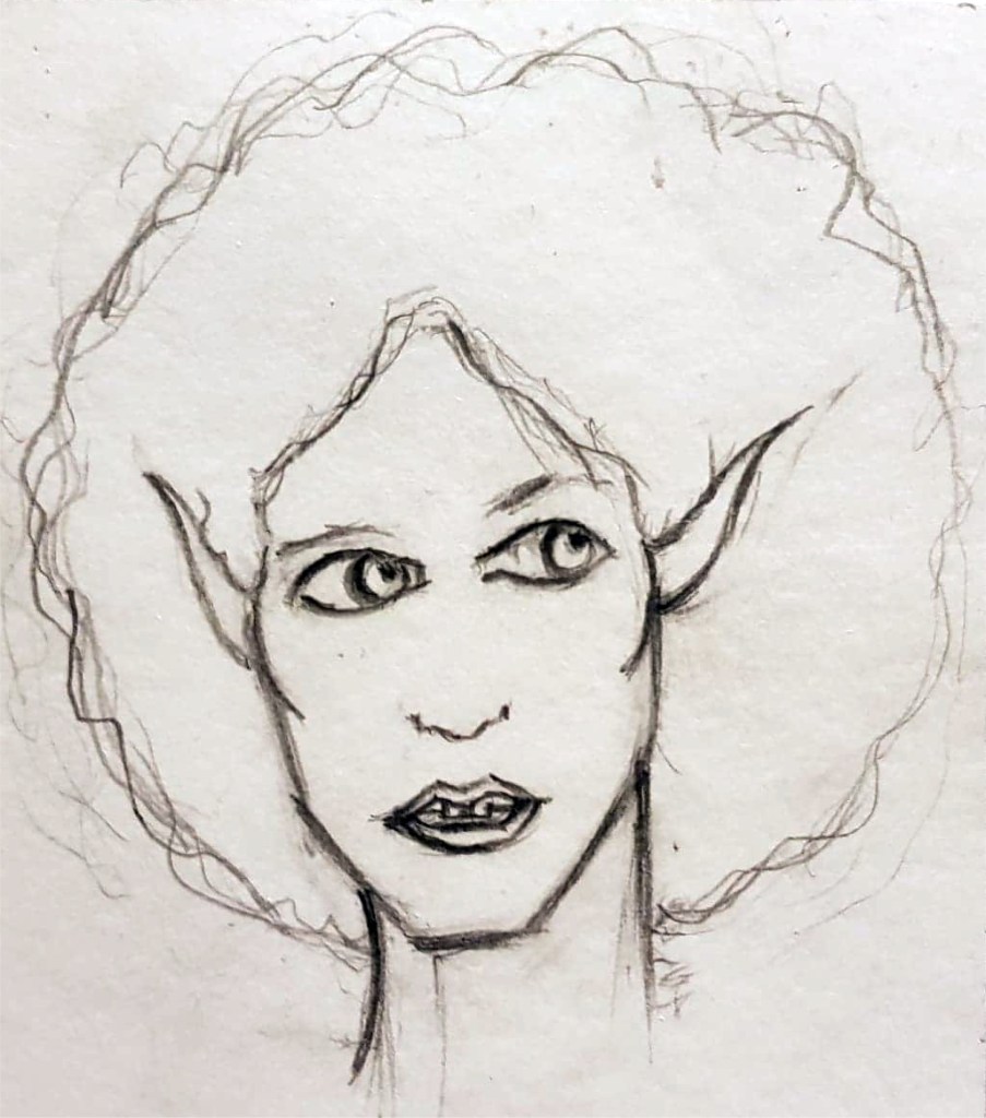
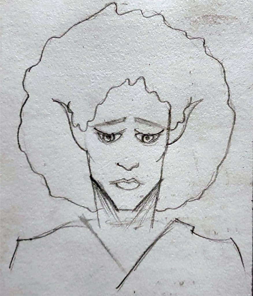
It’s weird for me to say but I actually kind of enjoyed creating a character for the 2cute2fail challenge, it ended up tying in with another project I’m working on, illustrating a book for my aunt by association. One of her friends and her have been running a blog for years where they write about weird history, folklore and the sometimes supernatural, it’s a really cool blog full of bizarre and sometimes horrific tales and historic events. Anyway, they have decided to publish a book featuring a collection of their best and most bizarre posts and they’ve asked myself and my girlfriend to illustrate it, which is amazing, my art is going to get published! One of the posts they need an illustration for is about a folk tale called ‘The King O’ the Cats’ in which a blissfully unaware cat is comfortably sitting in front of the fireplace when he finds out the previous cat king has died and he is now the new crowned king; the thought of a cat with a crown is adorable so I decided I’d kill two birds with one stone and design the King O’ the Cats for both the #2Cute2Fail contest and the book. I tired many times to get the design right but I just kept struggling to make the kitty look cute, it’s so unlike anything I’ve ever tried before, the first lot of designs looked too realistic and not cute at all… the 2nd batch were a step in the right direction but still weren’t right, it’s safe to say I got a little frustrated while trying to design the King O’ the Cats.

Insanity Psychopus- Fineliner and pencil

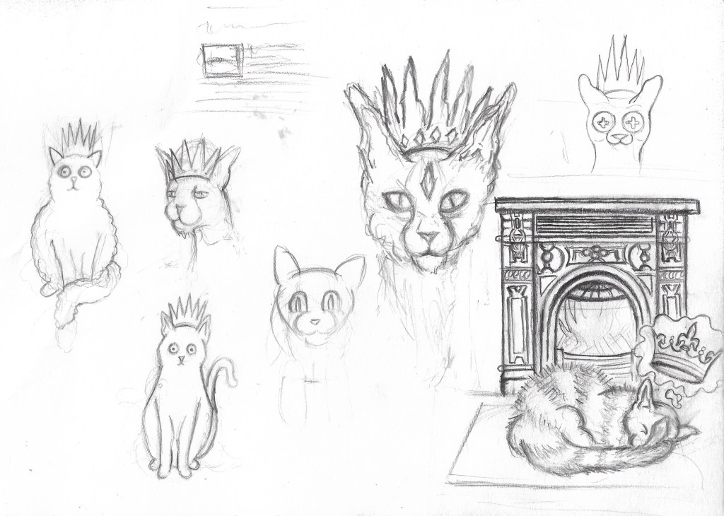
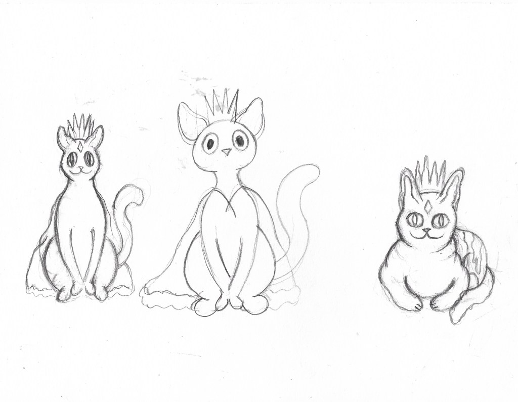
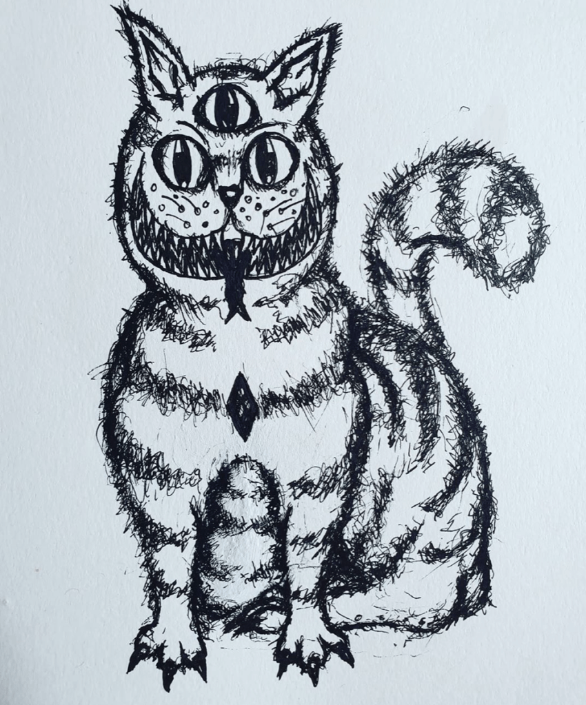
One night, when I was feeling particularly annoyed at my inability to draw something cute, I decided to give up and just started drawing a creepy cat instead. I wasn’t sure what it was going to turn out like, I wasn’t trying to make it good or cute, I was just drawing. I gave it 3 eyes, a terrifying grin and Cheshire cat stripes and it looked amazing. It wasn’t stereotypically cute, not by a long way, but it was my kind of cute, all dark and a bit ropey. I entered it into the #2Cute2Fail competition immediately and called it Insanity Psychopus, a feline Psychopomp that takes your sanity away. Sure, it might not get the best reception and probably doesn’t quite fit the criteria for the call for entries, but everyone has their own idea of what cute is and I wanted to enter something that really came from me, weird, unadulterated, unaffected by university me. Of course, I did then go on to submitting a more stereotypically cute King O’ the Cats too, one that was made digitally because hey, more chances to win right? The 2nd illustration was cuter in the traditional sense and resembled a normal cat, if that cat happened to have purple skin… like the one I drew. It also more closely depicted the folktale from which my original idea came from with the cat sitting peacefully in front of a fire.

I’m glad that I entered two different pieces into the competition because it just shows that I am capable of doing more than just one style, though I do much prefer the ropey one. As for the book illustration, neither of the designs ended up being fit for purpose but I did create a lot of sketches during the process of designing my #2Cute2Fail submissions and there’s one if particular that I think I’m going to develop further for the book, I may not have killed two birds with one stone but I have made the book illustration process easier than it was before and without knowing about the King O’ The Cats I probably wouldn’t have had an idea for the Pictoplasma competition at all. All in all, it’s been a pretty productive week and I’m weirdly looking forward to starting a new project at uni next week, and finding out my results for the previous one.

King O’ The Cats- Photoshop and Wacom tablet.

Tutorial Week

Over the weekend, ahead of tutorial that I felt was looming over me, worrying that I had not done enough, I finally decided to make a proper start on my character development board. Had it not taken me so long to refine my Skaadi poses, I probably would have started them sooner. Nevertheless, I made a start on the first board, I displayed both the refined Skaadi dynamic pose and the side pose, alongside her small arsenal of weapons and her treasured necklace; for the text I decided to show Skaadi’s character profile, rather than the whole story because I wanted the board to be just about her. After much deliberation and minor alterations, I just couldn’t get the layout to look professional, my illustrations looked a bit haphazardly placed and the board didn’t look neat.  In hindsight I probably should have spent more time looking at how other Illustrators laid out their character boards; but I was running out of time and panicking, I really wanted to have something to show my tutors for when my tutorial came on the fast approaching Monday.

My first attempt at creating a character board.
CareHere. (2019). Featured App-Stop, Breathe & Think. [online] Available at: https://carehere.com/stop-breath-think/ [Accessed 24 Oct. 2019].

Monday came and my time was up, I had to go in and face the tutorial. When I got there, Sarah (one of my tutors) was surprisingly happy with the amount of work I had done over the week off and offered me some guidance on how I could improve the layout of my development board, things such as making the character profile categories stand out from the rest of the text and laying out all of my illustrations so that they formed a straight line across the centre of the board; this is something that was mentioned to the class earlier in the project but I guess it slipped my mind, I do have trouble focusing on what is being said to me, primarily when the tutors are speaking to the whole class, my mind tends to wander off. It is paramount that I work on being present in the moment when I am in class because I won’t always get the chance to speak to my tutors one to one, I can’t avoid group talks and class conversations, and while I can’t help getting a bit anxious and close in on myself in those environments, there are ways I can improve it. Perhaps I could try mindfulness again, I used to sometimes use the Stop, Breath & Think app which did help, i’ve heard the Headspace app is a really good one to use too, maybe I could try it and share my thoughts on whether it works for me.

Skaadi’s legs just don’t look right.

Anyway, getting a bit off topic, as well as talking about my character board, we also talked about my final illustration, more specifically, how the dynamic Skaadi illustration would fit into the environment that I created over the weekend. After placing Skaadi into the environment it became rather clear that she didn’t quite make sense in the piece, it was pointed out to me that her legs were facing the wrong direction as they should be leading the viewer up the path; I had kept her legs side on in the hope that I wouldn’t need to change a pose that I had spent so much time on refining. It has been a few days since my tutorial and I am still struggling to change the position of her legs and I’m growing increasingly worried that I might have to change her whole body in order for my final illustration to make sense, a task that I’m not sure I have time left to do as the deadline for this project is only a week away. I’m going to try and get my girlfriend to act out the same dynamic pose as before, but with her legs in a different position so that I have some good first hand reference images to get a better idea of how I should draw Skaadi’s legs in a such a way that she is leading the audience up the path. I really hope that I am able to achieve this over the coming weekend so that I can focus on finalising the overall illustration and finishing the character boards from Monday. If not, I will have to redraw her whole body which could trip me up on the last hurdle of the project, watch this space.

Well, that was unexpected.

This week has been a bit of a mixed bag, on the plus side I have just about finished colouring up the Skaadi side pose on Illustrator and Photoshop and I have also digitised some of the essential items that Skaadi carries with her. What hasn’t been so good is finding out that we yesterday morning that our Thursday class isn’t happening any more due to a teacher training day, and also that we’re off all of next week for a reading week; followed by a tutorial on Monday the 28th of October. Normally this would be fine, however, I still feel a bit rusty with Illustrator and Photoshop (having not been on a course doing digital art for over a year now) and I have so much I need to do and very limited idea of how to do it. I guess I am going to have to watch YouTube tutorials on Photoshop processes and figure out how to finish this project to a high standard.  

While I am rather shocked at how little notice was given about not being in Uni today, I have at least managed to do the digital line work and colour for the Skaadi side pose. I did this by scanning the initial sketch on to the computer, opening it in Illustrator and using the pen tool to trace the sketched line work, similar to how I created the line work on Skaadi’s dynamic pose previously. As I mentioned on my last post, instead of colouring my work in Illustrator as well, I exported the line work and opened it in Photoshop to colour. I found this process a hell of a lot easier than colouring it in Illustrator, partly because I have painted in Photoshop in the past. It is just so much quicker and allows me to spend more time on doing details and shadows/highlights, the use of which I have learned from researching how Fiona Staples creates them in the Saga comics.  This is subsequently also much easier for me to do in Photoshop. I have cautiously high hopes for how this project is going to go from now on, I do feel as if I am improving a lot with digital art and it is quite surprising because a year ago I wouldn’t have even attempted to get good at using computers for art. I do still love doing traditional art and digital could never completely replace it for me, however I am final seeing the benefits of using Photoshop and Illustrator to create and enhance art and hopefully I will continue to do so in the future.

Skaadi Side Pose

I do have one small qualm about the way I have painted Skaadi so far and that is that she doesn’t quite look alive yet, like she doesn’t pop out of the page or look like she is a living being, this is something that I really need to rectify and quickly because she is such a complex and active character and I want to portray that life and spirit in the illustrations of Skaadi. Hopefully over the next week I will be able to push myself to learn more about how to use Photoshop and also what alterations to make to Skaadi to give her that bit of oomph, all without my tutor’s guidance. As well and adding life to Skaadi, I really ought to figure out what kind of environment Skaadi is going to be in and design it. I mean, I know she lives in a forest and I know in my head what the whole world she inhabits looks like, I just need to show it in my art. It is certainly going to be a busy week.

Things are finally happening!

This week we finally began to develop our summer comic projects even further, we were told that the final outcome of this project would be a fully finished singular comic panel that showcases the main character in a scene from our story. This is going to be a lot easier than completing the whole comic by November so I am rather happy with this, the comic will be finished during another project at a later date.

The main focus of this week was facial expressions, continuing on from the expression work given to us during the first Illustrator session, we were handed an expression sheet that contained 25 boxes and the names of 25 different expressions that we needed to draw. The purpose of this exercise was to make us think about how to draw different expressions that we may not have done before but may need when it comes to drawing our characters and comics. I wasn’t initially very pleased with this task because I really wanted to focus on improving the design of my characters and also develop the environment that my comic would be set in, I’ve had the idea to show Skaadi either in the middle of the forest fighting a demon, or to show her standing guard in the middle of a blasted heath, protecting what little forest remains; the fire demons and light elves having already destroyed  swathes of her homeland. However, after a while I began to realise the importance of this task because as a comic illustrator, I will have to express the emotions of characters that I draw through recognisable facial expressions that readers will be able to understand. I can’t just create emotionless characters that never show how they feel; I have to be real about this. I definitely found this task quite daunting and difficult when I started it as I am not used to drawing faces and I am certainly not used to expressing emotions through faces. To make it a bit easier we were asked to take selfies of ourselves making the facial expressions that we were asked to draw so that we had accurate reference to draw from; to be perfectly honest I found the prospect of this even more daunting than the drawing itself, I never take selfies! And I won’t be posting them!

 I tried to do as much of the sheet as I could using reference from the internet and memories of when I have seen people use these expressions. Ultimately I gave up on the sheet and talked to one of my tutors, Sarah, instead, she suggested that I focus on 3 main scenarios that Skaadi would likely face and draw out how she would react to them, this idea seemed a lot more favourable than drawing 25 expressions so this is what I did. I managed to get around taking selfies of myself by getting my girlfriend to model 3 expressions that Skaadi would make during the three main scenarios that I came up with. Once I had the reference imagery, I draw out Skaadi with the expressions, changing the design of her face as I went along.

I found it rather difficult to add light and shadow effectively to show depth in my characters faces so I decided to look at how other comic illustrators use light and shadow in their work. My main inspiration for the redesign of Skaadi’s face came from the comic series Saga; I gave her a much sharper face, more expressive eyes and changed her hair so that it looked a bit more realistic than before. The outcome of this redesign was a much more comic-like character in a style that I was finally happy with, I have been trying to find a comic style for a long time and finally managed to achieve one that I was happy with.

I am extremely happy with how I am progressing on this course so far and I hope that I am able to keep this up in the future. I am so pleased with myself for drawing Skaadi in a style that I am happy with and one that I would use in comics any day. There are still some tweaks needed to the style, it’s not exactly refined yet, or coloured, but oh my god I have something that I can work with. From here on I will developing the newfound comic style even further and refining it so that it will eventually be something that I am proud of and could possibly use in other comics in the future.