Editorial Illustration Research

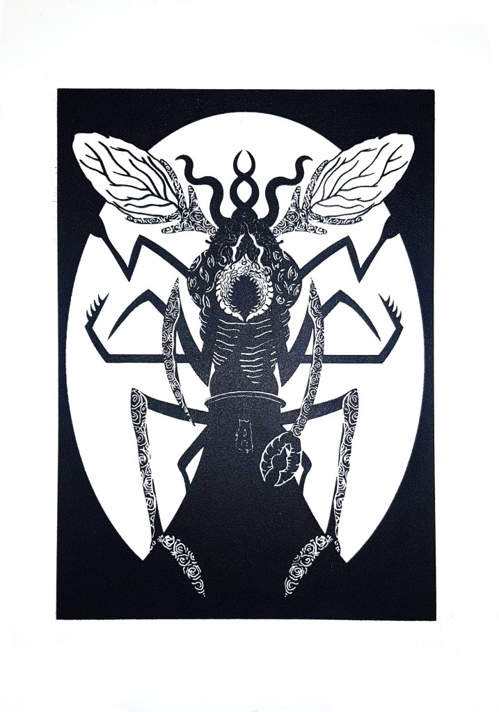
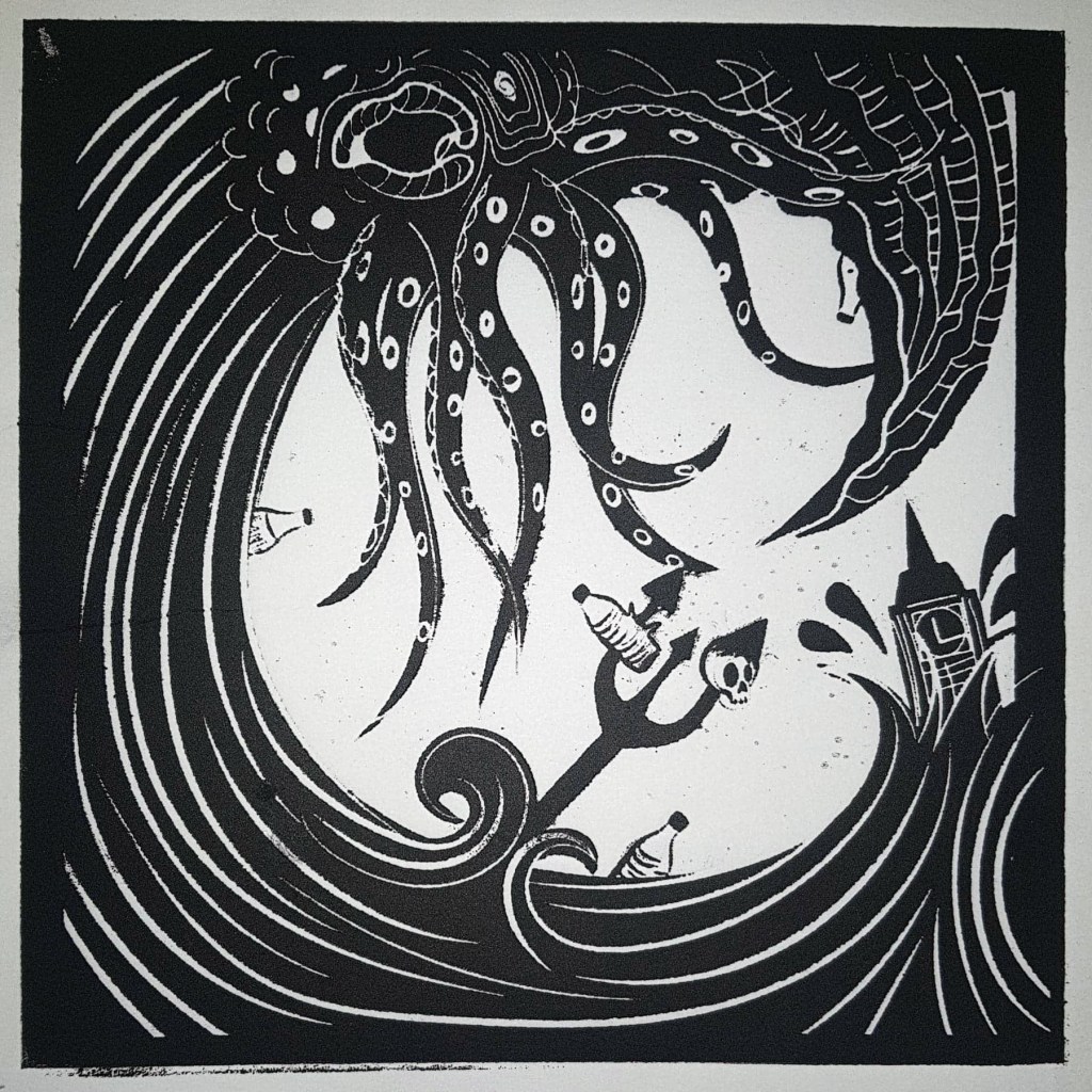
If there is one thing that the editorial illustration project taught me, it is that I could see myself going down that route as a career path, at least to help me fund my own personal projects. There has been a growing demand for illustration for publications over the recent years and it’s easy to see why, in an age where anyone can create content from the comfort of their homes, it has become increasingly difficult for publications to stand out from the crowd, which is why some publications, such as Little White Lies, New Scientist and Weapons of Reason and newspapers such as the Guardian are hiring independent illustrators to create stunning visuals that remove them from the sea of overused press shots, oversimplified vectors and overtly technical fodder.

I have done some further research into this area ahead of my final project as I see my future progression in the field. Art directors rely on illustrators to create beautiful and eye-catching illustrations that help to express complex ideas, articles and theories in a more accessible and understandable way for us normal folk to digest. Working together with illustrators, art directors try to create the best possible way to visually tell a particular story or illuminate an idea. As well as making complex ideas more accessible, editorial illustrations also bring stories to life and engage readers in a way that text alone can’t achieve. Illustrations help to break up a block of text and capture the essence of what is being said in an article.

(Heath, 2017)

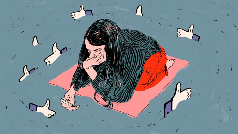
There are many different magazines and newspapers out there, almost all of which require a different illustrative style so there is a place for just about every style within the industry and publications are often playing with different aesthetics to keep their publication fresh. I find this reassuring because I haven’t yet figured out a specific style for myself, I can work in quite a few so it’s nice to know that I’ll be able to find some editorial work regardless of whether I have a ‘house style’ or not. Some complex stories will require a more expressive illustration, such as an illustration created by Calum Heath for Vice that depicts an isolated girl surrounded by Likes which encircle her like sharks which was shown alongside an article about cyber-bullying. This illustration perfectly captures the dangers of social media, especially to someone who is alone and vulnerable, there are a lot of horrible people online that say awful things to people while hidden behind a screen. There’s also the constant need to get likes online which can have a negative impact on one’s mental health.

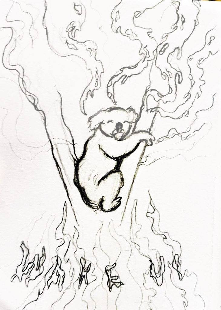
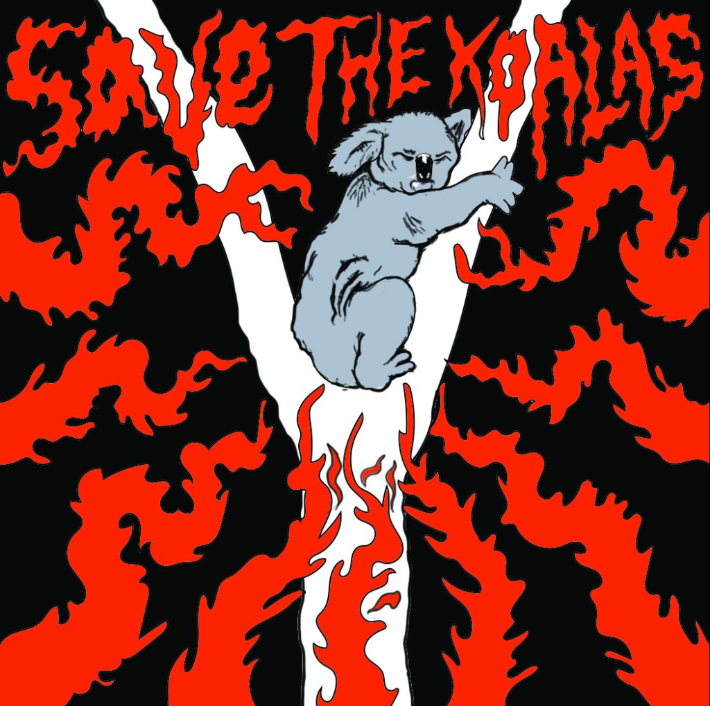
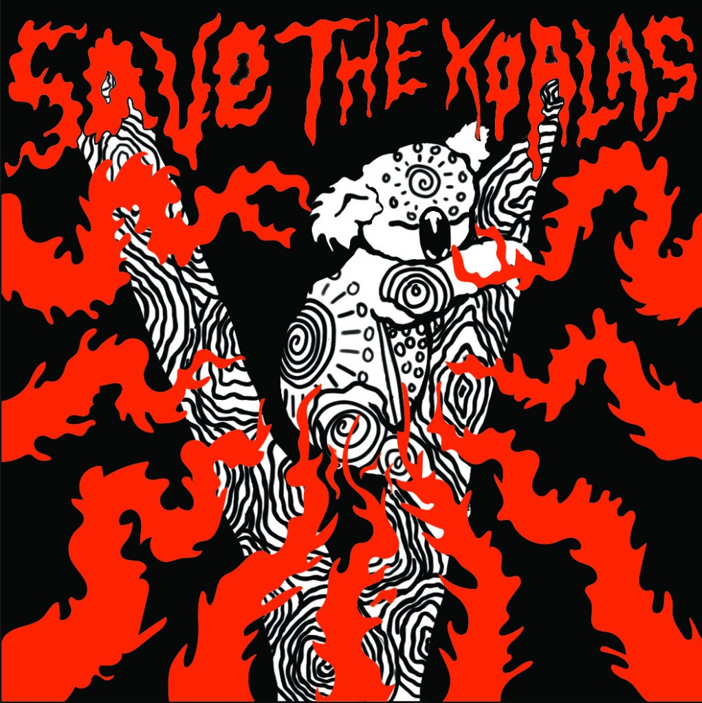
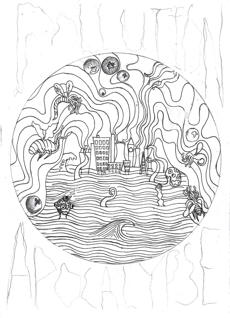
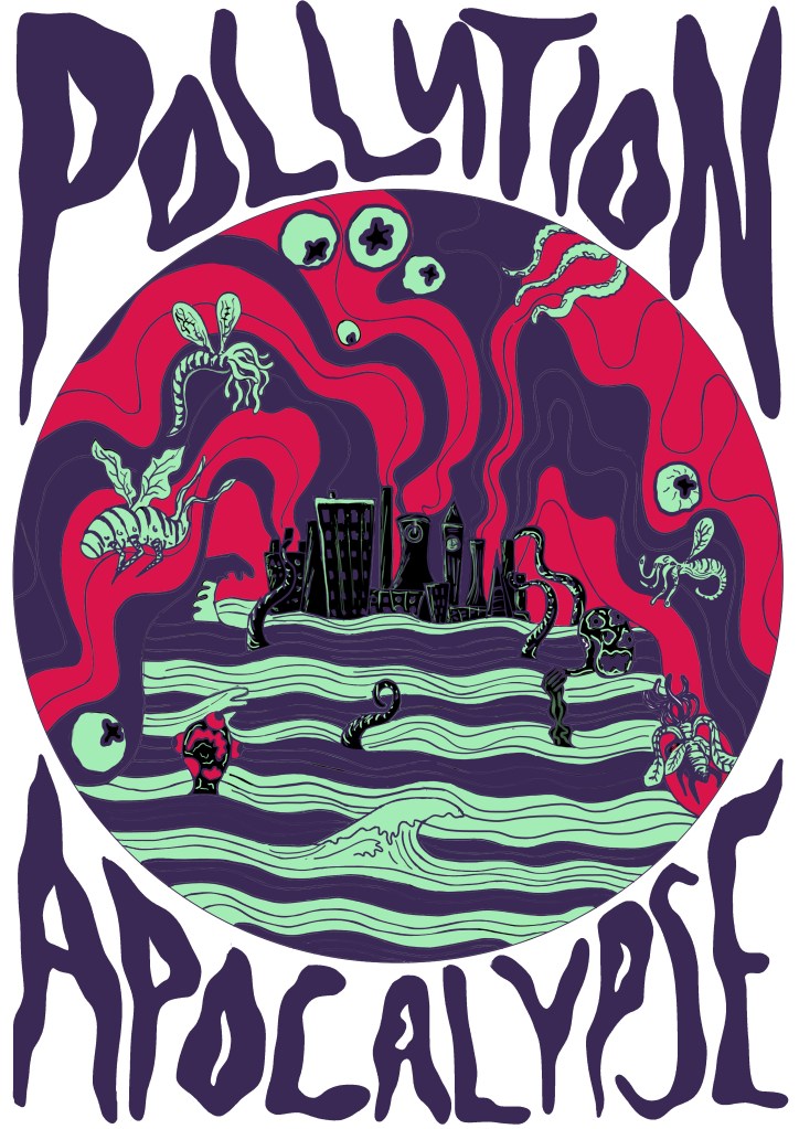
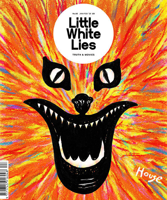
Cyber-bullying is just one of the many complex issues we are facing in 2020, things such as politics, the environment and climate change, women’s and LGBTQ issues and immigration are all problems we’re facing today. There is a huge need for illustrators to come up with engaging ideas on how to express these concepts in such a way that really gets to the heart of the problem and urges the viewer to be a part of the solution. This is part of why I think that editorial illustration would be a good path for me to go down because I do often tackle such issues in my art, and had hopes of creating a graphic novel that tackled climate change but it would be exceptionally hard to get funding for such a thing. The graphic novel idea is perhaps more personal than commercial. Going into editorial illustration would allow me to tackle the issues that I am passionate about, try and make the world a better place and also make a living in a more commercially viable area of illustration, there is a huge need for editorial illustrators right now and I could use the money I make to fund my own personal projects in the future. I have already proven that I have potential with editorial illustration based on my previous project where I created a front cover design for Little White Lies based on the 1977 movie house, the design recently got liked on Instagram by LWL themselves and they commented that they love it. This really made me happy and gave me hope. I am going to research into how to become an editorial illustrator and also research further into publications and companies that work in the field to continue the research for my final project.

Little White Lies House Design

References-

Ewens, H., 2017. The Brand New Face Of Cyberbullying. [online] Vice. Available at: <https://www.vice.com/en_uk/article/gyy8kq/the-harsh-new-world-of-teen-cyberbullying&gt;

Carson, N., 2018. 8 Inspiring Uses Of Editorial Illustration. [online] Creative Bloq. Available at: <https://www.creativebloq.com/inspiration/8-inspiring-uses-of-editorial-illustration&gt;

Wang, G., 2018. 12 Independent Magazines With Clever, Imaginative Illustration – STACK Magazines. [online] STACK magazines. Available at: <https://www.stackmagazines.com/illustration/12-independent-magazines-with-clever-imaginative-illustration/&gt;

Carless, J., 2020. What Art Directors Want: Tips For Editorial Illustrators | Create. [online] Create.adobe.com. Available at: <https://create.adobe.com/2016/4/20/what_art_directors_want_a_guide_for_editorial_illustrators.html&gt; [Accessed 22 March 2020].

Save The Koalas

It’s been just over a week since I returned from my holidays in Poland and Edinburgh, and after spending 3 weeks away from the course, I have been finding it quite difficult to readjust to university life. I didn’t draw enough when I was away, instead I focused on going to galleries and exhibitions in Poland so that I could try and get some more inspiration for where my project and coursework is going to go next, as well as enjoying myself because hey, it was Christmas and new year’s. While the time away was really nice, it has meant that it’s taking me a while to get back into the flow of things, when I returned, I wasn’t really sure what I was going to do for my final print, despite seeing so much amazing art abroad. It wasn’t until I was scrolling through Facebook and watching the news at home that an idea hit me horribly, the Australian bushfire crisis.

Please donate to help save the animals in Australia!- https://support.wwf.org.uk/australia-bushfires

So far during the print project, I have been creating art that tackles topics such as climate change and pollution, two things that are having a horrific impact on our world and wildlife, yet to me, aren’t being tackled enough. I wanted to try and change that, not necessarily on a large scale, I have to be realistic, but if I could reach just one person with my art it would be something. Having tackled these issues so far on the project, it was obvious to me that I needed to stick to similar themes when it came to be designing my final print, I just wasn’t sure what issue to tackle, there are unfortunately so many. For a while I considered tackling the meat industry, but this seemed too hypocritical as I was still eating meat, albeit little, at the time. I have stopped eating meat fully now and have for the past week, but still, I didn’t feel as if it is enough to start hitting the meat industry now. When I saw the horrors of the bushfires and just how much of the environment is being destroyed and how many animals are being killed, it made me feel sick to my core, it’s so upsetting that (at the time of writing) one billion animals have been affected. Having loved animals and nature since I was a child, sometimes more than humans, this topic hit close to heart and I just knew that I had to try and do something to help.

Now that I had an idea of what I was going to illustrate with my final print, I started sketching ideas of just how I could show the Australian bushfires and the impact that they are having. I made a few rough thumbnail sketches in pencil to get out some of my ideas which included:

  • The world being consumed by fire with a koala’s face emerging out in fear because the bushfires are the latest of the wildfires that have devastated the planet in the past year.
  • A Donald Trump earth laughing at the fires while a koala fell off the face of the earth, symbolising the risk of the koalas going extinct and just how little Trump cares about the environment (I thought this might be a bit too political so I didn’t take this idea forward)
  • A koala’s face on the Earth as it melted away in the flames, which would show the impact of climate change and how it is causing the ice caps to melt, as well as the impact the fires are having on the koalas.
The sketch I decided to take forward.

All of these ideas seemed a bit too wide, they focused on the entire world, rather than just the area and the animals that are being affected by the fires, on previous projects I did focus on showing the environmental impact of climate change, but I haven’t really focused on the impact it is having on its inhabitants, with one billion animals being affected by the horrific blaze, this time needed to be different, the animals needed the centre stage. I kept the idea of having the flames framing the illustration, but instead of showing the whole Earth, I drew a lonely koala clinging to a tree for dear life amongst the oncoming flames I showed my sketches to a few people to get their opinion and to find out which one they thought would get the most attention, and they agreed that the lone koala in the tree was the saddest of the sketches and would get more of a reaction from the wider public.

Digital Koala Development

With the design picked, I developed the thumbnail sketch further by drawing it out in a larger scale in an a4 sketchbook before scanning it onto my laptop and going over the line work and colouring it in Illustrator/ Photoshop so that it looked more professional ahead of college on fast approaching Thursday. My tutors liked the design but pointed out that I had two styles going on at once, with the fire and text being done in one style and the koala being done in another. I had struggled with how to depict the koala, I went with a rather realistic approach because I didn’t want to do a cutesy cartoon koala that would take away from the seriousness of the situation, but the realism clashed with the rest of the piece so I agreed that I needed to redesign the koala. The problem I was having is that the koala isn’t a monster, it’s a victim and up until that point on the project I had been depicting climate change in the form of Lovecraftian creatures attacking the planet and reclaiming their home. This time however I was trying to show how vulnerable the animals in Australia are right now, they needed to be cute and upsetting, to evoke feelings of sadness and vulnerability so that people would do their best to help them.  I redraw the koala 3 or 4 times before I finally came up with a design that felt right.

I looked at Australian aboriginal paintings of koalas as a source of inspiration which really helped me to figure out how to show the koala without making it too realistic. Unfortunately, I didn’t get the design right until the end of the day on Thursday, meaning that it was too late to send my design off to be prepared for print, which means that I am going to have to wait until next week to do this and come into college on a day that I am not scheduled to be in so that I can finish the project before the deadline next Thursday. This is fine for me though because I want to raise more money for charities to help save the animals in Australia, no matter what, and in order to do that, I need the prints. I just really hope that I am able to get everything done in time and that people do buy the prints when I try and sell them, this is the only way I know to raise money for the charities without having much reach in the field of illustration.

Final print design

Disclaimer; I am aware that Koalas are only one of the thousands of species that are being affected by the bushfires and I am not ignoring their struggle, but koalas are more well known and loved by many so I feel that they will help to get the attention of more people, which means that I have more chance of selling the prints and donating the proceeds to charities that are fighting to save all of the animals that are being affected by the wildfires.

Pollution Apocalypse- An Illustrated Response to the ongoing Climate Crisis

Pollution Apocalypse Initial Sketch

It’s Riso print week next week, which will be interesting considering how iffy my one-page zine went. We aren’t doing it this week like I thought as one of my tutors wasn’t in so they’re giving us more time to get our sketchbooks up to date and do more of the prints we have already.  I’m hoping that my risograph print goes better this time, at least the one-page zine experience taught me what not to do when it comes to risograph printing. I am still sceptical though of whether or not I’ll be able to achieve a good result though because the last riso print was only a 2 colour one and I’ve decided to be a bit more ambitious this time and try a 4-colour print, which might be my downfall, but  I’m really happy with what I have designed so far so I really, really hope that I am able to create a good print out of it.

For the design I have once again decided to stick to the Lovecraftian/climate change theme that I’ve got going on right now, only this time I have made it blatantly clear that this is the issue I am trying to tackle, compared to my previous designs which were more subtle in tone. I have written ‘Pollution Apocalypse’ around the outside of the main design so that there is no confusion to the issues I am trying to convey. While apocalypse may sound a bit drastic and exaggerated, scientists would disagree given the fact 11,000 scientists have declared a global climate emergency, which sounds like the beginning of an apocalypse to me. The main focus of the design is a heavily polluted city that is pumping noxious gases into the atmosphere, causing the city to flood and attracting all manners of monsters to its’ centre. The creatures represent the end of life as we know it, as well as mother nature fighting back against the destruction that we as a species have caused.

Pollution Apocalypse Photoshop Design.

11,000 scientists declare global climate emergency and warn of ‘untold human suffering’.

Weston, P. (2019). 11,000 scientists declare global climate emergency and warn of ‘untold human suffering’. [online] The Independent. Available at: https://www.independent.co.uk/environment/climate-emergency-scientists-emissions-letter-climate-change-a9185786.html [Accessed 5 Nov. 2019].

I’m going to Poland for Christmas next Thursday and I’ll hopefully be visiting a lot of galleries, exhibitions and also doing art with my girlfriend’s dd who is a full on, free spirited artist and actually makes a living out of it. So I’m hoping that I’ll be able to write a lot of interesting blog posts while I’m away because I feel like my blog is a little bland right now, I haven’t really had time to go to exhibitions and things like that because I’m so invested in each project that I don’t get out much. But yeah, anyway, hopefully a lot of interesting posts and photos of Polish art and inspiration happening in the coming weeks. I’m really looking forward to immersing myself in all sorts of different art that I haven’t seen before, and hopefully seeing some of Van Gogh’s work because he is one of my favourite artists of all time and I’m pretty sure some of his work is on display at a gallery in Krakow. The only thing I am slightly concerned about is the fact I am going to miss 2 days in college before Christmas which could potentially set me behind in the project before the hand in day in January, however, I have already done a lot of printing and my sketchbook is almost up to date so I should be fine, as long as I do some work while I am away.

Print, Prints and Printed- A Gallery of My Riso, Relief and Screen Prints

This week has been a fun one, we’ve done so much printmaking, including printing an unexpected one-page zine on Monday. I kept with my Lovecraftian theme and created a bestiary of his monsters, I was really happy with the designs I drew, but the finished zine did not go to plan at all. I think I rushed the background a bit and I hadn’t done risograph printing before, so despite having researched the process, I wasn’t entirely sure how it would work in practice. I drew my monster sketches in pencil and scribbled the background in pen, which in hindsight wasn’t the best idea because when it came to printing the zine, the background overpowered my illustrations and the risograph printed wasn’t able to pick up much of the detail of my pencil sketches so the final zine looks like a bit of a mess. It was a good learning exercise though, at least I know that next time I riso print, I need to make my line work bolder and the background needs to be done in a lighter tone to the foreground.

The zines were only the first part of printing we did on Monday, in the afternoon we went to the print workshop to make our screens for screen printing the 2nd of our designs. It cost £14 for the screens which is a bit on the high side for me because I’m having some money issues in the run up to Christmas, but after actually using the screen, I know it was a worthwhile investment because I can print that design as much as I want now and also change the screen and use the same frame for any other designs I make in the future. I managed to do a design that I am really happy with, it depicted one of Lovecraft’s monsters, a Mi-Go, perched over a power-plant and feeding off of its fumes. I chose to depict this because in Lovecraft lore, the Mi-Go awakens from its slumber when it gets warm and power plants heavily contribute to global warming. I wanted to show how horrible and horrific the world could be if it keeps heating up at the rate it is, using the Mi-go to depict the horrors of what life would be like in a scorching, desolate Earth. I’m once again not 100% certain if my illustration conveys the message that I want it to though, I know what it means, but I’m not convinced that other people will, they’d probably just a cool giant bug creature so when I do more designs this project I need to make the climate change and global warming message clearer, while still using Lovecraftian creatures so that I stick to the theme that I’ve chosen for this project.

Relief printed with an acrylic block and ink and put through a roller press.

I had to send my first design back off to the wood workshop place to be re- laser cut because I made a mistake with the formatting when I send it off the first time (no surprises there) so some of my design was missing from the acrylic plate, this all got sorted by Thursday though so I managed to create a lot of prints of both of the designs. I’ll post photos of the prints next week once the ink has all dried. I’ve thoroughly enjoyed printing so far, I’m just not sure about risograph printing yet, probably because it is the one that went the worst for me. I totally get the appeal of risograph printing, it’s so easy to create a huge run of prints, I just haven’t quite figured out how to make the process work for me yet, hopefully over the weekend I’ll be able to create a design that works because we are creating an A3 riso-print on Monday. It’d be great if I had another design to add to my permanent print collection. I already have some ideas of what I’m going to depict, I plan on showing a modern polluted and poisoned world with buildings that everyone should be able to recognise, inspired by Lovecraft’s short story ‘The Colour Out of Space’, I’ll leave a link to the story on this post. I’m hoping that I can make my message clear this time, hopefully 3rd time’s the charm.

http://www.hplovecraft.com/writings/texts/fiction/cs.aspx

The Dreaded Week Off

Surprisingly, this week has went a lot better than I thought it would. At the start of the week I felt slightly lost and had no idea how to bring some life to Skaadi, she looked good but was missing heart and fire, her eyes looked soulless and plain. However, after a lot of experimentation and watching a plethora YouTube tutorials on Photoshop processes I have finally created Skaadi as I saw her in my head, sure there are still a few small kinks and details to sort out, but overall, I am much happier with how she looks now.

I primarily focused on fully developing the Skaadi dynamic pose as this is the one that I plan to use when I create my final comic book panel which will depict Skaadi defending her forest home. Throughout this project I had the idea of showing Skaadi inside the beautiful forest in which she resides for my final outcome, however, over the past week or two I came to the conclusion that this would be too bright and happy and it wouldn’t show the depth and darkness within the story that I wrote, it also wouldn’t portray my protagonist as the complex and conflicted character that she is. 

I spoke to one of my tutors last week and she pointed out that Skaadi was currently looking quite normal, when she isn’t, she has a much darker demon side and there is endless conflict within her world which just wasn’t showing in the illustrations I had done so far. To tackle this problem, I have decided to depict Skaadi standing in the blasted heath that I describe in the story, protecting the forest she calls home. I hope that choosing this landscape will reveal a glimpse of how dark and distressing her life can be. I’m not certain that this change of setting will be enough though, Skaadi herself will still look the same, just in a different place, I think I need to show her demon face somewhere on my final hand ins. Physically showing her other side in all of its maniacal glory would most likely solve this issue.  I guess I could show the expressions I drew of her (including her demon face) on one of my development boards. Speaking of which I’m not too sure how I am going to tackle the development boards as such because I have primarily been focusing on what the final standalone illustration will look like, I need to improve my ability to spread my focus and attention across all aspects of the project.

Dvorsky, J. (2019). The Blasted Heath | The Pnakotic Atlas. [online] The Pnakotic Atlas. Available at: https://pnakoticatlas.com/places/97/the-blasted-heath [Accessed 17 Oct. 2019].

But even all this was not so bad as the blasted heath. I knew it the moment I came upon it at the bottom of a spacious valley; for no other name could fit such a thing, or any other thing fit such a name.

H.P. Lovecraft- The Colour Out of Space

I feel as if my time management and focus has been a bit off this project, I want to blame it on the fact that I haven’t done a course for a long time, however I don’t feel like this is good enough an excuse. Other than a few notes, both mental and paper, I didn’t really set myself an official timetable for this project which is starting to bite me in the behind a bit now; when I do future projects, I should try to write up a timetable, even if it is a loose one of how and when I am going to tackle each aspect of the project. I think this would be greatly beneficial to me as it would help me to organise my time better and would make me feel less scatter-brained.

Well, that was unexpected.

This week has been a bit of a mixed bag, on the plus side I have just about finished colouring up the Skaadi side pose on Illustrator and Photoshop and I have also digitised some of the essential items that Skaadi carries with her. What hasn’t been so good is finding out that we yesterday morning that our Thursday class isn’t happening any more due to a teacher training day, and also that we’re off all of next week for a reading week; followed by a tutorial on Monday the 28th of October. Normally this would be fine, however, I still feel a bit rusty with Illustrator and Photoshop (having not been on a course doing digital art for over a year now) and I have so much I need to do and very limited idea of how to do it. I guess I am going to have to watch YouTube tutorials on Photoshop processes and figure out how to finish this project to a high standard.  

While I am rather shocked at how little notice was given about not being in Uni today, I have at least managed to do the digital line work and colour for the Skaadi side pose. I did this by scanning the initial sketch on to the computer, opening it in Illustrator and using the pen tool to trace the sketched line work, similar to how I created the line work on Skaadi’s dynamic pose previously. As I mentioned on my last post, instead of colouring my work in Illustrator as well, I exported the line work and opened it in Photoshop to colour. I found this process a hell of a lot easier than colouring it in Illustrator, partly because I have painted in Photoshop in the past. It is just so much quicker and allows me to spend more time on doing details and shadows/highlights, the use of which I have learned from researching how Fiona Staples creates them in the Saga comics.  This is subsequently also much easier for me to do in Photoshop. I have cautiously high hopes for how this project is going to go from now on, I do feel as if I am improving a lot with digital art and it is quite surprising because a year ago I wouldn’t have even attempted to get good at using computers for art. I do still love doing traditional art and digital could never completely replace it for me, however I am final seeing the benefits of using Photoshop and Illustrator to create and enhance art and hopefully I will continue to do so in the future.

Skaadi Side Pose

I do have one small qualm about the way I have painted Skaadi so far and that is that she doesn’t quite look alive yet, like she doesn’t pop out of the page or look like she is a living being, this is something that I really need to rectify and quickly because she is such a complex and active character and I want to portray that life and spirit in the illustrations of Skaadi. Hopefully over the next week I will be able to push myself to learn more about how to use Photoshop and also what alterations to make to Skaadi to give her that bit of oomph, all without my tutor’s guidance. As well and adding life to Skaadi, I really ought to figure out what kind of environment Skaadi is going to be in and design it. I mean, I know she lives in a forest and I know in my head what the whole world she inhabits looks like, I just need to show it in my art. It is certainly going to be a busy week.