A Few Ways I’m Developing My Zine, and Other Things I’ve Done This Week

Plastic Orca, Marker Pen on Paper

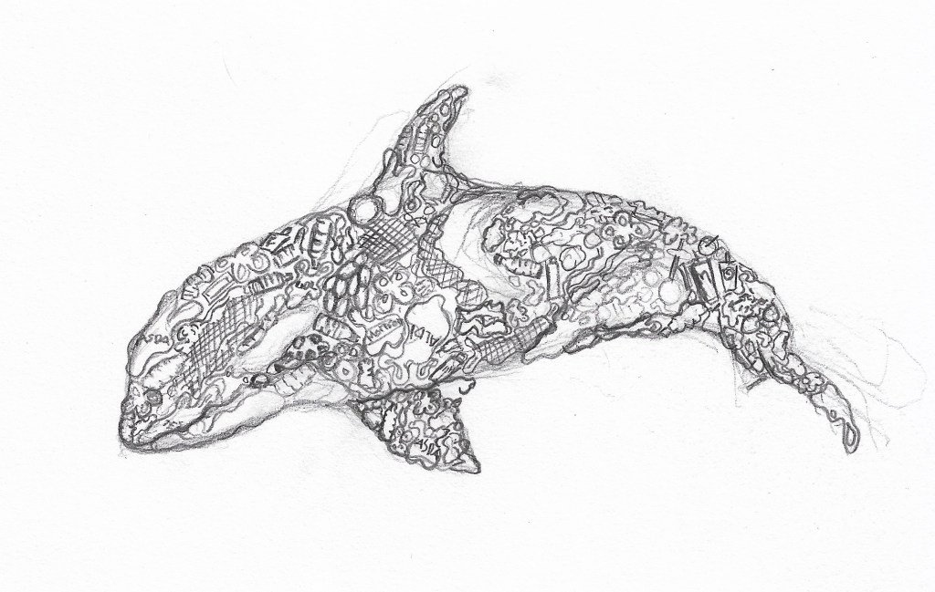
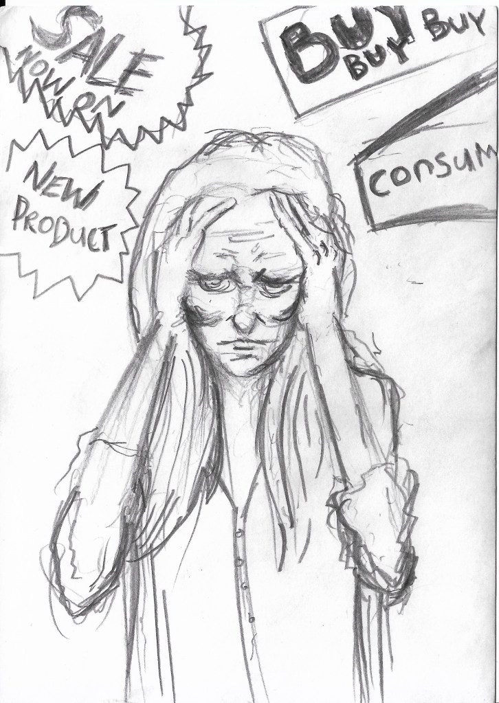
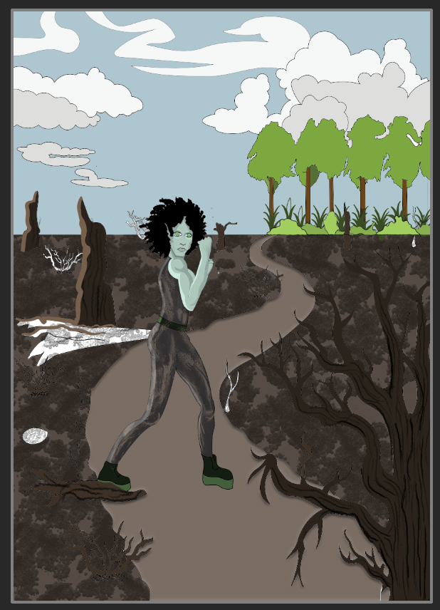
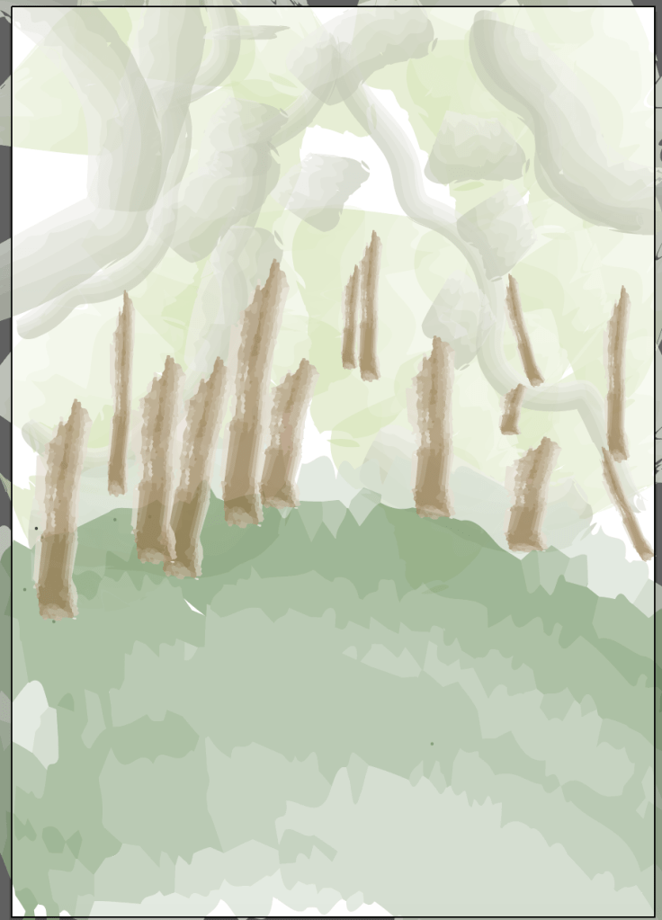
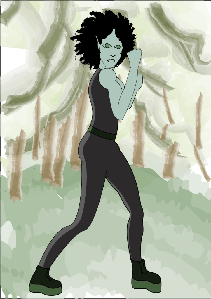
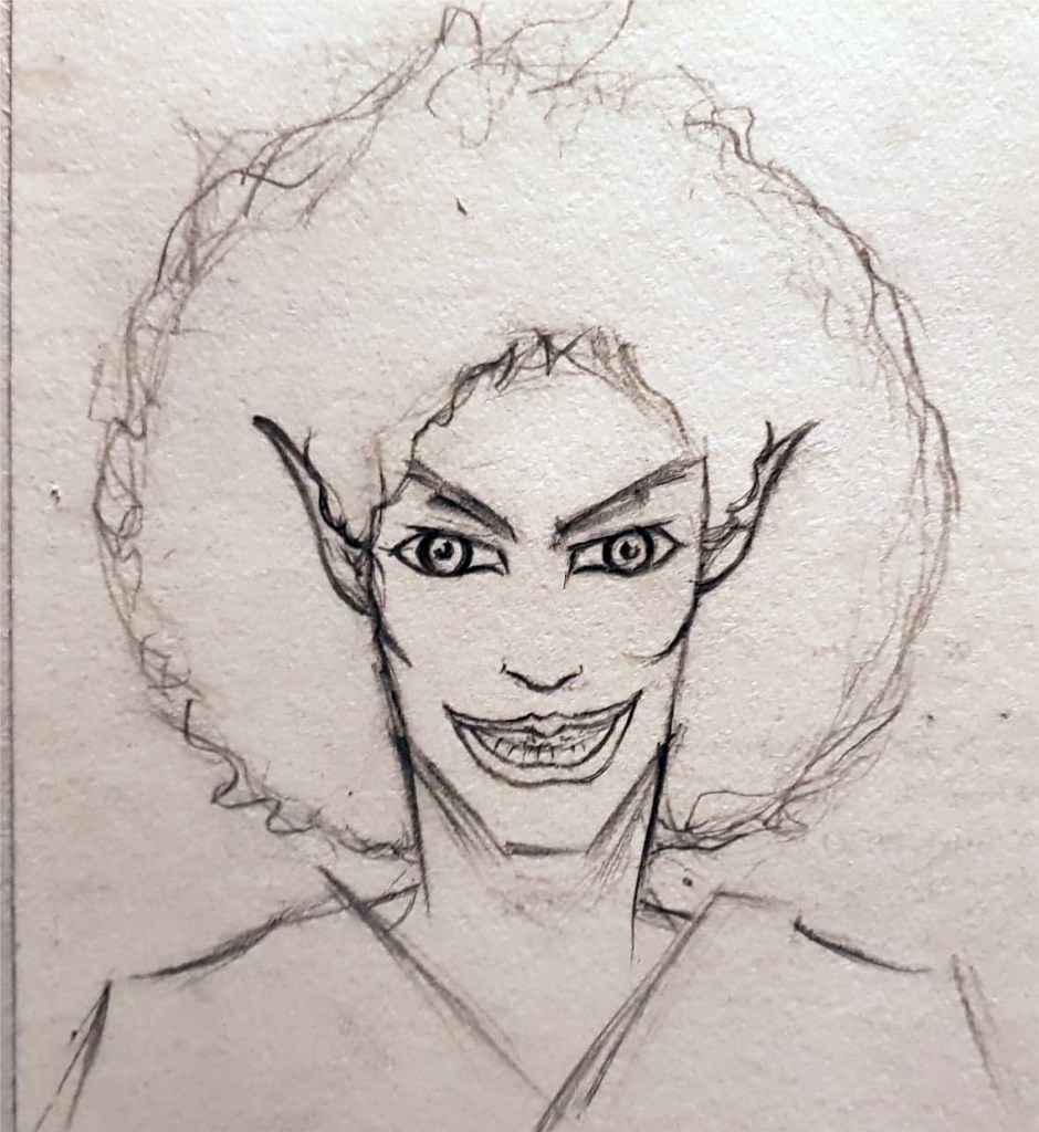
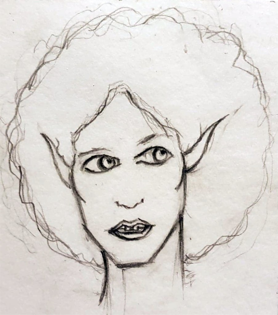
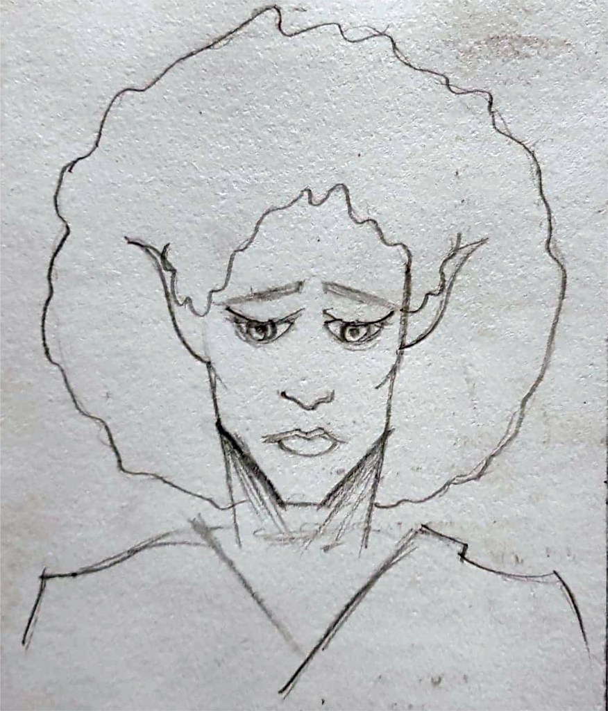
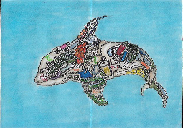
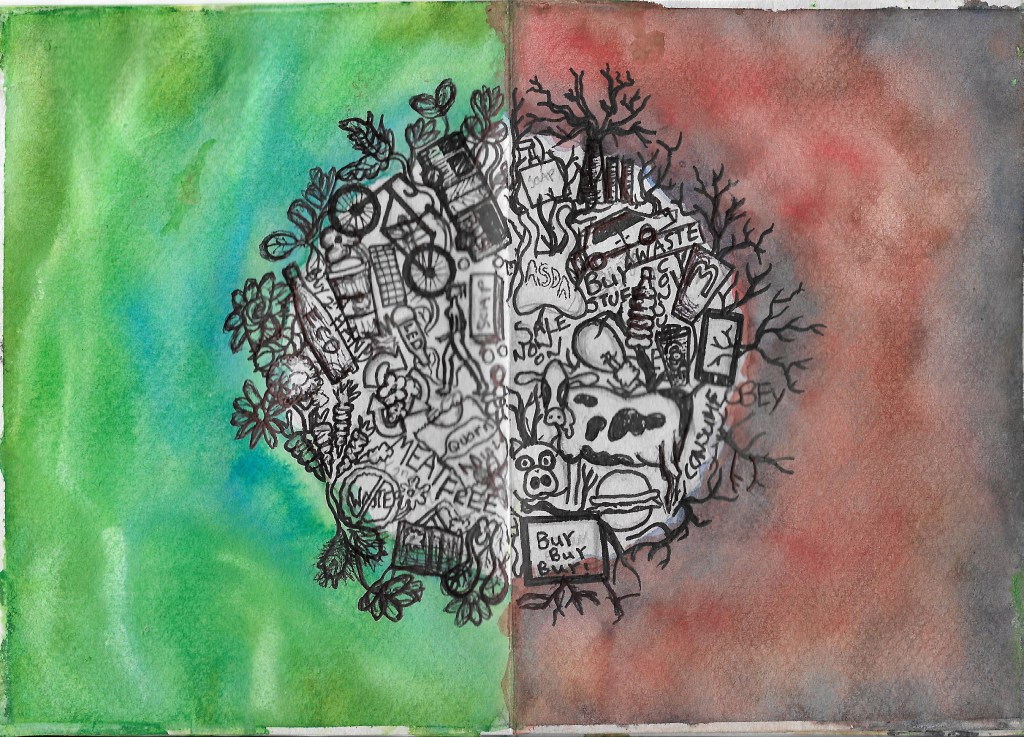
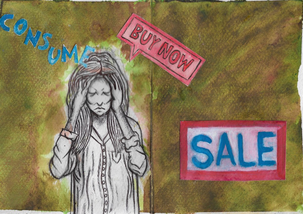
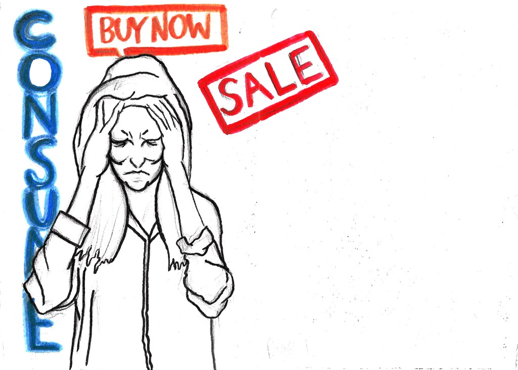
Zine week, it’s one page zine week. I am slowly getting used to the new lockdown way of life, it’s a weird world we’re living in now. I have found that focusing on one thing at a time is the way to motivate myself to do more work. This week has been spent creating a couple of one page zines which have allowed me to experiment with different mediums such as watercolour paint and marker pens. I’m still torn between the two mediums and I can’t decide which one would be best for creating my final zine. They both work well in their own way and neither of them really work for all 3 of the illustrations. For example, the plastic orca illustration seems to look best in brush pen, especially when it comes to creating a simple ocean background; but the advertisement anxiety illustration looks best with a combination of biro pen and watercolour paint. I’m starting to think that using mixed media would be the best way to proceed with the project. The one page zine format has also given me an opportunity to do some layout development at the same time as my media testing. It’s such a useful and economic way to work because if, when all of this is over, I want to print the zines, I’ll only have to pay for one page of printing which would save me a lot of money compared to printing other zine formats.

I am going to be making the zine accessible in a digital format as this is the only way I am going to be able to publish my zine due to the lack of printing facilities. I will be able to split the pages of my one page zine digitally using Photoshop or InDesign if I choose to use the one page format for my final piece. Which I might not, because while there are many positives to the format, there are also some negatives, such as the fact it would limit me to a certain number of pages, and the illustrations would have to be rather small as I only have access to A3 paper, meaning each individual page would be reduced to A6. Ideally I would like to draw them each at a minimum of A5.

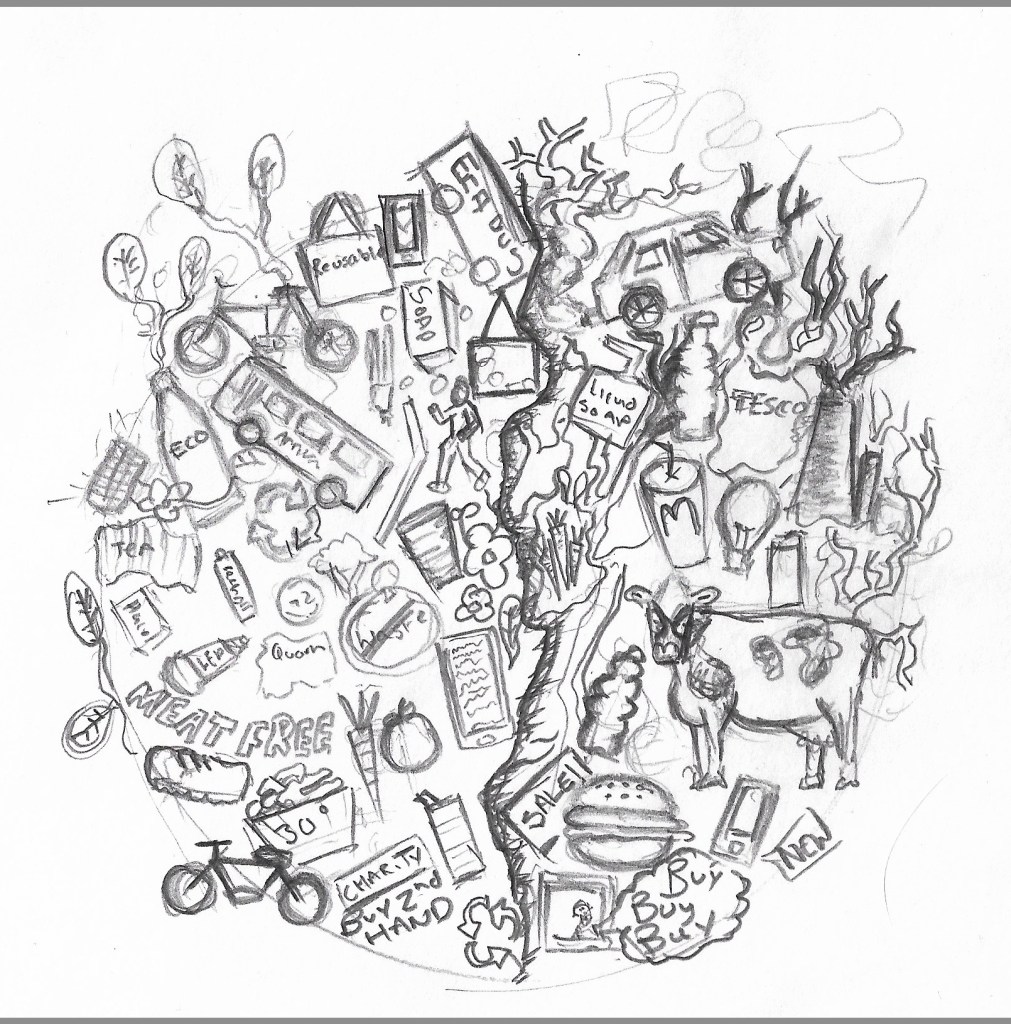
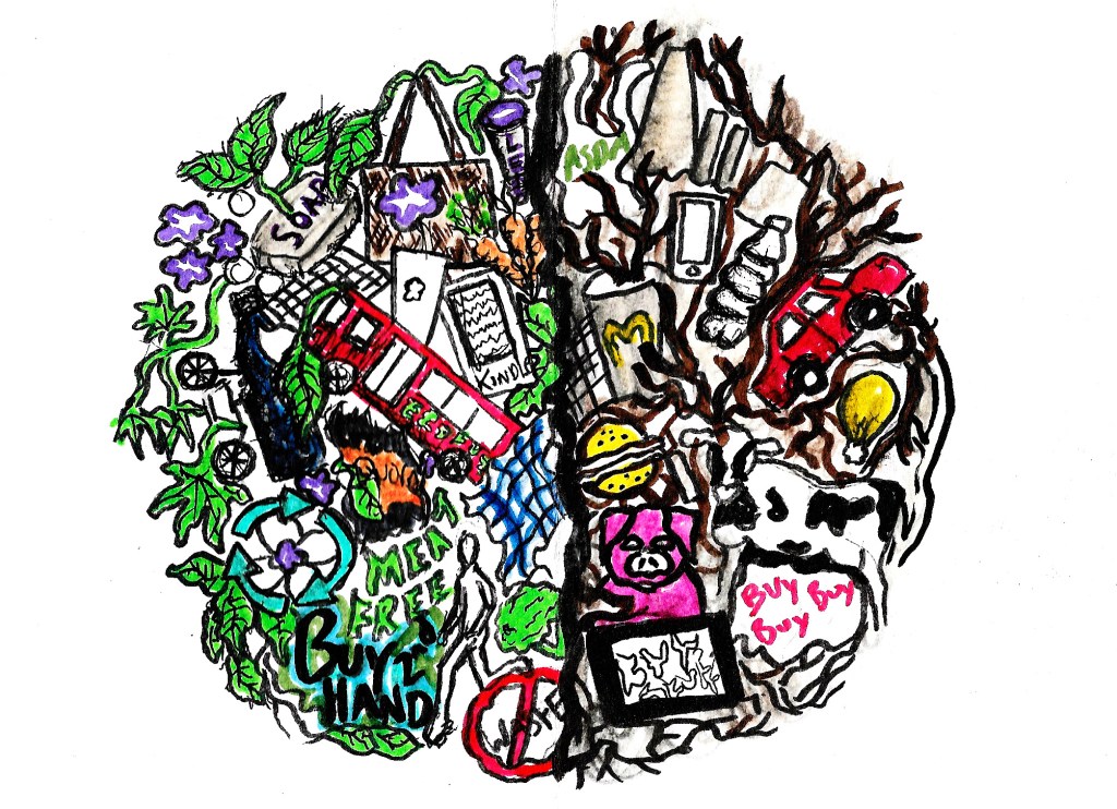
I really need to spend more time working on layout development too, because so far I have only tried creating double paged spreads with a front and back cover. While I do like these layouts, they are missing a few things such as text and I don’t want to just stick to the first layout idea I’ve had. I should experiment a bit more before deciding which layout will be best for my final zine. I’ve had some more ideas of how I could show conscious consumption since the start of the project too so I intend to create at least one more illustration which I would like to go in the zine, this is naturally going to change my layout ideas. I’m also thinking about adding a contents page, which are present in many zines and magazines, it would make the zine look a bit more professional. The addition of these extra pages would mean that I’d need to explore new methods of creating a zine because the one-page zine format just wouldn’t be viable anymore.

Coming to Terms With Life in Lockdown- Final Project Week 3

This has been a more productive week than last week, I have managed to develop my initial sketches further into more detailed illustrations. I am not completely happy with all of them because they are still a bit all over the place and are nowhere near good enough to go into the zine, but they are an improvement on my initial designs.

I’m still behind schedule on my weekly planner, which I guess is to be expected considering the state of the world right now. Though technically I have more time now, I’m still finding it difficult to motivate myself at home. I was hoping that by now I would have adjusted to the situation, but I haven’t, I miss being able to leave the house and going into college to knock out tons of work in a day. I miss seeing my tutors and the few people I talk to in college, I’m realising how helpful it was to be around a bunch of creatives that are all working, it definitely motivates me. Nevertheless, I am doing my best at home, I’m trying to work consistently, even if my work hours have changed. And while I may not feel like I’m doing as much work as usual, I am still working hard and not giving up. I also have my girlfriend and aunt to talk to and throw ideas off of which I am grateful for, life would have been much harder if I was still in London right now.

Plastic Orca Development Sketch

I am most happy with my orca development illustration which looks most like I see it in my mind. So far, I have only used pencils to create my illustrations, I intend to spend the next week or two working on media testing and layout ideas. I am going to experiment with watercolours, brush pens, digital painting and collage, with the possibility of trying out soft pastels again. I will only try soft pastels if I am able to get access to some, which so far is proving difficult due to shops being closed, I already have the rest of the materials to hand in my home.

I am also quite happy with my advertisement anxiety development illustration, there is a lot of energy emanating off of it and it’s overtly dramatic, in a good way. There is still a lot of room for improvement with it however, the drawing is still very sketchy and the proportions of the women needs to be improved. I’m still not the most comfortable with drawing people, which is exactly why I need to draw them more, practice makes perfect and all that jazz. I know I’m going to need to draw people if I want to become an editorial illustrator so I’m using the time I have now to get better at them.

Advertisement Anxiety Development Sketch

Speaking of time, if this lockdown situation is still happening over the summer after I have handed in my final project then I am planning on using the time to create a spreadsheet of art directors’ details that I am interested in working for. As well as this, I will also create a series of illustrations that are tailored to publications such as Little White Lies, New Scientist and the Guardian, in the hope that I get onto their radars and get the opportunity to illustrate for them. It would be a great way to get myself out into the world and get some cliental. At the very least, the illustrations would be great for my portfolio, even if they don’t get me work with the companies.

Planet Consumption Development Sketch

I started struggling with coming up with ideas for how to develop my designs further, and what colours to use on them. It is because of this that I decided to do something that I should have done much earlier in the project, I created a mind map that gathers a bunch of imagery and colour swatches on one page to help me get inspired during the remainder of the project.

LWL dev

I’d like to start this post by saying that I am so happy I have chosen House as the film I’m creating art for, and that we’re exploring editorial illustration. It is giving me the opportunity to explore materials and art styles that I have never done before, or even though I would ever do. The fact the visuals are so naïve and childlike has led me down the road of trying childlike materials such as crayons, and their adult cousin, soft pastels, which I’ve surprisingly really enjoyed doing. I feel as if this project is making me grow so much as an illustrator, more than the previous ones because I am so far out of my comfort zone, and thoroughly enjoying being so, that I’m considering keeping these materials in my illustrative arsenal and looking more into Editorial illustration as a potential path for me to go down, whether it’s side projects to add to my income or as a full time career. I need to research the field a lot more before I make any sort of concrete decision but I didn’t really think about it before this project and I feel as if my eyes have been opened up to the world of editorial illustration and it’s definitely got my interest.

Over the weekend I started what I hope are my final spot illustrations, having chosen soft pastels as the material I am going to use for them because of their boldness, messiness and ability to create interesting textures that I simply could not achieve with watercolour paint or digital painting. I also used a Japanese brush pen to draw linework around them to make them stand out more, I feel as if this is the best way for me to create them because I have used pens in my art pretty much consistently throughout my life and they also help me to contain the soft pastels a little bit and make the designs even bolder in the process. I still have a long way to go with using soft pastels, I need a lot more practice with them before the illustrations can be considered ready to be presented on my final design because I don’t have much experience with them prior to this week and they are difficult for me to get used to.

Decollage Attempt

As well as creating some spot illustrations at the start of the week, I have taken a bit of a U-turn as far as my front cover design for the LWL project goes, I was initially heading down the path of developing my cracked mirror design, and even went as far as creating a few media tests with decollage while I tried to figure out how to achieve the effect I wanted, but it just wasn’t working out. I realised that design was something I would feel comfortable doing and not necessarily something that would fit with the overall tone of House. Instead, I have chosen to develop my design that focuses on Blanche as the main character because I feel that she is the most recognisable film and focusing on only one character for the film fits with the layout that LWL magazines use on their front covers. I am worried that changing my mind about the front cover this late in the project could jeopardise the rest of my work because I am going to have to change the aesthetic a bit from what I was originally going for. I am hoping that this isn’t going to be much of a problem because my development piece has been done in soft pastel and brush pen, alike the spot illustrations I over the last weekend so at least there is some consistency with them. I haven’t really thought about how my spot illustrations are going to be presented on the page at this point, I’ve been focusing a lot on creating the art, rather than the layout which I realise isn’t a good thing because the layout of a magazine is just as important as the art inside it. Next week I really need to spend a lot of time creating potential layout sheets and thinking about where things should be placed on the page.

Front Cover Development- Soft Pastel and Brush Pen

Insanity Psychopus- Not #2Cute2Fail

It’s weird for me to say but I actually kind of enjoyed creating a character for the 2cute2fail challenge, it ended up tying in with another project I’m working on, illustrating a book for my aunt by association. One of her friends and her have been running a blog for years where they write about weird history, folklore and the sometimes supernatural, it’s a really cool blog full of bizarre and sometimes horrific tales and historic events. Anyway, they have decided to publish a book featuring a collection of their best and most bizarre posts and they’ve asked myself and my girlfriend to illustrate it, which is amazing, my art is going to get published! One of the posts they need an illustration for is about a folk tale called ‘The King O’ the Cats’ in which a blissfully unaware cat is comfortably sitting in front of the fireplace when he finds out the previous cat king has died and he is now the new crowned king; the thought of a cat with a crown is adorable so I decided I’d kill two birds with one stone and design the King O’ the Cats for both the #2Cute2Fail contest and the book. I tired many times to get the design right but I just kept struggling to make the kitty look cute, it’s so unlike anything I’ve ever tried before, the first lot of designs looked too realistic and not cute at all… the 2nd batch were a step in the right direction but still weren’t right, it’s safe to say I got a little frustrated while trying to design the King O’ the Cats.

Insanity Psychopus- Fineliner and pencil

One night, when I was feeling particularly annoyed at my inability to draw something cute, I decided to give up and just started drawing a creepy cat instead. I wasn’t sure what it was going to turn out like, I wasn’t trying to make it good or cute, I was just drawing. I gave it 3 eyes, a terrifying grin and Cheshire cat stripes and it looked amazing. It wasn’t stereotypically cute, not by a long way, but it was my kind of cute, all dark and a bit ropey. I entered it into the #2Cute2Fail competition immediately and called it Insanity Psychopus, a feline Psychopomp that takes your sanity away. Sure, it might not get the best reception and probably doesn’t quite fit the criteria for the call for entries, but everyone has their own idea of what cute is and I wanted to enter something that really came from me, weird, unadulterated, unaffected by university me. Of course, I did then go on to submitting a more stereotypically cute King O’ the Cats too, one that was made digitally because hey, more chances to win right? The 2nd illustration was cuter in the traditional sense and resembled a normal cat, if that cat happened to have purple skin… like the one I drew. It also more closely depicted the folktale from which my original idea came from with the cat sitting peacefully in front of a fire.

I’m glad that I entered two different pieces into the competition because it just shows that I am capable of doing more than just one style, though I do much prefer the ropey one. As for the book illustration, neither of the designs ended up being fit for purpose but I did create a lot of sketches during the process of designing my #2Cute2Fail submissions and there’s one if particular that I think I’m going to develop further for the book, I may not have killed two birds with one stone but I have made the book illustration process easier than it was before and without knowing about the King O’ The Cats I probably wouldn’t have had an idea for the Pictoplasma competition at all. All in all, it’s been a pretty productive week and I’m weirdly looking forward to starting a new project at uni next week, and finding out my results for the previous one.

King O’ The Cats- Photoshop and Wacom tablet.

Tutorial Week

Over the weekend, ahead of tutorial that I felt was looming over me, worrying that I had not done enough, I finally decided to make a proper start on my character development board. Had it not taken me so long to refine my Skaadi poses, I probably would have started them sooner. Nevertheless, I made a start on the first board, I displayed both the refined Skaadi dynamic pose and the side pose, alongside her small arsenal of weapons and her treasured necklace; for the text I decided to show Skaadi’s character profile, rather than the whole story because I wanted the board to be just about her. After much deliberation and minor alterations, I just couldn’t get the layout to look professional, my illustrations looked a bit haphazardly placed and the board didn’t look neat.  In hindsight I probably should have spent more time looking at how other Illustrators laid out their character boards; but I was running out of time and panicking, I really wanted to have something to show my tutors for when my tutorial came on the fast approaching Monday.

My first attempt at creating a character board.
CareHere. (2019). Featured App-Stop, Breathe & Think. [online] Available at: https://carehere.com/stop-breath-think/ [Accessed 24 Oct. 2019].

Monday came and my time was up, I had to go in and face the tutorial. When I got there, Sarah (one of my tutors) was surprisingly happy with the amount of work I had done over the week off and offered me some guidance on how I could improve the layout of my development board, things such as making the character profile categories stand out from the rest of the text and laying out all of my illustrations so that they formed a straight line across the centre of the board; this is something that was mentioned to the class earlier in the project but I guess it slipped my mind, I do have trouble focusing on what is being said to me, primarily when the tutors are speaking to the whole class, my mind tends to wander off. It is paramount that I work on being present in the moment when I am in class because I won’t always get the chance to speak to my tutors one to one, I can’t avoid group talks and class conversations, and while I can’t help getting a bit anxious and close in on myself in those environments, there are ways I can improve it. Perhaps I could try mindfulness again, I used to sometimes use the Stop, Breath & Think app which did help, i’ve heard the Headspace app is a really good one to use too, maybe I could try it and share my thoughts on whether it works for me.

Skaadi’s legs just don’t look right.

Anyway, getting a bit off topic, as well as talking about my character board, we also talked about my final illustration, more specifically, how the dynamic Skaadi illustration would fit into the environment that I created over the weekend. After placing Skaadi into the environment it became rather clear that she didn’t quite make sense in the piece, it was pointed out to me that her legs were facing the wrong direction as they should be leading the viewer up the path; I had kept her legs side on in the hope that I wouldn’t need to change a pose that I had spent so much time on refining. It has been a few days since my tutorial and I am still struggling to change the position of her legs and I’m growing increasingly worried that I might have to change her whole body in order for my final illustration to make sense, a task that I’m not sure I have time left to do as the deadline for this project is only a week away. I’m going to try and get my girlfriend to act out the same dynamic pose as before, but with her legs in a different position so that I have some good first hand reference images to get a better idea of how I should draw Skaadi’s legs in a such a way that she is leading the audience up the path. I really hope that I am able to achieve this over the coming weekend so that I can focus on finalising the overall illustration and finishing the character boards from Monday. If not, I will have to redraw her whole body which could trip me up on the last hurdle of the project, watch this space.

The Dreaded Week Off

Surprisingly, this week has went a lot better than I thought it would. At the start of the week I felt slightly lost and had no idea how to bring some life to Skaadi, she looked good but was missing heart and fire, her eyes looked soulless and plain. However, after a lot of experimentation and watching a plethora YouTube tutorials on Photoshop processes I have finally created Skaadi as I saw her in my head, sure there are still a few small kinks and details to sort out, but overall, I am much happier with how she looks now.

I primarily focused on fully developing the Skaadi dynamic pose as this is the one that I plan to use when I create my final comic book panel which will depict Skaadi defending her forest home. Throughout this project I had the idea of showing Skaadi inside the beautiful forest in which she resides for my final outcome, however, over the past week or two I came to the conclusion that this would be too bright and happy and it wouldn’t show the depth and darkness within the story that I wrote, it also wouldn’t portray my protagonist as the complex and conflicted character that she is. 

I spoke to one of my tutors last week and she pointed out that Skaadi was currently looking quite normal, when she isn’t, she has a much darker demon side and there is endless conflict within her world which just wasn’t showing in the illustrations I had done so far. To tackle this problem, I have decided to depict Skaadi standing in the blasted heath that I describe in the story, protecting the forest she calls home. I hope that choosing this landscape will reveal a glimpse of how dark and distressing her life can be. I’m not certain that this change of setting will be enough though, Skaadi herself will still look the same, just in a different place, I think I need to show her demon face somewhere on my final hand ins. Physically showing her other side in all of its maniacal glory would most likely solve this issue.  I guess I could show the expressions I drew of her (including her demon face) on one of my development boards. Speaking of which I’m not too sure how I am going to tackle the development boards as such because I have primarily been focusing on what the final standalone illustration will look like, I need to improve my ability to spread my focus and attention across all aspects of the project.

Dvorsky, J. (2019). The Blasted Heath | The Pnakotic Atlas. [online] The Pnakotic Atlas. Available at: https://pnakoticatlas.com/places/97/the-blasted-heath [Accessed 17 Oct. 2019].

But even all this was not so bad as the blasted heath. I knew it the moment I came upon it at the bottom of a spacious valley; for no other name could fit such a thing, or any other thing fit such a name.

H.P. Lovecraft- The Colour Out of Space

I feel as if my time management and focus has been a bit off this project, I want to blame it on the fact that I haven’t done a course for a long time, however I don’t feel like this is good enough an excuse. Other than a few notes, both mental and paper, I didn’t really set myself an official timetable for this project which is starting to bite me in the behind a bit now; when I do future projects, I should try to write up a timetable, even if it is a loose one of how and when I am going to tackle each aspect of the project. I think this would be greatly beneficial to me as it would help me to organise my time better and would make me feel less scatter-brained.

Well, that was unexpected.

This week has been a bit of a mixed bag, on the plus side I have just about finished colouring up the Skaadi side pose on Illustrator and Photoshop and I have also digitised some of the essential items that Skaadi carries with her. What hasn’t been so good is finding out that we yesterday morning that our Thursday class isn’t happening any more due to a teacher training day, and also that we’re off all of next week for a reading week; followed by a tutorial on Monday the 28th of October. Normally this would be fine, however, I still feel a bit rusty with Illustrator and Photoshop (having not been on a course doing digital art for over a year now) and I have so much I need to do and very limited idea of how to do it. I guess I am going to have to watch YouTube tutorials on Photoshop processes and figure out how to finish this project to a high standard.  

While I am rather shocked at how little notice was given about not being in Uni today, I have at least managed to do the digital line work and colour for the Skaadi side pose. I did this by scanning the initial sketch on to the computer, opening it in Illustrator and using the pen tool to trace the sketched line work, similar to how I created the line work on Skaadi’s dynamic pose previously. As I mentioned on my last post, instead of colouring my work in Illustrator as well, I exported the line work and opened it in Photoshop to colour. I found this process a hell of a lot easier than colouring it in Illustrator, partly because I have painted in Photoshop in the past. It is just so much quicker and allows me to spend more time on doing details and shadows/highlights, the use of which I have learned from researching how Fiona Staples creates them in the Saga comics.  This is subsequently also much easier for me to do in Photoshop. I have cautiously high hopes for how this project is going to go from now on, I do feel as if I am improving a lot with digital art and it is quite surprising because a year ago I wouldn’t have even attempted to get good at using computers for art. I do still love doing traditional art and digital could never completely replace it for me, however I am final seeing the benefits of using Photoshop and Illustrator to create and enhance art and hopefully I will continue to do so in the future.

Skaadi Side Pose

I do have one small qualm about the way I have painted Skaadi so far and that is that she doesn’t quite look alive yet, like she doesn’t pop out of the page or look like she is a living being, this is something that I really need to rectify and quickly because she is such a complex and active character and I want to portray that life and spirit in the illustrations of Skaadi. Hopefully over the next week I will be able to push myself to learn more about how to use Photoshop and also what alterations to make to Skaadi to give her that bit of oomph, all without my tutor’s guidance. As well and adding life to Skaadi, I really ought to figure out what kind of environment Skaadi is going to be in and design it. I mean, I know she lives in a forest and I know in my head what the whole world she inhabits looks like, I just need to show it in my art. It is certainly going to be a busy week.

Skaadi Returns!

After a week of absolute manic panic, I handed in the Fat Lass Preserves Project, which, to me went really well and I am happy enough with the final outcome. I have finally gotten back to doing the project I really enjoy doing, the Skaadi Project. Unsurprisingly, my fat lass design didn’t get picked by the company owner, which to be quite honest, doesn’t bother me because it was the first time I have ever attempted to draw and finish a larger person, so it was always going to be a learning curve, yet I am definitely feeling more confident about drawing larger characters again in the future and also in my ability to create plus size characters of my own.   

This week I have focused on digitising one of my dynamic Skaadi sketches to put on to an A2 development board that we have been asked to create as part of our final outcomes. I sketched out a variety of character poses last week during the fat lass project; they were really rough and sketchy and didn’t really look like Skaadi at all. To rectify this, I scanned the sketches on to a computer and opened them in Adobe Illustrator, I then used the pen and pencil tools to trace over the line work, while slightly changing the proportions of the Skaadi sketches to fit how I see Skaadi in my minds-eye. Once I had the line work I proceeded to colour Skaadi in Illustrator using the paintbrush tool, I decided to focus on colouring the dynamic pose because I am really happy with the proportions and I am considering using the dynamic pose on my final comic panel. I took photos of my girlfriend to use as reference for each of thew poses because I am still getting used to drawing humanoid characters and having first hand reference really helps me figure out the proportions of my characters.

I found colouring Skaadi with the paintbrush tool very awkward and fiddly, it was extremely time consuming to just create a basic fill layer, whereas I know that in photoshop, it is possible to fill entire areas with simply one click. It wasn’t until today (Thursday) that I found out from my tutor that there is a much easier way to fill colour in illustrator and also that we don’t actually have to complete the whole design in Illustrator, I was under the impression that it was an Illustrator project based on the content of the computer sessions so far. I guess I could have found out differently earlier if I had found the confidence to outwardly ask for help. Nevertheless, I will be using Photoshop to colour my designs in the future from now on and I will keep to Illustrator for the linework. I’ll probably take the dynamic Skaadi pose over to Photoshop as well because, while I am happy with the pose, proportions and the colour choices I have made, I am just not satisfied with her face and she looks rather flat, I feel as if it will be a lot easier to add highlights and shadows in Photoshop.

Overall, I am rather happy with my progress on the project so far, as well as how I have chosen to manage my time, especially without the support of my tutors, having been on a reading week.  I definitely need to work on my confidence and anxiety, I should ask for help and information when I need it instead of just struggling unnecessarily for ages. I am so pleased to be working on the Skaadi project now and my character is finally starting to come take some sort of shape, I’m aware that time is running out to do this project but now that I know we can use Photoshop as well as Illustrator, I am fairly confident that things are only going to get better from here.

Things are finally happening!

This week we finally began to develop our summer comic projects even further, we were told that the final outcome of this project would be a fully finished singular comic panel that showcases the main character in a scene from our story. This is going to be a lot easier than completing the whole comic by November so I am rather happy with this, the comic will be finished during another project at a later date.

The main focus of this week was facial expressions, continuing on from the expression work given to us during the first Illustrator session, we were handed an expression sheet that contained 25 boxes and the names of 25 different expressions that we needed to draw. The purpose of this exercise was to make us think about how to draw different expressions that we may not have done before but may need when it comes to drawing our characters and comics. I wasn’t initially very pleased with this task because I really wanted to focus on improving the design of my characters and also develop the environment that my comic would be set in, I’ve had the idea to show Skaadi either in the middle of the forest fighting a demon, or to show her standing guard in the middle of a blasted heath, protecting what little forest remains; the fire demons and light elves having already destroyed  swathes of her homeland. However, after a while I began to realise the importance of this task because as a comic illustrator, I will have to express the emotions of characters that I draw through recognisable facial expressions that readers will be able to understand. I can’t just create emotionless characters that never show how they feel; I have to be real about this. I definitely found this task quite daunting and difficult when I started it as I am not used to drawing faces and I am certainly not used to expressing emotions through faces. To make it a bit easier we were asked to take selfies of ourselves making the facial expressions that we were asked to draw so that we had accurate reference to draw from; to be perfectly honest I found the prospect of this even more daunting than the drawing itself, I never take selfies! And I won’t be posting them!

 I tried to do as much of the sheet as I could using reference from the internet and memories of when I have seen people use these expressions. Ultimately I gave up on the sheet and talked to one of my tutors, Sarah, instead, she suggested that I focus on 3 main scenarios that Skaadi would likely face and draw out how she would react to them, this idea seemed a lot more favourable than drawing 25 expressions so this is what I did. I managed to get around taking selfies of myself by getting my girlfriend to model 3 expressions that Skaadi would make during the three main scenarios that I came up with. Once I had the reference imagery, I draw out Skaadi with the expressions, changing the design of her face as I went along.

I found it rather difficult to add light and shadow effectively to show depth in my characters faces so I decided to look at how other comic illustrators use light and shadow in their work. My main inspiration for the redesign of Skaadi’s face came from the comic series Saga; I gave her a much sharper face, more expressive eyes and changed her hair so that it looked a bit more realistic than before. The outcome of this redesign was a much more comic-like character in a style that I was finally happy with, I have been trying to find a comic style for a long time and finally managed to achieve one that I was happy with.

I am extremely happy with how I am progressing on this course so far and I hope that I am able to keep this up in the future. I am so pleased with myself for drawing Skaadi in a style that I am happy with and one that I would use in comics any day. There are still some tweaks needed to the style, it’s not exactly refined yet, or coloured, but oh my god I have something that I can work with. From here on I will developing the newfound comic style even further and refining it so that it will eventually be something that I am proud of and could possibly use in other comics in the future.