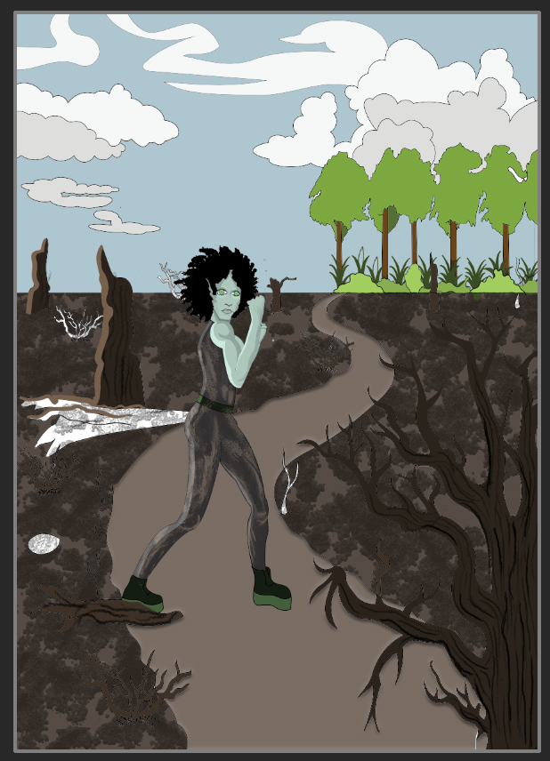
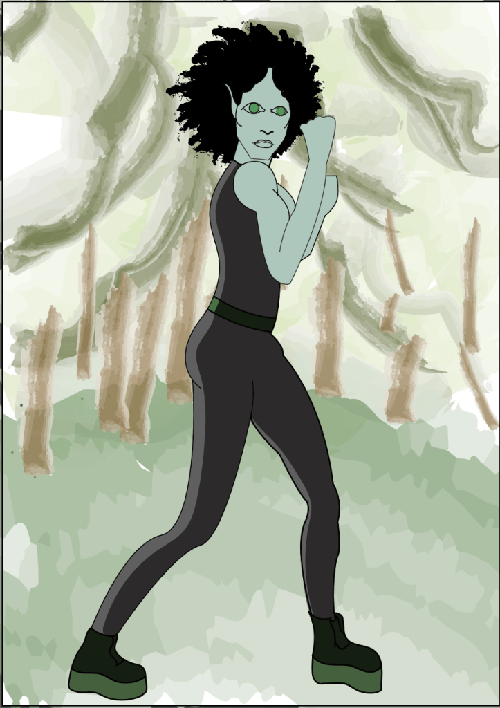
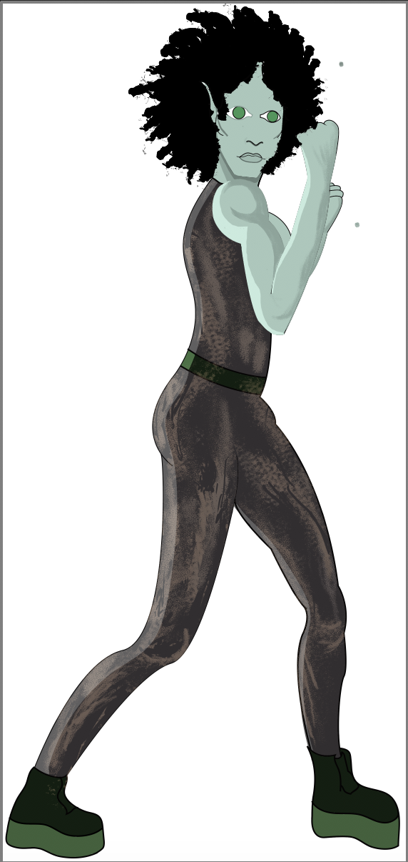
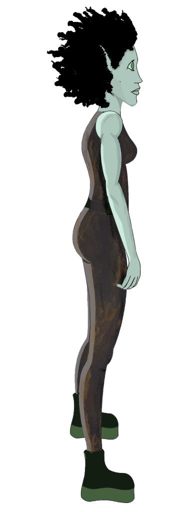
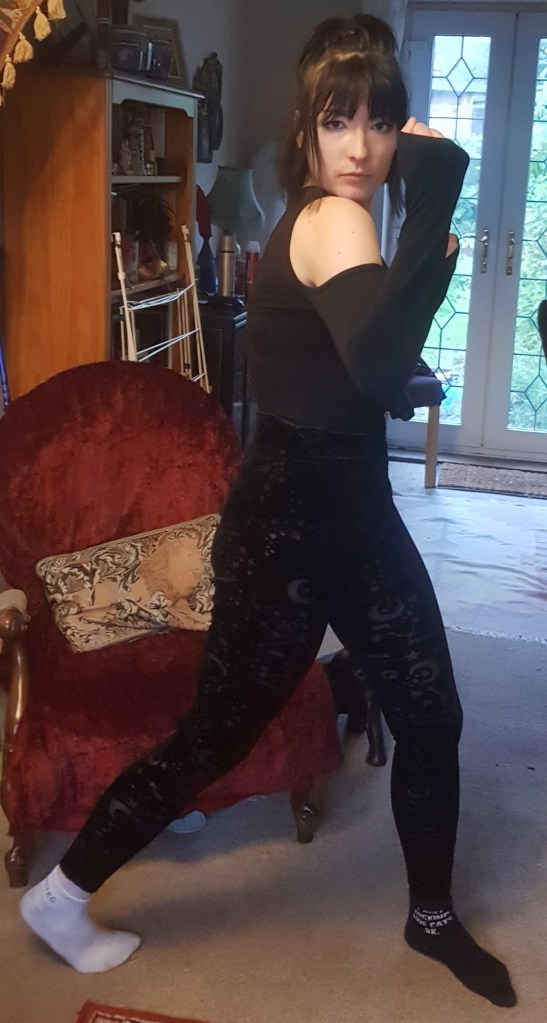
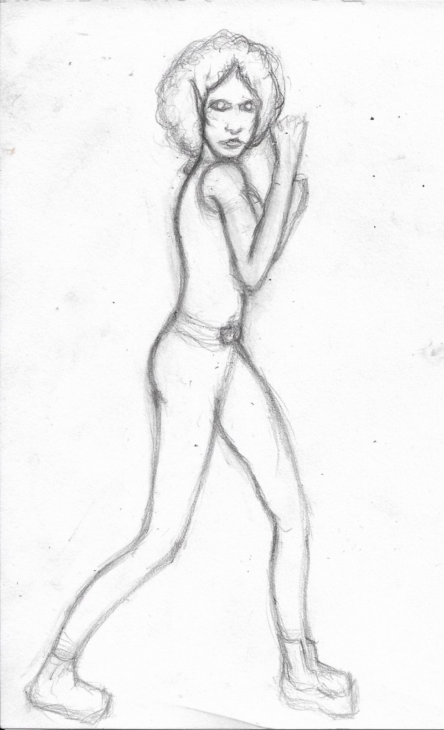
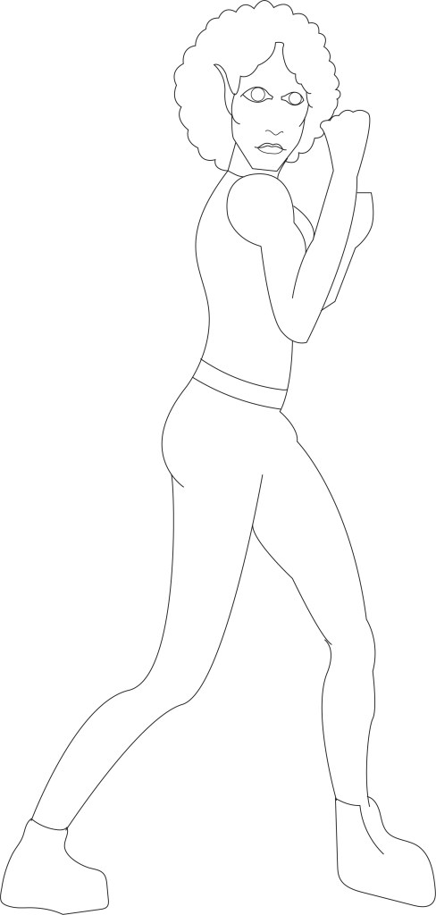
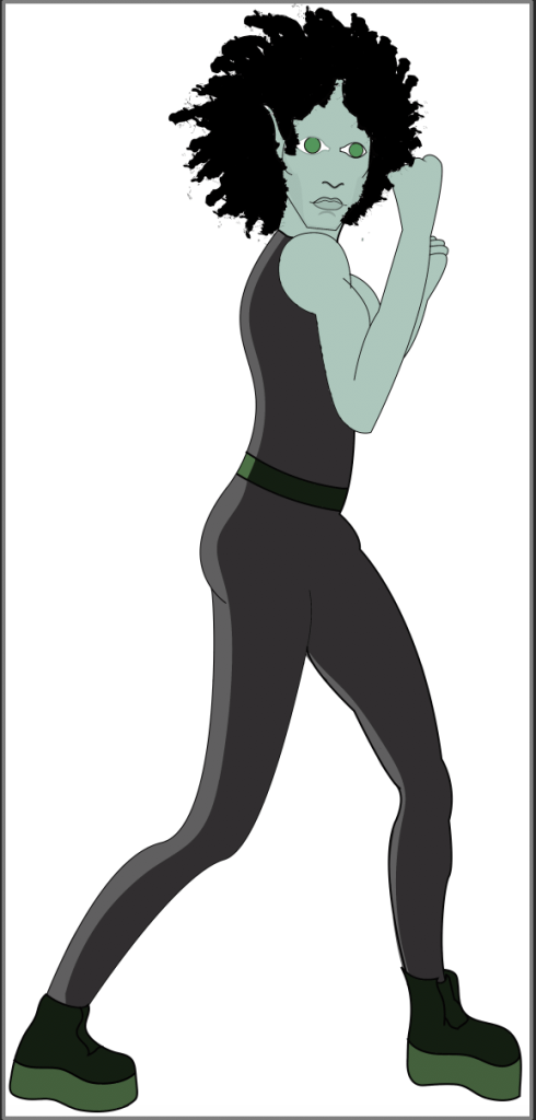
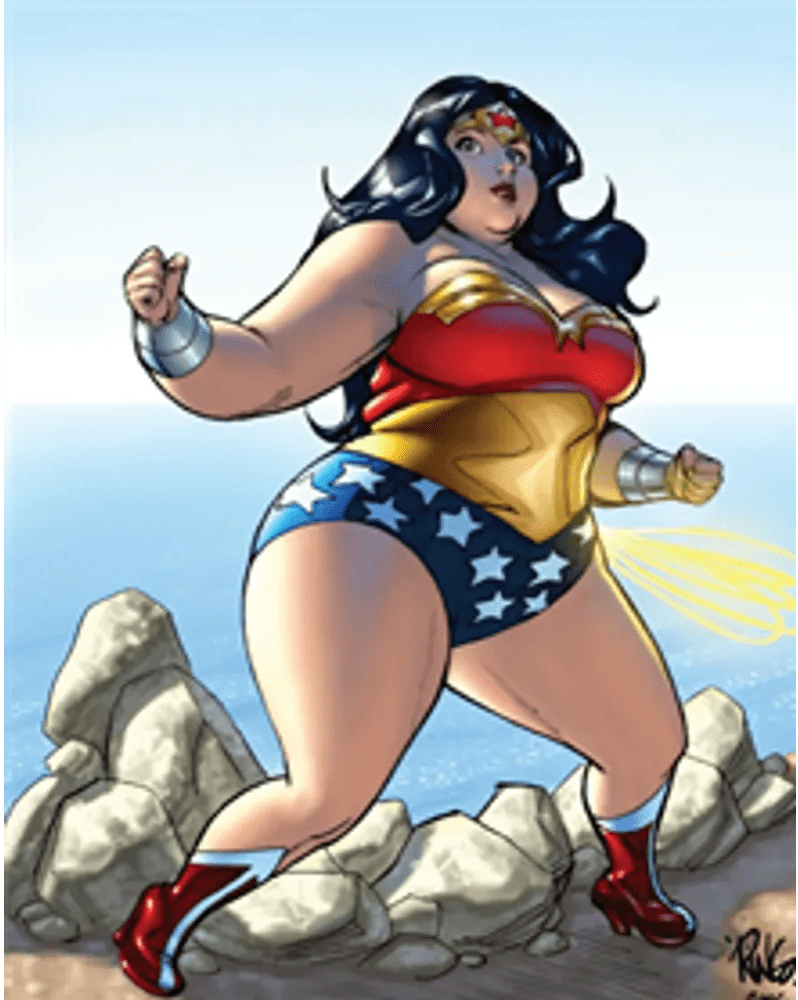
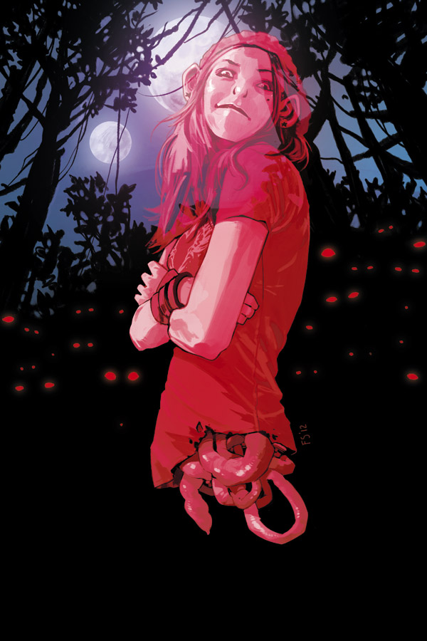
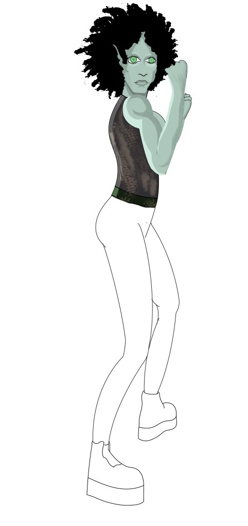
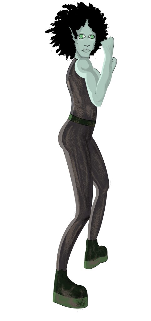
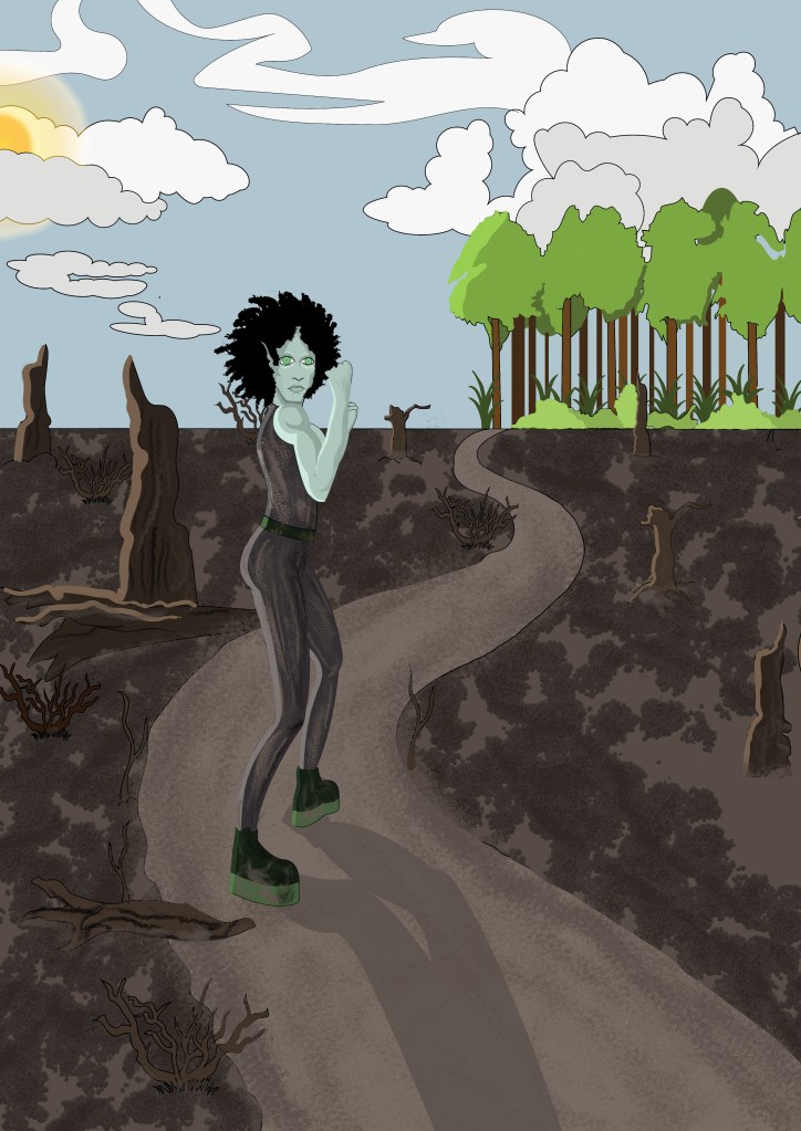
Well, I did it, I managed to redraw Skaadi’s legs and I can happily say that she looks like she belongs in the environment. It was not an easy task, at all. I asked my girlfriend to pose for me again so that I had some god first hand reference to draw from and even then I struggled; the position that the legs needed to be in meant that I had to use some foreshortening which is something I always try to avoid. I think it took me about 5 attempts to draw the legs in a way that they would make some sort of proportional sense, but it’s done now anyway and I guess it was a good learning exercise, I can’t avoid using foreshortening forever, especially since I hope to go into comic design someday. I think I need to practice doing foreshortening more, my attitude towards it isn’t the best and I managed to do it this time, so I should practice more so that I can get better and not struggle with it so much when I need to do it for a project again.

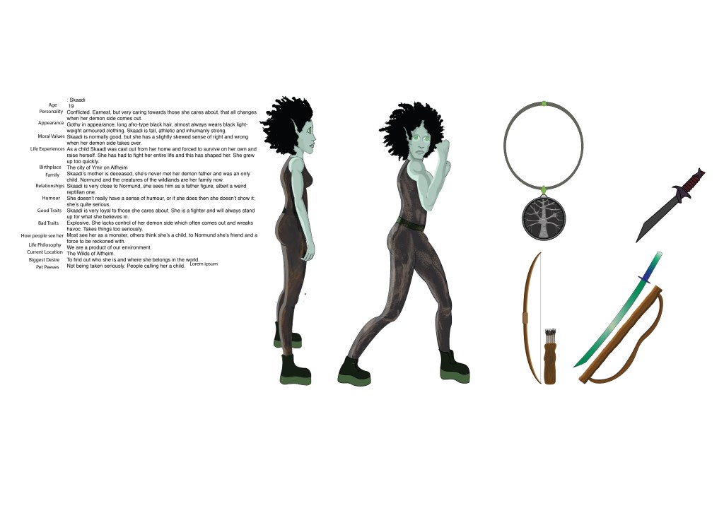
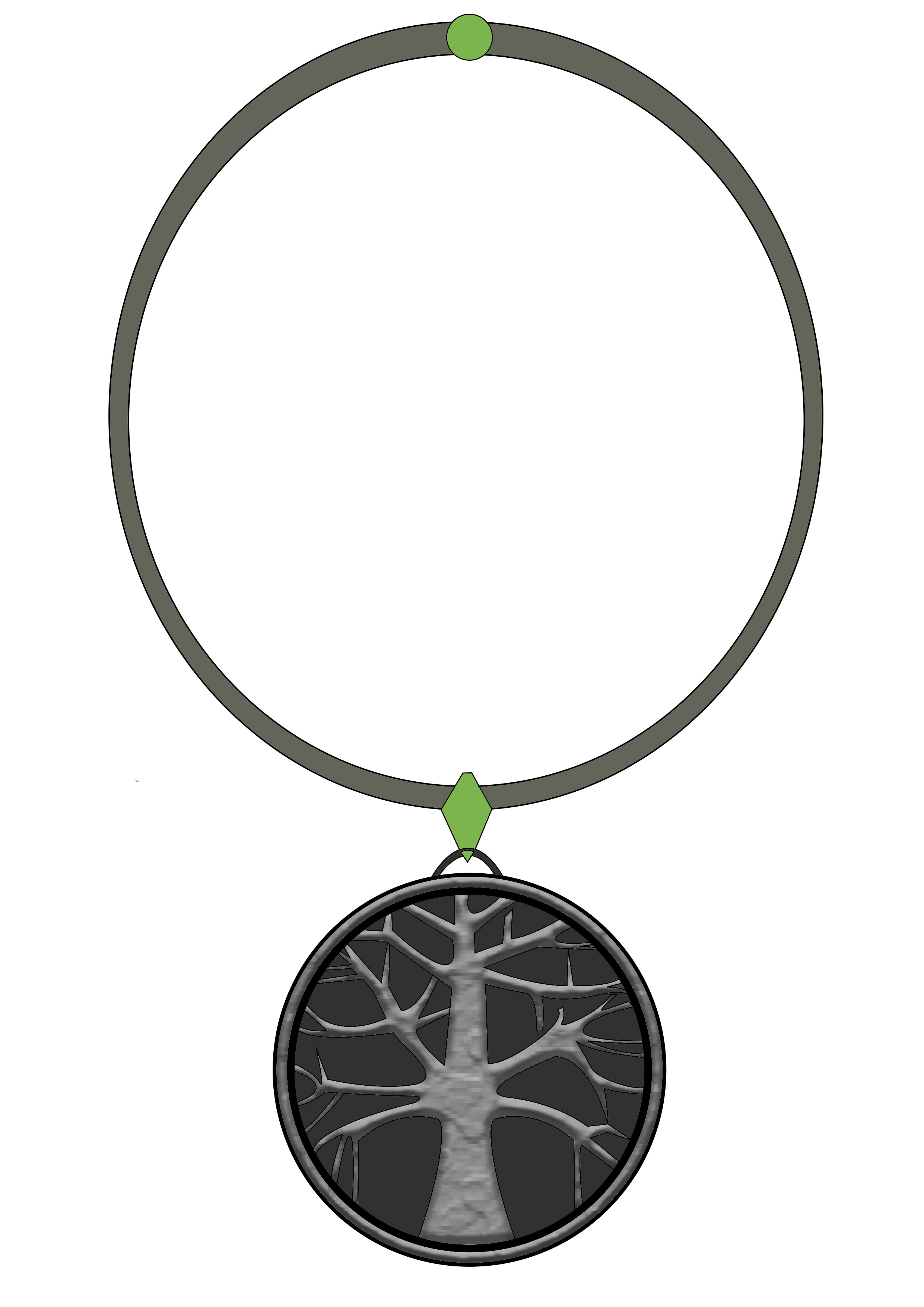
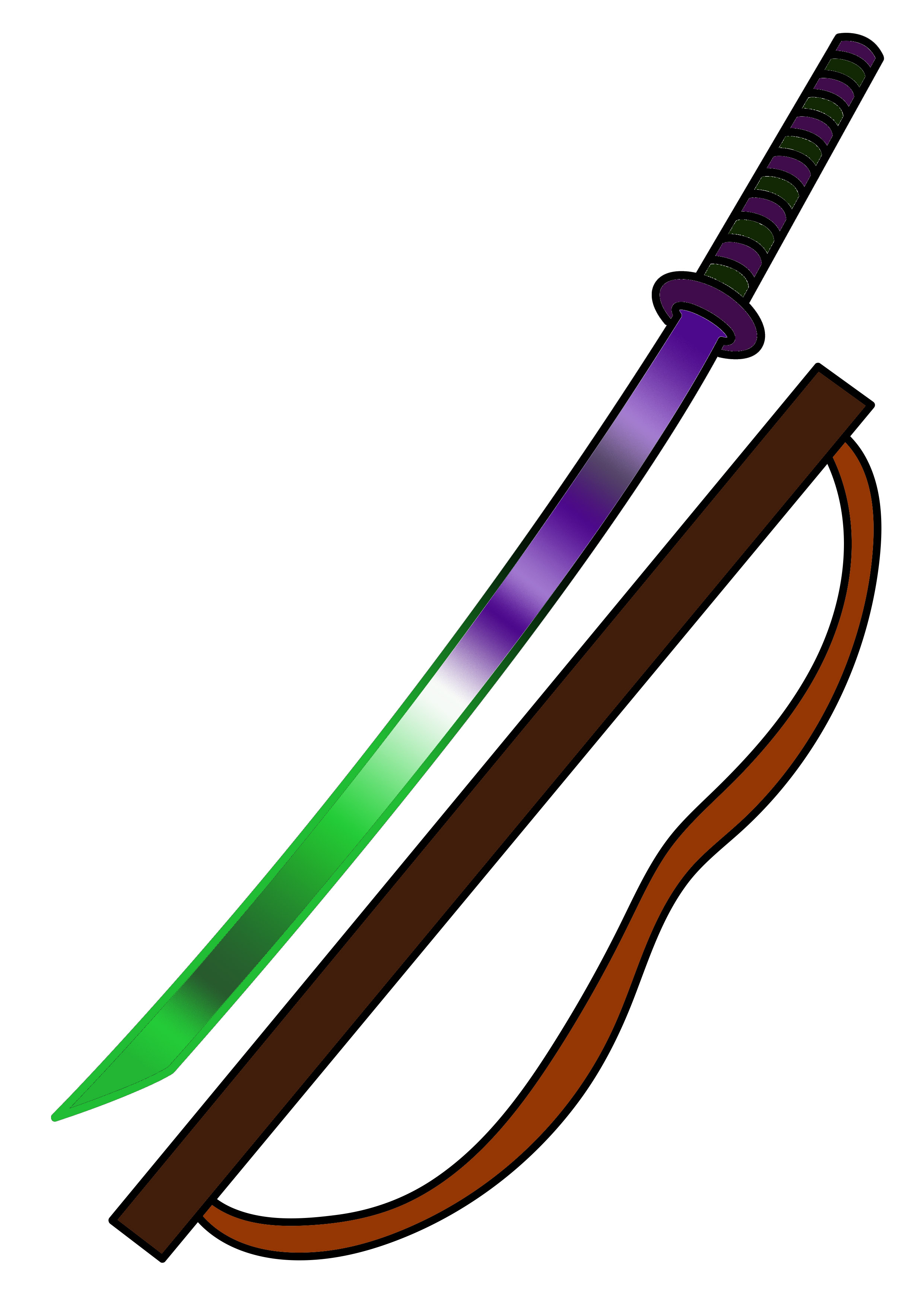
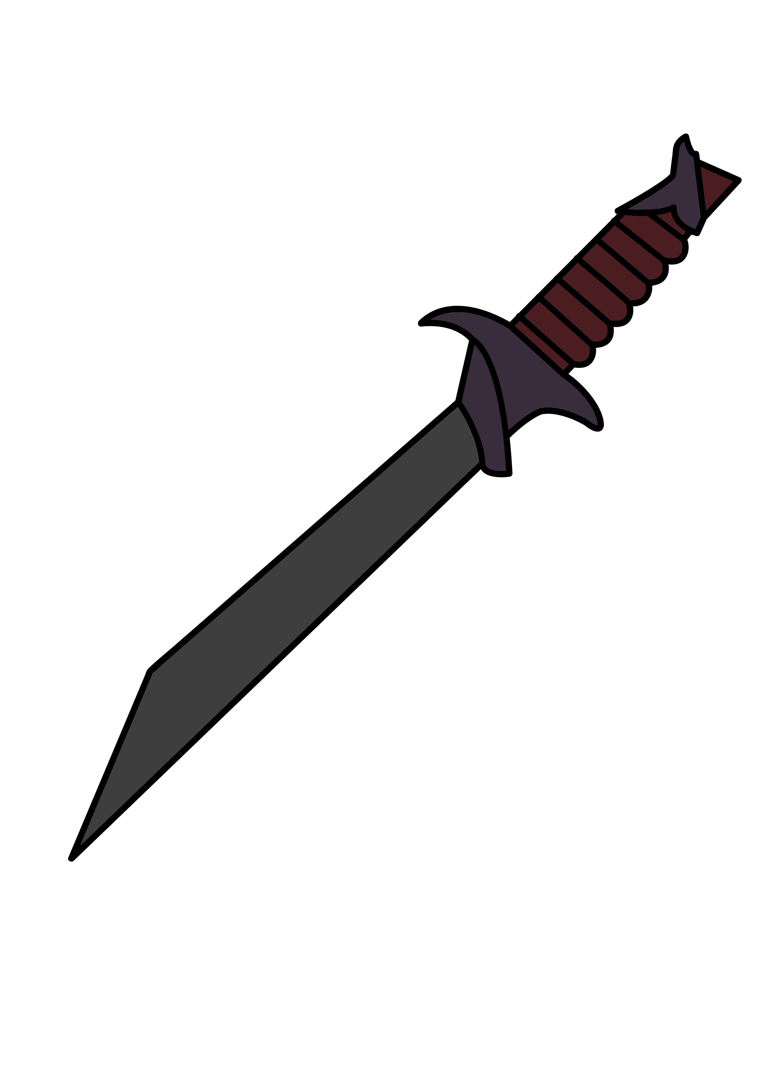
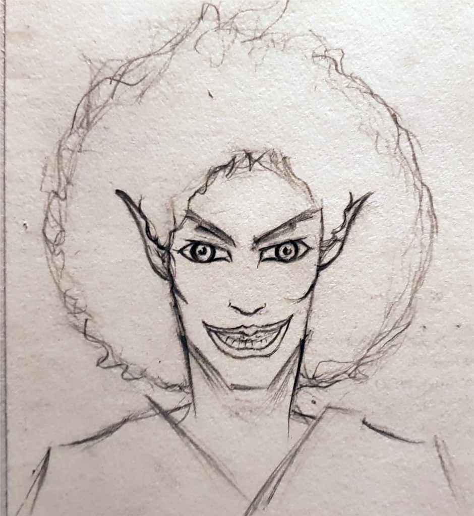
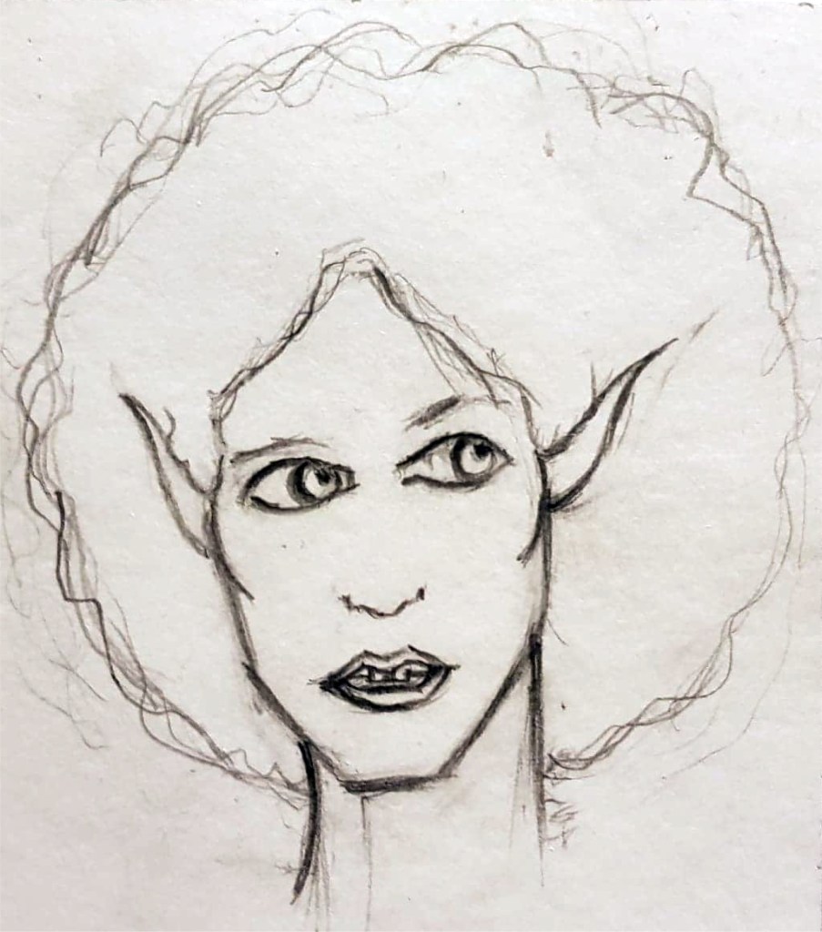
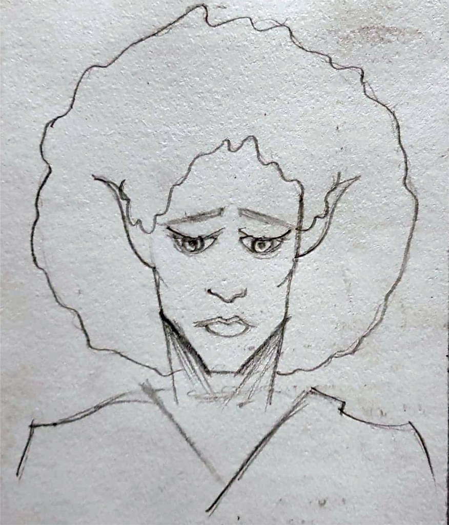
I’ve managed to finish my development board now too, I took what my tutor (Sarah) said to me in mind and decided to layout Skaadi’s character poses and weaponry in a straight line across the centre of the page, they look really uniform now and I’m quite pleased with it. My second board primarily has Skaadi’s expressions on it to show the different sides of her, from her brave elven side to her horrific demon persona. I wrote a few paragraphs explaining each part of Skaadi in detail so that the audience could really understand her and hopefully feel for her because she is in such an awful predicament.
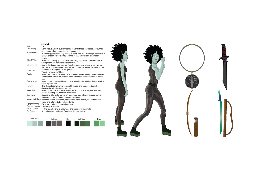
Final Character Board 1 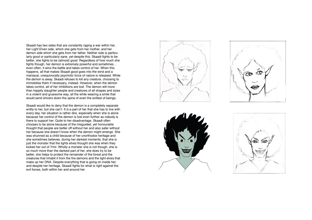
Final Character Board 2
I feel like I’ve come a long way as a person and illustrator since I was last on this course over a year ago, I’m more willing to adapt to using digital art methods and try new things, things that I was rather stubborn about not using in the past. I’m realising that I don’t always need to make things difficult for myself, and that I’m not as bad at art as I used to think. I still have a long way to come with my confidence but at least I feel like I’m getting somewhere. This project is coming to a close soon and I’m not so worried about getting everything done on time, my sketchbook is up to date, though it could look a lot neater and my work could be presented in a better way. I really need to work on my sketchbook presentation skills, I feel like a lot of the pages look grimy where my pencil sketches have smudged on to the other page, or where glue has stuck to the wrong parts of the page. I do try to make things look nice but I quite often get so caught up in actually producing the work and writing the annotations that I don’t focus enough on how I put it all together on the page. I hope I don’t miss out on too many marks because of this. Maybe I should start wearing gloves when I stick things in my sketchbook, it would stop me making marks on the page where my fingers have touched, or put pieces of scrap paper over pencil sketches to protect my sketchbook pages. I guess a fixative spray could work too, but it’d have to be one that wouldn’t change the colours or anything about the sketches. I should really look into getting some fixative spray and maybe write a review of it on the blog… is that something I could put on this blog?? I don’t know, why not.
Hopefully by the end of next week I will have handed in the project and everything will be all well and good, after which I’ll be straight on to the next project, there aren’t many breaks in 2nd year I’ve noticed, even when we aren’t in uni we’re doing some sort of project.. well, I am anyway, I’m not sure how other people on the course work but for me it’s pretty much non stop. I guess I like it that way, it gives me something to do and I feel like I’ll be able to become a professional illustrator someday if I keep putting the work in.