What is New Scientist Magazine and Why Should You Read It?

New Scientist magazine is one of the world’s most popular weekly science and technology magazines. Their magazine is featured online, through print and also on app editions which means that the illustrations and layout present in the mag need to be formattable across these areas. The magazine covers stories about science and technology that intrigue, inform and entertain the widest possible audience, which consists of people from a wide variety of lifestyle, from physicists, biologists to people that have no background in science at all. They have an unrivalled global reach largely in part to the fact they have been around since 1956 and have offices working for them around the world.
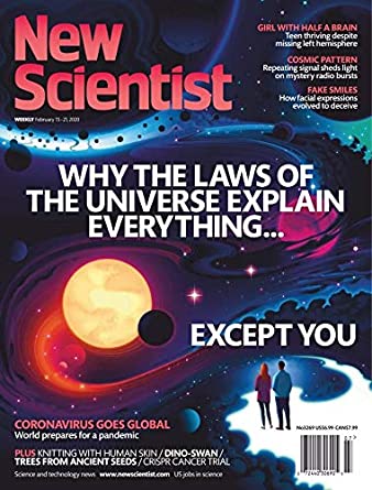
New Scientist does it’s best to stand out from the crowd, from writing exclusive scientific stories from an angle that can’t be found anywhere else, to hiring independent illustrators to design their covers and colourful illustrations that are carefully placed throughout each issue of the magazine. New Scientist really is one of a kind. They do something that a lot of science magazines don’t, they explore the social and cultural impacts of both scientific and technological discovery, as well as any consequences they could pose on society, rather than just documenting them. As well as exploring the social and cultural impacts of discoveries, they also write regular features and commentary on environmental issues, something that I am highly passionate about. This is one of the main reasons that I would like to create illustrations for New Scientist one day, they have ethics and aren’t afraid to show it, which is something that I really admire them for.
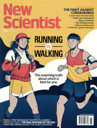
New Scientist uses often colourful and vibrant illustrations to help explain complex scientific theories and ideas in a more understandable and sometimes conceptual way. This is really important because a lot of their audience don’t have a huge scientific knowledge, but still want to keep up to date with the latest scientific and technological progress, the illustrations within the mag help non-scientists engage with the articles and keeps them coming back for more. They also need to be accurate enough to engage with the audience that are scientists, this must be a difficult line to walk but New Scientist manages to do it regardless. The art editor at New Scientist is Craig Mackie and he says that of 36 illustrated covers that he commissioned in 2015, 17 of them were done by new illustrators. He likes to keep the magazine fresh with new talent and while he does have a list of go to illustrators that he knows he can rely on; he likes bringing in new people that are going to bring something different to the magazine. Working like this is beneficial for both Mackie and the illustrators that he brings on, they get more exposure and the magazine gets to keep being ahead of the curve and stand out from the crowd.New Scientist. 2020.

About New Scientist Magazine | New Scientist. [online] Available at: <https://www.newscientist.com/about/&gt; [Accessed 26 March 2020].

Carless, J., 2020. What Art Directors Want: Tips For Editorial Illustrators | Create. [online] Create.adobe.com. Available at: <https://create.adobe.com/2016/4/20/what_art_directors_want_a_guide_for_editorial_illustrators.html&gt; [Accessed 26 March 2020].

New Scientist. 2020. Guide For Freelancers | New Scientist. [online] Available at: <https://www.newscientist.com/in209-guide-for-freelancers/&gt; [Accessed 29 March 2020].

https://www.newscientist.com/in16-about-new-scientist-magazine/

Newscientist.com. 2020. Magazine Archive 2020 | New Scientist. [online] Available at: <https://www.newscientist.com/issues/&gt; [Accessed 29 March 2020].

Hi Fructose Volume 54 Review

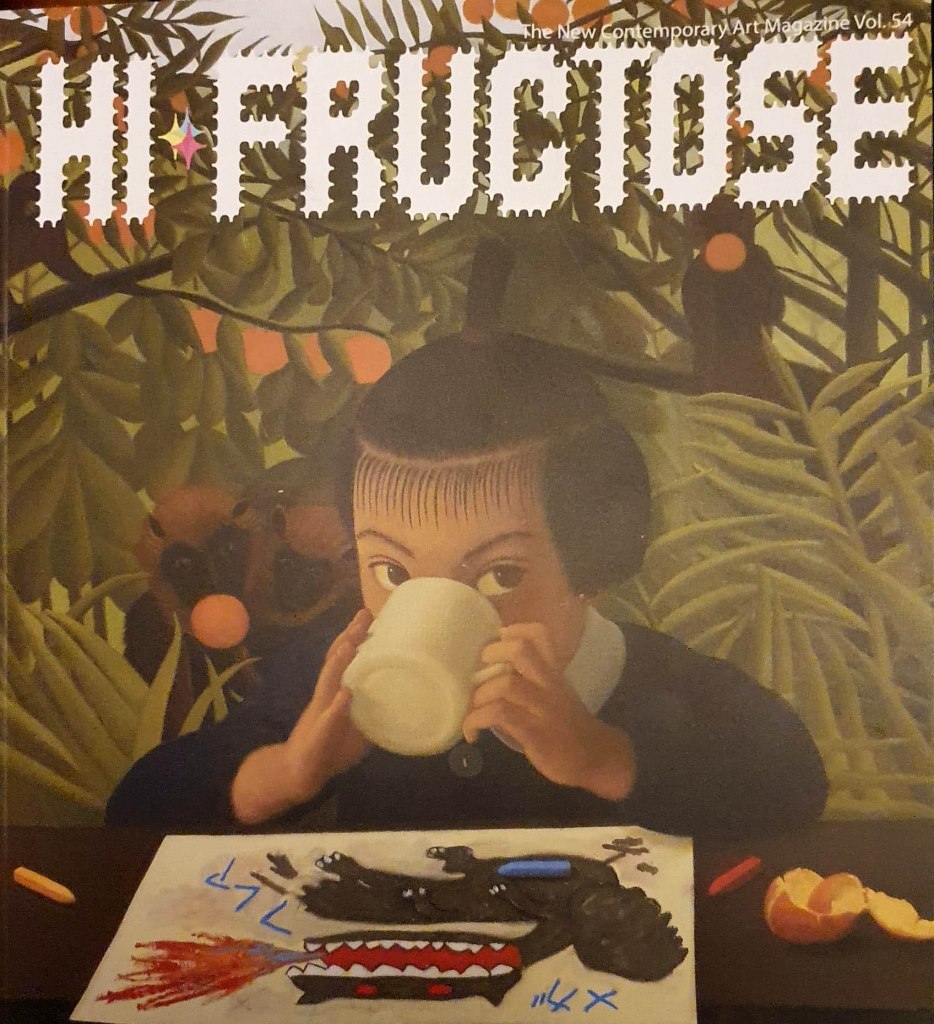
Hi-Fructose Volume 54 Cover- Image taken by Rohan Hall

In this post I will be reviewing Volume 54 of Hi-Fructose Magazine. Now this is the first time I have ever owned Hi-Fructose so I wasn’t too sure what to expect, but I liked the look of their website which is what lead me to purchasing it. The front cover also drew me to this particular issue a bit when I was browsing around in WH-Smith, it seemed to be rather nature focused, with an image of a young girl having a relaxing cup of tea in the middle of a forest/jungle. Gibbons surround the girl in the trees while they tuck into some oranges and stare curiously at the girl who appears to be drawing a picture of a dragon. There is just so much going on in this front cover, the more I stare at it, the more of a story I see and the more questions I have about what is going on. I was definitely drawn to the nature aspect of the cover, it seemed really interesting and I hoped that the nature theme would continue throughout the magazine, and I some ways it did.

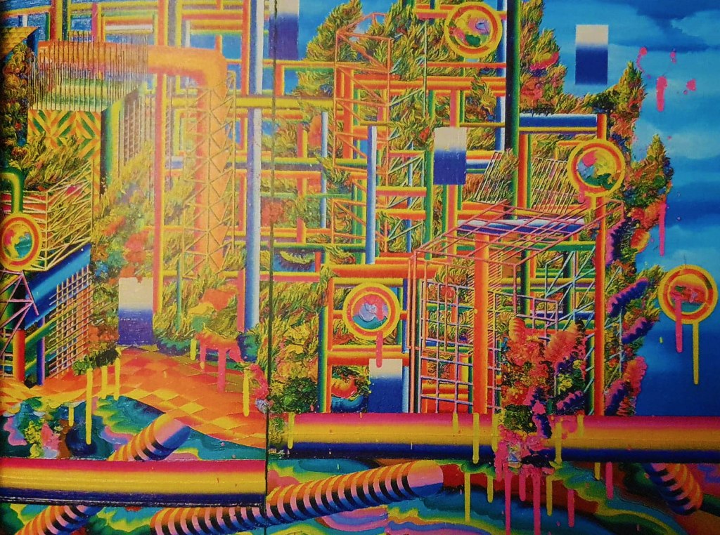
Now I cannot say that I like all of the art that is presented in this magazine, but even the artists that I do not likely still teach me something because the articles in Hi-Fructose are so well written and the interviews go so in depth to each illustrators and artists process to find out why they do what they do. This can be said about the first artist that is featured in this volume of Hi-Fructose, Eunjeon Choi, who creates unbelievably vibrant and psychedelic pieces that are inspired by bonsai trees and the way that they are structured and forced to grow a certain way against their will. To me, Choi’s work is too much to look at, their work feels crowded and overtly colourful and chaotic. This is kind of the point as Choi also takes inspiration from our fascination with artificiality and they chaotic world we have created online and while I do like the idea behind Choi’s work and their motivations, the art itself is just too much for me.

Eunjeon Choi artwork featured in HI-Fructose Volume 54- Image taken by Rohan Hall

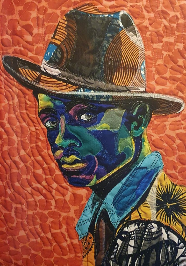
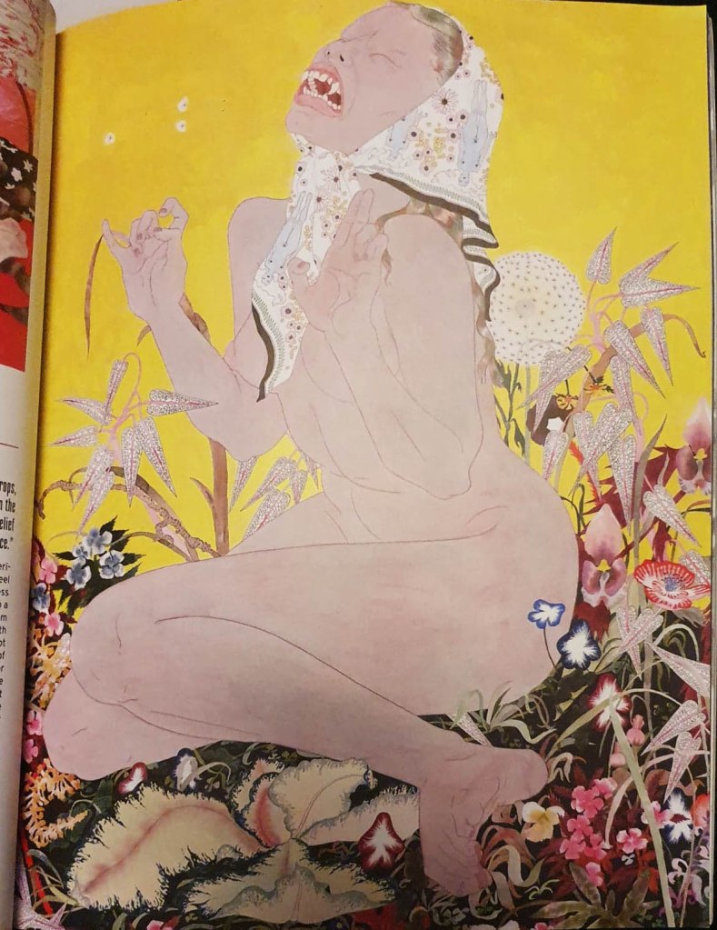
There are artists in this issue of Hi Fructose that really inspire me, artists such as Rikka Sormunnen and Bisa Butler who use their respective mediums to try and fight for change in the world and raise awareness to current issues that unfortunately are on the rise in 2020. Riikka Sormunen subverts the impossible beauty standards placed on women by men by using traditional poses that are often associated with beauty and turns them into something uncanny, something slightly disturbing. She has plans to start drawing women with stretch marks and cellulite in the future. Bisa Butler uses fabrics to create stunning, actual size portraits of unnamed African Americans in an attempt to give them the respect they never received in life. Her portraits are also made to confront people who do not believe that African Americans are equal, to challenge their misled preconceptions and force them to look them in the eye and question why their negative views.

There are a lot more artists featured in this issue of Hi-Fructose, there is even a small book contained within which is a nice extra bonus. Each page is beautifully laid out and has opened my eyes to a whole host of illustrators and artists that I didn’t know about before. I am definitely going to be buying more issues Hi-Fructose in the future. The magazine seems to be catered to young adult/adult audience, since quite a few of the artists draw mature things and the topics that are presented within the magazine are quite complex, as is the way the interviews and articles are written. I just don’t think a child would be able to understand much of what is going on within Hi-Fructose.

This magazine is going to help me a lot in my college work, it will provide me with a wider range of artists to research and explore which id dint have before. I also intend to use it as a part of my research for the essay which we have been asked to write before the 19th of March.

What Did I Just Watch? And Other Thoughts I Had This Week

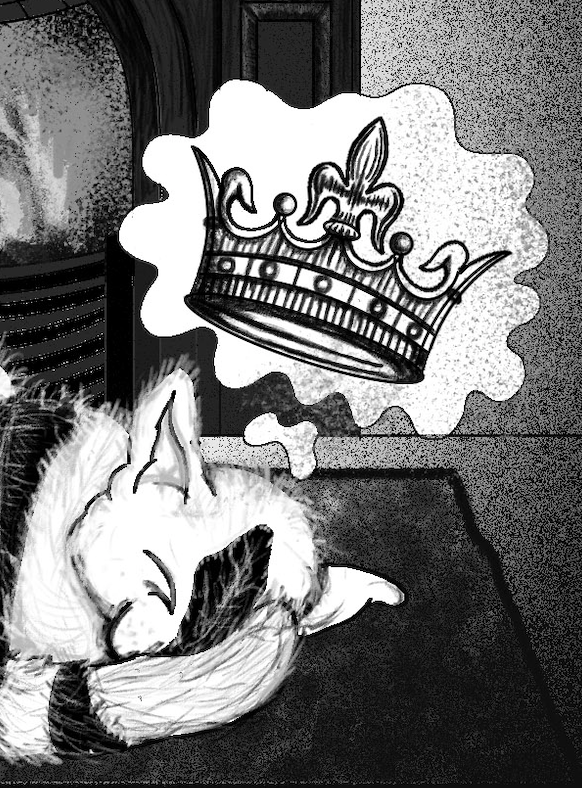
King of The Cats sneak peak

Well, I didn’t manage to watch all of the movies over the weekend because I was busy finishing off the King of The Cats illustration for my aunts’ book, which I’m trying to do alongside my university work; I’m not going to lie, it’s going to be difficult but I just need to get better at managing my time.  I watched Blade Runner and House though, I’ll post my reviews of the movies separately because there is just so much to say about them, especially House which is basically a drug fuelled nightmare in all of the right ways. After watching these two I have decided that House is the movie that I am going to focus on creating art for this project, it’s been a while since I did any horror based art and I think House will really challenge me it is far from a normal horror movie, the style, tone and atmosphere of the film are unlike anything I have ever came across before. I think choosing House for this project will really push me as an illustrator and take me far out of my comfort zone which will be a good thing to show in my portfolio.

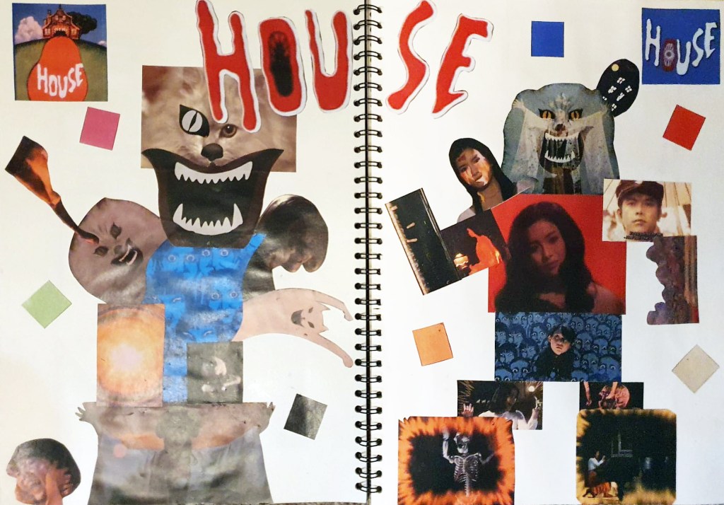
Double paged spread House moodboard

On Monday we were asked to create a mood board for one of the films that we will be able to refer back to for ideas during the course of the project, I actually ended up creating two because I just couldn’t fit all of my ideas for House on one page. On the mood board I have included images of the main protagonists, antagonists and supporting characters, as well as images of some of the many bizarre scene changes and special effects that are plastered throughout the film. I watched the movie on my laptop, so I was able to get reasonably high quality screenshots of key scenes in the film which I cut and stuck into my sketchbook.  I also used the eyedropper tool in Photoshop to take samples of the main colours that House uses so that I have an idea of what colours to use in my development and my final illustrations. The whole point of the Little White Lies front covers is to capture the themes, atmosphere and visual tone of the specially selected movie, this can be done with the use of linework, colour and composition of the illustration, the colours used should reflect the movie in order for it to be successful which is why I sampled the colours directly from the movie.

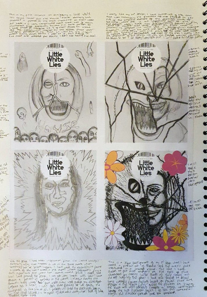
LWL House thumbnail sketches

As well as creating a mood board, one of my tutors kindly created a worksheet that contains four blank Little White Lies front covers, we were asked to sketch 8 different front cover variants as part of our initial ideas and development. So far, I have sketched out four out of 8 designs, taking inspiration from the House movie, as well as some illustrators that have previously created covers for LWL to do so. I have found it really difficult so far because no matter how hard I try, I just can’t get any of my people portraits to look right, I also can’t decide who the main character in House is, and I’m supposed to be creating a portrait of them. The plot of House is so confusing that I think 3 characters present in the film are all the same person by the end and one of them isn’t even human. I have tried to combine fragments of all 3 of their faces to create one unified portrait which hasn’t went very well either, trying to show all three characters was too much, it compromises the appearance of all of them. I also tried doing something similar using two of the main characters faces instead, which worked a lot better because half of the portrait is a cat which is something that I am much better at drawing. I used the iconic mirror scene from House to frame the design which really works to me compositionally, so far, my second design is the strongest and the one I want to develop further. Speaking of cats, I’m going to create a wholly separate post at some t point talking about my King of The Cats illustration because I am unbelievably happy that my art is going to be published and I want to talk about it.