Technology Isn’t Always reliable. I Need to Make Timetables, But The LWL Project Has Been Handed In- A Review Of This Week

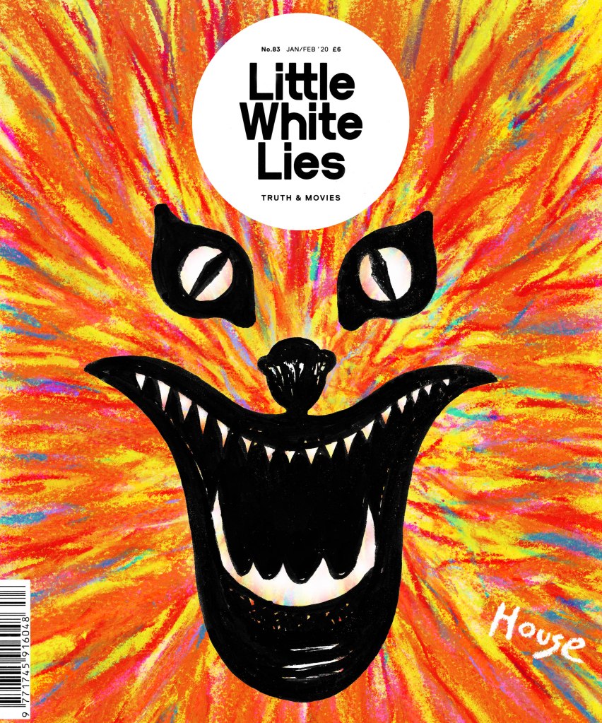
LWL Final Front Cover Design

It’s done, I’ve handed in now and there is no going back. I wish that I was better t managing my time because the past weekend and week have been draining. I left myself so much to do and didn’t even realise it until the last week of the project. My sketchbook was a bit behind; my layout was only half finished and my final front cover design hadn’t been put together. It was a mess. From the outside I look organised and my tutors seem to think that I am, but on the inside, I am screaming. Not literally but you get the point. I keep saying that I am going to make some sort of timetable or planner, anything to help me organise my time and I ironically never get the time to do it. Part of me thinks that I work best with the stress, and in some ways, I do, I do lots of work in a small amount of time and then rest. Some people do bits of work over a long period of time and I just can’t work like that. But, it would be handy to create myself a timetable that works for me, something that helps me plan which days I will work on the book illustrations, which days I will work on my blog and which days I will do coursework for college because right now I just feel stretched and a bit all over the place.

I have found out that as part of the final project, which is starting on a week or two, we will have to plan the whole project ourselves and will need to show it as a part of our process. This is similar to what I had to do during the final project of my level 3 course, and I managed to get distinction then. I know I have the capacity to be organised, it’s just difficult for me sometimes, especially since I largely plan things in my head and change my plans according to different circumstances. I guess this final project is going to be a test for me since it will force me to be more organised again and actually show it on paper.
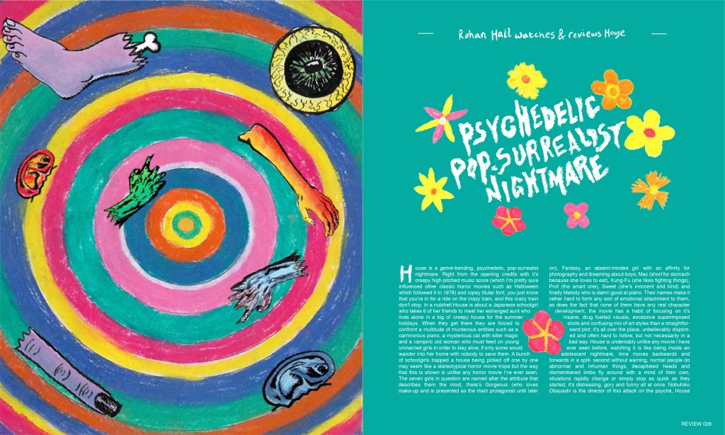
LWL Final Double Paged Spread

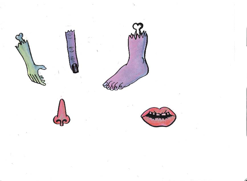
Anyway, all that aside, I ended up working like a machine over the past weekend and week, I tried out a bunch of different layout designs, redrew Blanche for my front cover, created a new trippy background with soft pastels and put everything together. I then found out that I hadn’t scanned my images to a high enough dpi which resulted in them being pixelated when I printed, so I had to rescan my spot illustrations again, and the front cover design again to try and stop the final designs from being pixelated. This all worked at first, until I got to the final day of the project and tried printing everything to hand in and I once again discovered that parts of my final design were pixelated which was an absolute nightmare because there wasn’t much I could do about it at that point. This time I knew it wasn’t something to do with how I scanned them because I got my tutors to check my scans and they were fine. Something went wrong with the software, whether I edited it too much, moved the file around too much or I don’t know what, something went wrong in the software and it has kind of ruined my final double paged spread on hand in day. Sometimes I forget how unreliable computers and digital art can be. I had to hand it in anyway and hope that it doesn’t cost me any marks because my tutors know that it wasn’t my fault. I’m going to have to redo the design when it comes to putting the work in my portfolio because I can’t show potential clients a pixelated piece of work. As stressful as it was sometimes, I have thorughly enjoyed this project and it has given me an interest in Editorial Illustration that i didnt have before, I am even conisdering it as a potential career path.

I have an essay due on the 19th of March and I decided to focus on the LWL project first as the due date was sooner. I am off next week while the project gets marked so I will use that time to do all of my research for the essay and get a first draft written ready to show my tutors on the Monday, I will be fine.
LWL dev

I’d like to start this post by saying that I am so happy I have chosen House as the film I’m creating art for, and that we’re exploring editorial illustration. It is giving me the opportunity to explore materials and art styles that I have never done before, or even though I would ever do. The fact the visuals are so naïve and childlike has led me down the road of trying childlike materials such as crayons, and their adult cousin, soft pastels, which I’ve surprisingly really enjoyed doing. I feel as if this project is making me grow so much as an illustrator, more than the previous ones because I am so far out of my comfort zone, and thoroughly enjoying being so, that I’m considering keeping these materials in my illustrative arsenal and looking more into Editorial illustration as a potential path for me to go down, whether it’s side projects to add to my income or as a full time career. I need to research the field a lot more before I make any sort of concrete decision but I didn’t really think about it before this project and I feel as if my eyes have been opened up to the world of editorial illustration and it’s definitely got my interest.

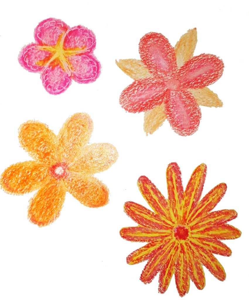
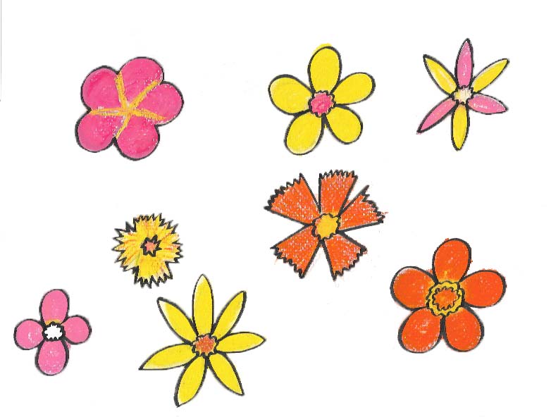
Over the weekend I started what I hope are my final spot illustrations, having chosen soft pastels as the material I am going to use for them because of their boldness, messiness and ability to create interesting textures that I simply could not achieve with watercolour paint or digital painting. I also used a Japanese brush pen to draw linework around them to make them stand out more, I feel as if this is the best way for me to create them because I have used pens in my art pretty much consistently throughout my life and they also help me to contain the soft pastels a little bit and make the designs even bolder in the process. I still have a long way to go with using soft pastels, I need a lot more practice with them before the illustrations can be considered ready to be presented on my final design because I don’t have much experience with them prior to this week and they are difficult for me to get used to.

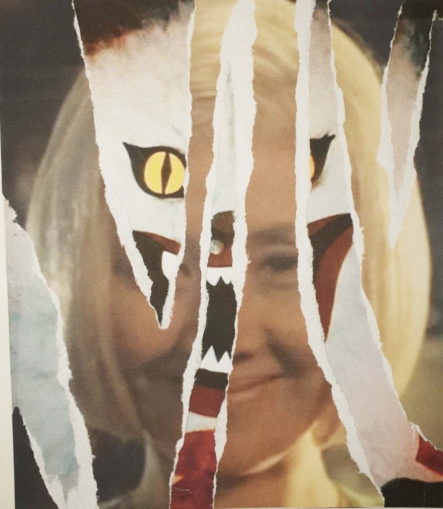
Decollage Attempt

As well as creating some spot illustrations at the start of the week, I have taken a bit of a U-turn as far as my front cover design for the LWL project goes, I was initially heading down the path of developing my cracked mirror design, and even went as far as creating a few media tests with decollage while I tried to figure out how to achieve the effect I wanted, but it just wasn’t working out. I realised that design was something I would feel comfortable doing and not necessarily something that would fit with the overall tone of House. Instead, I have chosen to develop my design that focuses on Blanche as the main character because I feel that she is the most recognisable film and focusing on only one character for the film fits with the layout that LWL magazines use on their front covers. I am worried that changing my mind about the front cover this late in the project could jeopardise the rest of my work because I am going to have to change the aesthetic a bit from what I was originally going for. I am hoping that this isn’t going to be much of a problem because my development piece has been done in soft pastel and brush pen, alike the spot illustrations I over the last weekend so at least there is some consistency with them. I haven’t really thought about how my spot illustrations are going to be presented on the page at this point, I’ve been focusing a lot on creating the art, rather than the layout which I realise isn’t a good thing because the layout of a magazine is just as important as the art inside it. Next week I really need to spend a lot of time creating potential layout sheets and thinking about where things should be placed on the page.

Front Cover Development- Soft Pastel and Brush Pen

Insanity Psychopus- Not #2Cute2Fail

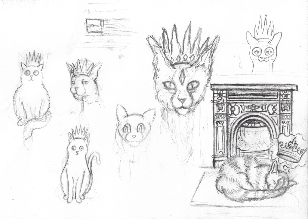
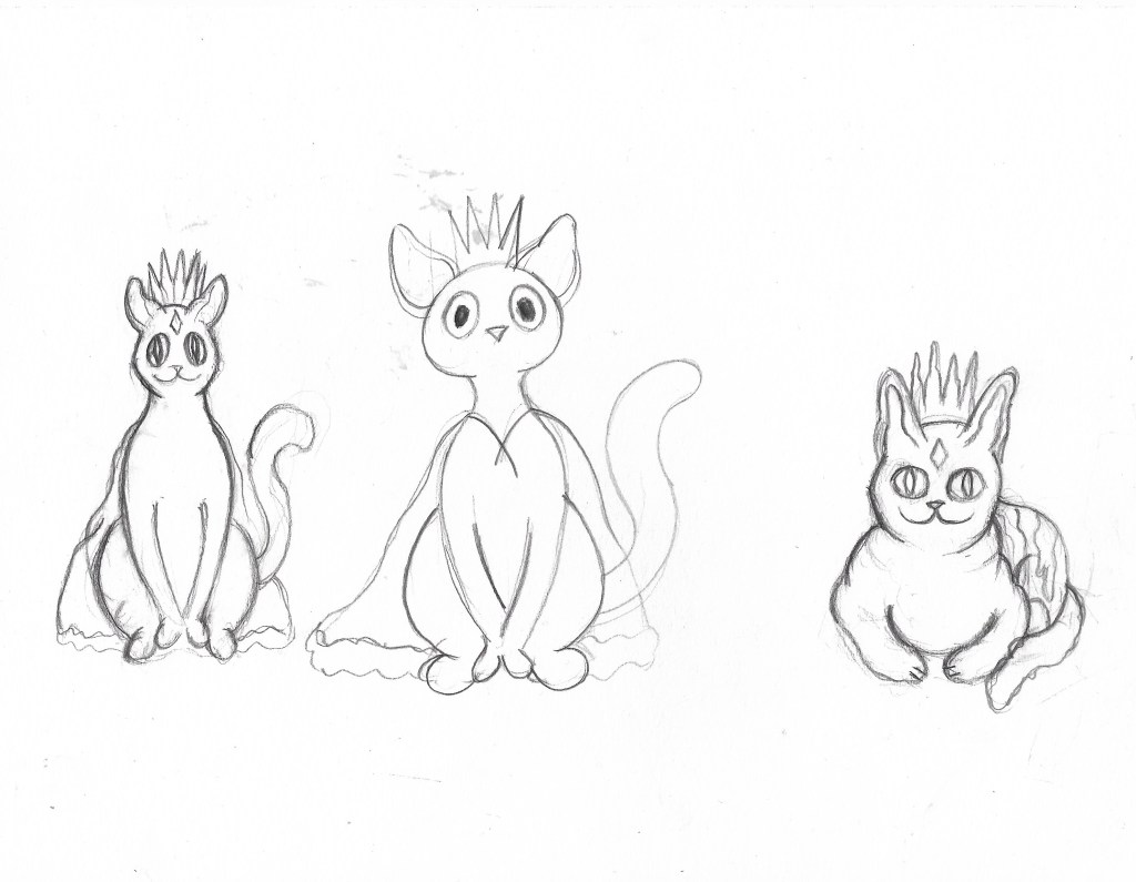
It’s weird for me to say but I actually kind of enjoyed creating a character for the 2cute2fail challenge, it ended up tying in with another project I’m working on, illustrating a book for my aunt by association. One of her friends and her have been running a blog for years where they write about weird history, folklore and the sometimes supernatural, it’s a really cool blog full of bizarre and sometimes horrific tales and historic events. Anyway, they have decided to publish a book featuring a collection of their best and most bizarre posts and they’ve asked myself and my girlfriend to illustrate it, which is amazing, my art is going to get published! One of the posts they need an illustration for is about a folk tale called ‘The King O’ the Cats’ in which a blissfully unaware cat is comfortably sitting in front of the fireplace when he finds out the previous cat king has died and he is now the new crowned king; the thought of a cat with a crown is adorable so I decided I’d kill two birds with one stone and design the King O’ the Cats for both the #2Cute2Fail contest and the book. I tired many times to get the design right but I just kept struggling to make the kitty look cute, it’s so unlike anything I’ve ever tried before, the first lot of designs looked too realistic and not cute at all… the 2nd batch were a step in the right direction but still weren’t right, it’s safe to say I got a little frustrated while trying to design the King O’ the Cats.

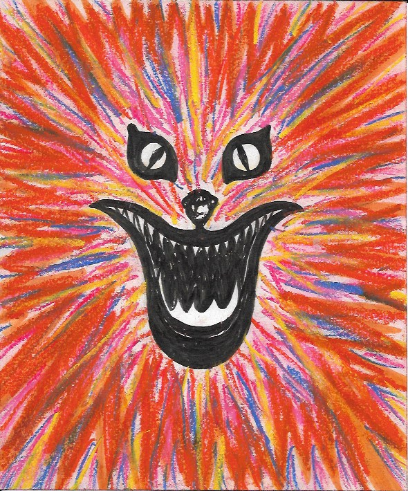
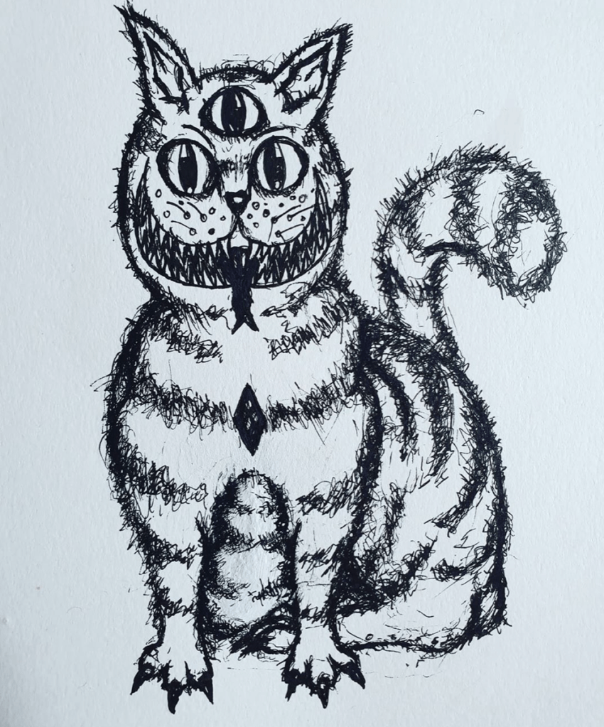
Insanity Psychopus- Fineliner and pencil

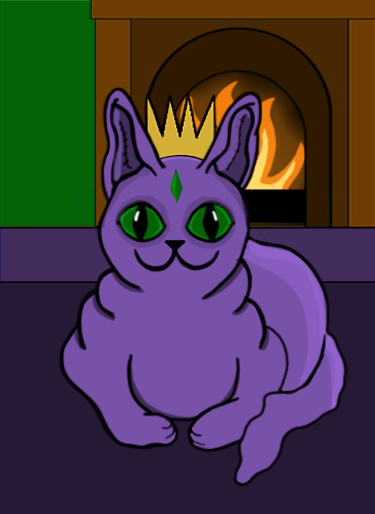
One night, when I was feeling particularly annoyed at my inability to draw something cute, I decided to give up and just started drawing a creepy cat instead. I wasn’t sure what it was going to turn out like, I wasn’t trying to make it good or cute, I was just drawing. I gave it 3 eyes, a terrifying grin and Cheshire cat stripes and it looked amazing. It wasn’t stereotypically cute, not by a long way, but it was my kind of cute, all dark and a bit ropey. I entered it into the #2Cute2Fail competition immediately and called it Insanity Psychopus, a feline Psychopomp that takes your sanity away. Sure, it might not get the best reception and probably doesn’t quite fit the criteria for the call for entries, but everyone has their own idea of what cute is and I wanted to enter something that really came from me, weird, unadulterated, unaffected by university me. Of course, I did then go on to submitting a more stereotypically cute King O’ the Cats too, one that was made digitally because hey, more chances to win right? The 2nd illustration was cuter in the traditional sense and resembled a normal cat, if that cat happened to have purple skin… like the one I drew. It also more closely depicted the folktale from which my original idea came from with the cat sitting peacefully in front of a fire.

I’m glad that I entered two different pieces into the competition because it just shows that I am capable of doing more than just one style, though I do much prefer the ropey one. As for the book illustration, neither of the designs ended up being fit for purpose but I did create a lot of sketches during the process of designing my #2Cute2Fail submissions and there’s one if particular that I think I’m going to develop further for the book, I may not have killed two birds with one stone but I have made the book illustration process easier than it was before and without knowing about the King O’ The Cats I probably wouldn’t have had an idea for the Pictoplasma competition at all. All in all, it’s been a pretty productive week and I’m weirdly looking forward to starting a new project at uni next week, and finding out my results for the previous one.

King O’ The Cats- Photoshop and Wacom tablet.