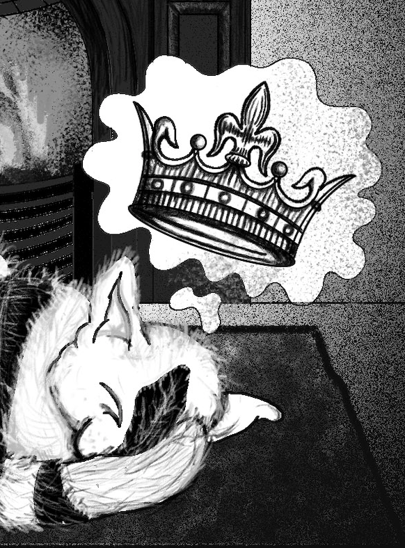
Well, I didn’t manage to watch all of the movies over the weekend because I was busy finishing off the King of The Cats illustration for my aunts’ book, which I’m trying to do alongside my university work; I’m not going to lie, it’s going to be difficult but I just need to get better at managing my time. I watched Blade Runner and House though, I’ll post my reviews of the movies separately because there is just so much to say about them, especially House which is basically a drug fuelled nightmare in all of the right ways. After watching these two I have decided that House is the movie that I am going to focus on creating art for this project, it’s been a while since I did any horror based art and I think House will really challenge me it is far from a normal horror movie, the style, tone and atmosphere of the film are unlike anything I have ever came across before. I think choosing House for this project will really push me as an illustrator and take me far out of my comfort zone which will be a good thing to show in my portfolio.
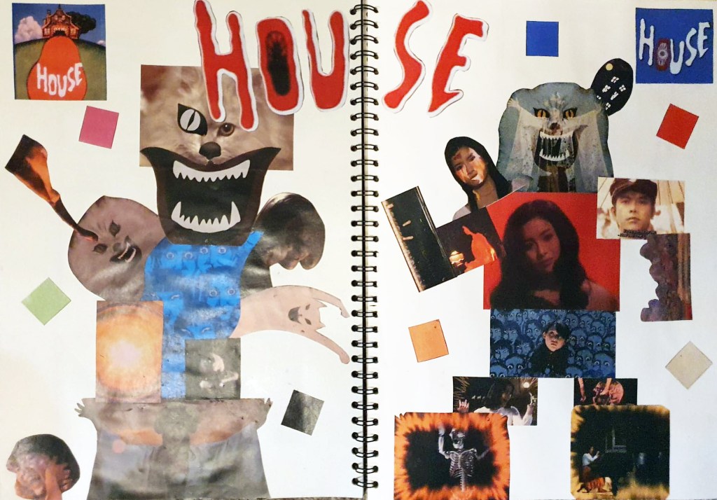
On Monday we were asked to create a mood board for one of the films that we will be able to refer back to for ideas during the course of the project, I actually ended up creating two because I just couldn’t fit all of my ideas for House on one page. On the mood board I have included images of the main protagonists, antagonists and supporting characters, as well as images of some of the many bizarre scene changes and special effects that are plastered throughout the film. I watched the movie on my laptop, so I was able to get reasonably high quality screenshots of key scenes in the film which I cut and stuck into my sketchbook. I also used the eyedropper tool in Photoshop to take samples of the main colours that House uses so that I have an idea of what colours to use in my development and my final illustrations. The whole point of the Little White Lies front covers is to capture the themes, atmosphere and visual tone of the specially selected movie, this can be done with the use of linework, colour and composition of the illustration, the colours used should reflect the movie in order for it to be successful which is why I sampled the colours directly from the movie.
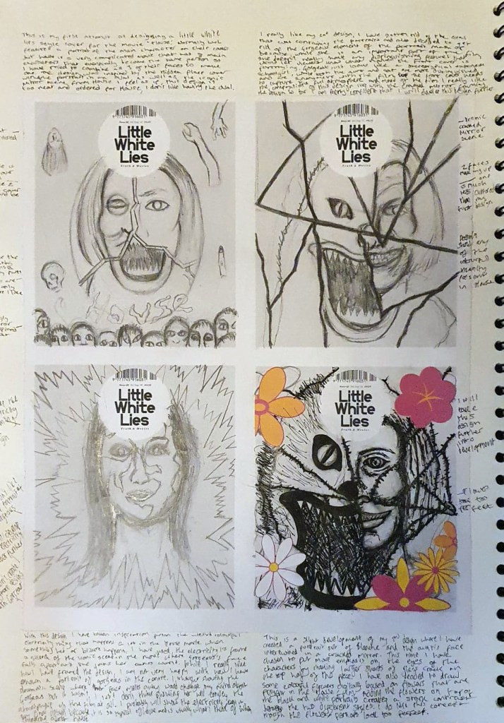
As well as creating a mood board, one of my tutors kindly created a worksheet that contains four blank Little White Lies front covers, we were asked to sketch 8 different front cover variants as part of our initial ideas and development. So far, I have sketched out four out of 8 designs, taking inspiration from the House movie, as well as some illustrators that have previously created covers for LWL to do so. I have found it really difficult so far because no matter how hard I try, I just can’t get any of my people portraits to look right, I also can’t decide who the main character in House is, and I’m supposed to be creating a portrait of them. The plot of House is so confusing that I think 3 characters present in the film are all the same person by the end and one of them isn’t even human. I have tried to combine fragments of all 3 of their faces to create one unified portrait which hasn’t went very well either, trying to show all three characters was too much, it compromises the appearance of all of them. I also tried doing something similar using two of the main characters faces instead, which worked a lot better because half of the portrait is a cat which is something that I am much better at drawing. I used the iconic mirror scene from House to frame the design which really works to me compositionally, so far, my second design is the strongest and the one I want to develop further. Speaking of cats, I’m going to create a wholly separate post at some t point talking about my King of The Cats illustration because I am unbelievably happy that my art is going to be published and I want to talk about it.
