This has been an exceptionally busy week so far. I have primarily been focusing on designing and creating layouts for the double paged spread since I am so worried about how little time I have spent doing it so far Time is running out on this project and I need to manage my time better if I have any hope of completing everything on time.
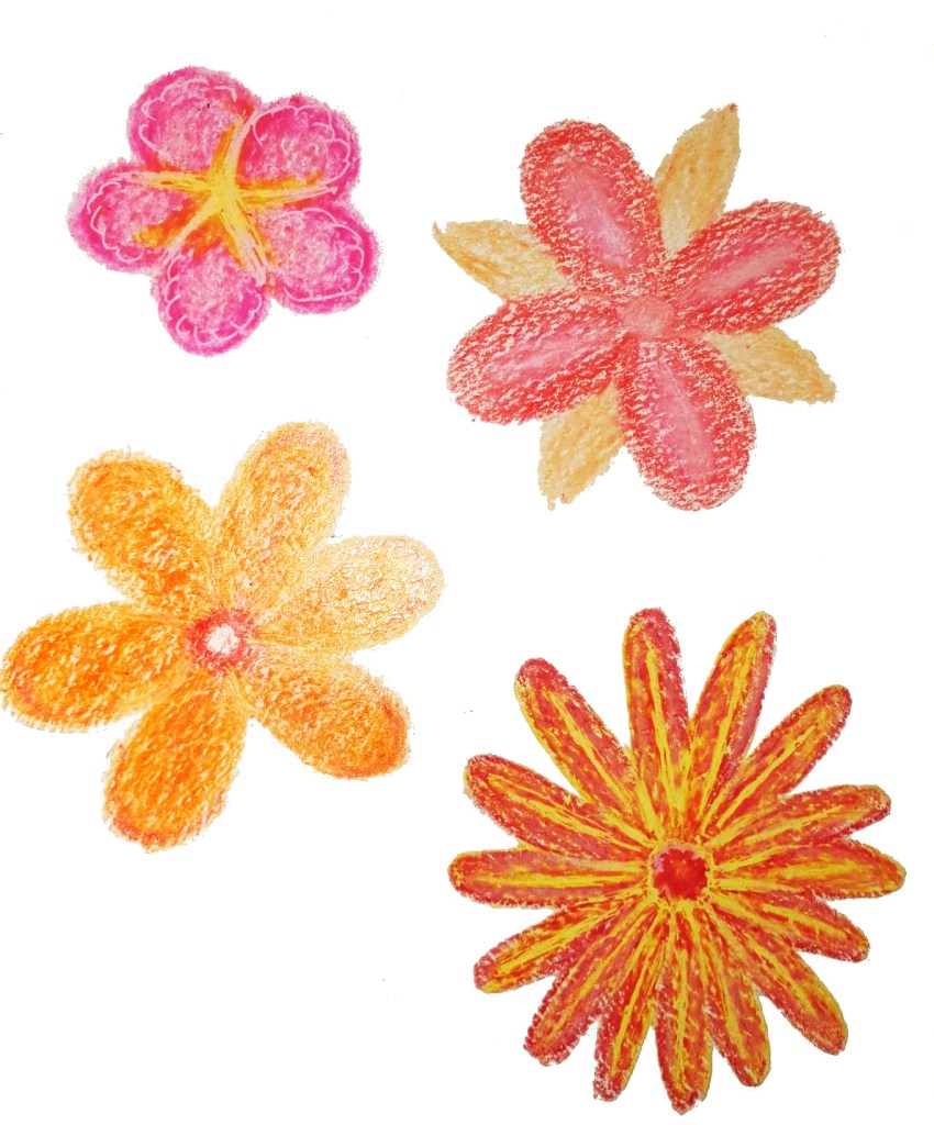
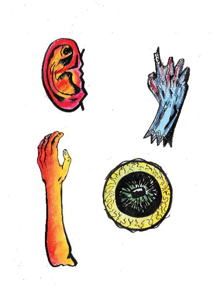
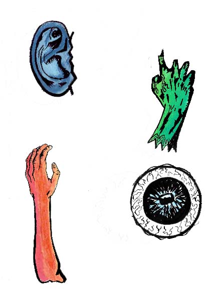
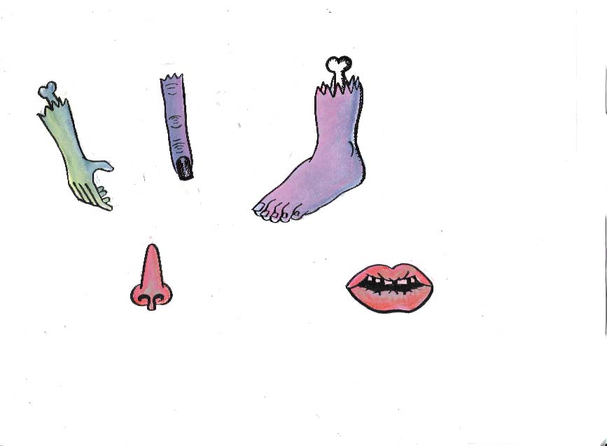
I have refined my spot illustrations a but by separating the colour layer from the linework layer. I did this by drawing out the shape of the body parts on a piece of layout payer using brush pen and colouring them in with soft pastels on a piece of cartridge paper with a light pad. This will allow me to stitch the linework and colour together in Photoshop and will make the linework and the whole spot illustrations bolder overall as the pastel won’t blur the lines. I have been struggling quite a bit with how much the pastels smudge, they are a relatively new material for me to use and doing the linework and colour separately seems to be the only way I can combat the problem.
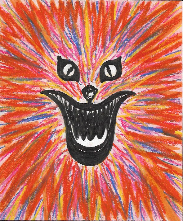
As far as the layout goes, I have decided that I want to have a full-page illustration on one page, with the text, headings, subheadings on the other page, with some other spot illustrations floating around the text. This is a similar layout to one used by Little White Lies in their Hidden Lives magazine issue and it inspired me quite a lot. For the full-page illustration, I was inspired by a particularly psychedelic scene in House where Kung-Fu is sucked through a lampshade and transported to some sort of weird, colourful dimension made up of colourful concentric circles. I decided to recreate this scene in my own way, having body parts swirling around in the vortex, rather than Kung-Fu because I feel as if using an entire person for a spot illustration would really blur the lines of what a spot illustration is supposed to be and wouldn’t really fit with how Little White Lies lays out their magazines.
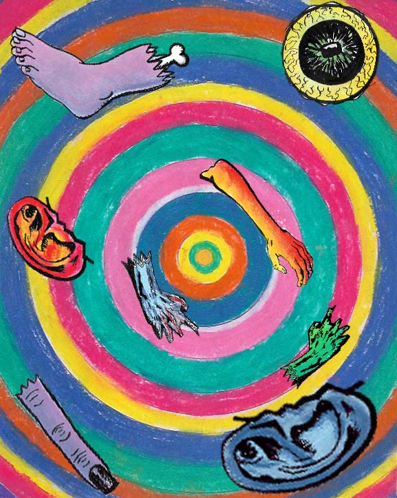
Full Page Illustration Created By Me 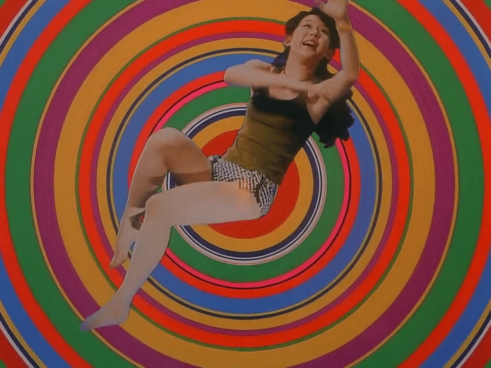
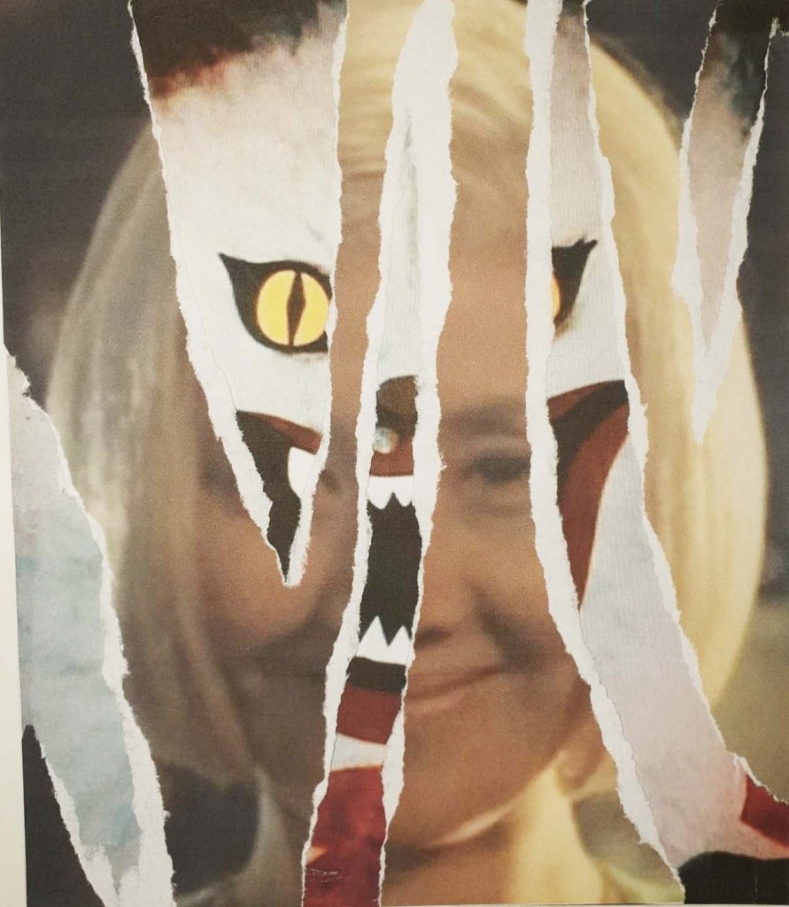
Screenshot from House 1977
House. 1977. [film] Directed by N. Obayashi. Japan: Toho.
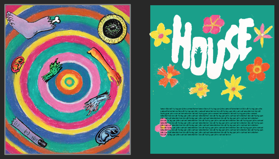
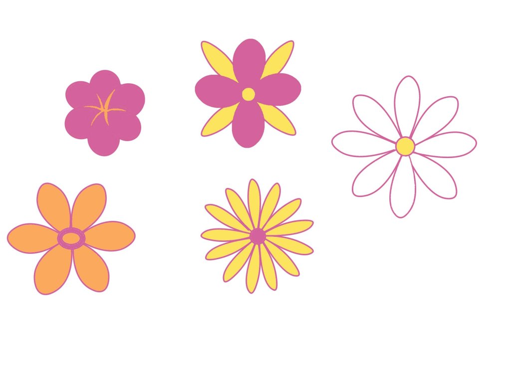
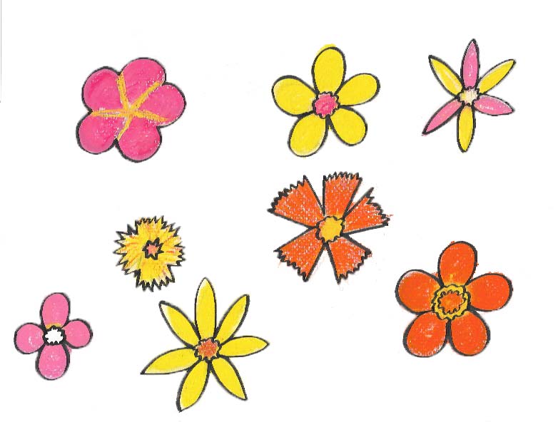
I have tried to be consistent with the materials I use for my spot illustrations, having used pastels for the colourful concentric circles design, the body parts and also the flowers because pastels seem to fit the messiness of House more than other materials and I want the texture of the spot illustrations to be the same since I am creating the design on the basis that it’s for a professional publication and it needs to be consistent for that. For the text page I used the eyedropper tool to sample colours from the full-page illustration and tried filling the text page with them to keep the colours consistent too. I settled on using the green colour as the background because it is lurid and creepy, while still looking nice and colourful which really fits with the overall tone of House. I used the actual text used on the House movie poster as placement text for the heading and filled it white because it seems to work best with the green and makes it look weirdly innocent, plus, Blanche the cat is white so it’s a nice nod to her. This isn’t going to be my final layout, but it does give me a good idea of what it is going to look like once I am done. I removed the outline on the flowers to contrast the boldness of the body parts illustrations on the previous page. I am quite happy with how much work I have done this week but there is still a long way to go. I need to refine my layout design and also do the same with the front cover. I am going to try separating the Blanche brush pen design from the trippy pastel background, similar to what I have done for these spot illustrations because I really want Blanche to stand out the most on the front over. I have quite a bit to do next week but I’m getting there. One day I will be good at managing my time instead of rushing around so much towards the end