The Printed Project Hand In

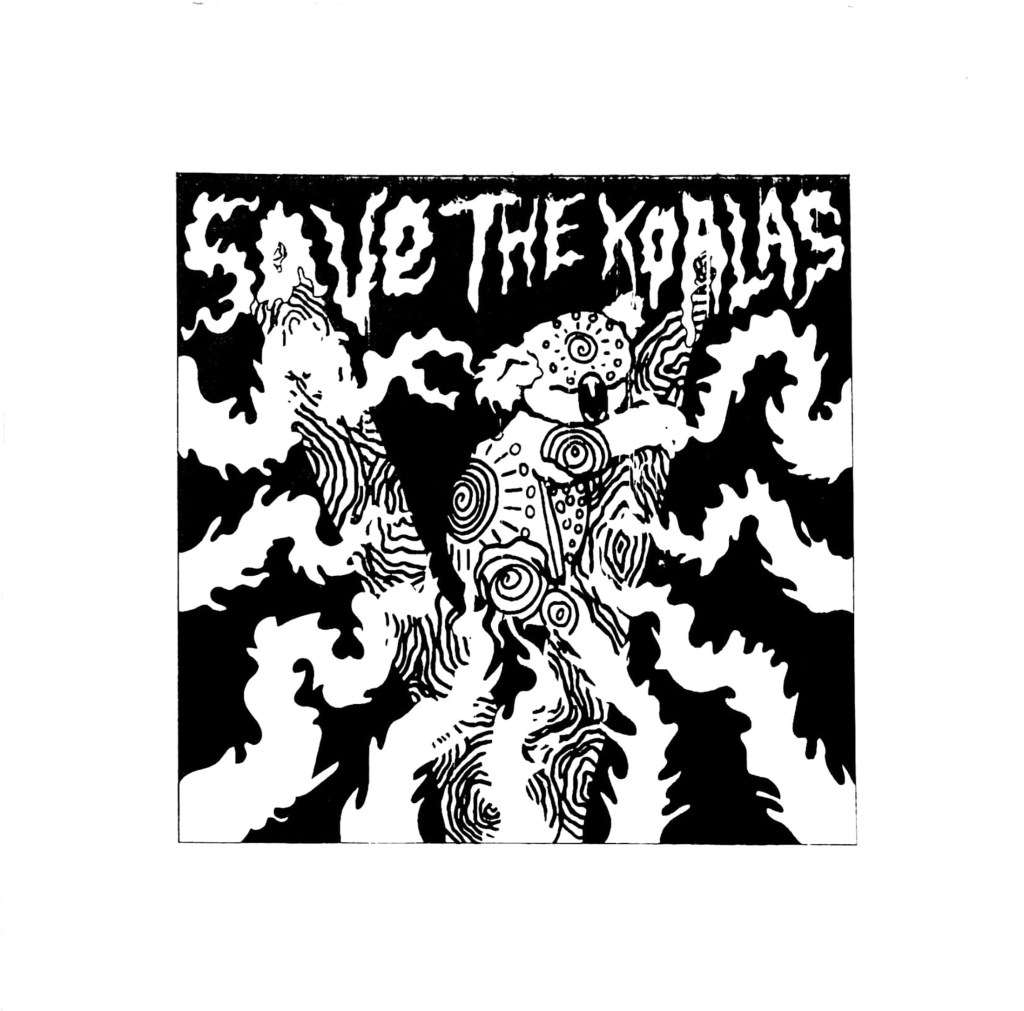
Save The Koalas Black And White Variant.

I had a bit of a stressful week the past week when it came to getting my prints ready to hand in, the screenprinting process wasn’t as easy as I thought it would be. Printing two colours is definitely a lot harder than one because you’ve got to perfectly line up each colour layer. I originally made the mistake of screenprinting the black layer before the orange layer, so when I tried to print colour over the black, parts of the design just got enveloped in the void. It also became a lot harder to line up each layer and I ended up creating a lot of offset prints. The same thing happened a while ago with risograph printing, but I was certain that the problem woudn’t be repeated with screenprinting, I was wrong. I kept getting unlucky with mesh screens too, both of the ones I used had marks on them which stopped my design being transferred properly, so whenever I tried printing a layer, a small part of my design was missing, a problem I just had to work with. Nevertheless, something good did come out of printing the black layer first, I realised just how good the design looks on it’s own without colour and all of a sudden I had two different print variations I could sell to raise money for the Australian Bushfire support. I still needed to create the colour prints that I originally set out to create to make my project successful so I started a different series of prints where I printed the orange layer first and then the black one on top; it was a lot easier to line up the colour layers this way so the 2nd batch of prints ended up having a lot less offset which I was finally happy with.

This project has been a huge eye opener for me, there were times during screenprinting where I wished I had just let the risograph machine do the work for me, it would have been a lot quicker and potentially easier than manually lining up each layer. But I would’ve definitely got an offset with the risograph machine, no matter how quick it is, at least with screenprinting I have more control over how much offset my prints are. I can unequivocally say that I will do screenprinting again in the future and hopefully, with a lot of practice, the process will be even more successful next time. Overall the quality of prints could be better, but they could also be a lot worse and I still intend to try and sell the prints I have on Etsy to raise money for WWF Australia which is what their original purpose was, so ultimately I think I have done a good jo this project, no matter what grade I end up getting. I have handed in the project now so I guess all I can do is wait and see what grade I get, I’d be lying if I said I wasn’t a bit worried because the prints didn’t turn out perfectly, there are some inconsistencies and the brief asked for 10 perfect prints which I haven’t really achieved. I can always fix the inconsistencies manually with a paintbrush when it comes to sellng them so that they are of a high quality, but it wasn’t something I could do before handing them in because in a way it would be cheating and my tutors had already seen the inconsistencies so they’d know if I fixed them before handing in. I just hope the fact that the meshes I used were fault doesn’t affect my grade because it was completey out of my control. Agh.

On a slightly less stressful note, I think… we’re off for the next week again while the print projects get marked and once again we have been given a task to complete we return. This time we have been asked to create a cute character and enter it into the Pictoplasma #2Cute2Fail competition, now if you follow my art then you’ll know that I don’t really do cute, more creepy and macabre so this is definitely going to be a bit of a challenge for me. I’m up for it though, it’s never a bad thing being taken out of your comfort zone so I’ll do my best to create a super cute character, though I can’t guarantee it won’t be a bit on the creepy side.
Print, Prints and Printed- A Gallery of My Riso, Relief and Screen Prints

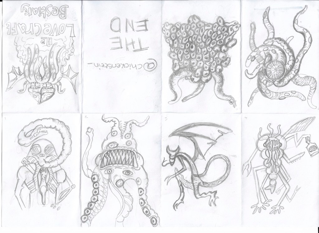
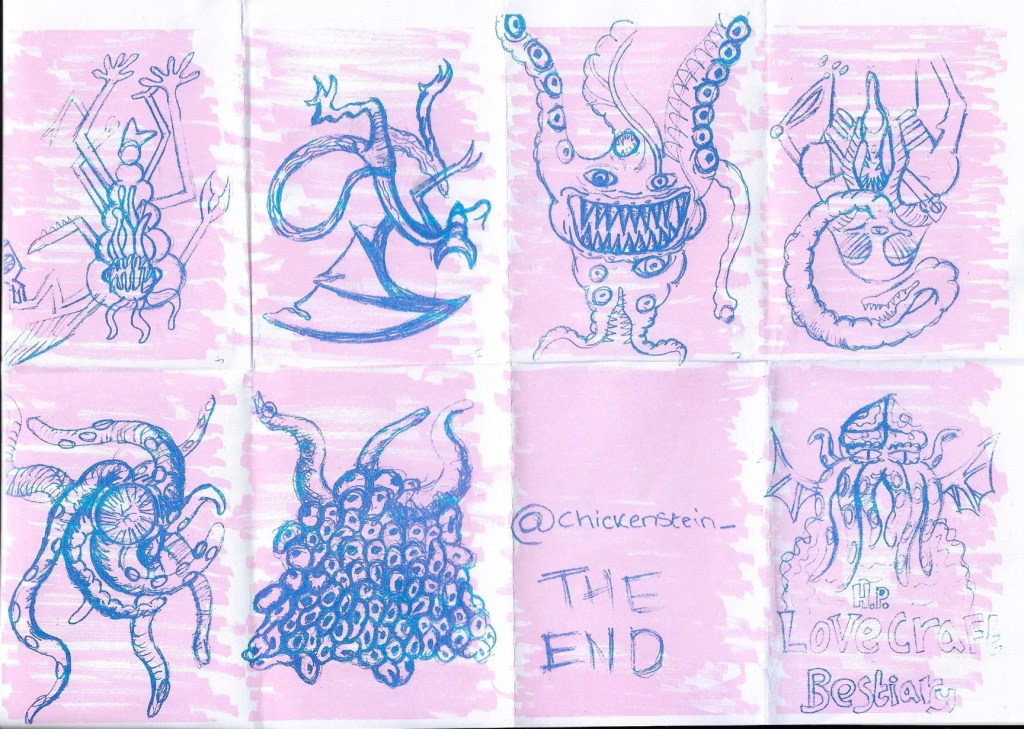
This week has been a fun one, we’ve done so much printmaking, including printing an unexpected one-page zine on Monday. I kept with my Lovecraftian theme and created a bestiary of his monsters, I was really happy with the designs I drew, but the finished zine did not go to plan at all. I think I rushed the background a bit and I hadn’t done risograph printing before, so despite having researched the process, I wasn’t entirely sure how it would work in practice. I drew my monster sketches in pencil and scribbled the background in pen, which in hindsight wasn’t the best idea because when it came to printing the zine, the background overpowered my illustrations and the risograph printed wasn’t able to pick up much of the detail of my pencil sketches so the final zine looks like a bit of a mess. It was a good learning exercise though, at least I know that next time I riso print, I need to make my line work bolder and the background needs to be done in a lighter tone to the foreground.

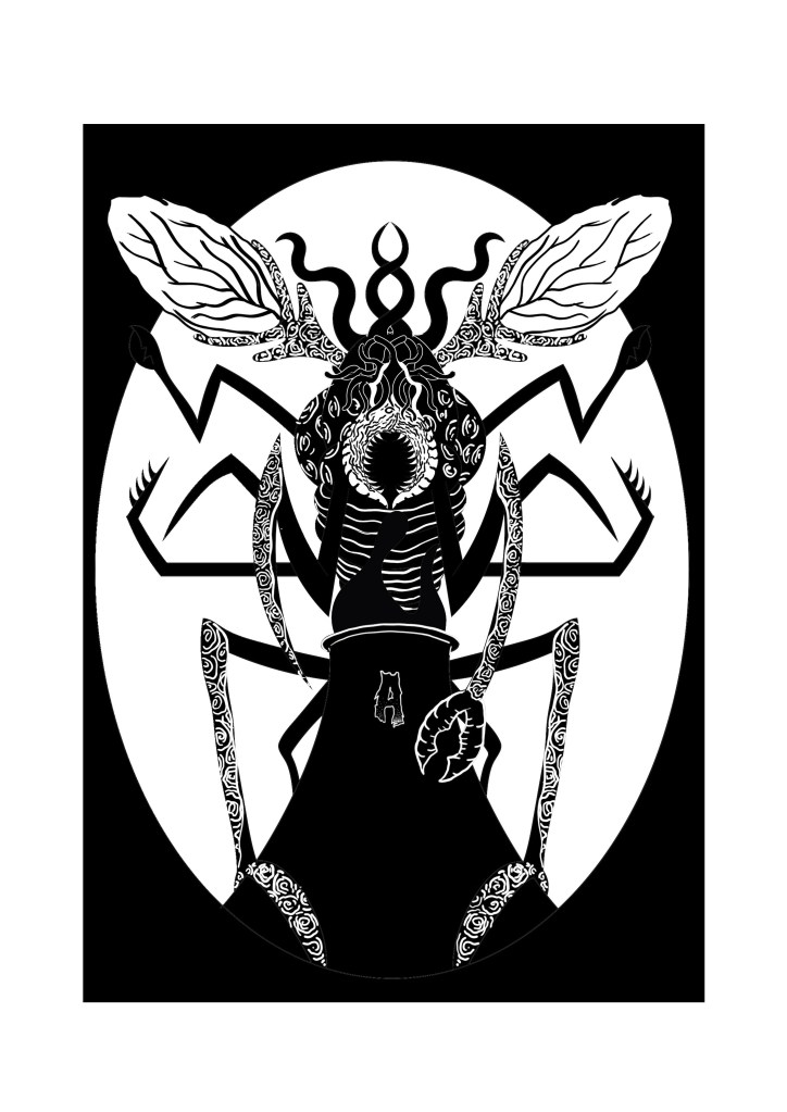
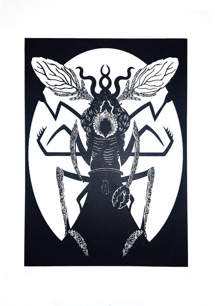
The zines were only the first part of printing we did on Monday, in the afternoon we went to the print workshop to make our screens for screen printing the 2nd of our designs. It cost £14 for the screens which is a bit on the high side for me because I’m having some money issues in the run up to Christmas, but after actually using the screen, I know it was a worthwhile investment because I can print that design as much as I want now and also change the screen and use the same frame for any other designs I make in the future. I managed to do a design that I am really happy with, it depicted one of Lovecraft’s monsters, a Mi-Go, perched over a power-plant and feeding off of its fumes. I chose to depict this because in Lovecraft lore, the Mi-Go awakens from its slumber when it gets warm and power plants heavily contribute to global warming. I wanted to show how horrible and horrific the world could be if it keeps heating up at the rate it is, using the Mi-go to depict the horrors of what life would be like in a scorching, desolate Earth. I’m once again not 100% certain if my illustration conveys the message that I want it to though, I know what it means, but I’m not convinced that other people will, they’d probably just a cool giant bug creature so when I do more designs this project I need to make the climate change and global warming message clearer, while still using Lovecraftian creatures so that I stick to the theme that I’ve chosen for this project.

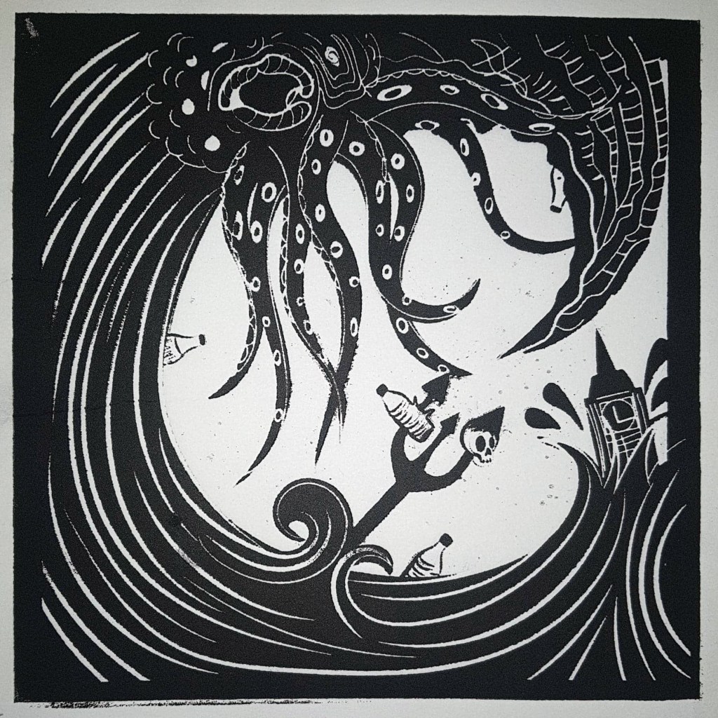
Relief printed with an acrylic block and ink and put through a roller press.

I had to send my first design back off to the wood workshop place to be re- laser cut because I made a mistake with the formatting when I send it off the first time (no surprises there) so some of my design was missing from the acrylic plate, this all got sorted by Thursday though so I managed to create a lot of prints of both of the designs. I’ll post photos of the prints next week once the ink has all dried. I’ve thoroughly enjoyed printing so far, I’m just not sure about risograph printing yet, probably because it is the one that went the worst for me. I totally get the appeal of risograph printing, it’s so easy to create a huge run of prints, I just haven’t quite figured out how to make the process work for me yet, hopefully over the weekend I’ll be able to create a design that works because we are creating an A3 riso-print on Monday. It’d be great if I had another design to add to my permanent print collection. I already have some ideas of what I’m going to depict, I plan on showing a modern polluted and poisoned world with buildings that everyone should be able to recognise, inspired by Lovecraft’s short story ‘The Colour Out of Space’, I’ll leave a link to the story on this post. I’m hoping that I can make my message clear this time, hopefully 3rd time’s the charm.

http://www.hplovecraft.com/writings/texts/fiction/cs.aspx