What is New Scientist Magazine and Why Should You Read It?

New Scientist magazine is one of the world’s most popular weekly science and technology magazines. Their magazine is featured online, through print and also on app editions which means that the illustrations and layout present in the mag need to be formattable across these areas. The magazine covers stories about science and technology that intrigue, inform and entertain the widest possible audience, which consists of people from a wide variety of lifestyle, from physicists, biologists to people that have no background in science at all. They have an unrivalled global reach largely in part to the fact they have been around since 1956 and have offices working for them around the world.

New Scientist does it’s best to stand out from the crowd, from writing exclusive scientific stories from an angle that can’t be found anywhere else, to hiring independent illustrators to design their covers and colourful illustrations that are carefully placed throughout each issue of the magazine. New Scientist really is one of a kind. They do something that a lot of science magazines don’t, they explore the social and cultural impacts of both scientific and technological discovery, as well as any consequences they could pose on society, rather than just documenting them. As well as exploring the social and cultural impacts of discoveries, they also write regular features and commentary on environmental issues, something that I am highly passionate about. This is one of the main reasons that I would like to create illustrations for New Scientist one day, they have ethics and aren’t afraid to show it, which is something that I really admire them for.

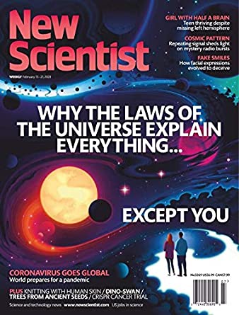
New Scientist uses often colourful and vibrant illustrations to help explain complex scientific theories and ideas in a more understandable and sometimes conceptual way. This is really important because a lot of their audience don’t have a huge scientific knowledge, but still want to keep up to date with the latest scientific and technological progress, the illustrations within the mag help non-scientists engage with the articles and keeps them coming back for more. They also need to be accurate enough to engage with the audience that are scientists, this must be a difficult line to walk but New Scientist manages to do it regardless. The art editor at New Scientist is Craig Mackie and he says that of 36 illustrated covers that he commissioned in 2015, 17 of them were done by new illustrators. He likes to keep the magazine fresh with new talent and while he does have a list of go to illustrators that he knows he can rely on; he likes bringing in new people that are going to bring something different to the magazine. Working like this is beneficial for both Mackie and the illustrators that he brings on, they get more exposure and the magazine gets to keep being ahead of the curve and stand out from the crowd.New Scientist. 2020.

About New Scientist Magazine | New Scientist. [online] Available at: <https://www.newscientist.com/about/&gt; [Accessed 26 March 2020].

Carless, J., 2020. What Art Directors Want: Tips For Editorial Illustrators | Create. [online] Create.adobe.com. Available at: <https://create.adobe.com/2016/4/20/what_art_directors_want_a_guide_for_editorial_illustrators.html&gt; [Accessed 26 March 2020].

New Scientist. 2020. Guide For Freelancers | New Scientist. [online] Available at: <https://www.newscientist.com/in209-guide-for-freelancers/&gt; [Accessed 29 March 2020].

https://www.newscientist.com/in16-about-new-scientist-magazine/

Newscientist.com. 2020. Magazine Archive 2020 | New Scientist. [online] Available at: <https://www.newscientist.com/issues/&gt; [Accessed 29 March 2020].

Editorial Illustration Research

If there is one thing that the editorial illustration project taught me, it is that I could see myself going down that route as a career path, at least to help me fund my own personal projects. There has been a growing demand for illustration for publications over the recent years and it’s easy to see why, in an age where anyone can create content from the comfort of their homes, it has become increasingly difficult for publications to stand out from the crowd, which is why some publications, such as Little White Lies, New Scientist and Weapons of Reason and newspapers such as the Guardian are hiring independent illustrators to create stunning visuals that remove them from the sea of overused press shots, oversimplified vectors and overtly technical fodder.

I have done some further research into this area ahead of my final project as I see my future progression in the field. Art directors rely on illustrators to create beautiful and eye-catching illustrations that help to express complex ideas, articles and theories in a more accessible and understandable way for us normal folk to digest. Working together with illustrators, art directors try to create the best possible way to visually tell a particular story or illuminate an idea. As well as making complex ideas more accessible, editorial illustrations also bring stories to life and engage readers in a way that text alone can’t achieve. Illustrations help to break up a block of text and capture the essence of what is being said in an article.

(Heath, 2017)

There are many different magazines and newspapers out there, almost all of which require a different illustrative style so there is a place for just about every style within the industry and publications are often playing with different aesthetics to keep their publication fresh. I find this reassuring because I haven’t yet figured out a specific style for myself, I can work in quite a few so it’s nice to know that I’ll be able to find some editorial work regardless of whether I have a ‘house style’ or not. Some complex stories will require a more expressive illustration, such as an illustration created by Calum Heath for Vice that depicts an isolated girl surrounded by Likes which encircle her like sharks which was shown alongside an article about cyber-bullying. This illustration perfectly captures the dangers of social media, especially to someone who is alone and vulnerable, there are a lot of horrible people online that say awful things to people while hidden behind a screen. There’s also the constant need to get likes online which can have a negative impact on one’s mental health.

Cyber-bullying is just one of the many complex issues we are facing in 2020, things such as politics, the environment and climate change, women’s and LGBTQ issues and immigration are all problems we’re facing today. There is a huge need for illustrators to come up with engaging ideas on how to express these concepts in such a way that really gets to the heart of the problem and urges the viewer to be a part of the solution. This is part of why I think that editorial illustration would be a good path for me to go down because I do often tackle such issues in my art, and had hopes of creating a graphic novel that tackled climate change but it would be exceptionally hard to get funding for such a thing. The graphic novel idea is perhaps more personal than commercial. Going into editorial illustration would allow me to tackle the issues that I am passionate about, try and make the world a better place and also make a living in a more commercially viable area of illustration, there is a huge need for editorial illustrators right now and I could use the money I make to fund my own personal projects in the future. I have already proven that I have potential with editorial illustration based on my previous project where I created a front cover design for Little White Lies based on the 1977 movie house, the design recently got liked on Instagram by LWL themselves and they commented that they love it. This really made me happy and gave me hope. I am going to research into how to become an editorial illustrator and also research further into publications and companies that work in the field to continue the research for my final project.

Little White Lies House Design

References-

Ewens, H., 2017. The Brand New Face Of Cyberbullying. [online] Vice. Available at: <https://www.vice.com/en_uk/article/gyy8kq/the-harsh-new-world-of-teen-cyberbullying&gt;

Carson, N., 2018. 8 Inspiring Uses Of Editorial Illustration. [online] Creative Bloq. Available at: <https://www.creativebloq.com/inspiration/8-inspiring-uses-of-editorial-illustration&gt;

Wang, G., 2018. 12 Independent Magazines With Clever, Imaginative Illustration – STACK Magazines. [online] STACK magazines. Available at: <https://www.stackmagazines.com/illustration/12-independent-magazines-with-clever-imaginative-illustration/&gt;

Carless, J., 2020. What Art Directors Want: Tips For Editorial Illustrators | Create. [online] Create.adobe.com. Available at: <https://create.adobe.com/2016/4/20/what_art_directors_want_a_guide_for_editorial_illustrators.html&gt; [Accessed 22 March 2020].

I Am Not Organised, When Will I Learn? Also An Autobiography

This has been an exceptionally busy week so far. I have primarily been focusing on designing and creating layouts for the double paged spread since I am so worried about how little time I have spent doing it so far Time is running out on this project and I need to manage my time better if I have any hope of completing everything on time.

I have refined my spot illustrations a but by separating the colour layer from the linework layer. I did this by drawing out the shape of the body parts on a piece of layout payer using brush pen and colouring them in with soft pastels on a piece of cartridge paper with a light pad. This will allow me to stitch the linework and colour together in Photoshop and will make the linework and the whole spot illustrations bolder overall as the pastel won’t blur the lines. I have been struggling quite a bit with how much the pastels smudge, they are a relatively new material for me to use and doing the linework and colour separately seems to be the only way I can combat the problem.

As far as the layout goes, I have decided that I want to have a full-page illustration on one page, with the text, headings, subheadings on the other page, with some other spot illustrations floating around the text. This is a similar layout to one used by Little White Lies in their Hidden Lives magazine issue and it inspired me quite a lot. For the full-page illustration, I was inspired by a particularly psychedelic scene in House where Kung-Fu is sucked through a lampshade and transported to some sort of weird, colourful dimension made up of colourful concentric circles. I decided to recreate this scene in my own way, having body parts swirling around in the vortex, rather than Kung-Fu because I feel as if using an entire person for a spot illustration would really blur the lines of what a spot illustration is supposed to be and wouldn’t really fit with how Little White Lies lays out their magazines.

Screenshot of Little White Lies draft layout

I have tried to be consistent with the materials I use for my spot illustrations, having used pastels for the colourful concentric circles design, the body parts and also the flowers because pastels seem to fit the messiness of House more than other materials and I want the texture of the spot illustrations to be the same since I am creating the design on the basis that it’s for a professional publication and it needs to be consistent for that. For the text page I used the eyedropper tool to sample colours from the full-page illustration and tried filling the text page with them to keep the colours consistent too. I settled on using the green colour as the background because it is lurid and creepy, while still looking nice and colourful which really fits with the overall tone of House. I used the actual text used on the House movie poster as placement text for the heading and filled it white because it seems to work best with the green and makes it look weirdly innocent, plus, Blanche the cat is white so it’s a nice nod to her. This isn’t going to be my final layout, but it does give me a good idea of what it is going to look like once I am done. I removed the outline on the flowers to contrast the boldness of the body parts illustrations on the previous page. I am quite happy with how much work I have done this week but there is still a long way to go. I need to refine my layout design and also do the same with the front cover. I am going to try separating the Blanche brush pen design from the trippy pastel background, similar to what I have done for these spot illustrations because I really want Blanche to stand out the most on the front over. I have quite a bit to do next week but I’m getting there. One day I will be good at managing my time instead of rushing around so much towards the end

LWL dev

I’d like to start this post by saying that I am so happy I have chosen House as the film I’m creating art for, and that we’re exploring editorial illustration. It is giving me the opportunity to explore materials and art styles that I have never done before, or even though I would ever do. The fact the visuals are so naïve and childlike has led me down the road of trying childlike materials such as crayons, and their adult cousin, soft pastels, which I’ve surprisingly really enjoyed doing. I feel as if this project is making me grow so much as an illustrator, more than the previous ones because I am so far out of my comfort zone, and thoroughly enjoying being so, that I’m considering keeping these materials in my illustrative arsenal and looking more into Editorial illustration as a potential path for me to go down, whether it’s side projects to add to my income or as a full time career. I need to research the field a lot more before I make any sort of concrete decision but I didn’t really think about it before this project and I feel as if my eyes have been opened up to the world of editorial illustration and it’s definitely got my interest.

Over the weekend I started what I hope are my final spot illustrations, having chosen soft pastels as the material I am going to use for them because of their boldness, messiness and ability to create interesting textures that I simply could not achieve with watercolour paint or digital painting. I also used a Japanese brush pen to draw linework around them to make them stand out more, I feel as if this is the best way for me to create them because I have used pens in my art pretty much consistently throughout my life and they also help me to contain the soft pastels a little bit and make the designs even bolder in the process. I still have a long way to go with using soft pastels, I need a lot more practice with them before the illustrations can be considered ready to be presented on my final design because I don’t have much experience with them prior to this week and they are difficult for me to get used to.

Decollage Attempt

As well as creating some spot illustrations at the start of the week, I have taken a bit of a U-turn as far as my front cover design for the LWL project goes, I was initially heading down the path of developing my cracked mirror design, and even went as far as creating a few media tests with decollage while I tried to figure out how to achieve the effect I wanted, but it just wasn’t working out. I realised that design was something I would feel comfortable doing and not necessarily something that would fit with the overall tone of House. Instead, I have chosen to develop my design that focuses on Blanche as the main character because I feel that she is the most recognisable film and focusing on only one character for the film fits with the layout that LWL magazines use on their front covers. I am worried that changing my mind about the front cover this late in the project could jeopardise the rest of my work because I am going to have to change the aesthetic a bit from what I was originally going for. I am hoping that this isn’t going to be much of a problem because my development piece has been done in soft pastel and brush pen, alike the spot illustrations I over the last weekend so at least there is some consistency with them. I haven’t really thought about how my spot illustrations are going to be presented on the page at this point, I’ve been focusing a lot on creating the art, rather than the layout which I realise isn’t a good thing because the layout of a magazine is just as important as the art inside it. Next week I really need to spend a lot of time creating potential layout sheets and thinking about where things should be placed on the page.

Front Cover Development- Soft Pastel and Brush Pen

What Did I Just Watch? And Other Thoughts I Had This Week

King of The Cats sneak peak

Well, I didn’t manage to watch all of the movies over the weekend because I was busy finishing off the King of The Cats illustration for my aunts’ book, which I’m trying to do alongside my university work; I’m not going to lie, it’s going to be difficult but I just need to get better at managing my time.  I watched Blade Runner and House though, I’ll post my reviews of the movies separately because there is just so much to say about them, especially House which is basically a drug fuelled nightmare in all of the right ways. After watching these two I have decided that House is the movie that I am going to focus on creating art for this project, it’s been a while since I did any horror based art and I think House will really challenge me it is far from a normal horror movie, the style, tone and atmosphere of the film are unlike anything I have ever came across before. I think choosing House for this project will really push me as an illustrator and take me far out of my comfort zone which will be a good thing to show in my portfolio.

Double paged spread House moodboard

On Monday we were asked to create a mood board for one of the films that we will be able to refer back to for ideas during the course of the project, I actually ended up creating two because I just couldn’t fit all of my ideas for House on one page. On the mood board I have included images of the main protagonists, antagonists and supporting characters, as well as images of some of the many bizarre scene changes and special effects that are plastered throughout the film. I watched the movie on my laptop, so I was able to get reasonably high quality screenshots of key scenes in the film which I cut and stuck into my sketchbook.  I also used the eyedropper tool in Photoshop to take samples of the main colours that House uses so that I have an idea of what colours to use in my development and my final illustrations. The whole point of the Little White Lies front covers is to capture the themes, atmosphere and visual tone of the specially selected movie, this can be done with the use of linework, colour and composition of the illustration, the colours used should reflect the movie in order for it to be successful which is why I sampled the colours directly from the movie.

LWL House thumbnail sketches

As well as creating a mood board, one of my tutors kindly created a worksheet that contains four blank Little White Lies front covers, we were asked to sketch 8 different front cover variants as part of our initial ideas and development. So far, I have sketched out four out of 8 designs, taking inspiration from the House movie, as well as some illustrators that have previously created covers for LWL to do so. I have found it really difficult so far because no matter how hard I try, I just can’t get any of my people portraits to look right, I also can’t decide who the main character in House is, and I’m supposed to be creating a portrait of them. The plot of House is so confusing that I think 3 characters present in the film are all the same person by the end and one of them isn’t even human. I have tried to combine fragments of all 3 of their faces to create one unified portrait which hasn’t went very well either, trying to show all three characters was too much, it compromises the appearance of all of them. I also tried doing something similar using two of the main characters faces instead, which worked a lot better because half of the portrait is a cat which is something that I am much better at drawing. I used the iconic mirror scene from House to frame the design which really works to me compositionally, so far, my second design is the strongest and the one I want to develop further. Speaking of cats, I’m going to create a wholly separate post at some t point talking about my King of The Cats illustration because I am unbelievably happy that my art is going to be published and I want to talk about it.

Insanity Psychopus- Not #2Cute2Fail

It’s weird for me to say but I actually kind of enjoyed creating a character for the 2cute2fail challenge, it ended up tying in with another project I’m working on, illustrating a book for my aunt by association. One of her friends and her have been running a blog for years where they write about weird history, folklore and the sometimes supernatural, it’s a really cool blog full of bizarre and sometimes horrific tales and historic events. Anyway, they have decided to publish a book featuring a collection of their best and most bizarre posts and they’ve asked myself and my girlfriend to illustrate it, which is amazing, my art is going to get published! One of the posts they need an illustration for is about a folk tale called ‘The King O’ the Cats’ in which a blissfully unaware cat is comfortably sitting in front of the fireplace when he finds out the previous cat king has died and he is now the new crowned king; the thought of a cat with a crown is adorable so I decided I’d kill two birds with one stone and design the King O’ the Cats for both the #2Cute2Fail contest and the book. I tired many times to get the design right but I just kept struggling to make the kitty look cute, it’s so unlike anything I’ve ever tried before, the first lot of designs looked too realistic and not cute at all… the 2nd batch were a step in the right direction but still weren’t right, it’s safe to say I got a little frustrated while trying to design the King O’ the Cats.

Insanity Psychopus- Fineliner and pencil

One night, when I was feeling particularly annoyed at my inability to draw something cute, I decided to give up and just started drawing a creepy cat instead. I wasn’t sure what it was going to turn out like, I wasn’t trying to make it good or cute, I was just drawing. I gave it 3 eyes, a terrifying grin and Cheshire cat stripes and it looked amazing. It wasn’t stereotypically cute, not by a long way, but it was my kind of cute, all dark and a bit ropey. I entered it into the #2Cute2Fail competition immediately and called it Insanity Psychopus, a feline Psychopomp that takes your sanity away. Sure, it might not get the best reception and probably doesn’t quite fit the criteria for the call for entries, but everyone has their own idea of what cute is and I wanted to enter something that really came from me, weird, unadulterated, unaffected by university me. Of course, I did then go on to submitting a more stereotypically cute King O’ the Cats too, one that was made digitally because hey, more chances to win right? The 2nd illustration was cuter in the traditional sense and resembled a normal cat, if that cat happened to have purple skin… like the one I drew. It also more closely depicted the folktale from which my original idea came from with the cat sitting peacefully in front of a fire.

I’m glad that I entered two different pieces into the competition because it just shows that I am capable of doing more than just one style, though I do much prefer the ropey one. As for the book illustration, neither of the designs ended up being fit for purpose but I did create a lot of sketches during the process of designing my #2Cute2Fail submissions and there’s one if particular that I think I’m going to develop further for the book, I may not have killed two birds with one stone but I have made the book illustration process easier than it was before and without knowing about the King O’ The Cats I probably wouldn’t have had an idea for the Pictoplasma competition at all. All in all, it’s been a pretty productive week and I’m weirdly looking forward to starting a new project at uni next week, and finding out my results for the previous one.

King O’ The Cats- Photoshop and Wacom tablet.

Save The Koalas

It’s been just over a week since I returned from my holidays in Poland and Edinburgh, and after spending 3 weeks away from the course, I have been finding it quite difficult to readjust to university life. I didn’t draw enough when I was away, instead I focused on going to galleries and exhibitions in Poland so that I could try and get some more inspiration for where my project and coursework is going to go next, as well as enjoying myself because hey, it was Christmas and new year’s. While the time away was really nice, it has meant that it’s taking me a while to get back into the flow of things, when I returned, I wasn’t really sure what I was going to do for my final print, despite seeing so much amazing art abroad. It wasn’t until I was scrolling through Facebook and watching the news at home that an idea hit me horribly, the Australian bushfire crisis.

Please donate to help save the animals in Australia!- https://support.wwf.org.uk/australia-bushfires

So far during the print project, I have been creating art that tackles topics such as climate change and pollution, two things that are having a horrific impact on our world and wildlife, yet to me, aren’t being tackled enough. I wanted to try and change that, not necessarily on a large scale, I have to be realistic, but if I could reach just one person with my art it would be something. Having tackled these issues so far on the project, it was obvious to me that I needed to stick to similar themes when it came to be designing my final print, I just wasn’t sure what issue to tackle, there are unfortunately so many. For a while I considered tackling the meat industry, but this seemed too hypocritical as I was still eating meat, albeit little, at the time. I have stopped eating meat fully now and have for the past week, but still, I didn’t feel as if it is enough to start hitting the meat industry now. When I saw the horrors of the bushfires and just how much of the environment is being destroyed and how many animals are being killed, it made me feel sick to my core, it’s so upsetting that (at the time of writing) one billion animals have been affected. Having loved animals and nature since I was a child, sometimes more than humans, this topic hit close to heart and I just knew that I had to try and do something to help.

Now that I had an idea of what I was going to illustrate with my final print, I started sketching ideas of just how I could show the Australian bushfires and the impact that they are having. I made a few rough thumbnail sketches in pencil to get out some of my ideas which included:

  • The world being consumed by fire with a koala’s face emerging out in fear because the bushfires are the latest of the wildfires that have devastated the planet in the past year.
  • A Donald Trump earth laughing at the fires while a koala fell off the face of the earth, symbolising the risk of the koalas going extinct and just how little Trump cares about the environment (I thought this might be a bit too political so I didn’t take this idea forward)
  • A koala’s face on the Earth as it melted away in the flames, which would show the impact of climate change and how it is causing the ice caps to melt, as well as the impact the fires are having on the koalas.
The sketch I decided to take forward.

All of these ideas seemed a bit too wide, they focused on the entire world, rather than just the area and the animals that are being affected by the fires, on previous projects I did focus on showing the environmental impact of climate change, but I haven’t really focused on the impact it is having on its inhabitants, with one billion animals being affected by the horrific blaze, this time needed to be different, the animals needed the centre stage. I kept the idea of having the flames framing the illustration, but instead of showing the whole Earth, I drew a lonely koala clinging to a tree for dear life amongst the oncoming flames I showed my sketches to a few people to get their opinion and to find out which one they thought would get the most attention, and they agreed that the lone koala in the tree was the saddest of the sketches and would get more of a reaction from the wider public.

Digital Koala Development

With the design picked, I developed the thumbnail sketch further by drawing it out in a larger scale in an a4 sketchbook before scanning it onto my laptop and going over the line work and colouring it in Illustrator/ Photoshop so that it looked more professional ahead of college on fast approaching Thursday. My tutors liked the design but pointed out that I had two styles going on at once, with the fire and text being done in one style and the koala being done in another. I had struggled with how to depict the koala, I went with a rather realistic approach because I didn’t want to do a cutesy cartoon koala that would take away from the seriousness of the situation, but the realism clashed with the rest of the piece so I agreed that I needed to redesign the koala. The problem I was having is that the koala isn’t a monster, it’s a victim and up until that point on the project I had been depicting climate change in the form of Lovecraftian creatures attacking the planet and reclaiming their home. This time however I was trying to show how vulnerable the animals in Australia are right now, they needed to be cute and upsetting, to evoke feelings of sadness and vulnerability so that people would do their best to help them.  I redraw the koala 3 or 4 times before I finally came up with a design that felt right.

I looked at Australian aboriginal paintings of koalas as a source of inspiration which really helped me to figure out how to show the koala without making it too realistic. Unfortunately, I didn’t get the design right until the end of the day on Thursday, meaning that it was too late to send my design off to be prepared for print, which means that I am going to have to wait until next week to do this and come into college on a day that I am not scheduled to be in so that I can finish the project before the deadline next Thursday. This is fine for me though because I want to raise more money for charities to help save the animals in Australia, no matter what, and in order to do that, I need the prints. I just really hope that I am able to get everything done in time and that people do buy the prints when I try and sell them, this is the only way I know to raise money for the charities without having much reach in the field of illustration.

Final print design

Disclaimer; I am aware that Koalas are only one of the thousands of species that are being affected by the bushfires and I am not ignoring their struggle, but koalas are more well known and loved by many so I feel that they will help to get the attention of more people, which means that I have more chance of selling the prints and donating the proceeds to charities that are fighting to save all of the animals that are being affected by the wildfires.

Pollution Apocalypse- An Illustrated Response to the ongoing Climate Crisis

Pollution Apocalypse Initial Sketch

It’s Riso print week next week, which will be interesting considering how iffy my one-page zine went. We aren’t doing it this week like I thought as one of my tutors wasn’t in so they’re giving us more time to get our sketchbooks up to date and do more of the prints we have already.  I’m hoping that my risograph print goes better this time, at least the one-page zine experience taught me what not to do when it comes to risograph printing. I am still sceptical though of whether or not I’ll be able to achieve a good result though because the last riso print was only a 2 colour one and I’ve decided to be a bit more ambitious this time and try a 4-colour print, which might be my downfall, but  I’m really happy with what I have designed so far so I really, really hope that I am able to create a good print out of it.

For the design I have once again decided to stick to the Lovecraftian/climate change theme that I’ve got going on right now, only this time I have made it blatantly clear that this is the issue I am trying to tackle, compared to my previous designs which were more subtle in tone. I have written ‘Pollution Apocalypse’ around the outside of the main design so that there is no confusion to the issues I am trying to convey. While apocalypse may sound a bit drastic and exaggerated, scientists would disagree given the fact 11,000 scientists have declared a global climate emergency, which sounds like the beginning of an apocalypse to me. The main focus of the design is a heavily polluted city that is pumping noxious gases into the atmosphere, causing the city to flood and attracting all manners of monsters to its’ centre. The creatures represent the end of life as we know it, as well as mother nature fighting back against the destruction that we as a species have caused.

Pollution Apocalypse Photoshop Design.

11,000 scientists declare global climate emergency and warn of ‘untold human suffering’.

Weston, P. (2019). 11,000 scientists declare global climate emergency and warn of ‘untold human suffering’. [online] The Independent. Available at: https://www.independent.co.uk/environment/climate-emergency-scientists-emissions-letter-climate-change-a9185786.html [Accessed 5 Nov. 2019].

I’m going to Poland for Christmas next Thursday and I’ll hopefully be visiting a lot of galleries, exhibitions and also doing art with my girlfriend’s dd who is a full on, free spirited artist and actually makes a living out of it. So I’m hoping that I’ll be able to write a lot of interesting blog posts while I’m away because I feel like my blog is a little bland right now, I haven’t really had time to go to exhibitions and things like that because I’m so invested in each project that I don’t get out much. But yeah, anyway, hopefully a lot of interesting posts and photos of Polish art and inspiration happening in the coming weeks. I’m really looking forward to immersing myself in all sorts of different art that I haven’t seen before, and hopefully seeing some of Van Gogh’s work because he is one of my favourite artists of all time and I’m pretty sure some of his work is on display at a gallery in Krakow. The only thing I am slightly concerned about is the fact I am going to miss 2 days in college before Christmas which could potentially set me behind in the project before the hand in day in January, however, I have already done a lot of printing and my sketchbook is almost up to date so I should be fine, as long as I do some work while I am away.

Print, Prints and Printed- A Gallery of My Riso, Relief and Screen Prints

This week has been a fun one, we’ve done so much printmaking, including printing an unexpected one-page zine on Monday. I kept with my Lovecraftian theme and created a bestiary of his monsters, I was really happy with the designs I drew, but the finished zine did not go to plan at all. I think I rushed the background a bit and I hadn’t done risograph printing before, so despite having researched the process, I wasn’t entirely sure how it would work in practice. I drew my monster sketches in pencil and scribbled the background in pen, which in hindsight wasn’t the best idea because when it came to printing the zine, the background overpowered my illustrations and the risograph printed wasn’t able to pick up much of the detail of my pencil sketches so the final zine looks like a bit of a mess. It was a good learning exercise though, at least I know that next time I riso print, I need to make my line work bolder and the background needs to be done in a lighter tone to the foreground.

The zines were only the first part of printing we did on Monday, in the afternoon we went to the print workshop to make our screens for screen printing the 2nd of our designs. It cost £14 for the screens which is a bit on the high side for me because I’m having some money issues in the run up to Christmas, but after actually using the screen, I know it was a worthwhile investment because I can print that design as much as I want now and also change the screen and use the same frame for any other designs I make in the future. I managed to do a design that I am really happy with, it depicted one of Lovecraft’s monsters, a Mi-Go, perched over a power-plant and feeding off of its fumes. I chose to depict this because in Lovecraft lore, the Mi-Go awakens from its slumber when it gets warm and power plants heavily contribute to global warming. I wanted to show how horrible and horrific the world could be if it keeps heating up at the rate it is, using the Mi-go to depict the horrors of what life would be like in a scorching, desolate Earth. I’m once again not 100% certain if my illustration conveys the message that I want it to though, I know what it means, but I’m not convinced that other people will, they’d probably just a cool giant bug creature so when I do more designs this project I need to make the climate change and global warming message clearer, while still using Lovecraftian creatures so that I stick to the theme that I’ve chosen for this project.

Relief printed with an acrylic block and ink and put through a roller press.

I had to send my first design back off to the wood workshop place to be re- laser cut because I made a mistake with the formatting when I send it off the first time (no surprises there) so some of my design was missing from the acrylic plate, this all got sorted by Thursday though so I managed to create a lot of prints of both of the designs. I’ll post photos of the prints next week once the ink has all dried. I’ve thoroughly enjoyed printing so far, I’m just not sure about risograph printing yet, probably because it is the one that went the worst for me. I totally get the appeal of risograph printing, it’s so easy to create a huge run of prints, I just haven’t quite figured out how to make the process work for me yet, hopefully over the weekend I’ll be able to create a design that works because we are creating an A3 riso-print on Monday. It’d be great if I had another design to add to my permanent print collection. I already have some ideas of what I’m going to depict, I plan on showing a modern polluted and poisoned world with buildings that everyone should be able to recognise, inspired by Lovecraft’s short story ‘The Colour Out of Space’, I’ll leave a link to the story on this post. I’m hoping that I can make my message clear this time, hopefully 3rd time’s the charm.

http://www.hplovecraft.com/writings/texts/fiction/cs.aspx