Achievement unlocked!

Mural painted by Iga Pencak for L&S Gifts in Wallsend.

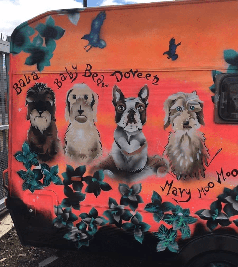
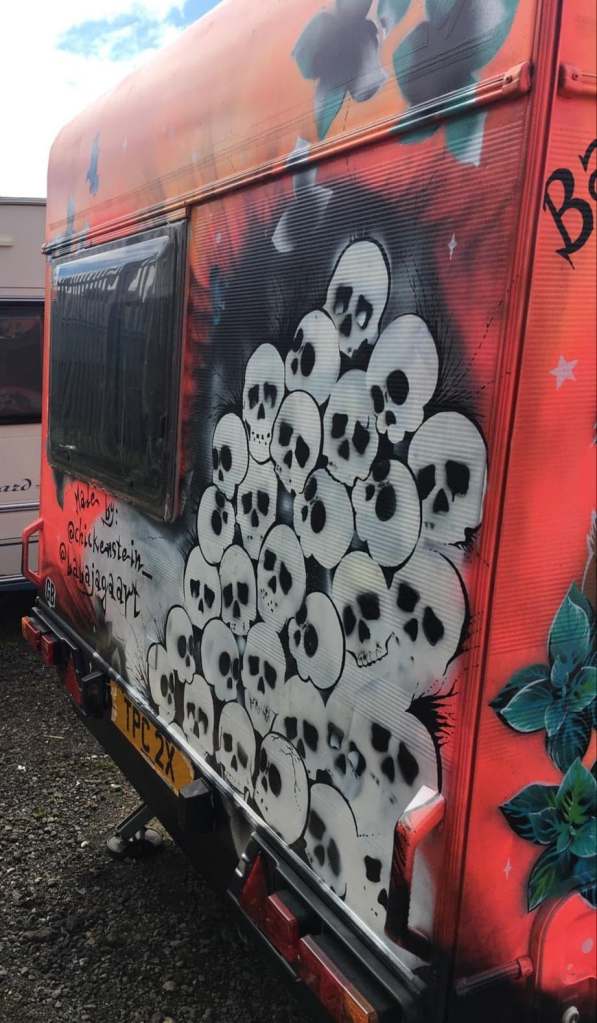
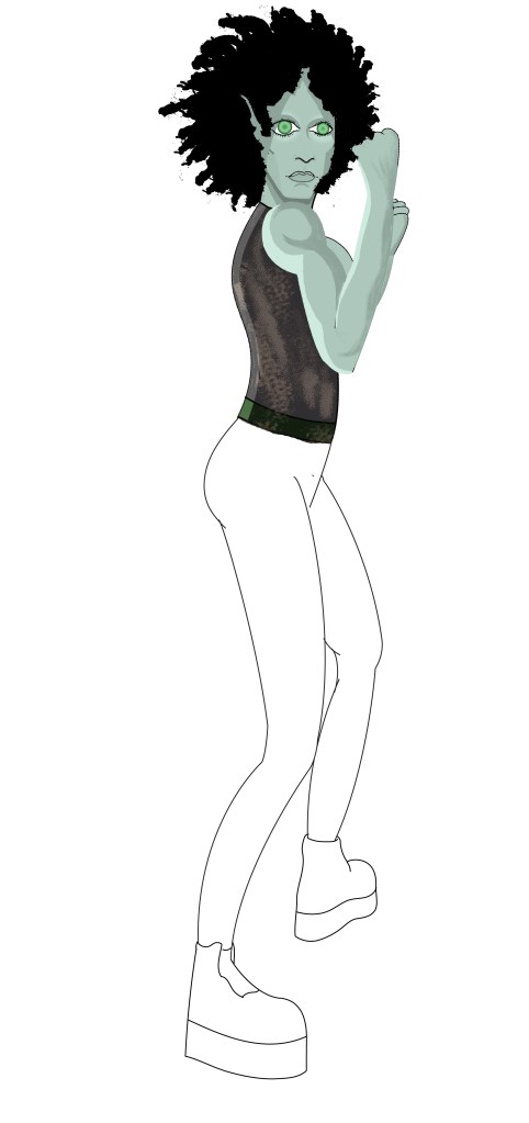
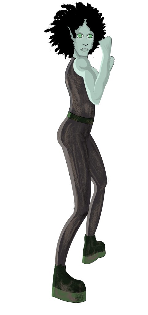
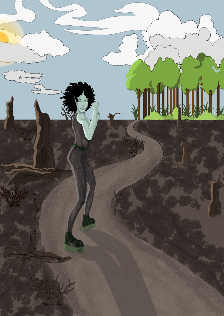
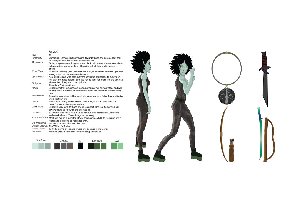
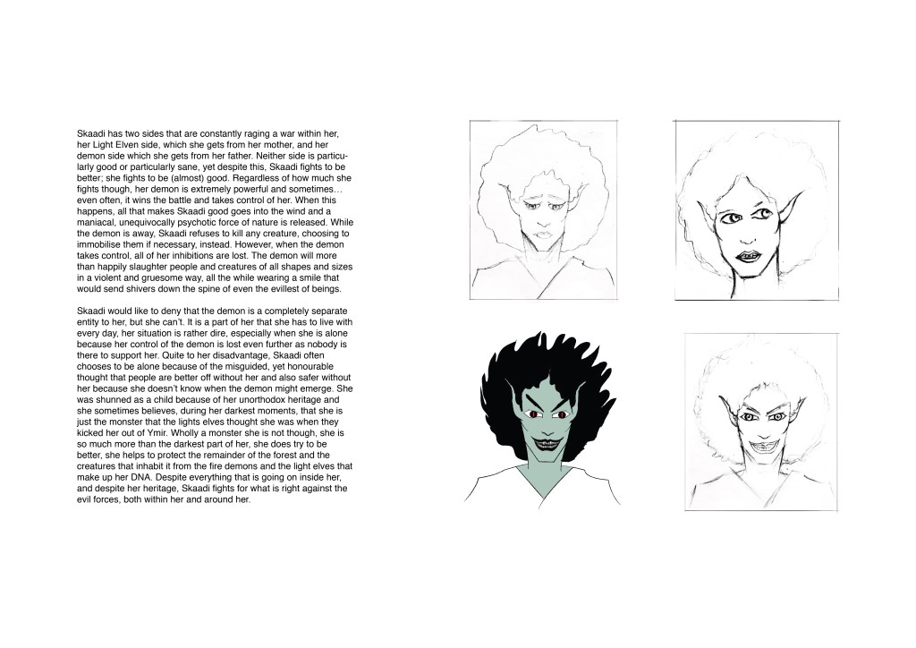
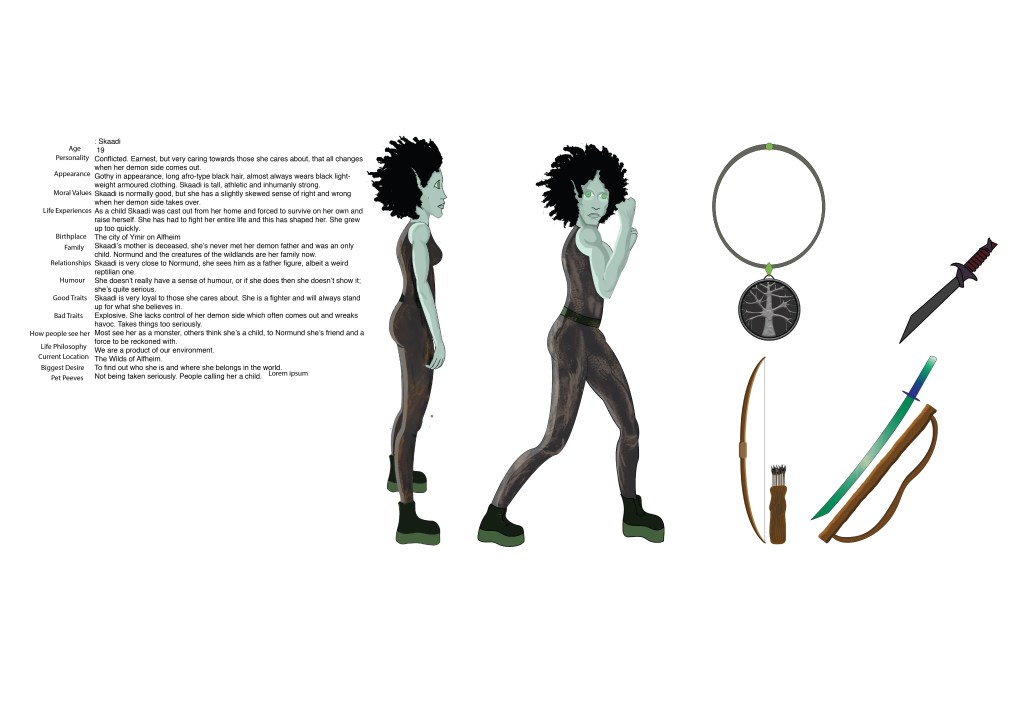
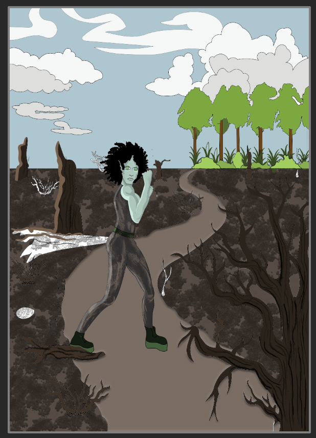
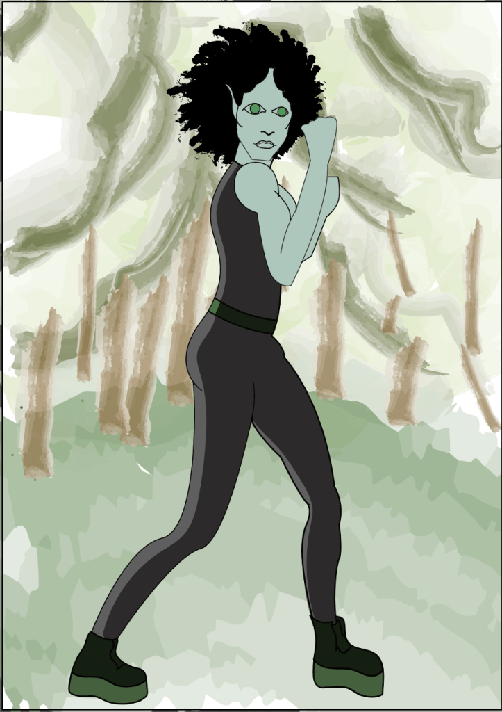
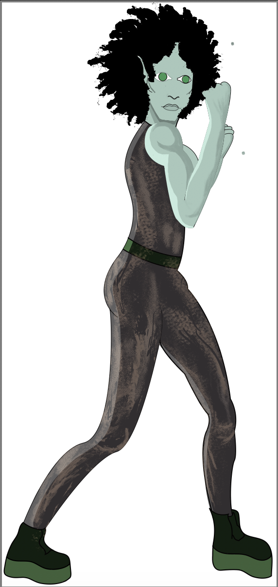
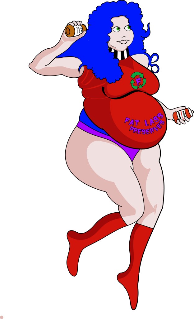
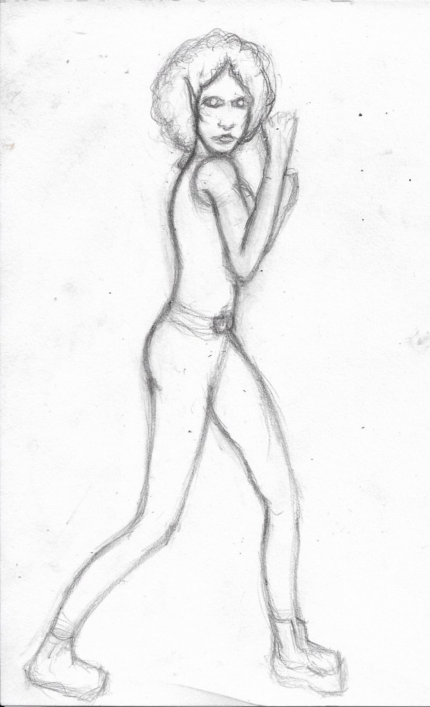
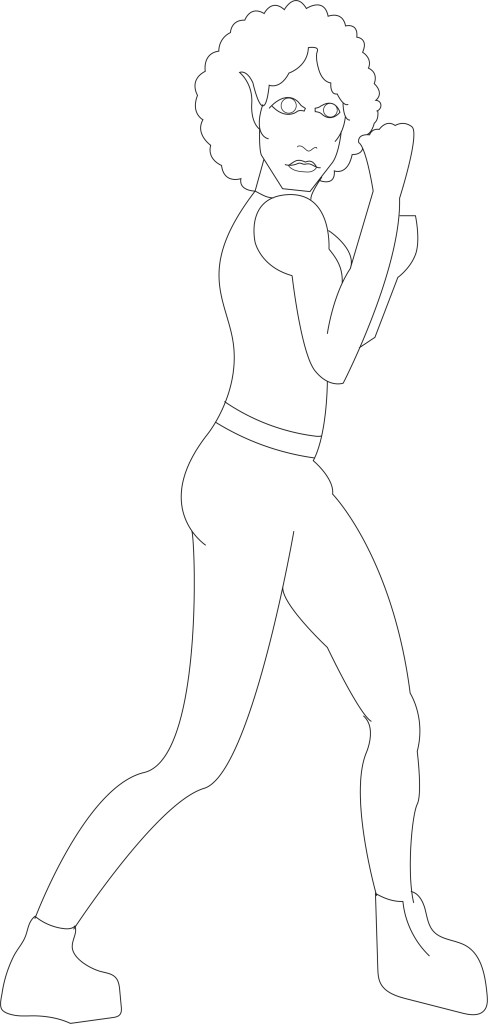
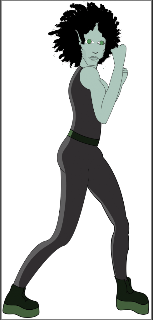
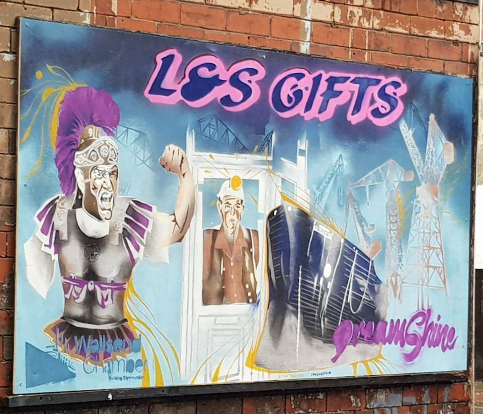
I’m so happy with myself right now, I got a high merit (or a 2:1) on my first university project in almost a year!! I was so worried that I’d only get a pass, but all of the work I put into the Character Design project finally paid off. The mural that my girlfriend was commissioned to do got finished on time too and the woman commissioned her loved it, I was so happy that it worked out and the mural is now displayed in Wallsend, hopefully forever. I did struggle to get all of the research done on time and to be honest, I still have one form of printing to research so I am a little bit behind right now. I’ll catch up though, now that the mural is out of the way. I would love to get a distinction at the end of the course, the only reason I didn’t get one this time is because I had an idea of what Skaadi would look like from the start and I stuck with that design throughout the entire project. In the future I need to explore different designs and develop my characters and ideas more. I do struggle with this to be honest; I think too much about what I want to achieve and once I have a solid idea, I just stick to it. I really should sketch out multiple designs first and be a bit more adventurous with my development instead of just keeping my ideas exactly the same from start to finish.

First print design , 2b pencil on paper.

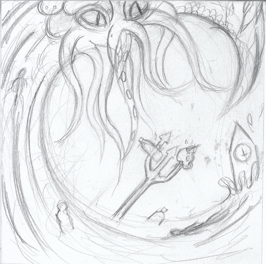
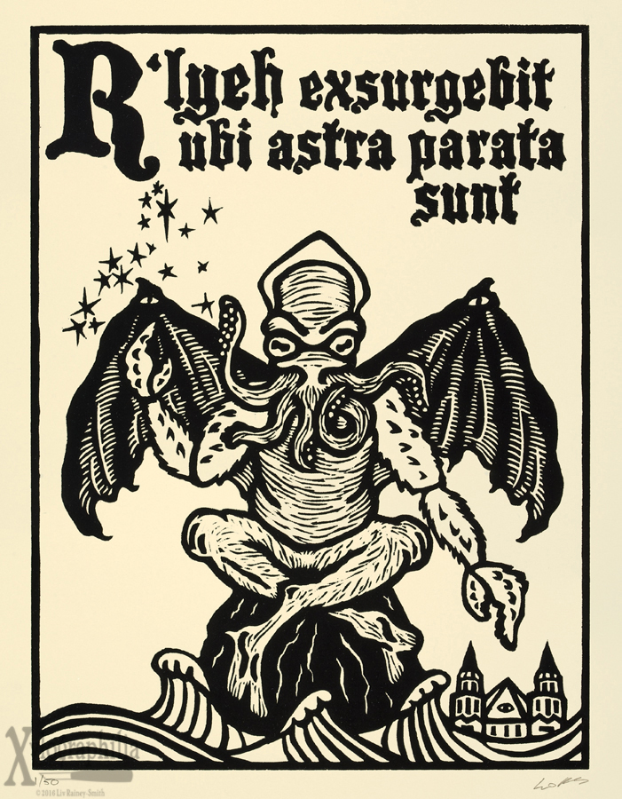
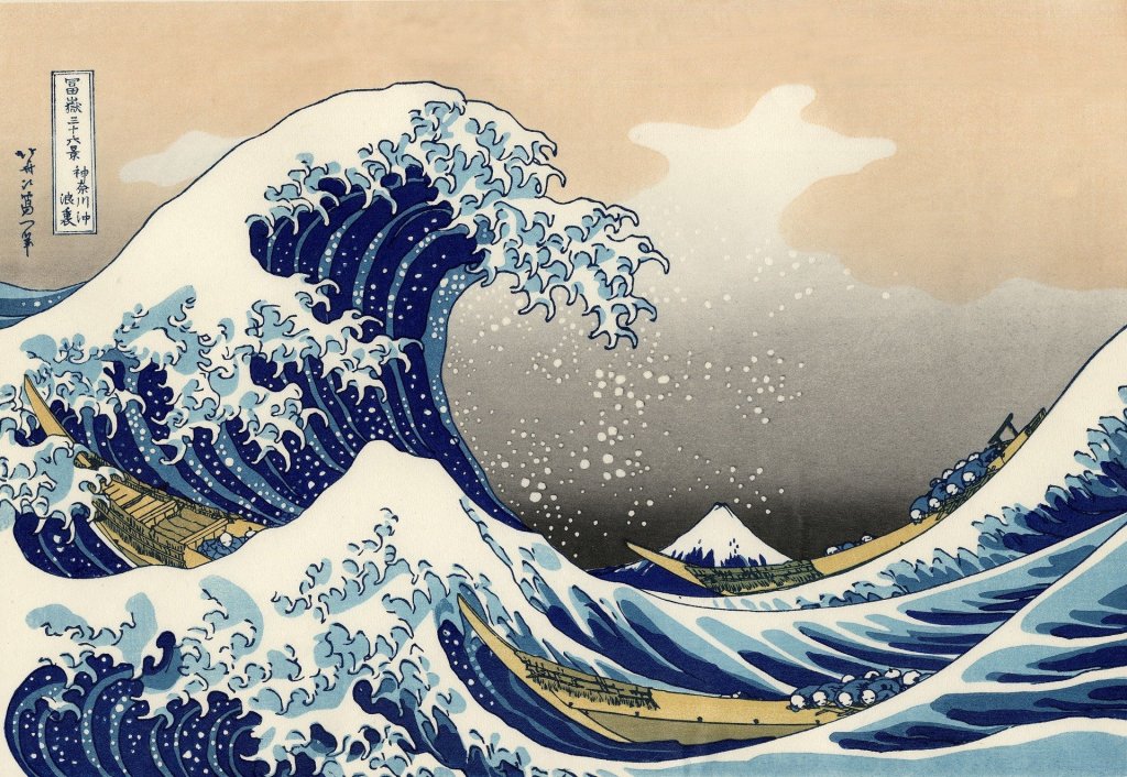
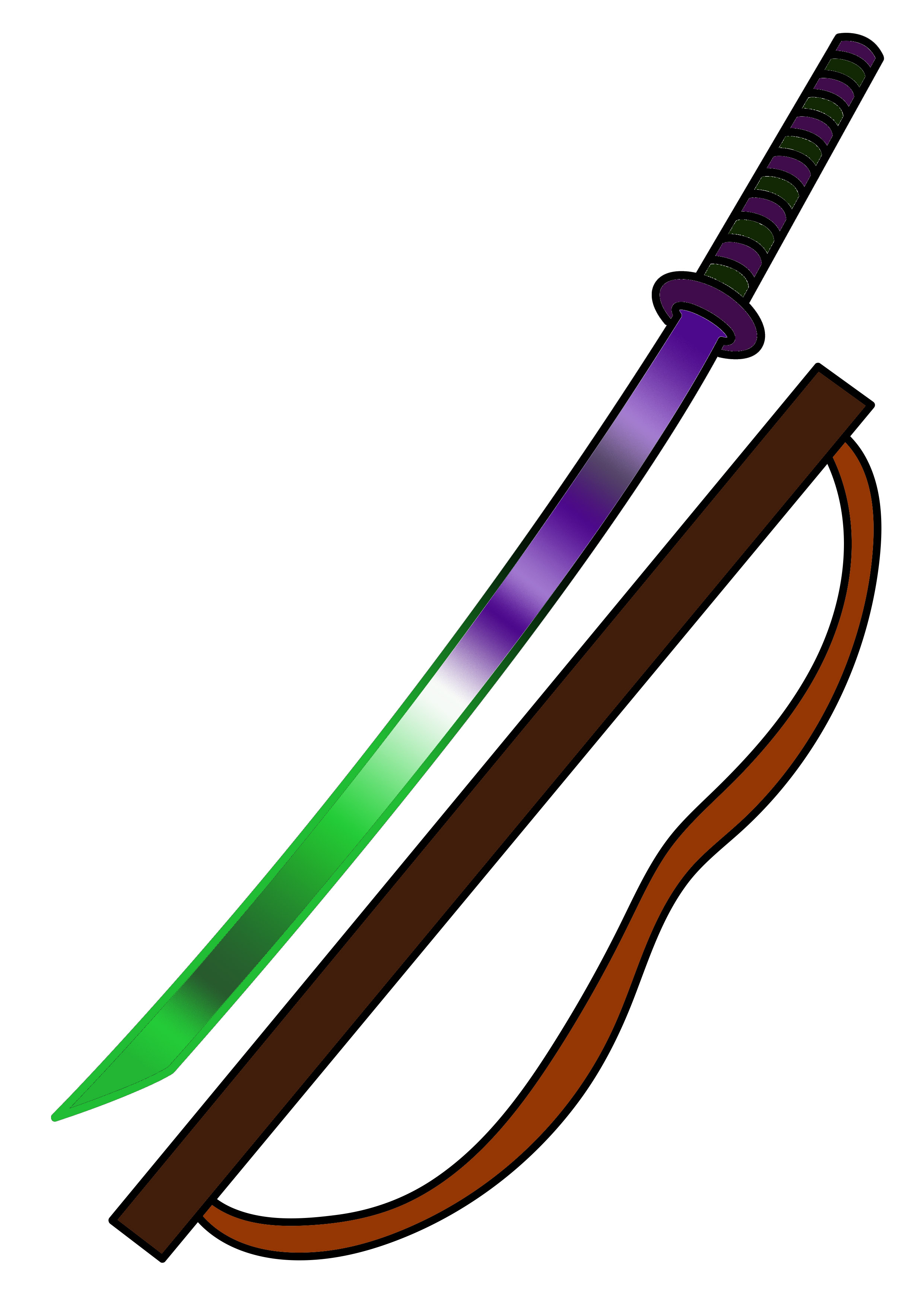
Since last week I’ve managed to finish researching all of the artists that were set to us by the tutors, including Hokusai, Liv Rainey-Smith and Jack Davis, and I’ve researched relief printing and risograph printing, all that’s left to do as far as the research goes is screen-print research, technically we we’re supposed to have finished this by now so I have made things a bit harder for myself but I’m not too worried; I like the writing and research side of things so it shouldn’t take me too long. As well as the research I’ve also completed my first design for printing, I opted to draw Cthulhu riding a plastic polluted Hokusai inspired wave, with a trident piercing a skull and water bottle at the moment the wave crashes over Big Ben. It sounds like a lot I know but I don’t know how else to put it, I chose to do this design because alike the Skaadi project where I made my design depict the Amazon Rainforest crisis, I wanted to make my designs this project convey some of the horrific issues that are facing our world today. I chose to depict the ongoing plastic pollution problem that is threatening our oceans because it is something that could and probably will wipe out much of our known world if we don’t do something about it. My design serves as a warning, with Cthulhu symbolising the horrors of pollution and the great wave that could flood the world if the ice caps continue to melt and the sea levels rise.

Initial print design idea. 2b pencil on paper. Inspired by Hokusai.

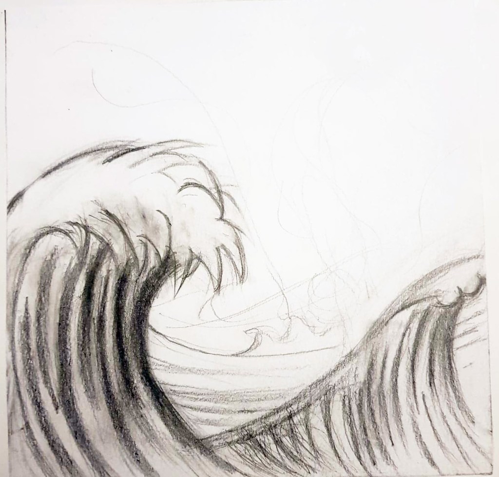
I struggled with designing this because I knew what I wanted to convey, I just didn’t know how, I’m not even sure if my final design is effective at getting the message across, my original sketch was far too derivative of Hokusai, it took me a couple of attempts to get something that I was happy with. Time was against me though and I had to settle with what I had, it’s not that I don’t like the design, it’s just missing something where the white space is. I guess can always paint over the design once it’s been printed or redo it in my own time, but the main thing is that the design has been sent off to the right place for it to be laser cut onto acrylic ready for printing. Speaking about sending the file off, I once again struggled with formatting my design correctly to be laser cut, my tutor told us how to do it but a lot of the information got lost to me in my head, I don’t know if it’s because he was throwing a lot of information at the class really fast, or because I wasn’t paying attention enough due to the fact I get anxious in clss. Either way, I need to work on my ability to format things, I keep meaning to take a notebook to class with me so that I can take notes on how to do these things, but ironically, I keep forgetting to do so. I will try to take a notebook next time because I am sick of feeling kind of stupid when I have to keep asking the tutors to help me send files to certain places to be marked or printed. I don’t see many other people needing help with this and to be perfectly honest, I don’t want to have to either. I think we are printing the design on Monday which I am looking forward to, it’d be good to finally have a design that I can print over and over again, it could be something that I end up selling on Etsy which would be nice. We’ve already been asked to create another design for a different form of printmaking that we’ll be doing soon, which is great because I’ll have a lot of reproduceable designs in the near future. I’m probably going to stick with the Lovecraftian take on modern day issues theme that I’ve started with the Cthulhu design, so I guess I’m going to need to look for a more obscure one of his creatures, I don’t want to only use Cthulhu in my designs. I love H.P. Lovecraft though, so the next weekend is going to be quite fun.

Warning- Cute Dog Painting Inside

Rainey-Smith, L. (2019). Gallery | The Art of Liv Rainey-Smith. [online] Xylographilia.com. Available at: https://xylographilia.com/gallery/#jp-carousel-3538 [Accessed 14 Nov. 2019].

Well, this has a been a pretty productive week so far, I’ve done over half of the research and figured out which of my own artists I am going to choose to research once I’ve finished the ones set by my tutors. I found a really cool woodcut printmaker called Liv Rainey-Smith who does some seriously gothic, Lovecraftian designs; her work is right up my alley and is definitely going to tie into my more macabre theme that I plan on running with this project, with H.P. Lovecraft being one of the godfathers of horror, he even has a branch of horror named after him! The level of detail Rainey-Smith achieves with woodcut is mind-blowing too, it’s almost hard to believe that she’s using woodcut to create her designs. I’m getting so excited about this project now; I think I’m going to hone the spirit of Lovecraft with my designs this time too. The only thing I’m worried about is whether or not I am going to have time to finish the research because my girlfriend is working on a large mural commission  that is going up in Wallsend and it’s looking like she is going to need help finishing it before the deadline on Saturday. I may have to put my research project on hold for a couple of days to make sure that the mural gets finished on time and do my best to catch up on the research afterwards. I just can’t let her struggle like this, we’ve collaborated on murals before, we painted a caravan together and work well together so I’m confident that if I help her then it’ll get done on time and then I can wholly focus on the research afterwards, even if it means staying up most of the night on Sunday, it’s not like I have a project hand in on Monday, her deadline is more important right now.

The Great Wave off Kanagawa- Hokusai

All of this said, I am still going to do bits of research in between painting the mural, like when the paint is drying etc, so hopefully I won’t have a horrific amount to do on Sunday. As well as Liv Rainey-Smith, I plan on researching the legendary Hokusai, I mean how could I not research him for the purpose of a print project, he literally revolutionised relief printing and took it into a whole other realm. I’m not usually that interested in the historical artists, which I know is bad because we wouldn’t be where we are with art without them, however, there are a few historical artists that I’m really interested in and Hokusai is one of them. I don’t really know a lot about him as a person or artist, only what I’ve seen of his work like the great wave so it will be interesting to research him properly and find out how he achieved so much in his life, maybe I could learn something that I could apply to my own artistic practice.

The third and final artist that I’m going to research isn’t even a print maker at all, which I’m hoping won’t be a problem, I’m not sure if we’re only supposed to research artists that make prints. Anyway, I’m going to research Jack Davis, best known for his work on the Creepshow comics, I’ve chosen him as more of a style reference than anything else, he used to create highly bizarre and macabre characters that I think could inspire my own horror focused style during the print project. I’m really hoping that we get to create enough prints to take home and not just prints for the course during the project because I wouldn’t mind selling some on etsy or something, it’s not exactly making comics but I have thought about selling art prints and getting myself out there for a while, I’ve just never had the resources to do so and I’m hoping exploring all of the print facilities I’ll have access to on the upcoming project will change that. I’m happy that we are going to be doing different types of printing because I’ll be able to figure out which one works out best for me, who knows, it could even be the start of a print business venture for me.

Don’t Panic, It’s Only Hand-In Day

I need to take my own advice.

Well… Today was a bit of a mess, the good news is that I finally handed in the Character Design project, the bad news is it took me the entire day to get there. Today was an anxiety day and a bad one at that, I ran out of anxiety meds and barely slept last night trying to make sure everything was perfect and ready to hand in, which in hindsight wasn’t the best idea; no pills and no sleep makes me a stressed boy. All throughout the day I watched as people rushed to finish their project, spend a few minutes handing it in digitally and go home, whereas despite having my project done before going to uni, I was still the last person to go home because I just couldn’t for the life of me figure out how to format my artwork correctly to send off to the submissions dropbox, nor could I figure out how to print out my character boards and final illustration, despite having done this many times before. My brain just was clearly on vacation today. I guess it is over now and I can rest easy knowing that I have handed in the best I could do at the time. In the future, I am so going to have to manage my time more effectively and prepare for the fact that things are most likely going to go wrong on hand in day. I need to have everything sorted and ready to hand in a whole 24 hours before hand in day so that I don’t end up having to stay up until a ridiculous hour before going to uni. Hopefully this way I can be properly rested and in a better mental state to deal with anything that goes wrong on hand in day, because to be perfectly honest, the more things went wrong, the worse my mental state got, and I basically had a complete breakdown which could have been avoided.

As I expected, we’re off next week and have been given a research task for the upcoming project to be handed in by Monday. There are a lot of artists and companies to research on the list, more than we have been given before, which I’m pretty sure is due to the fact that not everyone on the course necessarily does a lot of research, something that has been mentioned in class previously. Hopefully this doesn’t apply to me because I spent a lot of time doing my research for the Skaadi project, nevertheless I will do my best to complete the whopping 11 people/companies to research that the tutors have given us plus another 3 of our choice in just over a week, it’s a good thing I enjoy writing!! The upcoming project looks like one I will really enjoy though, it seems to be a print based project and we’ll be doing risograph printing (something I’ve seen done but haven’t tried before) relief printing (I’ve done lino cut before with varying results) and screen printing which is the one I am looking forward to the most because during the final project on my level 3 course I did screen printing for the first time in my life and managed to get my first distinction ever, so I’ve got high hopes for it this time.

I’m going to spend the next week delving into the world of printing and research artists that I feel could influence my style this project, I’m thinking about going down a more macabre route this time, while still linking it to current world events. I enjoy making sci-fi/fantasy and horror tropes and gothic comment on the modern world. Besides, my main interests generally fall between sci-fi/ fantasy and horror, I did fantasy last time with Skaadi the demon elf, so now it’s time for something a bit on the dark side. I haven’t been doing a lot of my own art lately and I don’t think I’m going to have much time to in the foreseeable future with uni, so I guess I’m going to have my make my own artwork my university work.

Skaadi Reborn

Well, I did it, I managed to redraw Skaadi’s legs and I can happily say that she looks like she belongs in the environment. It was not an easy task, at all. I asked my girlfriend to pose for me again so that I had some god first hand reference to draw from and even then I struggled; the position that the legs needed to be in meant that I had to use some foreshortening which is something I always try to avoid. I think it took me about 5 attempts to draw the legs in a way that they would make some sort of proportional sense, but it’s done now anyway and I guess it was a good learning exercise, I can’t avoid using foreshortening forever, especially since I hope to go into comic design someday. I think I need to practice doing foreshortening more, my attitude towards it isn’t the best and I managed to do it this time, so I should practice more so that I can get better and not struggle with it so much when I need to do it for a project again.

I’ve managed to finish my development board now too, I took what my tutor (Sarah) said to me in mind and decided to layout Skaadi’s character poses and weaponry in a straight line across the centre of the page, they look really uniform now and I’m quite pleased with it. My second board primarily has Skaadi’s expressions on it to show the different sides of her, from her brave elven side to her horrific demon persona. I wrote a few paragraphs explaining each part of Skaadi in detail so that the audience could really understand her and hopefully feel for her because she is in such an awful predicament.

I feel like I’ve come a long way as a person and illustrator since I was last on this course over a year ago, I’m more willing to adapt to using digital art methods and try new things, things that I was rather stubborn about not using in the past. I’m realising that I don’t always need to make things difficult for myself, and that I’m not as bad at art as I used to think. I still have a long way to come with my confidence but at least I feel like I’m getting somewhere. This project is coming to a close soon and I’m not so worried about getting everything done on time, my sketchbook is up to date, though it could look a lot neater and my work could be presented in a better way. I really need to work on my sketchbook presentation skills, I feel like a lot of the pages look grimy where my pencil sketches have smudged on to the other page, or where glue has stuck to the wrong parts of the page. I do try to make things look nice but I quite often get so caught up in actually producing the work and writing the annotations that I don’t focus enough on how I put it all together on the page. I hope I don’t miss out on too many marks because of this. Maybe I should start wearing gloves when I stick things in my sketchbook, it would stop me making marks on the page where my fingers have touched, or put pieces of scrap paper over pencil sketches to protect my sketchbook pages. I guess a fixative spray could work too, but it’d have to be one that wouldn’t change the colours or anything about the sketches. I should really look into getting some fixative spray and maybe write a review of it on the blog… is that something I could put on this blog?? I don’t know, why not.

Hopefully by the end of next week I will have handed in the project and everything will be all well and good, after which I’ll be straight on to the next project, there aren’t many breaks in 2nd year I’ve noticed, even when we aren’t in uni we’re doing some sort of project.. well, I am anyway, I’m not sure how other people on the course work but for me it’s pretty much non stop. I guess I like it that way, it gives me something to do and I feel like I’ll be able to become a professional illustrator someday if I keep putting the work in.

Tutorial Week

Over the weekend, ahead of tutorial that I felt was looming over me, worrying that I had not done enough, I finally decided to make a proper start on my character development board. Had it not taken me so long to refine my Skaadi poses, I probably would have started them sooner. Nevertheless, I made a start on the first board, I displayed both the refined Skaadi dynamic pose and the side pose, alongside her small arsenal of weapons and her treasured necklace; for the text I decided to show Skaadi’s character profile, rather than the whole story because I wanted the board to be just about her. After much deliberation and minor alterations, I just couldn’t get the layout to look professional, my illustrations looked a bit haphazardly placed and the board didn’t look neat.  In hindsight I probably should have spent more time looking at how other Illustrators laid out their character boards; but I was running out of time and panicking, I really wanted to have something to show my tutors for when my tutorial came on the fast approaching Monday.

My first attempt at creating a character board.
CareHere. (2019). Featured App-Stop, Breathe & Think. [online] Available at: https://carehere.com/stop-breath-think/ [Accessed 24 Oct. 2019].

Monday came and my time was up, I had to go in and face the tutorial. When I got there, Sarah (one of my tutors) was surprisingly happy with the amount of work I had done over the week off and offered me some guidance on how I could improve the layout of my development board, things such as making the character profile categories stand out from the rest of the text and laying out all of my illustrations so that they formed a straight line across the centre of the board; this is something that was mentioned to the class earlier in the project but I guess it slipped my mind, I do have trouble focusing on what is being said to me, primarily when the tutors are speaking to the whole class, my mind tends to wander off. It is paramount that I work on being present in the moment when I am in class because I won’t always get the chance to speak to my tutors one to one, I can’t avoid group talks and class conversations, and while I can’t help getting a bit anxious and close in on myself in those environments, there are ways I can improve it. Perhaps I could try mindfulness again, I used to sometimes use the Stop, Breath & Think app which did help, i’ve heard the Headspace app is a really good one to use too, maybe I could try it and share my thoughts on whether it works for me.

Skaadi’s legs just don’t look right.

Anyway, getting a bit off topic, as well as talking about my character board, we also talked about my final illustration, more specifically, how the dynamic Skaadi illustration would fit into the environment that I created over the weekend. After placing Skaadi into the environment it became rather clear that she didn’t quite make sense in the piece, it was pointed out to me that her legs were facing the wrong direction as they should be leading the viewer up the path; I had kept her legs side on in the hope that I wouldn’t need to change a pose that I had spent so much time on refining. It has been a few days since my tutorial and I am still struggling to change the position of her legs and I’m growing increasingly worried that I might have to change her whole body in order for my final illustration to make sense, a task that I’m not sure I have time left to do as the deadline for this project is only a week away. I’m going to try and get my girlfriend to act out the same dynamic pose as before, but with her legs in a different position so that I have some good first hand reference images to get a better idea of how I should draw Skaadi’s legs in a such a way that she is leading the audience up the path. I really hope that I am able to achieve this over the coming weekend so that I can focus on finalising the overall illustration and finishing the character boards from Monday. If not, I will have to redraw her whole body which could trip me up on the last hurdle of the project, watch this space.

The Dreaded Week Off

Surprisingly, this week has went a lot better than I thought it would. At the start of the week I felt slightly lost and had no idea how to bring some life to Skaadi, she looked good but was missing heart and fire, her eyes looked soulless and plain. However, after a lot of experimentation and watching a plethora YouTube tutorials on Photoshop processes I have finally created Skaadi as I saw her in my head, sure there are still a few small kinks and details to sort out, but overall, I am much happier with how she looks now.

I primarily focused on fully developing the Skaadi dynamic pose as this is the one that I plan to use when I create my final comic book panel which will depict Skaadi defending her forest home. Throughout this project I had the idea of showing Skaadi inside the beautiful forest in which she resides for my final outcome, however, over the past week or two I came to the conclusion that this would be too bright and happy and it wouldn’t show the depth and darkness within the story that I wrote, it also wouldn’t portray my protagonist as the complex and conflicted character that she is. 

I spoke to one of my tutors last week and she pointed out that Skaadi was currently looking quite normal, when she isn’t, she has a much darker demon side and there is endless conflict within her world which just wasn’t showing in the illustrations I had done so far. To tackle this problem, I have decided to depict Skaadi standing in the blasted heath that I describe in the story, protecting the forest she calls home. I hope that choosing this landscape will reveal a glimpse of how dark and distressing her life can be. I’m not certain that this change of setting will be enough though, Skaadi herself will still look the same, just in a different place, I think I need to show her demon face somewhere on my final hand ins. Physically showing her other side in all of its maniacal glory would most likely solve this issue.  I guess I could show the expressions I drew of her (including her demon face) on one of my development boards. Speaking of which I’m not too sure how I am going to tackle the development boards as such because I have primarily been focusing on what the final standalone illustration will look like, I need to improve my ability to spread my focus and attention across all aspects of the project.

Dvorsky, J. (2019). The Blasted Heath | The Pnakotic Atlas. [online] The Pnakotic Atlas. Available at: https://pnakoticatlas.com/places/97/the-blasted-heath [Accessed 17 Oct. 2019].

But even all this was not so bad as the blasted heath. I knew it the moment I came upon it at the bottom of a spacious valley; for no other name could fit such a thing, or any other thing fit such a name.

H.P. Lovecraft- The Colour Out of Space

I feel as if my time management and focus has been a bit off this project, I want to blame it on the fact that I haven’t done a course for a long time, however I don’t feel like this is good enough an excuse. Other than a few notes, both mental and paper, I didn’t really set myself an official timetable for this project which is starting to bite me in the behind a bit now; when I do future projects, I should try to write up a timetable, even if it is a loose one of how and when I am going to tackle each aspect of the project. I think this would be greatly beneficial to me as it would help me to organise my time better and would make me feel less scatter-brained.

Well, that was unexpected.

This week has been a bit of a mixed bag, on the plus side I have just about finished colouring up the Skaadi side pose on Illustrator and Photoshop and I have also digitised some of the essential items that Skaadi carries with her. What hasn’t been so good is finding out that we yesterday morning that our Thursday class isn’t happening any more due to a teacher training day, and also that we’re off all of next week for a reading week; followed by a tutorial on Monday the 28th of October. Normally this would be fine, however, I still feel a bit rusty with Illustrator and Photoshop (having not been on a course doing digital art for over a year now) and I have so much I need to do and very limited idea of how to do it. I guess I am going to have to watch YouTube tutorials on Photoshop processes and figure out how to finish this project to a high standard.  

While I am rather shocked at how little notice was given about not being in Uni today, I have at least managed to do the digital line work and colour for the Skaadi side pose. I did this by scanning the initial sketch on to the computer, opening it in Illustrator and using the pen tool to trace the sketched line work, similar to how I created the line work on Skaadi’s dynamic pose previously. As I mentioned on my last post, instead of colouring my work in Illustrator as well, I exported the line work and opened it in Photoshop to colour. I found this process a hell of a lot easier than colouring it in Illustrator, partly because I have painted in Photoshop in the past. It is just so much quicker and allows me to spend more time on doing details and shadows/highlights, the use of which I have learned from researching how Fiona Staples creates them in the Saga comics.  This is subsequently also much easier for me to do in Photoshop. I have cautiously high hopes for how this project is going to go from now on, I do feel as if I am improving a lot with digital art and it is quite surprising because a year ago I wouldn’t have even attempted to get good at using computers for art. I do still love doing traditional art and digital could never completely replace it for me, however I am final seeing the benefits of using Photoshop and Illustrator to create and enhance art and hopefully I will continue to do so in the future.

Skaadi Side Pose

I do have one small qualm about the way I have painted Skaadi so far and that is that she doesn’t quite look alive yet, like she doesn’t pop out of the page or look like she is a living being, this is something that I really need to rectify and quickly because she is such a complex and active character and I want to portray that life and spirit in the illustrations of Skaadi. Hopefully over the next week I will be able to push myself to learn more about how to use Photoshop and also what alterations to make to Skaadi to give her that bit of oomph, all without my tutor’s guidance. As well and adding life to Skaadi, I really ought to figure out what kind of environment Skaadi is going to be in and design it. I mean, I know she lives in a forest and I know in my head what the whole world she inhabits looks like, I just need to show it in my art. It is certainly going to be a busy week.

Skaadi Returns!

After a week of absolute manic panic, I handed in the Fat Lass Preserves Project, which, to me went really well and I am happy enough with the final outcome. I have finally gotten back to doing the project I really enjoy doing, the Skaadi Project. Unsurprisingly, my fat lass design didn’t get picked by the company owner, which to be quite honest, doesn’t bother me because it was the first time I have ever attempted to draw and finish a larger person, so it was always going to be a learning curve, yet I am definitely feeling more confident about drawing larger characters again in the future and also in my ability to create plus size characters of my own.   

This week I have focused on digitising one of my dynamic Skaadi sketches to put on to an A2 development board that we have been asked to create as part of our final outcomes. I sketched out a variety of character poses last week during the fat lass project; they were really rough and sketchy and didn’t really look like Skaadi at all. To rectify this, I scanned the sketches on to a computer and opened them in Adobe Illustrator, I then used the pen and pencil tools to trace over the line work, while slightly changing the proportions of the Skaadi sketches to fit how I see Skaadi in my minds-eye. Once I had the line work I proceeded to colour Skaadi in Illustrator using the paintbrush tool, I decided to focus on colouring the dynamic pose because I am really happy with the proportions and I am considering using the dynamic pose on my final comic panel. I took photos of my girlfriend to use as reference for each of thew poses because I am still getting used to drawing humanoid characters and having first hand reference really helps me figure out the proportions of my characters.

I found colouring Skaadi with the paintbrush tool very awkward and fiddly, it was extremely time consuming to just create a basic fill layer, whereas I know that in photoshop, it is possible to fill entire areas with simply one click. It wasn’t until today (Thursday) that I found out from my tutor that there is a much easier way to fill colour in illustrator and also that we don’t actually have to complete the whole design in Illustrator, I was under the impression that it was an Illustrator project based on the content of the computer sessions so far. I guess I could have found out differently earlier if I had found the confidence to outwardly ask for help. Nevertheless, I will be using Photoshop to colour my designs in the future from now on and I will keep to Illustrator for the linework. I’ll probably take the dynamic Skaadi pose over to Photoshop as well because, while I am happy with the pose, proportions and the colour choices I have made, I am just not satisfied with her face and she looks rather flat, I feel as if it will be a lot easier to add highlights and shadows in Photoshop.

Overall, I am rather happy with my progress on the project so far, as well as how I have chosen to manage my time, especially without the support of my tutors, having been on a reading week.  I definitely need to work on my confidence and anxiety, I should ask for help and information when I need it instead of just struggling unnecessarily for ages. I am so pleased to be working on the Skaadi project now and my character is finally starting to come take some sort of shape, I’m aware that time is running out to do this project but now that I know we can use Photoshop as well as Illustrator, I am fairly confident that things are only going to get better from here.

Fat Lass Preserves

This week came as a bit of a shock to me, after focusing on developing my personal comic project for so long now and with November quickly approaching, we have been thrown completely off the tracks with a new project that is due by Monday. The tutors did mention that we would be given a live brief at some point, but I didn’t think it would happen this quickly or that we would have so little time to do it. The brief we have been given is to redesign a confident, plus size superhero that will become the logo for a local company called ‘Fat Lass Preserves’ that sells jams, chutneys and other preserves. We have been asked to do this because the image that the owner of the company is currently using is technically protected by copyright as it depicts a large version of Wonder Woman which she isn’t really allowed to use. One person from the class will have their logo chosen, receive money for designing the logo and it will be featured on local TV, so while this project temporarily throws a spanner into the works of my other project, it is a great opportunity.

Fat Lass Preserves Current Logo: Deane, B. (2019). Artisan preserves with a modern twist. [online] Fat Lass Preserves. Available at: https://fatlasspreserves.co.uk/ [Accessed 27 Sep. 2019].

Nevertheless, I am finding it extremely difficult to complete this project because I am so invested in the ongoing personal project and find it slightly challenging to just jump from one project to another and back, however, I know that this will provide me with valuable experience for when I become a professional Illustrator.  As well as this, I am still developing my ability to draw humanoid characters and designing a plus size character creates a new set of challenges for me, such as, the muscle definition is not as visible on plus size characters which makes it more difficult to know where each muscular element should be. So far, I have primarily been using anatomy books as reference for human proportions which don’t necessarily focus on the proportions of plus size people, who often have different proportions to the average human being.   It is because of these things that I have never really tried to draw a plus size humanoid character thus far, I am however looking forward to the challenge in the hope that it will help me to develop my illustration practice further. While I have struggled with the transition from one project to another, I know that this project is good training for real world scenarios, because when I am a professional Illustrator, I will rarely get to choose what kind of character I design and I’ll also probably have a short timeframe to complete any project that is given to me, as well as multiple ongoing project at once.  This project is providing me with a dose of reality and should help me get a better idea of what it will be like to be a professional illustrator in the future.

So far, I have attempted to draw a confident fat female superhero in 3 different poses, including the pose that the commissioner really likes, and so far, all of which I feel need improvement.  I researched the company to get an idea of what their ethics were and what kind of imagery and colours I should use for the costume and I have come up with a pretty solid idea of what I want the finished design to look like, I am just finding it unbelievably difficult to turn that idea into reality. It is currently Thursday, and I have until Monday to finish this. Help.

Fat Lass Preserves Pose 3